
Like Windows 8, Windows 11 also significantly changes the design of the Start menu. The new Start menu drops support for live tiles in favor of static icons, and they can no longer be customized. The new Start menu isn't as attractive as Windows 10's Live Tile-driven Start, and it has its share of feedback — both positive and negative.
The Start menu is now located in the middle of the taskbar, with a search bar at the top. When you click the search bar, Windows 11 automatically switches to the Windows Search interface, showing results for local apps, files, and pictures, as well as Bing Web suggestions.
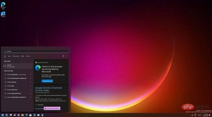
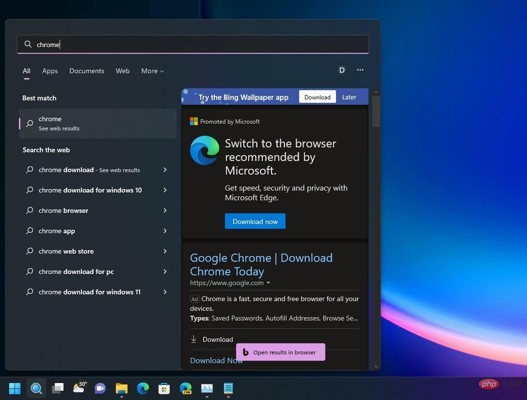
Windows 11 is now apparently showing ads in search results in an attempt to convince people to continue using Microsoft Edge when they try to download Chrome. This is yet another move by Microsoft to promote Windows 11's Edge, which may anger people as the ads appear to be becoming part of the core user interface.

#If you search for Chrome or Firefox, you will see an ad in the panel that pops up on the right. Microsoft is targeting two keywords - Chrome and Firefox. For some reason, the same ads don't appear when you search for Opera, Brave, Vivaldi, and other web browsers.
Textio co-founder and former Microsoft Office designer Jensen Harris took to Twitter to express his frustration with Microsoft’s design choices. In a series of tweets, Harris explained how Windows 11 doesn't deliver the flagship Start menu experience we've all come to expect.
What's up with the Web 1.0 Geocities era banner ad for the "Bing Wallpaper App"? Honestly, I look like I've been infected by a virus. The text is not aligned and it's on top of a Windows Vista era background on," Harris tweeted.
“Design matters. Details matter. Especially in a UI as iconic as the Windows Start Menu. I remember the team created a special font in the Segoe UI font (used in Windows) words so that the "S" and "t" line up perfectly with the word "Start." That's how important Start is to Microsoft," he added.
The former Windows engineer also had some complaints about the Bing Wallpapers app ads in the Start/Search panel and how some areas of the operating system use both rounded corners and sharp edges.

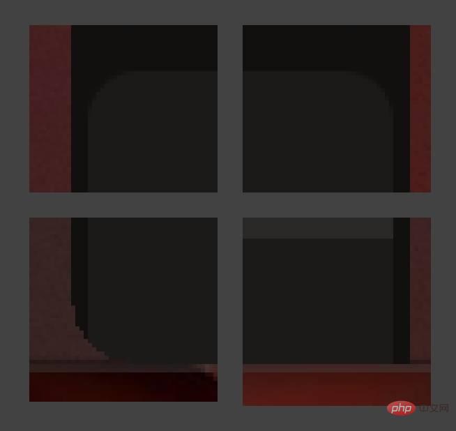
As you can see in the screenshot above, the former Windows engineer shared some examples of consistency issues in Start menu design.
The above is the detailed content of Former Microsoft engineer criticizes Windows 11's new Start menu design and ad push. For more information, please follow other related articles on the PHP Chinese website!


