
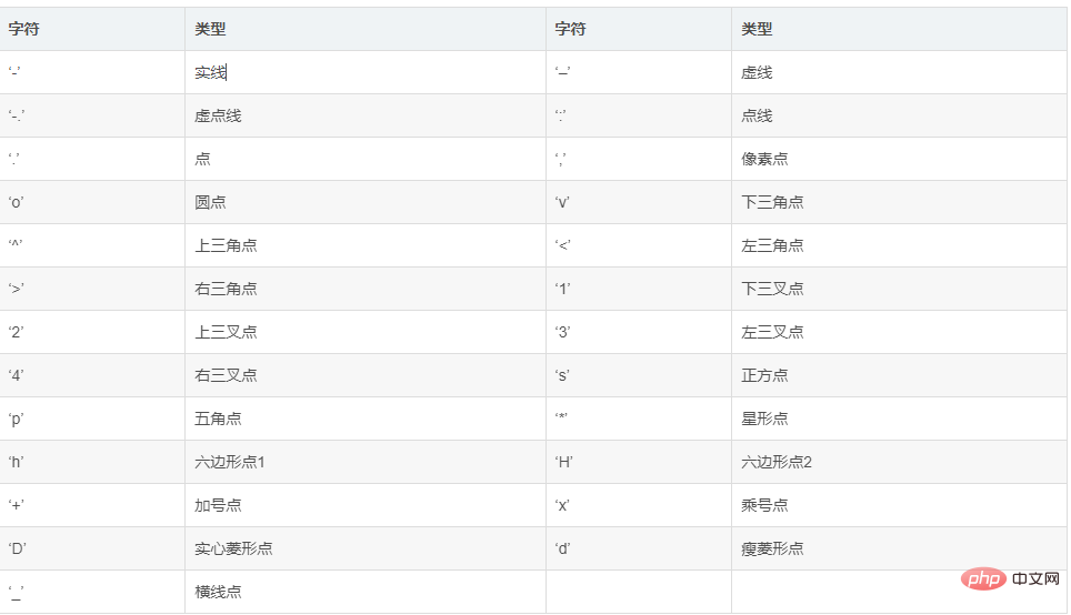
marker:关键点重点标记
annotate:注释文本
 Backend Development
Python Tutorial
What are the steps and methods to draw charts using the Python Matplotlib library?
Backend Development
Python Tutorial
What are the steps and methods to draw charts using the Python Matplotlib library?
What are the steps and methods to draw charts using the Python Matplotlib library?

Chinese font settings:
# 字体设置
plt.rcParams['font.sans-serif'] = ["SimHei"]
plt.rcParams["axes.unicode_minus"] = False
1. Basic use
Matplotlib: It is a Python 2D drawing Library, through Matplotlib, developers can generate line charts, histograms, bar charts, pie charts, scatter charts, etc. with just a few lines of code. plot is a drawing function, its parameters: plot([x],y,[fmt],data=None,**kwargs)
1.1. Line style & color
(1) Dotted line form
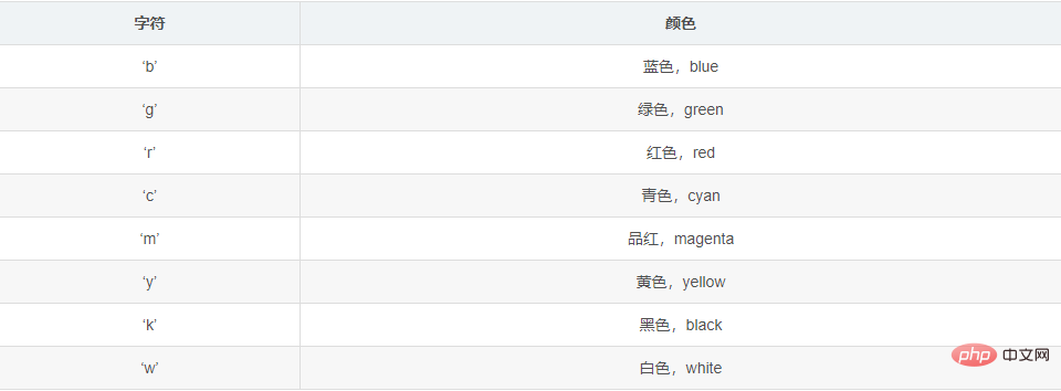
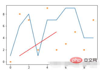
import matplotlib.pyplot as plt
import numpy as np
# 原始线图
plt.plot(range(10),[np.random.randint(0,10) for x in range(10)])
# 点线图
plt.plot(range(10),[np.random.randint(0,10) for x in range(10)],"*")
# 线条颜色
plt.plot([1,2,3,4,5],[1,2,3,4,5],'r') #将颜色线条设置成红色
Run results:
- 1, Settings Figure title: plt.title
- 2. Set axis title: plt.xlabel & plt.ylabel - Title name
- 3. Set axis Scale: plt.xticks & plt.yticks - Scale length, scale title
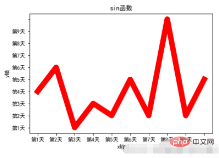
Example:
x = range(10)
y = [np.random.randint(0,10) for x in range(10)]
plt.plot(x,y,linewidth=10,color='red')
# 设置图标题
plt.title("sin函数")
# 设置轴标题
plt.xlabel("x轴")
plt.ylabel("y轴")
# 设置轴刻度
plt.xticks(range(10),["第%d天"%x for x in range(1,10)])
plt.yticks(range(10),["第%d天"%x for x in range(1,10)])
# 加载字体
plt.rcParams['font.sans-serif'] = ["SimHei"]
plt.rcParams["axes.unicode_minus"] = FalseRun result:
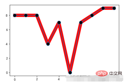
marker:关键点重点标记
Copy after login
marker:关键点重点标记
Example:
x = range(10)
y = [np.random.randint(0,10) for x in range(10)]
plt.plot(x,y,linewidth=10,color='red')
# 重点标记
plt.plot(x,y,marker="o",markerfacecolor='k',markersize=10)
Run result:
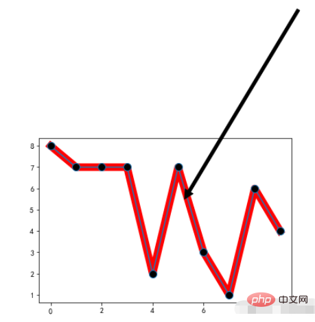
annotate:注释文本
Copy after login
annotate:注释文本
Example:
x = range(10)
y = [np.random.randint(0,10) for x in range(10)]
plt.plot(x,y,linewidth=10,color='red')
# 重点标记
plt.plot(x,y,marker="o",markerfacecolor='k',markersize=10)

# 注释文本设置
plt.annotate('local max', xy=(5, 5), xytext=(10,15),
arrowprops=dict(facecolor='black',shrink=0.05),
)Run result:
plt.figure:调整图片的大小和像素
	`num`:图的编号,
	`figsize`:单位是英寸,
	`dpi`:每英寸的像素点,
	`facecolor`:图片背景颜色,
	`edgecolor`:边框颜色,
	`frameon`:是否绘制画板。
Copy after login
plt.figure:调整图片的大小和像素 `num`:图的编号, `figsize`:单位是英寸, `dpi`:每英寸的像素点, `facecolor`:图片背景颜色, `edgecolor`:边框颜色, `frameon`:是否绘制画板。
Example:
x = range(10)
y = [np.random.randint(0,10) for x in range(10)]
# 设置图形样式
plt.figure(figsize=(20,10),dpi=80)
plt.plot(x,y,linewidth=10,color='red')
Running result:
Application scenario:
- 1 . total.
- 2. Frequency statistics.
Related parameters:
barh: Bar chart
- 1. `x`: an array or list, representing the coordinate point of the x-axis of the bar chart to be drawn.
- 2. `height`: an array or list, representing the coordinate point of the y-axis of the bar chart that needs to be drawn.
- 3. `width`: The width of each bar chart, the default is 0.8 width.
- 4. `bottom`: The baseline of the `y` axis, the default is 0, that is, the distance from the bottom is 0. ##5. `align`: Alignment method, the default is `center`, which is aligned with the center of the specified `x` coordinate, and `edge`, which is aligned to the edge, whether to the right or left, depends on the positive or negative value of `width`.
- 6. `color`: The color of the bar chart.
- 2.1. Horizontal bar chart example
movies = {
    "流浪地球":40.78,
    "飞驰人生":15.77,
    "疯狂的外星人":20.83,
    "新喜剧之王":6.10,
    "廉政风云":1.10,
    "神探蒲松龄":1.49,
    "小猪佩奇过大年":1.22,
    "熊出没·原始时代":6.71
}
plt.barh(np.arange(len(movies)),list(movies.values()))
plt.yticks(np.arange(len(movies)),list(movies.keys()),fontproperties=font)
plt.grid()Running results
 2.2. Grouped bar chart
movies = {
    "流浪地球":[2.01,4.59,7.99,11.83,16],
    "飞驰人生":[3.19,5.08,6.73,8.10,9.35],
    "疯狂的外星人":[4.07,6.92,9.30,11.29,13.03],
    "新喜剧之王":[2.72,3.79,4.45,4.83,5.11],
    "廉政风云":[0.56,0.74,0.83,0.88,0.92],
    "神探蒲松龄":[0.66,0.95,1.10,1.17,1.23],
    "小猪佩奇过大年":[0.58,0.81,0.94,1.01,1.07],
    "熊出没·原始时代":[1.13,1.96,2.73,3.42,4.05]
}
plt.figure(figsize=(20,8))
width = 0.75
bin_width = width/5
movie_pd = pd.DataFrame(movies)
ind = np.arange(0,len(movies))

# 第一种方案
for index in movie_pd.index:
    day_tickets = movie_pd.iloc[index]
    xs = ind-(bin_width*(2-index))
    plt.bar(xs,day_tickets,width=bin_width,label="第%d天"%(index+1))
    for ticket,x in zip(day_tickets,xs):
        plt.annotate(ticket,xy=(x,ticket),xytext=(x-0.1,ticket+0.1))
# 设置图例
plt.ylabel("单位:亿")
plt.title("春节前5天电影票房记录")
# 设置x轴的坐标
plt.xticks(ind,movie_pd.columns)
plt.xlim
plt.grid(True)
plt.show()
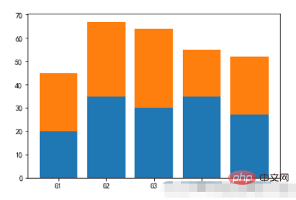
 2.3, Stacked Bar Chart
menMeans = (20, 35, 30, 35, 27)
womenMeans = (25, 32, 34, 20, 25)
groupNames = ('G1','G2','G3','G4','G5')
xs = np.arange(len(menMeans))
plt.bar(xs,menMeans)
plt.bar(xs,womenMeans,bottom=menMeans)
plt.xticks(xs,groupNames)
plt.show()
 3. Histogram
- 1. x: Array or sequence that can be looped;
- 2. bins: numbers or sequences (arrays/lists, etc.);
- 3. range: tuple or None, if it is a tuple, specify `x` to divide the interval Maximum and minimum values;
- 4. density: The default is `False`, if equal to `True`, then the frequency distribution histogram will be used;
- 5. cumulative: If this and `density` are both equal to `True`, then the first parameter of the return value will continue to accumulate and eventually equal `1`.
- 1. Display the quantity distribution of each group of data.
- 2. Used to observe abnormal or isolated data.
- 3. If the number of samples drawn is too small, large errors will occur, the credibility will be low, and the statistical significance will be lost. Therefore, the number of samples should not be less than 50.
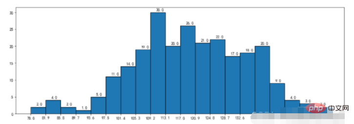
- 3.1, Histogram
durations = [131,  98, 125, 131, 124, 139, 131, 117, 128, 108, 135, 138, 131, 102, 107, 114, 119, 128, 121, 142, 127, 130, 124, 101, 110, 116, 117, 110, 128, 128, 115,  99, 136, 126, 134,  95, 138, 117, 111,78, 132, 124, 113, 150, 110, 117,  86,  95, 144, 105, 126, 130,126, 130, 126, 116, 123, 106, 112, 138, 123,  86, 101,  99, 136,123, 117, 119, 105, 137, 123, 128, 125, 104, 109, 134, 125, 127,105, 120, 107, 129, 116, 108, 132, 103, 136, 118, 102, 120, 114,105, 115, 132, 145, 119, 121, 112, 139, 125, 138, 109, 132, 134,156, 106, 117, 127, 144, 139, 139, 119, 140,  83, 110, 102,123,107, 143, 115, 136, 118, 139, 123, 112, 118, 125, 109, 119, 133,112, 114, 122, 109, 106, 123, 116, 131, 127, 115, 118, 112, 135,115, 146, 137, 116, 103, 144,  83, 123, 111, 110, 111, 100, 154,136, 100, 118, 119, 133, 134, 106, 129, 126, 110, 111, 109, 141,120, 117, 106, 149, 122, 122, 110, 118, 127, 121, 114, 125, 126,114, 140, 103, 130, 141, 117, 106, 114, 121, 114, 133, 137,  92,121, 112, 146,  97, 137, 105,  98, 117, 112,  81,  97, 139, 113,134, 106, 144, 110, 137, 137, 111, 104, 117, 100, 111, 101, 110,105, 129, 137, 112, 120, 113, 133, 112,  83,  94, 146, 133, 101,131, 116, 111,  84, 137, 115, 122, 106, 144, 109, 123, 116, 111,111, 133, 150]
plt.figure(figsize=(15,5))
nums,bins,patches = plt.hist(durations,bins=20,edgecolor='k')
plt.xticks(bins,bins)
for num,bin in zip(nums,bins):
    plt.annotate(num,xy=(bin,num),xytext=(bin+1.5,num+0.5))
plt.show()
范例: 运行结果: 范例: 运行结果: plt.scatter:散点图绘制: 1. x,y:分别是x轴和y轴的数据集。两者的数据长度必须一致。 2. s:点的尺寸。 3. c:点的颜色。 4. marker:标记点,默认是圆点,也可以换成其他的。 范例: 运行结果: 在 运行结果: 箱图的绘制方法是: :1、先找出一组数据的上限值、下限值、中位数(Q2)和下四分位数(Q1)以及上四分位数(Q3) :2、然后连接两个四分位数画出箱子 :3、再将最大值和最小值与箱子相连接,中位数在箱子中间。 中位数:把数据按照从小到大的顺序排序,然后最中间的那个值为中位数,如果数据的个数为偶数,那么就是最中间的两个数的平均数为中位数。 上下限的计算规则是: IQR=Q3-Q1 上限=Q3+1.5IQR 下限=Q1-1.5IQR 在 范例: 运行结果: 范例: 运行结果: 注意事项: Because The above is the detailed content of What are the steps and methods to draw charts using the Python Matplotlib library?. For more information, please follow other related articles on the PHP Chinese website!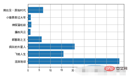
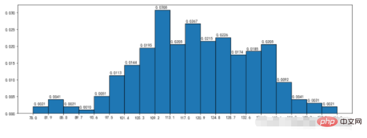
3.2、频率直方图
density:频率直方分布图
nums,bins,patches = plt.hist(durations,bins=20,edgecolor='k',density=True,cumulative=True)
plt.xticks(bins,bins)
for num,bin in zip(nums,bins):
    plt.annotate("%.4f"%num,xy=(bin,num),xytext=(bin+0.2,num+0.0005))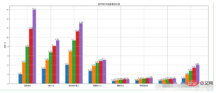
3.3、直方图
cumulative参数:nums的总和为1
plt.figure(figsize=(15,5))
nums,bins,patches = plt.hist(durations,bins=20,edgecolor='k',density=True,cumulative=True)
plt.xticks(bins,bins)
for num,bin in zip(nums,bins):
    plt.annotate("%.4f"%num,xy=(bin,num),xytext=(bin+0.2,num+0.0005))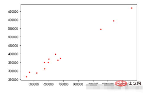
4、散点图
plt.scatter(x =data_month_sum["sumprice"]     #传入X变量数据
            ,y=data_month_sum["Quantity"]     #传入Y变量数据
            ,marker='*'     #点的形状
            ,s=10           #点的大小
            ,c='r'          #点的颜色
           )
plt.show()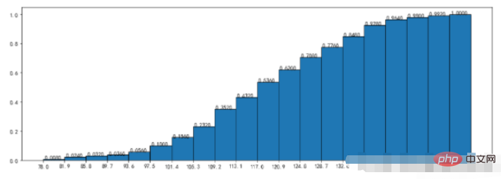
5、饼图
饼图:一个划分为几个扇形的圆形统计图表,用于描述量、频率或百分比之间的相对关系的。
matplotlib中,可以通过plt.pie来实现,其中的参数如下:x:饼图的比例序列。labels:饼图上每个分块的名称文字。explode:设置某几个分块是否要分离饼图。autopct:设置比例文字的展示方式。比如保留几个小数等。shadow:是否显示阴影。textprops:文本的属性(颜色,大小等)。 范例plt.figure(figsize=(8,8),dpi=100,facecolor='white')
plt.pie(x = StockCode.values, #数据传入
radius=1.5, #半径
autopct='%.2f%%' #百分比显示
,pctdistance=0.6, #百分比距离圆心比例
labels=StockCode.index, #标签
labeldistance=1.1, #标签距离圆心比例
wedgeprops ={'linewidth':1.5,'edgecolor':'green'}, #边框的线宽和颜色
textprops={'fontsize':10,'color':'blue'}) #文本字体大小和颜色
plt.title('商品销量占比',pad=100) #设置标题及距离坐标轴的位置
plt.show()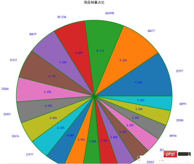
6、箱线图
上下四分位数:同样把数据排好序后,把数据等分为4份。出现在`25%`位置的叫做下四分位数,出现在`75%`位置上的数叫做上四分位数。但是四分位数位置的确定方法不是固定的,有几种算法,每种方法得到的结果会有一定差异,但差异不会很大。matplotlib中有plt.boxplot来绘制箱线图,这个方法的相关参数如下:x:需要绘制的箱线图的数据。notch:是否展示置信区间,默认是False。如果设置为True,那么就会在盒子上展示一个缺口。sym:代表异常点的符号表示,默认是小圆点。vert:是否是垂直的,默认是True,如果设置为False那么将水平方向展示。whis:上下限的系数,默认是1.5,也就是上限是Q3+1.5IQR,可以改成其他的。也可以为一个序列,如果是序列,那么序列中的两个值分别代表的就是下限和上限的值,而不是再需要通过IQR来计算。positions:设置每个盒子的位置。widths:设置每个盒子的宽度。labels:每个盒子的label。meanline和showmeans:如果这两个都为True,那么将会绘制平均值的的线条。#箱线图 - 主要观察数据是否有异常(离群点)
#箱须-75%和25%的分位数+/-1.5倍分位差
plt.figure(figsize=(6.4,4.8),dpi=100)
#是否填充箱体颜色,是否展示均值,是否展示异常值,箱体设置,异常值设置,均值设置,中位数设置
plt.boxplot(x=UnitPrice #传入数据
,patch_artist=True #是否填充箱体颜色
,showmeans=True #是否展示均值
,showfliers=True #是否展示异常值
,boxprops={'color':'black','facecolor':'white'} #箱体设置
,flierprops={'marker':'o','markersize':4,'markerfacecolor':'red'} #异常值设置
,meanprops={'marker':'o','markersize':6,'markerfacecolor':'indianred'} #均值设置
,medianprops={'linestyle':'--','color':'blue'} #中位数设置
)
plt.show()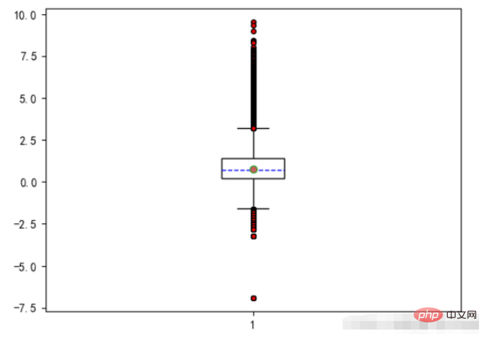
7、雷达图
雷达图:又被叫做蜘蛛网图,适用于显示三个或更多的维度的变量的强弱情况
plt.polar来绘制雷达图,x轴的坐标点应该为弧度(2*PI=360°)import numpy as np
properties = ['输出','KDA','发育','团战','生存']
values = [40,91,44,90,95,40]
theta = np.linspace(0,np.pi*2,6)
plt.polar(theta,values)
plt.xticks(theta,properties)
plt.fill(theta,values)
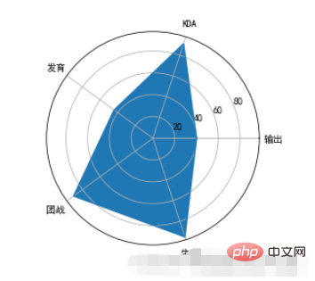
polar will not complete the closed drawing of the line, so we need to balance theta and values when drawing. Repeat and add the value of the 0th position at the end, and then it can be closed with the first point when drawing. polar just draws lines, so if you want to fill it with color, you need to call the fill function to achieve it. polarThe default coordinates of the circle are angles. If we want to change it to text display, we can set it through xticks.

Hot AI Tools

Undresser.AI Undress
AI-powered app for creating realistic nude photos

AI Clothes Remover
Online AI tool for removing clothes from photos.

Undress AI Tool
Undress images for free

Clothoff.io
AI clothes remover

AI Hentai Generator
Generate AI Hentai for free.

Hot Article
Hot Tools

Notepad++7.3.1
Easy-to-use and free code editor

SublimeText3 Chinese version
Chinese version, very easy to use

Zend Studio 13.0.1
Powerful PHP integrated development environment

Dreamweaver CS6
Visual web development tools

SublimeText3 Mac version
God-level code editing software (SublimeText3)
Hot Topics
 1377
1377
 52
52

 Do mysql need to pay
Apr 08, 2025 pm 05:36 PM
Do mysql need to pay
Apr 08, 2025 pm 05:36 PM
MySQL has a free community version and a paid enterprise version. The community version can be used and modified for free, but the support is limited and is suitable for applications with low stability requirements and strong technical capabilities. The Enterprise Edition provides comprehensive commercial support for applications that require a stable, reliable, high-performance database and willing to pay for support. Factors considered when choosing a version include application criticality, budgeting, and technical skills. There is no perfect option, only the most suitable option, and you need to choose carefully according to the specific situation.
 HadiDB: A lightweight, horizontally scalable database in Python
Apr 08, 2025 pm 06:12 PM
HadiDB: A lightweight, horizontally scalable database in Python
Apr 08, 2025 pm 06:12 PM
HadiDB: A lightweight, high-level scalable Python database HadiDB (hadidb) is a lightweight database written in Python, with a high level of scalability. Install HadiDB using pip installation: pipinstallhadidb User Management Create user: createuser() method to create a new user. The authentication() method authenticates the user's identity. fromhadidb.operationimportuseruser_obj=user("admin","admin")user_obj.
 Can mysql workbench connect to mariadb
Apr 08, 2025 pm 02:33 PM
Can mysql workbench connect to mariadb
Apr 08, 2025 pm 02:33 PM
MySQL Workbench can connect to MariaDB, provided that the configuration is correct. First select "MariaDB" as the connector type. In the connection configuration, set HOST, PORT, USER, PASSWORD, and DATABASE correctly. When testing the connection, check that the MariaDB service is started, whether the username and password are correct, whether the port number is correct, whether the firewall allows connections, and whether the database exists. In advanced usage, use connection pooling technology to optimize performance. Common errors include insufficient permissions, network connection problems, etc. When debugging errors, carefully analyze error information and use debugging tools. Optimizing network configuration can improve performance
 Navicat's method to view MongoDB database password
Apr 08, 2025 pm 09:39 PM
Navicat's method to view MongoDB database password
Apr 08, 2025 pm 09:39 PM
It is impossible to view MongoDB password directly through Navicat because it is stored as hash values. How to retrieve lost passwords: 1. Reset passwords; 2. Check configuration files (may contain hash values); 3. Check codes (may hardcode passwords).
 How to solve mysql cannot connect to local host
Apr 08, 2025 pm 02:24 PM
How to solve mysql cannot connect to local host
Apr 08, 2025 pm 02:24 PM
The MySQL connection may be due to the following reasons: MySQL service is not started, the firewall intercepts the connection, the port number is incorrect, the user name or password is incorrect, the listening address in my.cnf is improperly configured, etc. The troubleshooting steps include: 1. Check whether the MySQL service is running; 2. Adjust the firewall settings to allow MySQL to listen to port 3306; 3. Confirm that the port number is consistent with the actual port number; 4. Check whether the user name and password are correct; 5. Make sure the bind-address settings in my.cnf are correct.
 Does mysql need the internet
Apr 08, 2025 pm 02:18 PM
Does mysql need the internet
Apr 08, 2025 pm 02:18 PM
MySQL can run without network connections for basic data storage and management. However, network connection is required for interaction with other systems, remote access, or using advanced features such as replication and clustering. Additionally, security measures (such as firewalls), performance optimization (choose the right network connection), and data backup are critical to connecting to the Internet.
 How to optimize MySQL performance for high-load applications?
Apr 08, 2025 pm 06:03 PM
How to optimize MySQL performance for high-load applications?
Apr 08, 2025 pm 06:03 PM
MySQL database performance optimization guide In resource-intensive applications, MySQL database plays a crucial role and is responsible for managing massive transactions. However, as the scale of application expands, database performance bottlenecks often become a constraint. This article will explore a series of effective MySQL performance optimization strategies to ensure that your application remains efficient and responsive under high loads. We will combine actual cases to explain in-depth key technologies such as indexing, query optimization, database design and caching. 1. Database architecture design and optimized database architecture is the cornerstone of MySQL performance optimization. Here are some core principles: Selecting the right data type and selecting the smallest data type that meets the needs can not only save storage space, but also improve data processing speed.
 How to use AWS Glue crawler with Amazon Athena
Apr 09, 2025 pm 03:09 PM
How to use AWS Glue crawler with Amazon Athena
Apr 09, 2025 pm 03:09 PM
As a data professional, you need to process large amounts of data from various sources. This can pose challenges to data management and analysis. Fortunately, two AWS services can help: AWS Glue and Amazon Athena.
