

How vue3+async-validator implements form validation

Build a vue3 project
Before creating the project, the first thing we need to explain here is the version we use
Nodejs: v17.5.0##pnpm: 7.0.0
Vue: 3.2.25
FormValidate, we Enter the command
pnpm create vite FormValidate on the command line and press Enter
FormValidate (Form Validation) Project
According to the command line prompts, we enter the project root directory, and then use the commandpnpm install to install the dependencies required for the project. Of course, pnpm is used here. Much faster than npm or yarn.
pnpm run dev, and the output in the terminal is as shown in the figure
 vite v2.9.7 dev server running at:
  > Local: http://localhost:3000/
  > Network: use `--host` to expose
  ready in 954ms.
http://localhost:3000 /
Form verification
vue3 Form validationHere we use async-validator. This is a plug-in for asynchronous validation of forms. It has 5k stars on github and is also widely used, such asAnt.design, Element UI, Naive UI, etc. are all using this plug-in, and even some Nodejs back-end projects are also using this plug-in.
pnpm install async-validator
async-validator version on the command line Yes4.1.1
vue3 form verification, and add some initial code
<template>
    <div class="main">
        <h4 id="vue-nbsp-表单验证">vue3 表单验证</h4>

        <form>
            <div>
                <label class="label">账号</label>
                <input  type="text"  placeholder="请输入账号" class="input" />
            </div>
            <div>
                <label class="label">密码</label>
                <input  tyep="password" type="text" class="input"  placeholder="请输入密码"  />
            </div>

            <div>
                <button>保存</button>
            </div>
        </form>
    </div>
</template>
<script setup>

</script>
<style lang="css">
.main{
    text-align:center;
}
.label {
    padding-right: 10px;
    padding-left: 10px;
    display: inline-block;
    box-sizing: border-box;
    width: 100px;
    text-align: right;
}
.input {
    width: 200px;
    height: 30px;
    margin-top:10px;
}
</style><template>
<div class="main">
<h4 id="Vue-表单验证">Vue3表单验证</h4>
<form class="form-box">
<div class="form-group ">
<label class="label">账号</label>
<input type="text" class="input" placeholder="请输入账号" />
</div>
<div class="form-group">
<label class="label">密码</label>
<input tyep="password" type="text" placeholder="请输入密码" class="input" />
</div>
<div class="form-group">
<button class="btn ">保存</button>
</div>
</form>
</div>
</template>
<script setup>
</script>
<style scoped>
.main {
text-align: center;
}
.btn{
margin: 0;
line-height: 1;
padding: 15px;
height: 30px;
width: 60px;
font-size: 14px;
border-radius: 4px;
color: #fff;
background-color: #2080f0;
white-space: nowrap;
outline: none;
position: relative;
border: none;
display: inline-flex;
flex-wrap: nowrap;
flex-shrink: 0;
align-items: center;
justify-content: center;
user-select: none;
text-align: center;
cursor: pointer;
text-decoration: none;
}
.form-box{
width: 500px;
max-width: 100%;
margin: 0 auto;
padding: 10px;
}
.form-group{
margin: 10px;
padding: 10px 15px 10px 0
}
.label {
padding-right: 10px;
padding-left: 10px;
display: inline-block;
box-sizing: border-box;
width: 110px;
text-align: right;
}
.input {
width: calc(100% - 120px);
height: 28px;
}
</style>ref attributes and async-validator, here we add v-model binding to each input box Defined attributes,
// html
<input type="text" v-model="form.account" class="input" placeholder="请输入账号" />
<input tyep="password" v-model="form.password" type="text" placeholder="请输入密码" class="input" />
// script
import { ref } from "vue"
import Schema from 'async-validator';
const form = ref({
account: null,
password: null,
})const rules = {
account: { required: true, message: '请输入账号' },
password: { required: true, message: '请输入密码' }
}const validator = new Schema(rules)
lost focus event, define a function, and add this function to the out of focus event on the account input
// html
<input v-model="account" type="text" class="input" @blur="handleBlurAccount" placeholder="请输入账号"  />
// script
const handleBlurAccount = () => {}const handleBlurAccount = () => {
validator.validate({account: form.value.account}, (errors, fields) => {
if (errors && fields.account) {
console.log(fields.account[0].message);
return errors
}
})
}Please enter the account number## printed on the console # Wait for the words Similarly, we also add the following code to the password box
//html
<input v-model="form.password" tyep="password" type="text" @blur="handleBlurPassword"  placeholder="请输入密码" class="input" />
//script
const handleBlurPassword = () => {
    validator.validate({password: form.value.password}, (errors, fields) => {
        if (errors && fields.password) {
            console.log(errors, fields);
            console.log(fields.password[0].message);
            return errors
        }
    })
}2-2. Verification of multiple forms
Of course, only a single input is verified here Yes, let’s talk about the verification of multiple forms next. Define a click event as submit, add the submit event to the button, and of course don’t forget to prevent the browser default event
const submit = (e) => {
    e.preventDefault();
    validator.validate(form.value, (errors, fields) => {
        if (errors) {
            for(let key of errors) {
                console.log(key.message);
            }
            return errors
        }
    })
}2-3. Promise method After verifying
the above method,
async-validator also provides the Promise method, we modify the code in the submit function as follows <div class="code" style="position:relative; padding:0px; margin:0px;"><pre class='brush:php;toolbar:false;'>validator.validate(form.value).then((value) => {
// 校验通过
console.log(value);
}).catch(({ errors, fields }) => {
console.log(errors);
return errors
})</pre><div class="contentsignin">Copy after login</div></div>Click save, the same, We can see that the error message has been printed on the console, indicating that what we wrote is appropriate
 2-4. Regular verification
Of course sometimes we Forms such as email addresses, phone numbers, etc. will be entered. At this time, we need to add regular rules for verification. We first add two forms and add out-of-focus events. Regular verification requires the attributes of
async-validator pattern, we will add the regular rules that meet the requirements to rules. The code is as follows<div class="code" style="position:relative; padding:0px; margin:0px;"><pre class='brush:php;toolbar:false;'><div class="form-group ">
<label class="label">电话号码</label>
<input v-model="form.phone" type="text" class="input" @blur="handleBlurPhone"
placeholder="请输入电话号码" />
</div>
<div class="form-group ">
<label class="label">邮箱</label>
<input v-model="form.email" type="text" class="input" @blur="handleBlurEmail"
placeholder="请输入邮箱" />
</div>
const form = ref({
account: null,
email: null,
password: null,
})
const rules = {
account: { required: true, message: &#39;请输入账号&#39; },
phone: {
required: true,
pattern: /^1\d{10}$/,
message: "请输入电话号码"
},
email: {
required: true,
pattern: /^([a-zA-Z0-9]+[_|_|\-|.]?)*[a-zA-Z0-9]+@([a-zA-Z0-9]+[_|_|.]?)*[a-zA-Z0-9]+\.[a-zA-Z]{2,6}$/,
message: "请输入邮箱"
},
password: { required: true, message: &#39;请输入密码&#39; }
}
const handleBlurPhone = () => {
validator.validate({ phone: form.value.phone }, (errors, fields) => {
if (errors && fields.phone) {
console.log(errors, fields);
console.log(fields.phone[0].message);
return errors
}
})
}
const handleBlurEmail = () => {
validator.validate({ email: form.value.email }, (errors, fields) => {
if (errors && fields.email) {
console.log(errors, fields);
console.log(fields.email[0].message);
return errors
}
})
}</pre><div class="contentsignin">Copy after login</div></div>Of course, there is no problem with the test
2-5. Length control
If you To control the length of form input content, you can use the attributes min and max. We use the account form as an example. We add these two attributes to the account of the rules object. For example, the account is required to be at least 5 characters and at most 10 characters, as follows
account: { required: true, min:5, max:10, message: '请输入账号' }We can also use the native attribute maxLength="10" of input to control the user's input
2-6. Multiple verification conditions
When we have multiple verifications When setting conditions, we can write the verification conditions of rules as an array. We still use the account form as an example. For example, the account requirement must be in Chinese, and the account number must be at least 5 characters and at most 10 characters. The code is as follows
account: [
    { required: true, min:5, max:10, message: '请输入账号' },
    { required: true, pattern: /[\u4e00-\u9fa5]/, message: '请输入中文账号' }
],2-5. Custom verification
Sometimes, we will use a custom verification function to meet special verification situations. At this time, we can do this
field:{
    required: true,
    validator(rule, value, callback){
      return value === '';
    },
    message: '值不等于 "".',
}Here, the prototype of vue3's form verification function has basically come out. Now we will improve the verification function
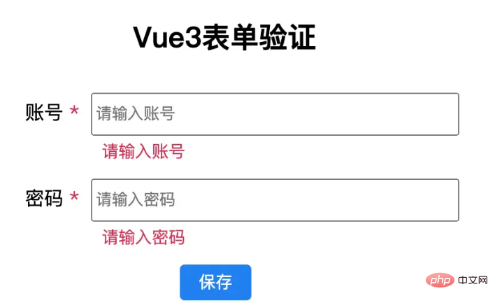
3.优化完善
之前的表单验证虽然已经做出了,但是校验的提示信息是在控制台,这个很不友好,用户也看不到提示,所以这里我们完善下这部分功能
首先我们在 label 边加一个 "*" 表示必填,并且添加样式,给一个红色,醒目一些
<label class="label">
    <span>账号</span>
    <span class="asterisk"> *</span>
</label>
.asterisk{
    color: #d03050;
}我们考虑到 rules 对象中 required 属性的作用,这里使用 vue 的条件判断语句 v-if 来判断,先定义一个函数,名字就叫 getRequired,然后将 rules.account,作为参数传进去,这里要重点说明一下,如果考虑封装验证方法,这里可以不用传参,不多说,后面讲到了,我们再说,先看代码
 <span class="asterisk" v-if="getRequired(rules.account)"> *</span>
const getRequired = (condition) => {
    if(Object.prototype.toString.call(condition) === "[object Object]") {
        return condition.required
    } else if (Object.prototype.toString.call(condition) === "[object Array]") {
        let result = condition.some(item => item.required)
        return result
    }
    return false
}因为 rules.account, 有可能是对象或者数组,这里我们加一个判断区别下,如果传递进来的是对象,我们直接将属性required返回回去,至于required属性是否存在,这里没有必要多判断。 如果传递进来的是数组,我们使用 some 函数获取下结果,然后再返回.
修改 rules.account 的 required 值为false,星号消失,这里只要有一个required 值为true,那么这个星号就显示
我们接着来添加错误信息的显示与隐藏
我们定义一个对象 modelControl,这个对象里面动态存储错误信息,
const modelControl = ref({})
接着给 account 的 input 框添加一个自定义属性 prop, 属性值是 account, 再加一个div显示错误提示信息
<div class="form-group">
<label class="label">
<span>账号</span>
<span class="asterisk" v-if="getRequired(rules.account)"> *</span>
</label>
<input v-model="form.account" type="text" maxLength="10" class="input" prop="account" @blur="handleBlurAccount" placeholder="请输入账号" />
<div class="input feedback" v-if="modelControl['account']">{{modelControl['account']}}</div>
</div>
.feedback{
color: #d03050;
font-size:14px;
margin-top: 3px;
text-align:left;
margin-left:110px;
}为了动态的显示和隐藏错误信息,我们需要修改失焦事件 和 submit 事件,在事件执行的时候,动态的将值赋予或清除,代码如下
const handleBlurAccount = (e) => {
    const prop = e.target.attributes.prop.value
    if (!prop) {
        return false
    }
    validator.validate({ account: form.value.account }, (errors, fields) => {
        if (errors && fields.account) {
            console.log(errors, fields);
            console.log(fields.account[0].message);

            modelControl.value[prop] = fields[prop][0].message
            return errors
        }
        modelControl.value[prop] = null
    })
}
validator.validate(form.value).then((value) => {
        // 校验通过
    console.log(value);
}).catch(({ errors, fields }) => {
    console.log(errors, fields);
    for(let key in fields) {
        modelControl.value[key] = fields[key][0].message
    }
    console.log(modelControl);
    return errors
})到这里 表单的动态验证功能基本算是完成了,但是我们发现,每次错误信息的展示都会使得input框跳动,所以还得调整下样式
.form-group {
    margin: 2px;
    padding: 10px 15px 3px 0;
    height:57px;
    transition: color .3s ease;
}The above is the detailed content of How vue3+async-validator implements form validation. For more information, please follow other related articles on the PHP Chinese website!

Hot AI Tools

Undresser.AI Undress
AI-powered app for creating realistic nude photos

AI Clothes Remover
Online AI tool for removing clothes from photos.

Undress AI Tool
Undress images for free

Clothoff.io
AI clothes remover

Video Face Swap
Swap faces in any video effortlessly with our completely free AI face swap tool!

Hot Article
Hot Tools

Notepad++7.3.1
Easy-to-use and free code editor

SublimeText3 Chinese version
Chinese version, very easy to use

Zend Studio 13.0.1
Powerful PHP integrated development environment

Dreamweaver CS6
Visual web development tools

SublimeText3 Mac version
God-level code editing software (SublimeText3)
Hot Topics
 1389
1389
 52
52

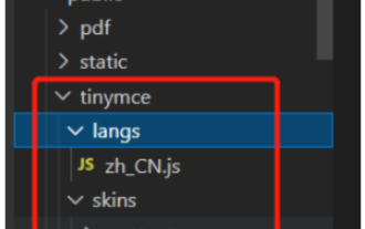 How to use tinymce in vue3 project
May 19, 2023 pm 08:40 PM
How to use tinymce in vue3 project
May 19, 2023 pm 08:40 PM
tinymce is a fully functional rich text editor plug-in, but introducing tinymce into vue is not as smooth as other Vue rich text plug-ins. tinymce itself is not suitable for Vue, and @tinymce/tinymce-vue needs to be introduced, and It is a foreign rich text plug-in and has not passed the Chinese version. You need to download the translation package from its official website (you may need to bypass the firewall). 1. Install related dependencies npminstalltinymce-Snpminstall@tinymce/tinymce-vue-S2. Download the Chinese package 3. Introduce the skin and Chinese package. Create a new tinymce folder in the project public folder and download the
 vue3+vite: How to solve the error when using require to dynamically import images in src
May 21, 2023 pm 03:16 PM
vue3+vite: How to solve the error when using require to dynamically import images in src
May 21, 2023 pm 03:16 PM
vue3+vite:src uses require to dynamically import images and error reports and solutions. vue3+vite dynamically imports multiple images. If vue3 is using typescript development, require will introduce image errors. requireisnotdefined cannot be used like vue2 such as imgUrl:require(' .../assets/test.png') is imported because typescript does not support require, so import is used. Here is how to solve it: use awaitimport
 How to refresh partial content of the page in Vue3
May 26, 2023 pm 05:31 PM
How to refresh partial content of the page in Vue3
May 26, 2023 pm 05:31 PM
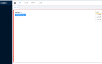
To achieve partial refresh of the page, we only need to implement the re-rendering of the local component (dom). In Vue, the easiest way to achieve this effect is to use the v-if directive. In Vue2, in addition to using the v-if instruction to re-render the local dom, we can also create a new blank component. When we need to refresh the local page, jump to this blank component page, and then jump back in the beforeRouteEnter guard in the blank component. original page. As shown in the figure below, how to click the refresh button in Vue3.X to reload the DOM within the red box and display the corresponding loading status. Since the guard in the component in the scriptsetup syntax in Vue3.X only has o
 How Vue3 parses markdown and implements code highlighting
May 20, 2023 pm 04:16 PM
How Vue3 parses markdown and implements code highlighting
May 20, 2023 pm 04:16 PM
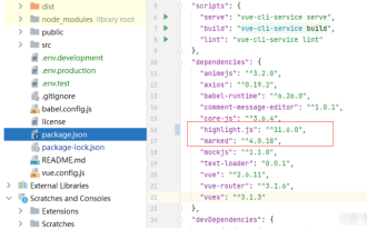
Vue implements the blog front-end and needs to implement markdown parsing. If there is code, it needs to implement code highlighting. There are many markdown parsing libraries for Vue, such as markdown-it, vue-markdown-loader, marked, vue-markdown, etc. These libraries are all very similar. Marked is used here, and highlight.js is used as the code highlighting library. The specific implementation steps are as follows: 1. Install dependent libraries. Open the command window under the vue project and enter the following command npminstallmarked-save//marked to convert markdown into htmlnpmins
 How to select an avatar and crop it in Vue3
May 29, 2023 am 10:22 AM
How to select an avatar and crop it in Vue3
May 29, 2023 am 10:22 AM
The final effect is to install the VueCropper component yarnaddvue-cropper@next. The above installation value is for Vue3. If it is Vue2 or you want to use other methods to reference, please visit its official npm address: official tutorial. It is also very simple to reference and use it in a component. You only need to introduce the corresponding component and its style file. I do not reference it globally here, but only introduce import{userInfoByRequest}from'../js/api' in my component file. import{VueCropper}from'vue-cropper&
 How to use Vue3 reusable components
May 20, 2023 pm 07:25 PM
How to use Vue3 reusable components
May 20, 2023 pm 07:25 PM
Preface Whether it is vue or react, when we encounter multiple repeated codes, we will think about how to reuse these codes instead of filling a file with a bunch of redundant codes. In fact, both vue and react can achieve reuse by extracting components, but if you encounter some small code fragments and you don’t want to extract another file, in comparison, react can be used in the same Declare the corresponding widget in the file, or implement it through renderfunction, such as: constDemo:FC=({msg})=>{returndemomsgis{msg}}constApp:FC=()=>{return(
 How to use vue3+ts+axios+pinia to achieve senseless refresh
May 25, 2023 pm 03:37 PM
How to use vue3+ts+axios+pinia to achieve senseless refresh
May 25, 2023 pm 03:37 PM
vue3+ts+axios+pinia realizes senseless refresh 1. First download aiXos and pinianpmipinia in the project--savenpminstallaxios--save2. Encapsulate axios request-----Download js-cookienpmiJS-cookie-s//Introduce aixosimporttype{AxiosRequestConfig ,AxiosResponse}from"axios";importaxiosfrom'axios';import{ElMess
 How to use defineCustomElement to define components in Vue3
May 28, 2023 am 11:29 AM
How to use defineCustomElement to define components in Vue3
May 28, 2023 am 11:29 AM
Using Vue to build custom elements WebComponents is a collective name for a set of web native APIs that allow developers to create reusable custom elements (customelements). The main benefit of custom elements is that they can be used with any framework, even without one. They are ideal when you are targeting end users who may be using a different front-end technology stack, or when you want to decouple the final application from the implementation details of the components it uses. Vue and WebComponents are complementary technologies, and Vue provides excellent support for using and creating custom elements. You can integrate custom elements into existing Vue applications, or use Vue to build
