
1.1: Setting
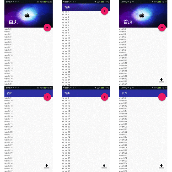
in CoordinatorLayout The previous addition of dependencies has been mentioned in the previous article and will not be repeated here. This time a new layout CollapsingToolbarLayout (folding tool) has been added to the coordinator layout. Bar layout), it is obvious that the toolbar in the above rendering slides up and the picture is folded in. This is an animation effect. If it were not for the power of the MaterialDesign library, we would have written this ourselves. Let's analyze what is used in the renderings. We only see the colored text, an Apple background image, and a floating button (adsorbed in the lower right corner of CollapsingToolbarLayout). Let’s analyze the main code
The outermost layer-->The inner layer is still: CoordinatorLayout-->AppBarLayout-->CollapsingToolbarLayout. It turns out that the folded part is the toolbar and background image, so it is natural to write these two spaces in CollapsingToolbarLayout. Because the coordinator layout and appbar layout above are very simple, I will not write them here. I will only post the folding layout code ( The comments inside were added after posting, please pay attention to the syntax when using this code). It can be seen here that I added a height of 180dp to the ImageView. It must be added here. Otherwise, the following errors will occur on the side toolbar. 1: The text is not displayed. 2: Only the title bar is displayed. 3: The picture is too large and fills the entire screen. Of course not everyone has these problems.
<!--折叠toolbar布局--><android.support.design.widget.collapsingtoolbarlayout><!--这里ContentScrim是实现上滑后由什么颜色作为标题背景色--><imageview></imageview><android.support.v7.widget.toolbar></android.support.v7.widget.toolbar></android.support.design.widget.collapsingtoolbarlayout>
This is how we write our folding layout, and what we need to pay attention to is our floating action button. The highlighted part is the focus.
<android.support.design.widget.floatingactionbutton></android.support.design.widget.floatingactionbutton>
The writing here is basically completed. The code is small and the effect is good. This is the power of this library. The use in Activity is basically the same as the previous article. There are many attributes in this floating button, so I won’t list them all here. They are just added here as an auxiliary to make us more comfortable visually.

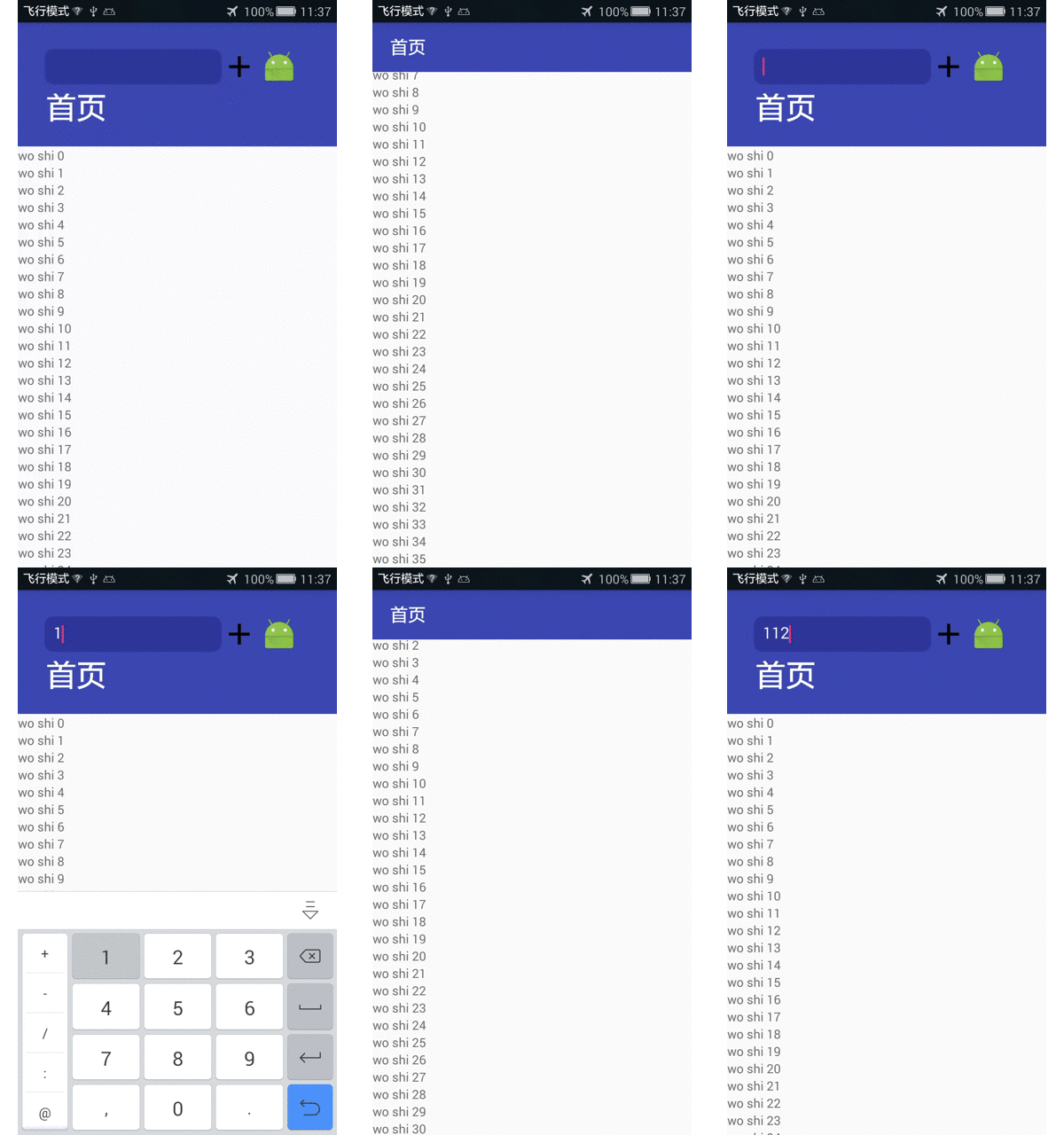
The layout here is the same as above, just replace the imageview with the LinearLayout layout, and write the familiar input box and picture button in the layout,
The outermost layer -->The inner layer is still: CoordinatorLayout-->AppBarLayout-->CollapsingToolbarLayout-->LinearLayout.
In the most normal times, when we write an input box, we need to add a regular expression to determine which line does not meet the requirements. data, and then use a toast to prompt the user, which seems to have a very poor user experience. Some users close the toast before finishing the toast, and the specific error line is not marked in red, which is very embarrassing. So today This control is also an input box, but by adding a layout (TextInputLayout) to the outer layer, it can accurately prompt specific errors in one line.
TextInputLayout is a newly added control in 22.2.0. It is used in conjunction with EditText (or a subclass of EditText) and can only contain one EditText (or a subclass of EditText).
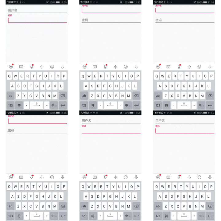
When EditText gets the cursor, the prompt text is usually automatically hidden, which is not very friendly. At this time, TextInputLayout displays errors. TextInputLayout is a subclass of LinearLayout and is used to assist in displaying prompt information. When an EditText gets focus, its tooltip text automatically appears above it, with animation.

Now it is just an over effect, no prompt information has been added. The usage is very simple, but please note that TextInputLayout can only contain one TextInputEditText, if you write user name and password, write two TextInputLayout. Oh, by the way, this outermost layout has nothing to do with the coordinator layout, just any linear layout.
<android.support.design.widget.textinputlayout><android.support.design.widget.textinputedittext></android.support.design.widget.textinputedittext></android.support.design.widget.textinputlayout>
What should be noted here is that the Id is added to the TextInputLayout, and the layout is also obtained when obtained in the Activity. So how to obtain the data input by edittext? There are methods.
viewById.getEditText().addTextChangedListener(this);
Get the text inside and add text change monitoring. Three methods need to be implemented here
public void afterTextChanged(Editable s) //内容改变后调用
These two methods are not used in simple demos, so I won’t explain them too much here.
@Override
    public void beforeTextChanged(CharSequence s, int start, int count, int after) {

    }

    @Override
    public void onTextChanged(CharSequence s, int start, int before, int count) {

}Here we focus on the afterTextChanged method. Only the first control is added with this listener (comparison).
 @Override
    public void afterTextChanged(Editable s) {
if(s.length()<p><br><img src="/static/imghw/default1.png" data-src="https://img.php.cn/upload/article/000/887/227/168432291069475.gif" class="lazy" alt="What are the Android MaterialDesign application methods?"><br></p>The above is the detailed content of What are the Android MaterialDesign application methods?. For more information, please follow other related articles on the PHP Chinese website!
 Three major frameworks for android development
 What system is android
 How to unlock android permission restrictions
 What are the methods for restarting applications in Android?
 Android voice playback function implementation method
 Methods for reading and writing java dbf files
 What does context mean?
 How to use label label
 matlab griddata function usage


