 Backend Development
 Python Tutorial
 What is the method to customize the color of Python catplot function?
What is the method to customize the color of Python catplot function?
1. catplot function
The catplot() function is a very useful function in Seaborn. It can draw graphics of categorical variables and can draw graphs of categorical variables based on other variables. Group by one or more variables. Using different chart types, the catplot() function can create appropriate charts.
By default, the catplot() function draws a column chart of categorical variables, but you can also use the kind parameter to specify other types of graphics, such as dot plots, box plots, violin plots, etc. The following is an example of using the catplot() function to draw a column chart:
import seaborn as sns

# 使用 Seaborn 内置数据集 "tips"
tips = sns.load_dataset("tips")

# 绘制分类变量的柱形图
sns.catplot(x="day", y="total_bill", data=tips)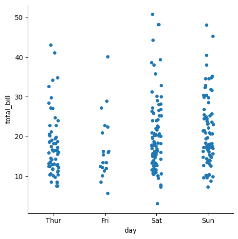
In the above code, we use Seaborn's built-in load_dataset() function to load a file named "tips" data set, and then use the catplot() function to plot a column chart of categorical variables. Here, we have the "day" column as the x-axis and the "total_bill" column as the y-axis.
In addition to the kind parameter, the catplot() function can also use some other parameters to control the appearance and behavior of the graph. For example, the hue parameter can group the data according to another variable and represent each group with a different color. ; The col and row parameters allow you to group the data based on another variable and plot each group in multiple subplots. For example, here is an example of grouping data using the hue parameter:
import seaborn as sns

# 使用 Seaborn 内置数据集 "tips"
tips = sns.load_dataset("tips")

# 根据 "smoker" 列对数据进行分组,并使用不同的颜色表示每个组
sns.catplot(x="day", y="total_bill", hue="smoker", data=tips)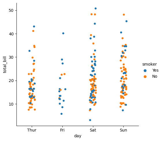
In the above code, we are using the hue parameter to group the data based on the "smoker" column, And use a different color to represent each group. We still use "day" as the x-axis and "total_bill" as the y-axis column.
2. How to control color in catplot?
2.1 No custom colors
In Seaborn, you can use the hue parameter to control the color. Use the hue parameter to color data by another categorical variable in the same plot, showing the relationship between different categorical variables. Here is a simple example showing how to control color using hue parameters:
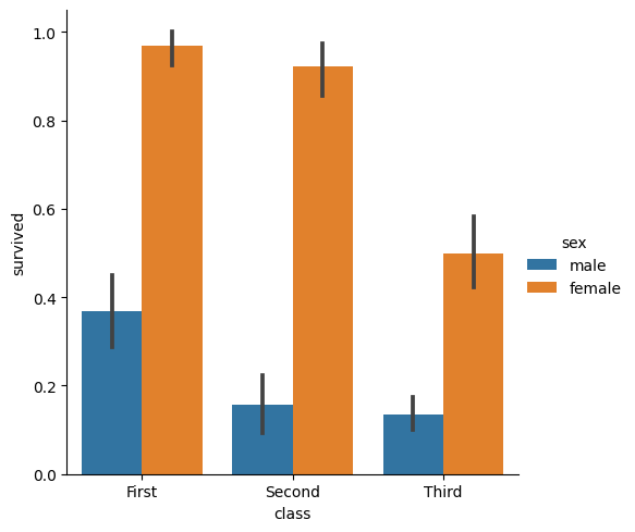
In the above code, we use "class" as the x-axis and "survived" as the y axis, use the hue parameter to color the data based on the "sex" variable, and use the "bar" type to draw the bar chart.
2.2 Custom Colors
To customize colors, you can use Seaborn's palette parameter to specify a color map. The palette parameter can use Seaborn's built-in color map, or it can be a dictionary that maps categorical variables to specified colors. Here is a simple example that demonstrates how to use palette parameters to customize colors:
import seaborn as sns
import matplotlib.pyplot as plt

# 加载Seaborn内置数据集
titanic = sns.load_dataset("titanic")

# 定义自定义颜色映射
my_palette = {"male": "b", "female": "r"}

# 使用sns.catplot()方法绘制子图,并使用palette参数自定义颜色
sns.catplot(x="class", y="survived", hue="sex", data=titanic, kind="bar", palette=my_palette)

# 显示图像
plt.show()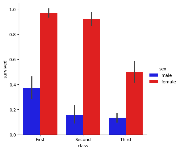
In the above code, we define a custom color map that will Map the "male" categorical variable to blue and the "female" categorical variable to red, and use the palette parameter to specify a custom color mapping.
3. How to select colors in catplot
Catplot function in Seaborn offers several built-in color palettes to color categorical variables in the graphics.. Beautiful colors can be generated using preset palettes, just set the palette parameter. Here are several common palettes used in catplot:
deep: A dark palette containing 8 colors, used for shading graphics with deeper depth.
pastel: A pastel palette of 8 colors for shading graphics with a lighter depth.
bright: A bright palette of 8 colors used to emphasize important information in graphics.
dark: A dark palette containing 8 colors, used for shading graphics with deeper depth.
colorblind: A palette of 8 colors designed to provide maximum differentiability for people with impaired color vision.
sns.color_palette() function can be used to view and call these built-in color palettes.. For example, to use the "deep" palette, set the palette parameter to sns.color_palette("deep"). The following is a simple example:
import seaborn as sns
import matplotlib.pyplot as plt

# 加载Seaborn内置数据集
titanic = sns.load_dataset("titanic")

# 使用sns.catplot()方法绘制子图,并使用deep调色板
sns.catplot(x="class", y="survived", hue="sex", data=titanic, kind="bar", palette=sns.color_palette("deep"))

# 显示图像
plt.show()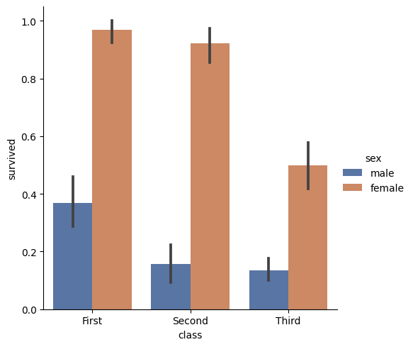
In the above code, we use the sns.color_palette("deep") function to call the "deep" palette and add This is passed to the palette parameter to color the bar chart.
Seaborn provides other useful functions in addition to the built-in palettes for creating custom palettes. For example, use the sns.color_palette(["#FF0B04", "#4374B3"]) function to create a custom palette containing red and blue.
总之,Seaborn 提供了多种方法来为 catplot 中的分类变量着色,您可以根据需要选择合适的调色板。
四、调色板怎么显示颜色
在 Seaborn 中,可以使用预定义的一组颜色列表作为调色板,对图表进行着色。Seaborn 提供了一些有用的函数来可视化这些调色板中的颜色,其中最常用的函数是 sns.palplot()。
调用 sns.palplot() 函数可将给定调色板中的所有颜色展示为色块图表。可以使用 Seaborn 内置的调色板,也可以使用自定义的调色板作为该函数的参数。这里是一个展示如何使用 sns.palplot() 函数来可视化“deep”调色板的示例:
import seaborn as sns

# 可视化Seaborn内置调色板"deep"
sns.palplot(sns.color_palette("deep"))
上述代码将会绘制一个包含 “deep” 调色板中所有颜色的颜色条,每个颜色都代表了该调色板中的一个颜色。您可以使用 sns.palplot() 函数来对不同的调色板进行可视化。
另外,Seaborn 还提供了 sns.color_palette() 函数,该函数返回一个颜色列表,可以用于手动设置图形中的颜色。可以使用 sns.color_palette() 函数返回的颜色列表来自定义 Seaborn 中的图形颜色。以下是手动设置颜色并使用 sns.color_palette() 函数的一个示例:
import seaborn as sns
import matplotlib.pyplot as plt

# 使用自定义调色板
my_palette = sns.color_palette(["#FF0B04", "#4374B3"])

# 绘制柱状图,并使用自定义调色板
sns.barplot(x="day", y="total_bill", data=tips, palette=my_palette)

# 显示图像
plt.show()
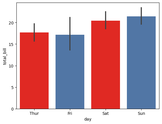
在上述代码中,我们使用 sns.color_palette([“#FF0B04”, “#4374B3”]) 函数创建一个包含红色和蓝色的自定义调色板,并将其传递给 sns.barplot() 函数中的 palette 参数以设置图形颜色。
The above is the detailed content of What is the method to customize the color of Python catplot function?. For more information, please follow other related articles on the PHP Chinese website!

Hot AI Tools

Undresser.AI Undress
AI-powered app for creating realistic nude photos

AI Clothes Remover
Online AI tool for removing clothes from photos.

Undress AI Tool
Undress images for free

Clothoff.io
AI clothes remover

AI Hentai Generator
Generate AI Hentai for free.

Hot Article

Hot Tools

Notepad++7.3.1
Easy-to-use and free code editor

SublimeText3 Chinese version
Chinese version, very easy to use

Zend Studio 13.0.1
Powerful PHP integrated development environment

Dreamweaver CS6
Visual web development tools

SublimeText3 Mac version
God-level code editing software (SublimeText3)

Hot Topics
 Is there any mobile app that can convert XML into PDF?
Apr 02, 2025 pm 08:54 PM
An application that converts XML directly to PDF cannot be found because they are two fundamentally different formats. XML is used to store data, while PDF is used to display documents. To complete the transformation, you can use programming languages and libraries such as Python and ReportLab to parse XML data and generate PDF documents.
 Is the conversion speed fast when converting XML to PDF on mobile phone?
Apr 02, 2025 pm 10:09 PM
The speed of mobile XML to PDF depends on the following factors: the complexity of XML structure. Mobile hardware configuration conversion method (library, algorithm) code quality optimization methods (select efficient libraries, optimize algorithms, cache data, and utilize multi-threading). Overall, there is no absolute answer and it needs to be optimized according to the specific situation.
 How to convert XML files to PDF on your phone?
Apr 02, 2025 pm 10:12 PM
It is impossible to complete XML to PDF conversion directly on your phone with a single application. It is necessary to use cloud services, which can be achieved through two steps: 1. Convert XML to PDF in the cloud, 2. Access or download the converted PDF file on the mobile phone.
 How to control the size of XML converted to images?
Apr 02, 2025 pm 07:24 PM
To generate images through XML, you need to use graph libraries (such as Pillow and JFreeChart) as bridges to generate images based on metadata (size, color) in XML. The key to controlling the size of the image is to adjust the values of the <width> and <height> tags in XML. However, in practical applications, the complexity of XML structure, the fineness of graph drawing, the speed of image generation and memory consumption, and the selection of image formats all have an impact on the generated image size. Therefore, it is necessary to have a deep understanding of XML structure, proficient in the graphics library, and consider factors such as optimization algorithms and image format selection.
 How to open xml format
Apr 02, 2025 pm 09:00 PM
Use most text editors to open XML files; if you need a more intuitive tree display, you can use an XML editor, such as Oxygen XML Editor or XMLSpy; if you process XML data in a program, you need to use a programming language (such as Python) and XML libraries (such as xml.etree.ElementTree) to parse.
 Recommended XML formatting tool
Apr 02, 2025 pm 09:03 PM
XML formatting tools can type code according to rules to improve readability and understanding. When selecting a tool, pay attention to customization capabilities, handling of special circumstances, performance and ease of use. Commonly used tool types include online tools, IDE plug-ins, and command-line tools.
 What is the process of converting XML into images?
Apr 02, 2025 pm 08:24 PM
To convert XML images, you need to determine the XML data structure first, then select a suitable graphical library (such as Python's matplotlib) and method, select a visualization strategy based on the data structure, consider the data volume and image format, perform batch processing or use efficient libraries, and finally save it as PNG, JPEG, or SVG according to the needs.
 Is there a mobile app that can convert XML into PDF?
Apr 02, 2025 pm 09:45 PM
There is no APP that can convert all XML files into PDFs because the XML structure is flexible and diverse. The core of XML to PDF is to convert the data structure into a page layout, which requires parsing XML and generating PDF. Common methods include parsing XML using Python libraries such as ElementTree and generating PDFs using ReportLab library. For complex XML, it may be necessary to use XSLT transformation structures. When optimizing performance, consider using multithreaded or multiprocesses and select the appropriate library.


