| 名称 | 版本 |
|---|---|
| vue | 3.2.13 |
| vue-cli | 5.x |
| webpack | 5.x |
| nodejs | 16.15 |
| postcss-px-to-viewport | ^1.1.1 |
npm install postcss-px-to-viewport --save-dev
yarn add postcss-px-to-viewport --save-dev
pnpm add postcss-px-to-viewport --save-dev
如果devserver正在运行,安装完成以后记得重启devserver。
在项目根目录下创建 postcss.config.js 文件,并填入一下内容:
module.exports = {
  plugins: {
    // ...
    'postcss-px-to-viewport': {
      // options
      unitToConvert: "px",
      viewportWidth: 1920,
      viewportHeight:1080,
      unitPrecision: 3,
      propList: [
        "*"
      ],
      viewportUnit: "vw",
      fontViewportUnit: "vw",
      selectorBlackList: [],
      minPixelValue: 1,
      mediaQuery: false,
      replace: true,
      exclude: /(\/|\\)(node_modules)(\/|\\)/,
    }
  }
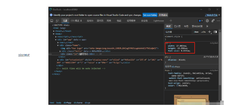
}重新运行,打开浏览器查看属性值已经变为vw计算,就是这么简单。

| 项目 | 类型 | 描述 |
|---|---|---|
| unitToConvert | (String) | unit to convert, by default, it is px. |
| viewportWidth | (Number) | The width of the viewport. |
| unitPrecision | (Number) | The decimal numbers to allow the vw units to grow to. |
| propList | (Array) | - The properties that can change from px to vw. |
| -Values need to be exact matches. | ||
| Use * at the start or end of a word. (['position'] will match background-position-y) | ||
| Use ! to not match a property. Example: ['*', '!letter-spacing'] | ||
| Combine the "not" prefix with the other prefixes. Example: ['', '!font'] | ||
| viewportUnit | (String) | Expected units. |
| fontViewportUnit | (String) | Expected units for font. |
| selectorBlackList | (Array)The selectors to ignore and leave as px. | If value is string, it checks to see if selector contains the string. ['body'] will match .body-class |
| If value is regexp, it checks to see if the selector matches the regexp. [/^body$/] will match body but not .body | ||
| minPixelValue | (Number) | Set the minimum pixel value to replace. |
| mediaQuery | (Boolean) | replaces rules containing vw instead of adding fallbacks |
| exclude | (Regexp or Array of Regexp Ignore some files like 'node_modules') | If value is regexp, will ignore the matches files. |
| If value is array, the elements of the array are regexp. | ||
| include | (Regexp or Array of Regexp) If include is set, only matching files will be converted, for example, only files under src/mobile/ (include: /\/src\/mobile\//) | If value is array, the elements of the array are regexp. |
| If value is regexp, will ignore the matches files. | ||
| landscape | (Boolean) | Adds @media (orientation: landscape) with values converted via landscapeWidth. |
| landscapeUnit | (String) | Expected unit for landscape option |
| landscapeWidth | (Number) | Viewport width for landscape orientation. |
The above is the detailed content of How to use postcss-px-to-viewport to adapt to the screen in vue3. For more information, please follow other related articles on the PHP Chinese website!
 The difference between vue2.0 and 3.0
 What are the life cycles of vue3
 Common website vulnerability detection methods
 java exception handling
 How to use the print function in python
 Association rules apriori algorithm
 Does inflation rate have an impact on digital currencies?
 vc6.0
vc6.0
 What does frame rate mean?


