

Storytelling is a crucial skill for data scientists. In order to express our ideas and persuade others, we need to communicate effectively. And beautiful visualizations are a great tool for this task.
This article will introduce 5 non-traditional visualization techniques that can make your data stories more beautiful and effective. Python's Plotly graphics library will be used here, allowing you to effortlessly generate animated charts and interactive charts.
If you haven’t installed Plotly yet, just run the following command in your terminal to complete the installation:
pip install plotly
When studying the evolution of this or that indicator, we often involve time data. The Plotly animation tool only requires one line of code to allow people to watch the changes in data over time, as shown in the figure below:
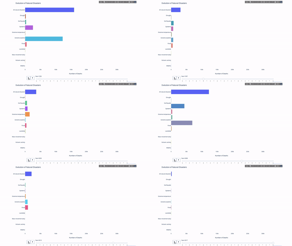
The code is as follows:
import plotly.express as px
from vega_datasets import data
df = data.disasters()
df = df[df.Year > 1990]
fig = px.bar(df,
 y="Entity",
 x="Deaths",
 animation_frame="Year",
 orientation='h',
 range_x=[0, df.Deaths.max()],
 color="Entity")
# improve aesthetics (size, grids etc.)
fig.update_layout(width=1000,
height=800,
xaxis_showgrid=False,
yaxis_showgrid=False,
paper_bgcolor='rgba(0,0,0,0)',
plot_bgcolor='rgba(0,0,0,0)',
title_text='Evolution of Natural Disasters',
showlegend=False)
fig.update_xaxes(title_text='Number of Deaths')
fig.update_yaxes(title_text='')
fig.show()
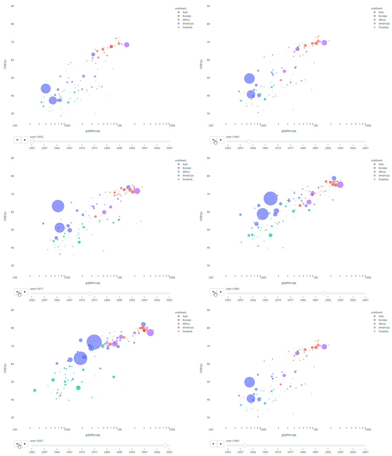
As long as You have a time variable to filter on, then almost any chart can be animated. The following is an example of making a scatter chart animation:
import plotly.express as px
df = px.data.gapminder()
fig = px.scatter(
df,
x="gdpPercap",
y="lifeExp",
animation_frame="year",
size="pop",
color="continent",
hover_name="country",
log_x=True,
size_max=55,
range_x=[100, 100000],
range_y=[25, 90],
# color_continuous_scale=px.colors.sequential.Emrld
)
fig.update_layout(width=1000,
height=800,
xaxis_showgrid=False,
yaxis_showgrid=False,
paper_bgcolor='rgba(0,0,0,0)',
plot_bgcolor='rgba(0,0,0,0)')
The sunburst chart is a good way to visualize the group by statement. method. If you want to break down a given quantity by one or more categorical variables, use a sun chart.
Suppose we want to break down the average tip data according to gender and time of day. This double group by statement can be displayed more effectively through visualization compared to a table.
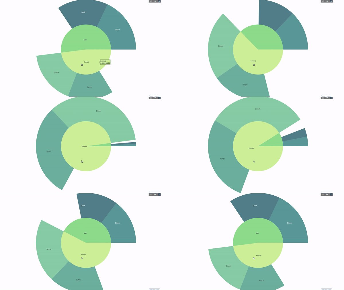
This chart is interactive, allowing you to click and explore the categories on your own. You just need to define all your categories, declare the hierarchy between them (see the parents parameter in the code below) and assign the corresponding values, which in our case is the output of the group by statement.
import plotly.graph_objects as go
import plotly.express as px
import numpy as np
import pandas as pd
df = px.data.tips()
fig = go.Figure(go.Sunburst(
labels=["Female", "Male", "Dinner", "Lunch", 'Dinner ', 'Lunch '],
parents=["", "", "Female", "Female", 'Male', 'Male'],
values=np.append(
df.groupby('sex').tip.mean().values,
df.groupby(['sex', 'time']).tip.mean().values),
marker=dict(colors=px.colors.sequential.Emrld)),
layout=go.Layout(paper_bgcolor='rgba(0,0,0,0)',
 plot_bgcolor='rgba(0,0,0,0)'))
fig.update_layout(margin=dict(t=0, l=0, r=0, b=0),
title_text='Tipping Habbits Per Gender, Time and Day')
fig.show()
Now we add one more layer to this hierarchy:
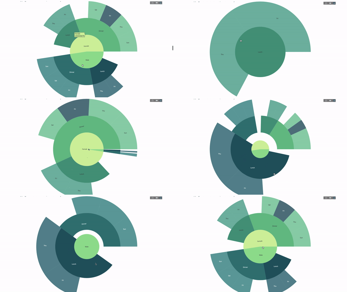
To do this, we add another group by statement involving three categorical variables value.
import plotly.graph_objects as go
import plotly.express as px
import pandas as pd
import numpy as np
df = px.data.tips()
fig = go.Figure(go.Sunburst(labels=[
"Female", "Male", "Dinner", "Lunch", 'Dinner ', 'Lunch ', 'Fri', 'Sat',
'Sun', 'Thu', 'Fri ', 'Thu ', 'Fri', 'Sat', 'Sun', 'Fri ', 'Thu '
],
parents=[
"", "", "Female", "Female", 'Male', 'Male',
'Dinner', 'Dinner', 'Dinner', 'Dinner',
'Lunch', 'Lunch', 'Dinner ', 'Dinner ',
'Dinner ', 'Lunch ', 'Lunch '
],
values=np.append(
np.append(
df.groupby('sex').tip.mean().values,
df.groupby(['sex',
'time']).tip.mean().values,
),
df.groupby(['sex', 'time',
'day']).tip.mean().values),
marker=dict(colors=px.colors.sequential.Emrld)),
layout=go.Layout(paper_bgcolor='rgba(0,0,0,0)',
 plot_bgcolor='rgba(0,0,0,0)'))
fig.update_layout(margin=dict(t=0, l=0, r=0, b=0),
title_text='Tipping Habbits Per Gender, Time and Day')

fig.show()
The pointer diagram is just for looks. Use this type of chart when reporting on success metrics like KPIs and showing how close they are to your goals.
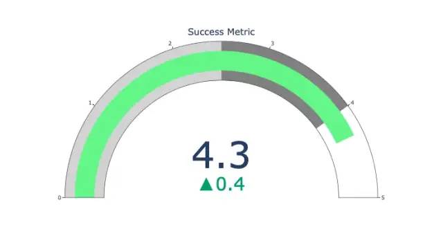
import plotly.graph_objects as go
fig = go.Figure(go.Indicator(
domain = {'x': [0, 1], 'y': [0, 1]},
value = 4.3,
mode = "gauge+number+delta",
title = {'text': "Success Metric"},
delta = {'reference': 3.9},
gauge = {'bar': {'color': "lightgreen"},
'axis': {'range': [None, 5]},
 'steps' : [
 {'range': [0, 2.5], 'color': "lightgray"},
 {'range': [2.5, 4], 'color': "gray"}],
}))
fig.show()
Another way to explore the relationship between categorical variables is a parallel coordinate plot like the following. You can drag, drop, highlight and browse values at any time, perfect for presentations.
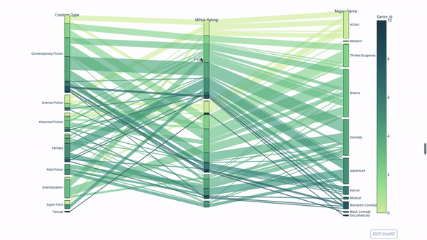
The code is as follows:
import plotly.express as px
from vega_datasets import data
import pandas as pd
df = data.movies()
df = df.dropna()
df['Genre_id'] = df.Major_Genre.factorize()[0]
fig = px.parallel_categories(
df,
dimensions=['MPAA_Rating', 'Creative_Type', 'Major_Genre'],
color="Genre_id",
color_continuous_scale=px.colors.sequential.Emrld,
)
fig.show()
The parallel coordinate chart is a derivative of the chart above. Here, each string represents a single observation. This is a method that can be used to identify outliers (single lines that are far away from the rest of the data), clusters, trends, and redundant variables (for example, if two variables have similar values at every observation, they will lie on the same horizontal line , a useful tool to indicate the presence of redundancy).
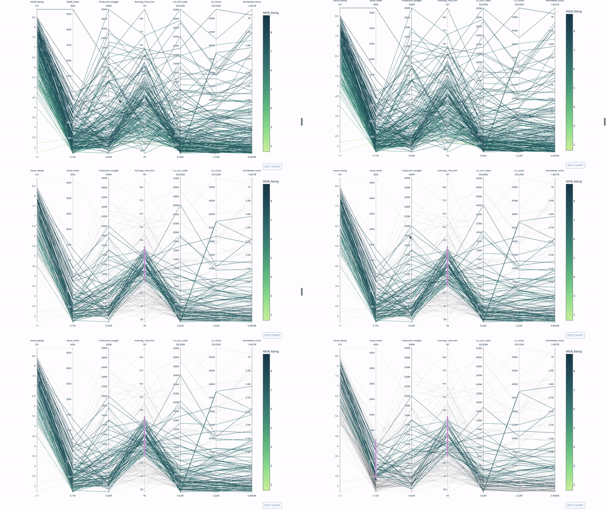
The code is as follows:
import plotly.express as px
from vega_datasets import data
import pandas as pd
df = data.movies()
df = df.dropna()
df['Genre_id'] = df.Major_Genre.factorize()[0]
fig = px.parallel_coordinates(
df,
dimensions=[
'IMDB_Rating', 'IMDB_Votes', 'Production_Budget', 'Running_Time_min',
'US_Gross', 'Worldwide_Gross', 'US_DVD_Sales'
],
color='IMDB_Rating',
color_continuous_scale=px.colors.sequential.Emrld)
fig.show()
The above is the detailed content of Drawing dynamic visualization charts with Python is so cool!. For more information, please follow other related articles on the PHP Chinese website!


