
 Web Front-end
JS Tutorial
CSS image responsive vertical and horizontal centering_javascript skills
Web Front-end
JS Tutorial
CSS image responsive vertical and horizontal centering_javascript skills
CSS image responsive vertical and horizontal centering_javascript skills

I see that CSS centering technology is popular on Weibo recently. I read several materials and none of them were very good, so I took the time to integrate the relevant materials. The specific contents are as follows.
Click hereDownload the source code
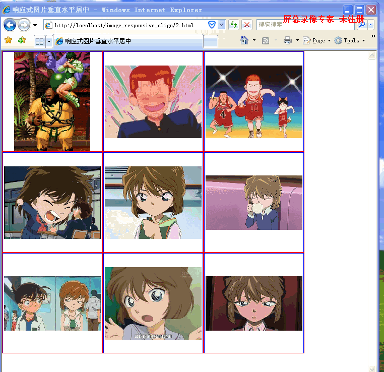
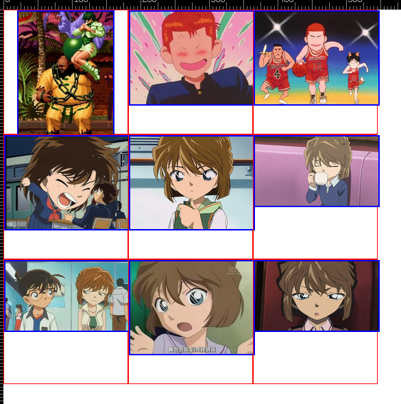
Effect display:
Requirements:
1. Compatible with as many browsers as possible. It is compatible with ie7. If ie6 does not support max-*, it will not be considered.
2. When the browser size changes, the image is always stretched or scaled proportionally.
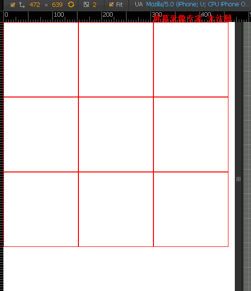
3. The div wrapping the image is also responsive, and the size of each div is the same.
4. The image is always centered horizontally and vertically.
5. The number of rows and columns of the picture remains unchanged, it is always 3*3 here.
Let’s complete the requirements one by one.
Meeting requirement 1 means that you should try not to use attributes that are only available in advanced browsers, such as what are commonly used in advanced browsers for centering
display:table-cell;vertical-align;center;
flexbox
transform
. . .
If you have to use these attributes, there must be an alternative that is compatible with lower version browsers.
The proportional stretching and scaling of the images in requirement 2 is easy to achieve in responsive design.
Just change the image img{max-width: 100%;} directly. Even if the outer width is set to a smaller size than the image width, the image will fill the outer div, and the height of the image at this time will be calculated proportionally.
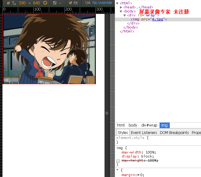
You can see that the image size is 640*480(4:3), the outer div is set to 300px, and the image size now becomes 300*225(4:3).
Then there is the browser size change in requirement 2. This is also easy, just write the width of the outer div to 100%.
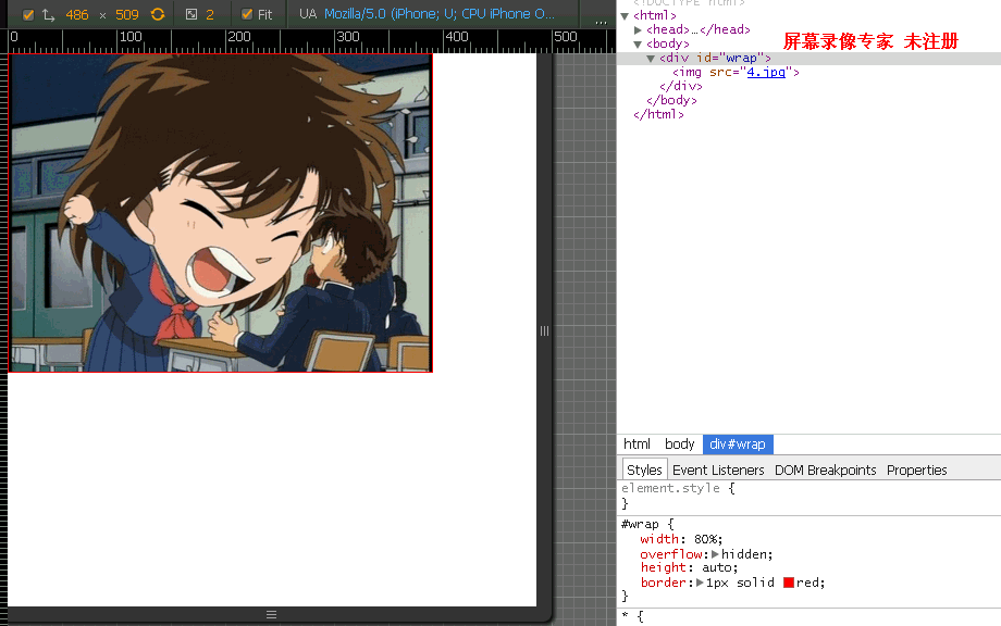
You can see that no matter how the size of the outer div changes, the aspect ratio of the image never changes.
Then there is requirement 3, the outer div is responsive.
The first reaction is to set the size to 100%. For example, in the top effect, there are three pictures in one row. Set the width of each div that wraps the image to 33.3%; then the div will be scaled or stretched in proportion to the image inside, and the height of the div will be uneven.
<div id='wrap'>
<ul>
<li>
<p><img src="1.jpg"></p>
</li>
.....
</ul>
</div>
*{
margin: 0;
padding:0;
}
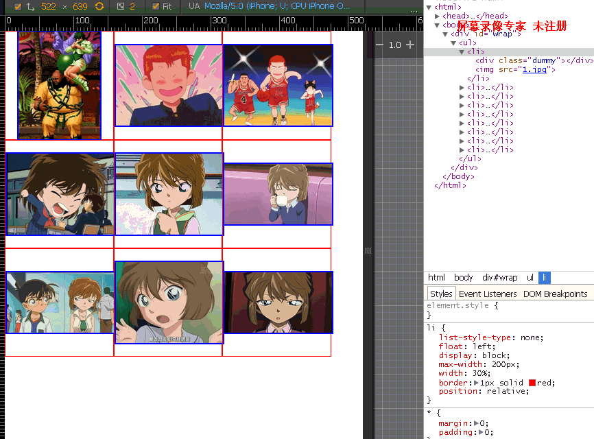
li{
list-style-type: none;
display:inline-block;
vertical-align: middle;
max-width: 200px;
width: 32%;
border:1px solid red;
}
img{
max-width: 100%;
max-height: 100%;
display: inline-block;
vertical-align: middle;
}
#wrap{
max-width: 620px;
font-size: 0;
}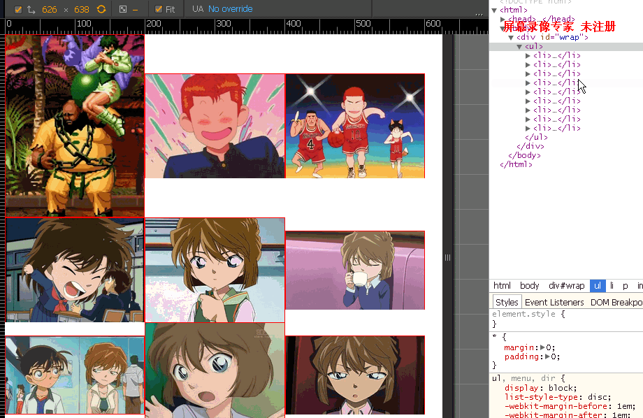
You can see that the height of the first picture has exceeded 200px, because the width of the first picture is smaller than the height. Obviously, the height should be used as the benchmark at this time, and the width should be scaled proportionally. If you add overflow:hidden; to the parent element of the picture, you won’t be able to see the pig’s feet.
So how can we make the outer div responsive?
padding-top:100%;
<div id='wrap'>
  <ul>
   <li>
    <div class="dummy"></div>
   </li>
      ...
  </ul>
 </div>

 *{
  margin: 0;
  padding:0;
 }
 li{
  list-style-type: none;
  float: left;
  display: block;
  max-width: 200px;
  width: 32%;
  border:1px solid red;
 }
 .dummy{
  padding-top: 100%;
 }
 #wrap{
  max-width: 620px;
  font-size: 0;
 }
The aspect ratio here is 1:1. If the aspect ratio is 4:3, set it to padding-top: 75%;, and so on for the others.
Requirement 3 is done, and the following is requirement 4.
Put the picture in first.
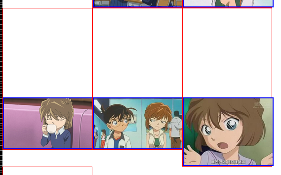
At this time, the image is separated from the document flow and the entire image is spread.
 img{
  position: absolute;
  top: 0;
  bottom: 0;
  left: 0;
  right: 0;
  max-width: 100%;
  max-height: 100%;
  display: block;
  margin: 0 auto;
  border: 2px solid blue;
}At the same time, put the package image div position:relative;
Notice that the margin: 0 auto; in the above image can be centered horizontally.
The only thing left below is to center the image vertically. For requirement 5, you only need to set a max-width in the outermost div to set the number of columns in a row.
There are many methods for vertical centering, but here the image position:absolute;, it is easy to think of setting margin:auto;padding:auto; to center the image that is out of the document flow horizontally and vertically. See Absolute Horizontal And Vertical Centering In CSS.
But this method is not valid for ie7. Therefore, we only need to add a layer of div outside the image.
Here we use a very common vertical centering method.
 <li>
    <div class="dummy"></div>
    <p><img src="1.jpg"><i></i></p>
   </li>
 img{
  max-width: 100%;
  max-height: 100%;
  display: inline-block;
  vertical-align: middle;
 }
 i{
  display: inline-block;
  vertical-align: middle;
  height:100%;
}Note that the
tag must be set to height:100% at this time. Otherwise, in IE7, the tag has no reference height, making it unable to reach the same height as the external container.
The above content is all the content of this article on responsive vertical and horizontal centering of CSS images. I hope you like it.

Hot AI Tools

Undresser.AI Undress
AI-powered app for creating realistic nude photos

AI Clothes Remover
Online AI tool for removing clothes from photos.

Undress AI Tool
Undress images for free

Clothoff.io
AI clothes remover

AI Hentai Generator
Generate AI Hentai for free.

Hot Article
Hot Tools

Notepad++7.3.1
Easy-to-use and free code editor

SublimeText3 Chinese version
Chinese version, very easy to use

Zend Studio 13.0.1
Powerful PHP integrated development environment

Dreamweaver CS6
Visual web development tools

SublimeText3 Mac version
God-level code editing software (SublimeText3)
Hot Topics
 1377
1377
 52
52

 How to achieve wave effect with pure CSS3? (code example)
Jun 28, 2022 pm 01:39 PM
How to achieve wave effect with pure CSS3? (code example)
Jun 28, 2022 pm 01:39 PM
How to achieve wave effect with pure CSS3? This article will introduce to you how to use SVG and CSS animation to create wave effects. I hope it will be helpful to you!
 Use CSS skillfully to realize various strange-shaped buttons (with code)
Jul 19, 2022 am 11:28 AM
Use CSS skillfully to realize various strange-shaped buttons (with code)
Jul 19, 2022 am 11:28 AM
This article will show you how to use CSS to easily realize various weird-shaped buttons that appear frequently. I hope it will be helpful to you!
 How to hide elements in css without taking up space
Jun 01, 2022 pm 07:15 PM
How to hide elements in css without taking up space
Jun 01, 2022 pm 07:15 PM
Two methods: 1. Using the display attribute, just add the "display:none;" style to the element. 2. Use the position and top attributes to set the absolute positioning of the element to hide the element. Just add the "position:absolute;top:-9999px;" style to the element.
 How to implement lace borders in css3
Sep 16, 2022 pm 07:11 PM
How to implement lace borders in css3
Sep 16, 2022 pm 07:11 PM
In CSS, you can use the border-image attribute to achieve a lace border. The border-image attribute can use images to create borders, that is, add a background image to the border. You only need to specify the background image as a lace style; the syntax "border-image: url (image path) offsets the image border width inward. Whether outset is repeated;".
 It turns out that text carousel and image carousel can also be realized using pure CSS!
Jun 10, 2022 pm 01:00 PM
It turns out that text carousel and image carousel can also be realized using pure CSS!
Jun 10, 2022 pm 01:00 PM
How to create text carousel and image carousel? The first thing everyone thinks of is whether to use js. In fact, text carousel and image carousel can also be realized using pure CSS. Let’s take a look at the implementation method. I hope it will be helpful to everyone!
 How to enlarge the image by clicking the mouse in css3
Apr 25, 2022 pm 04:52 PM
How to enlarge the image by clicking the mouse in css3
Apr 25, 2022 pm 04:52 PM
Implementation method: 1. Use the ":active" selector to select the state of the mouse click on the picture; 2. Use the transform attribute and scale() function to achieve the picture magnification effect, the syntax "img:active {transform: scale(x-axis magnification, y Axis magnification);}".
 How to set animation rotation speed in css3
Apr 28, 2022 pm 04:32 PM
How to set animation rotation speed in css3
Apr 28, 2022 pm 04:32 PM
In CSS3, you can use the "animation-timing-function" attribute to set the animation rotation speed. This attribute is used to specify how the animation will complete a cycle and set the speed curve of the animation. The syntax is "element {animation-timing-function: speed attribute value;}".
 Does css3 animation effect have deformation?
Apr 28, 2022 pm 02:20 PM
Does css3 animation effect have deformation?
Apr 28, 2022 pm 02:20 PM
The animation effect in css3 has deformation; you can use "animation: animation attribute @keyframes ..{..{transform: transformation attribute}}" to achieve deformation animation effect. The animation attribute is used to set the animation style, and the transform attribute is used to set the deformation style. .
