css制作的圆,三角形,椭圆,箭头图标
圆:
<code>.yuan{
    width:100px;
    height:100px;
    -moz-border-radius:50%;
    -webkit-border-radius:50%;
    border-radius:50%;
    background-color:red;
}
<div class="yuan"></div></code>
椭圆
<code>.oval {
    width: 200px;
    height: 100px;
    background-color: red;
    -moz-border-radius: 100px / 50px;
    -webkit-border-radius: 100px / 50px;
    border-radius: 100px / 50px;
}
<div class="oval"></div></code>
箭头:
<code>.arrow{
    content: '';
    position: absolute;
    width: 30px;
    height: 30px;
    border: 10px solid #f5b24a;
    -webkit-transform: rotate(-135deg);
    -moz-transform: rotate(-135deg);
    -o-transform: rotate(-135deg);
    -ms-transform: rotate(-135deg);
    transform: rotate(-135deg);
    border-top: none;
    border-right: none;
    top: 9px;
}
<span class="arrow"></span></code>
三角形:
<code>.rencentle {
    width: 0;
    height: 0;
    border-left: 50px solid transparent;
    border-right: 50px solid transparent;
    border-bottom: 100px solid red;
}
<div class="rencentle"></div></code>

Hot AI Tools

Undresser.AI Undress
AI-powered app for creating realistic nude photos

AI Clothes Remover
Online AI tool for removing clothes from photos.

Undress AI Tool
Undress images for free

Clothoff.io
AI clothes remover

Video Face Swap
Swap faces in any video effortlessly with our completely free AI face swap tool!

Hot Article

Hot Tools

Notepad++7.3.1
Easy-to-use and free code editor

SublimeText3 Chinese version
Chinese version, very easy to use

Zend Studio 13.0.1
Powerful PHP integrated development environment

Dreamweaver CS6
Visual web development tools

SublimeText3 Mac version
God-level code editing software (SublimeText3)

Hot Topics
 1389
1389
 52
52
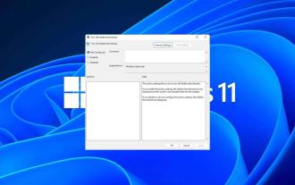 How to disable taskbar thumbnail preview in Win11? Turn off the taskbar icon display thumbnail technique by moving the mouse
Feb 29, 2024 pm 03:20 PM
This article will introduce how to turn off the thumbnail function displayed when the mouse moves the taskbar icon in Win11 system. This feature is turned on by default and displays a thumbnail of the application's current window when the user hovers the mouse pointer over an application icon on the taskbar. However, some users may find this feature less useful or disruptive to their experience and want to turn it off. Taskbar thumbnails can be fun, but they can also be distracting or annoying. Considering how often you hover over this area, you may have inadvertently closed important windows a few times. Another drawback is that it uses more system resources, so if you've been looking for a way to be more resource efficient, we'll show you how to disable it. but
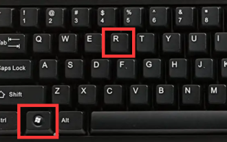 How to get rid of arrow icons for shortcuts on Windows 11
Dec 28, 2023 am 10:39 AM
After many users use the latest win11 system, a small arrow appears on the shortcut icon on the desktop, which affects the appearance. Therefore, we have brought you a tutorial to remove the small arrow from the win11 shortcut icon. If you also think it does not look good, come and watch it. Let’s see how it works. How to remove the small shortcut arrow in win11: 1. First, press the "win+r" shortcut keys on the keyboard at the same time. 2. Then open "Run", enter the "regedit" command, and click the "OK" button. 3. Next, enter the "Registry Editor" page and click to open: HKEY_CLASSES_ROOT\lnkfile (can be copied and pasted). 4. After re-entering, right-click "lsShortcut" and select
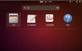 How to remove icons in Ubuntu start menu?
Jan 13, 2024 am 10:45 AM
There are many software icons listed in the Ubuntu system start menu. There are many uncommon icons. If you want to delete them, how should you delete them? Let’s take a look at the detailed tutorial below. 1. First enter the ubuntu desktop and click on the start menu under the left panel. 2. You can find a text editor icon inside, we need to delete it. 3. Now we return to the desktop and right-click the mouse to open the terminal. 4. Use the command to open the application list directory. sudonautilus/usr/share/applicationssudonautilus~/.local/share/applications5. Find the corresponding text editor icon inside. 6. Then go straight
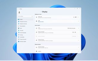 How do I get the system tray icon to appear on all my Windows 11 monitors?
Sep 22, 2023 pm 03:21 PM
When using a multi-monitor setup, users want to display the tray icon on all monitors in order to keep up with the latest notifications or access certain applications. This can be very useful, and in today's guide we'll show you how to enable this feature correctly. How to show tray icon on all monitors in Windows 11? 1. Use the display fusion software to visit the DisplayFusion website and download the software. After downloading the software, run the setup file and install it. Start the software and configure it as needed. On the second screen, right-click the taskbar, select Multi-monitor Taskbar, and then select System Tray. Finally, check Show/Hide Icons. Once this is done, you should get your system on both monitors on Windows 11
 Download the phone settings icon to the desktop 'Know in seconds: Steps to change icons for apps on Android phones'
Feb 06, 2024 pm 04:27 PM
In order to beautify their desktop, many users like to change their desktop themes regularly to keep them fresh. However, changing the theme will not change the icon of the third-party APP, and the personalized beautification is not thorough enough. If you're tired of the same app icons, replace them. Theoretically, if you want to change the icon for a mobile app, you usually need a ROOT system and some tools to unpack and replace the icon. But since the vast majority of mobile phones no longer support the ROOT system, we need to find other methods to achieve it. For example, some specific applications may offer the option to customize the icon, or personalize the icon through a third-party launcher. In addition, some mobile phone brands have also launched special theme and icon stores for users to choose and change icons. In major app stores,
 What do the 5G UC and 5G UW icons on your T-mobile smartphone mean?
Feb 24, 2024 pm 06:10 PM
T-Mobile users have started noticing that the network icon on their phone screens sometimes reads 5GUC, while other carriers read 5GUW. This is not a typo, but represents a different type of 5G network. In fact, operators are constantly expanding their 5G network coverage. In this topic, we will take a look at the meaning of the 5GUC and 5GUW icons displayed on T-Mobile smartphones. The two logos represent different 5G technologies, each with its own unique characteristics and advantages. By understanding what these signs mean, users can better understand the type of 5G network they are connected to so they can choose the network service that best suits their needs. 5GUCVS5GUW icon in T
 How to quickly restore the small arrow of the shortcut icon in Win10? The solution to the missing shortcut icon
Feb 29, 2024 pm 04:46 PM
This article will introduce how to restore the small arrow of shortcut icon in Win10. The small arrow in the shortcut icon indicates that the file or folder is the shortcut and not the original file or folder. If the small arrow on a shortcut icon disappears, it can cause confusion and difficulty for users to identify which files or folders are shortcuts. This article will provide detailed steps to help users easily restore the small arrow on the shortcut icon. Tips for restoring the small arrow on the shortcut icon 1. By default in Win10 system, the desktop shortcut icon will have a small arrow displayed, but some users found that the small arrow on the shortcut icon disappeared strangely; 2. When the desktop is blank where, click [right-click], and in the right-click menu item that opens, select [New-Text
 How to insert excel icons into PPT slides
Mar 26, 2024 pm 05:40 PM
1. Open the PPT and turn the page to the page where you need to insert the excel icon. Click the Insert tab. 2. Click [Object]. 3. The following dialog box will pop up. 4. Click [Create from file] and click [Browse]. 5. Select the excel table to be inserted. 6. Click OK and the following page will pop up. 7. Check [Show as icon]. 8. Click OK.


