

Use go-zero to implement visual monitoring and data analysis system

With the development of the Internet and the increasing amount of data, big data processing and analysis have become an indispensable part of modern enterprises. However, most of the existing data processing and analysis tools require complex configuration and use, and often require professional technical support. This article introduces how to use the go-zero framework to implement a visual monitoring and data analysis system, allowing enterprises to analyze and monitor data more conveniently.
- System introduction
This system is developed using Go language and implemented using go-zero framework. The system mainly consists of the following parts:
- Monitoring component: Use the Prometheus component to obtain monitoring data and store the data in the InfluxDB database.
- Data analysis component: Use the Grafana component to perform visual display and data analysis of monitoring data stored in InfluxDB.
- API service: Use the go-zero framework to implement API services, which are used to interact with the front-end and obtain monitoring data and data analysis results.
- Monitoring component
In the entire system architecture, the monitoring component plays the role of collecting data. We use Prometheus components to obtain monitoring data and store the data in the InfluxDB database.
Prometheus is an open source monitoring system that can collect and store various indicator data and provide query and visualization functions. Prometheus can monitor a variety of different services, including applications, operating systems, and network devices. In this system, we use Prometheus to collect monitoring data of the application.
In Prometheus, we need to define indicators for monitoring data. For the indicators that need to be monitored, we need to write the corresponding exporter so that Prometheus can collect data on these indicators. For example, we can write an HTTP exporter to monitor the status code, response time and other information of HTTP requests. Then, Prometheus will periodically obtain indicator data from this exporter and store the data in a time series database.
InfluxDB is a high-performance time series database that can be used to store and query monitoring data. Using the InfluxDB database, we can easily store the monitoring data collected by Prometheus and perform query and analysis.
- Data analysis component
The data analysis component is mainly implemented using Grafana. Grafana is an open source visual data analysis and monitoring platform that can aggregate data from a variety of different data sources and present the data in a visual way. Compared with components such as Prometheus and InfluxDB, Grafana pays more attention to the visual display of data and provides a very rich set of charts and panels to facilitate users to analyze and display data.
We can use Grafana's data source function, use InfluxDB as the data source, and create panels in Grafana to visually display the monitoring data. For indicators that require data analysis, we can write relevant query statements in Grafana and create corresponding statistical charts to display the data. In this system, we can use Grafana to conduct data analysis on the service quality and performance indicators of the application.
- API service
API service is implemented using the go-zero framework and is used to interact with the front-end and obtain monitoring data and data analysis results. The go-zero framework is a microservice framework based on the Go language. It provides a wealth of components and tools to facilitate users to implement efficient API services.
In this system, we use the go-zero framework to implement an API service to obtain monitoring data from Prometheus and InfluxDB and provide the data to the front end. We can write corresponding processing functions in the API service to handle requests from the front end, including querying monitoring data, performing data analysis, etc. In the processing function, we can use the components and tools provided by the go-zero framework to easily operate components such as Prometheus and InfluxDB to achieve efficient data query and analysis.
- Summary
This article introduces how to use the go-zero framework to implement a visual monitoring and data analysis system. The system uses Prometheus components to obtain monitoring data and stores the data in the InfluxDB database. Use Grafana components for visual display and data analysis of monitoring data stored in InfluxDB. Finally, the go-zero framework is used to implement API services for interacting with the front-end and obtaining monitoring data and data analysis results.
This system can easily monitor and analyze data on the service quality and performance indicators of enterprise applications, thereby helping enterprises better understand their business conditions and make reasonable decisions. At the same time, this system is implemented using the go-zero framework, which has good performance in terms of performance and efficiency.
The above is the detailed content of Use go-zero to implement visual monitoring and data analysis system. For more information, please follow other related articles on the PHP Chinese website!

Hot AI Tools

Undresser.AI Undress
AI-powered app for creating realistic nude photos

AI Clothes Remover
Online AI tool for removing clothes from photos.

Undress AI Tool
Undress images for free

Clothoff.io
AI clothes remover

Video Face Swap
Swap faces in any video effortlessly with our completely free AI face swap tool!

Hot Article
Hot Tools

Notepad++7.3.1
Easy-to-use and free code editor

SublimeText3 Chinese version
Chinese version, very easy to use

Zend Studio 13.0.1
Powerful PHP integrated development environment

Dreamweaver CS6
Visual web development tools

SublimeText3 Mac version
God-level code editing software (SublimeText3)
Hot Topics
 1387
1387
 52
52

 Read CSV files and perform data analysis using pandas
Jan 09, 2024 am 09:26 AM
Read CSV files and perform data analysis using pandas
Jan 09, 2024 am 09:26 AM
Pandas is a powerful data analysis tool that can easily read and process various types of data files. Among them, CSV files are one of the most common and commonly used data file formats. This article will introduce how to use Pandas to read CSV files and perform data analysis, and provide specific code examples. 1. Import the necessary libraries First, we need to import the Pandas library and other related libraries that may be needed, as shown below: importpandasaspd 2. Read the CSV file using Pan
 Introduction to data analysis methods
Jan 08, 2024 am 10:22 AM
Introduction to data analysis methods
Jan 08, 2024 am 10:22 AM
Common data analysis methods: 1. Comparative analysis method; 2. Structural analysis method; 3. Cross analysis method; 4. Trend analysis method; 5. Cause and effect analysis method; 6. Association analysis method; 7. Cluster analysis method; 8 , Principal component analysis method; 9. Scatter analysis method; 10. Matrix analysis method. Detailed introduction: 1. Comparative analysis method: Comparative analysis of two or more data to find the differences and patterns; 2. Structural analysis method: A method of comparative analysis between each part of the whole and the whole. ; 3. Cross analysis method, etc.
 How to build a fast data analysis application using React and Google BigQuery
Sep 26, 2023 pm 06:12 PM
How to build a fast data analysis application using React and Google BigQuery
Sep 26, 2023 pm 06:12 PM
How to use React and Google BigQuery to build fast data analysis applications Introduction: In today's era of information explosion, data analysis has become an indispensable link in various industries. Among them, building fast and efficient data analysis applications has become the goal pursued by many companies and individuals. This article will introduce how to use React and Google BigQuery to build a fast data analysis application, and provide detailed code examples. 1. Overview React is a tool for building
 11 basic distributions that data scientists use 95% of the time
Dec 15, 2023 am 08:21 AM
11 basic distributions that data scientists use 95% of the time
Dec 15, 2023 am 08:21 AM
Following the last inventory of "11 Basic Charts Data Scientists Use 95% of the Time", today we will bring you 11 basic distributions that data scientists use 95% of the time. Mastering these distributions helps us understand the nature of the data more deeply and make more accurate inferences and predictions during data analysis and decision-making. 1. Normal Distribution Normal Distribution, also known as Gaussian Distribution, is a continuous probability distribution. It has a symmetrical bell-shaped curve with the mean (μ) as the center and the standard deviation (σ) as the width. The normal distribution has important application value in many fields such as statistics, probability theory, and engineering.
 11 Advanced Visualizations for Data Analysis and Machine Learning
Oct 25, 2023 am 08:13 AM
11 Advanced Visualizations for Data Analysis and Machine Learning
Oct 25, 2023 am 08:13 AM
Visualization is a powerful tool for communicating complex data patterns and relationships in an intuitive and understandable way. They play a vital role in data analysis, providing insights that are often difficult to discern from raw data or traditional numerical representations. Visualization is crucial for understanding complex data patterns and relationships, and we will introduce the 11 most important and must-know charts that help reveal the information in the data and make complex data more understandable and meaningful. 1. KSPlotKSPlot is used to evaluate distribution differences. The core idea is to measure the maximum distance between the cumulative distribution functions (CDF) of two distributions. The smaller the maximum distance, the more likely they belong to the same distribution. Therefore, it is mainly interpreted as a "system" for determining distribution differences.
 Machine learning and data analysis using Go language
Nov 30, 2023 am 08:44 AM
Machine learning and data analysis using Go language
Nov 30, 2023 am 08:44 AM
In today's intelligent society, machine learning and data analysis are indispensable tools that can help people better understand and utilize large amounts of data. In these fields, Go language has also become a programming language that has attracted much attention. Its speed and efficiency make it the choice of many programmers. This article introduces how to use Go language for machine learning and data analysis. 1. The ecosystem of machine learning Go language is not as rich as Python and R. However, as more and more people start to use it, some machine learning libraries and frameworks
 How to use ECharts and php interfaces to implement data analysis and prediction of statistical charts
Dec 17, 2023 am 10:26 AM
How to use ECharts and php interfaces to implement data analysis and prediction of statistical charts
Dec 17, 2023 am 10:26 AM
How to use ECharts and PHP interfaces to implement data analysis and prediction of statistical charts. Data analysis and prediction play an important role in various fields. They can help us understand the trends and patterns of data and provide references for future decisions. ECharts is an open source data visualization library that provides rich and flexible chart components that can dynamically load and process data by using the PHP interface. This article will introduce the implementation method of statistical chart data analysis and prediction based on ECharts and php interface, and provide
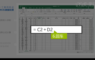 Integrated Excel data analysis
Mar 21, 2024 am 08:21 AM
Integrated Excel data analysis
Mar 21, 2024 am 08:21 AM
1. In this lesson, we will explain integrated Excel data analysis. We will complete it through a case. Open the course material and click on cell E2 to enter the formula. 2. We then select cell E53 to calculate all the following data. 3. Then we click on cell F2, and then we enter the formula to calculate it. Similarly, dragging down can calculate the value we want. 4. We select cell G2, click the Data tab, click Data Validation, select and confirm. 5. Let’s use the same method to automatically fill in the cells below that need to be calculated. 6. Next, we calculate the actual wages and select cell H2 to enter the formula. 7. Then we click on the value drop-down menu to click on other numbers.
