
 Operation and Maintenance
Nginx
Build a Raspberry Pi monitoring dashboard in less than 30 minutes
Operation and Maintenance
Nginx
Build a Raspberry Pi monitoring dashboard in less than 30 minutes
Build a Raspberry Pi monitoring dashboard in less than 30 minutes


You may need a Raspberry Pi dashboard to understand its performance. In this article, I'll demonstrate how to quickly build an on-demand monitoring dashboard to view your Raspberry Pi's CPU performance, memory, and disk usage in real time, and add more views and actions at any time as needed.
If you already use Appsmith, you can also directly import the Sample Application and get started.
Appsmith
Appsmith is an open source Low-code application building tool that helps developers easily and quickly build internal applications such as dashboards and admin panels. It is a great option for dashboards and reduces the time and complexity required by traditional coding methods.
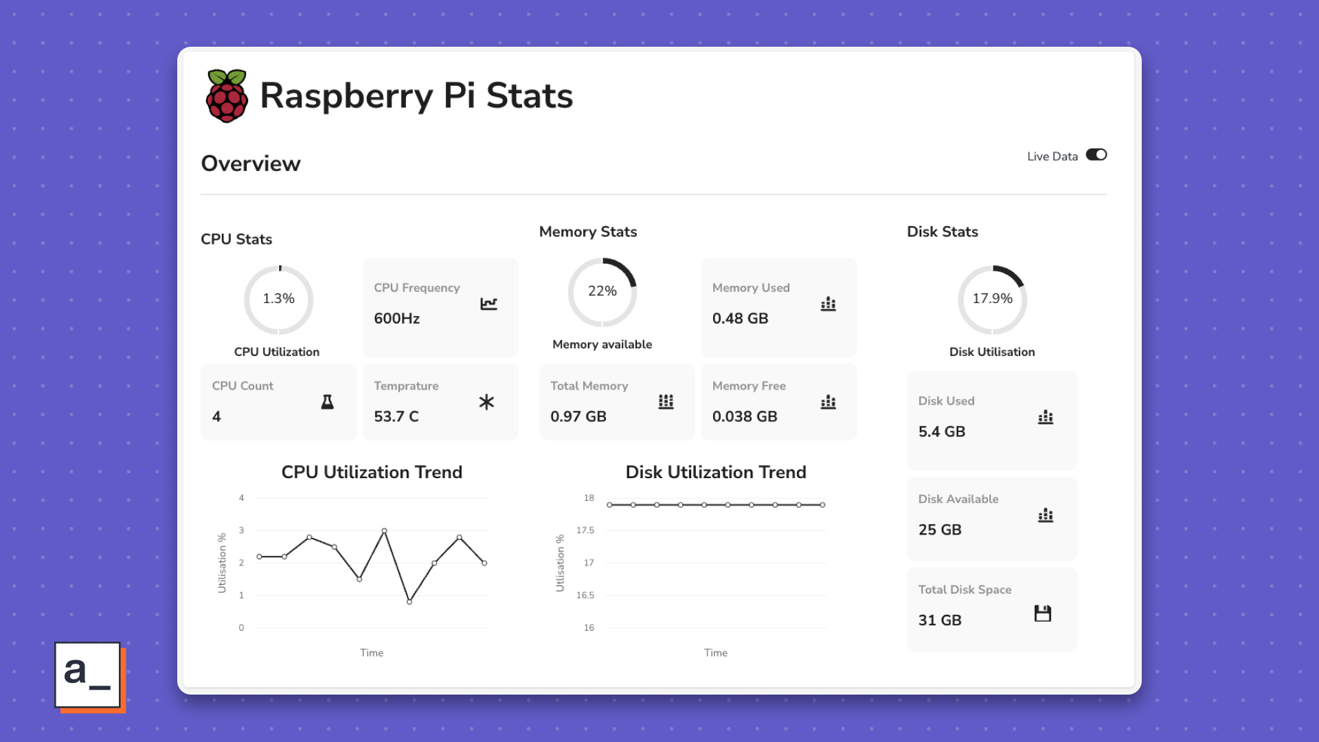
In this example dashboard, I display the following statistics:
- CPU
- % occupied
- Frequency or clock speed
- Count
- Temperature
- Memory
- Percentage occupied
- Available memory percentage
- Total memory
- Free memory
- Disk
- Disk usage percentage
- Absolute Disk Space Usage
- Available Disk Space
- Total Disk Space
Creating an Endpoint
You need a way to start from The Raspberry Pi gets this data and passes it to the Appsmith method. psutil is a Python library for monitoring and analysis, while Flask-RESTful is a Flask extension that creates a REST API.
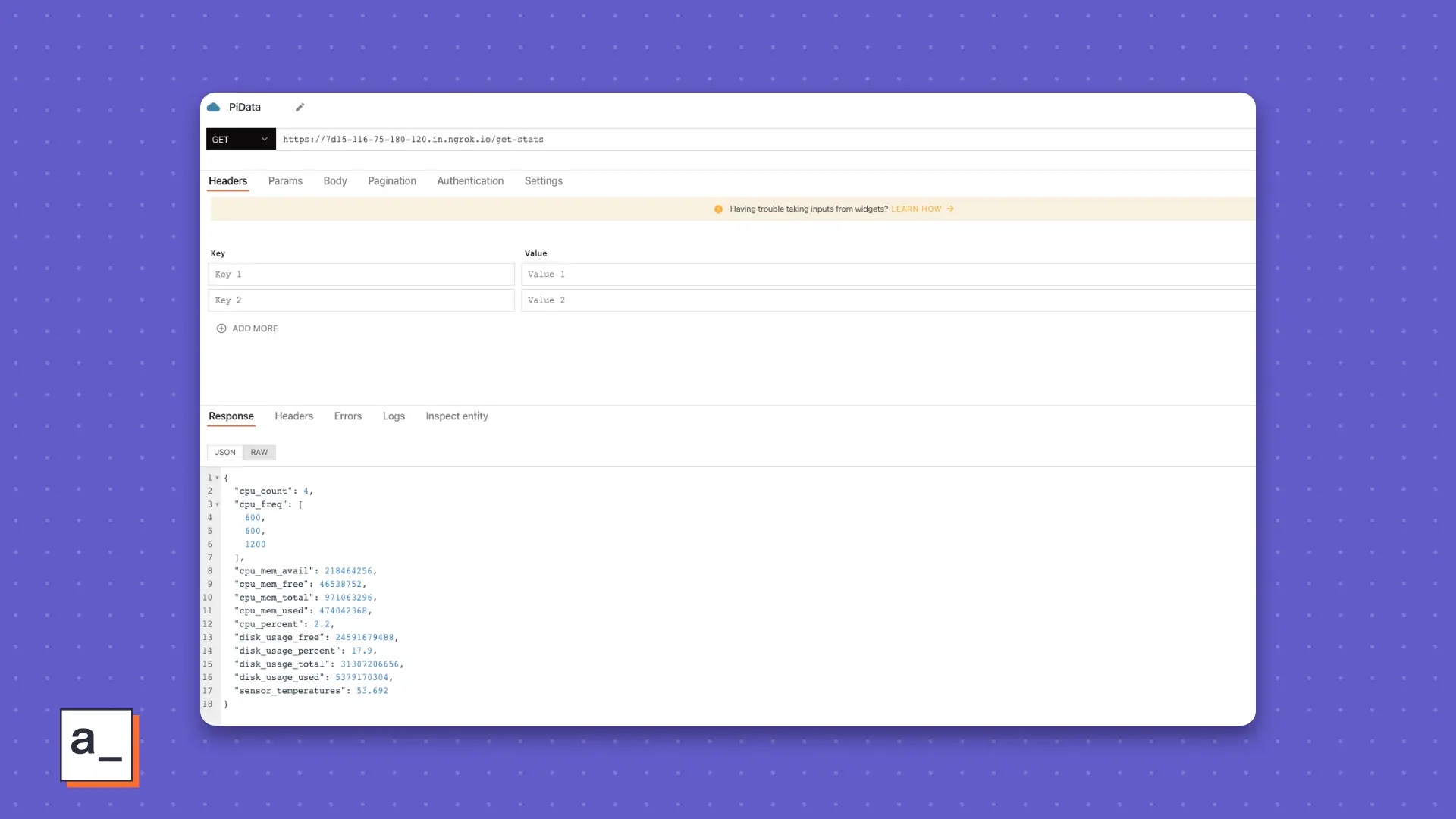
Appsmith calls the REST API every few seconds to automatically refresh the data and responds with a JSON object containing all the required statistics, as shown below:
{ "cpu_count": 4,"cpu_freq": [600.0,600.0,1200.0 ],"cpu_mem_avail": 463953920,"cpu_mem_free": 115789824,"cpu_mem_total": 971063296,"cpu_mem_used": 436252672,"cpu_percent": 1.8,"disk_usage_free": 24678121472,"disk_usage_percent": 17.7,"disk_usage_total": 31307206656,"disk_usage_used": 5292728320,"sensor_temperatures": 52.616 }1. Settings REST API
If your Raspberry Pi does not already have Python installed, open a terminal on your Raspberry Pi and run this installation command:
$ sudo apt install python3
Now set up a Python for your development Virtual Environment:
$ python -m venv PiData
Next, activate the environment. You must do this after restarting the Raspberry Pi.
$ source PiData/bin/activate$ cd PiData
In order to install Flask, Flask-RESTful and future dependencies, please create a file named requirements.txt in your Python virtual environment and add the following content Go into it:
flaskflask-restfulgunicorn
Save the files, then use pip to install them all at once. You must do this after restarting the Raspberry Pi.
(PyData)$ python -m pip install -r requirements.txt
Next, create a file named pi_stats.py to hold the logic for retrieving Raspberry Pi system statistics using psutil. Paste the following code into the pi_stats.py file:
from flask import Flaskfrom flask_restful import Resource, Apiimport psutilapp = Flask(__name__)api = Api(app)class PiData(Resource):def get(self):return "RPI Stat dashboard"api.add_resource(PiData, '/get-stats')if __name__ == '__main__':app.run(debug=True)
The function of this code is as follows:
- 使用
app = Flask(name)来定义嵌套 API 对象的应用程序。 - 使用 Flask-RESTful 的 API 方法 来定义 API 对象。
- 在 Flask-RESTful 中将
PiData定义为具体的 Resource 类 ,以公开每个支持的 HTTP 方法。 - 使用
api.add_resource(PiData, '/get-stats')将资源PiData附加到 API 对象api。 - 每当你访问 URL
/get-stats时,将返回PiData作为响应。
2、使用 psutil 读取统计信息
要从你的树莓派获取统计信息,你可以使用 psutil 提供的这些内置函数:
-
cpu_percentage、cpu_count、cpu_freq和sensors_temperatures函数分别用于获取 CPU 的占用百分比、计数、时钟速度和温度。sensors_temperatures报告了与树莓派连接的所有设备的温度。要仅获取 CPU 的温度,请使用键cpu-thermal。 -
virtual_memory函数可返回总内存、可用内存、已使用内存和空闲内存的统计信息(以字节为单位)。 -
disk_usage函数可返回总磁盘空间、已使用空间和可用空间的统计信息(以字节为单位)。
将所有函数组合到一个 Python 字典中的示例如下:
system_info_data = {'cpu_percent': psutil.cpu_percent(1),'cpu_count': psutil.cpu_count(),'cpu_freq': psutil.cpu_freq(),'cpu_mem_total': memory.total,'cpu_mem_avail': memory.available,'cpu_mem_used': memory.used,'cpu_mem_free': memory.free,'disk_usage_total': disk.total,'disk_usage_used': disk.used,'disk_usage_free': disk.free,'disk_usage_percent': disk.percent,'sensor_temperatures': psutil.sensors_temperatures()['cpu-thermal'][0].current,}下一节将使用该字典。
3、从 Flask-RESTful API 获取数据
为了在 API 响应中看到来自树莓派的数据,请更新 pi_stats.py 文件,将字典 system_info_data 包含在 PiData 类中:
from flask import Flaskfrom flask_restful import Resource, Apiimport psutilapp = Flask(__name__)api = Api(app)class PiData(Resource):def get(self):memory = psutil.virtual_memory()disk = psutil.disk_usage('/')system_info_data = {'cpu_percent': psutil.cpu_percent(1),'cpu_count': psutil.cpu_count(),'cpu_freq': psutil.cpu_freq(),'cpu_mem_total': memory.total,'cpu_mem_avail': memory.available,'cpu_mem_used': memory.used,'cpu_mem_free': memory.free,'disk_usage_total': disk.total,'disk_usage_used': disk.used,'disk_usage_free': disk.free,'disk_usage_percent': disk.percent,'sensor_temperatures': psutil.sensors_temperatures()['cpu-thermal'][0].current, }return system_info_dataapi.add_resource(PiData, '/get-stats')if __name__ == '__main__':app.run(debug=True)你的脚本已经就绪,下面运行 PiData.py:
$ python PyData.py * Serving Flask app "PiData" (lazy loading) * Environment: production WARNING: This is a development server. Do not run this in a production environment. * Debug mode: on * Running on http://127.0.0.1:5000 (Press CTRL+C to quit) * Restarting with stat * Debugger is active!
你有了一个可以工作的 API。
4、将 API 提供给互联网
你可以在本地网络中与 API 进行交互。然而,要在互联网上访问它,你必须在防火墙中打开一个端口,并将传入的流量转发到由 Flask 提供的端口。然而,正如你的测试输出建议的那样,在 Flask 中运行 Flask 应用程序仅适用于开发,而不适用于生产。为了安全地将 API 提供给互联网,你可以使用安装过程中安装的 gunicorn 生产服务器。
现在,你可以启动 Flask API。每次重新启动树莓派时都需要执行此操作。
$ gunicorn -w 4 'PyData:app'Serving on http://0.0.0.0:8000
要从外部世界访问你的树莓派,请在网络防火墙中打开一个端口,并将流量定向到你树莓派的 IP 地址,端口为 8000。
首先,获取树莓派的内部 IP 地址:
$ ip addr show | grep inet
内部 IP 地址通常以 10 或 192 或 172 开头。
接下来,你必须配置防火墙。通常,你从互联网服务提供商(ISP)获取的路由器中嵌入了防火墙。通常,你可以通过网络浏览器访问家用路由器。路由器的地址有时会打印在路由器的底部,它以 192.168 或 10 开头。不过,每个设备都不同,因此我无法告诉你需要点击哪些选项来调整设置。关于如何配置防火墙的完整描述,请阅读 Seth Kenlon 的文章 《打开端口并通过你的防火墙路由流量》。
或者,你可以使用 localtunnel 来使用动态端口转发服务。
一旦你的流量到达树莓派,你就可以查询你的 API:
$ curl https://example.com/get-stats{ "cpu_count": 4, "cpu_freq": [600.0,600.0,1200.0 ], "cpu_mem_avail": 386273280, ...如果你已经执行到这一步,那么最困难的部分已经过去了。
5、重复步骤
如果你重新启动了树莓派,你必须按照以下步骤进行操作:
- 使用
source重新激活 Python 环境 - 使用
pip刷新应用程序的依赖项 - 使用
gunicorn启动 Flask 应用程序
你的防火墙设置是持久的,但如果你使用了 localtunnel,则必须在重新启动后启动新的隧道。
如果你愿意,可以自动化这些任务,但那是另一个教程的内容。本教程的最后一部分是在 Appsmith 上构建一个用户界面,使用拖放式小部件和一些 JavaScript,将你的树莓派数据绑定到用户界面。相信我,从现在开始很容易!
在 Appsmith 上构建仪表盘
 硬件监控仪表盘
要制作一个像这样的仪表盘,你需要将公开的 API 端点连接到 Appsmith,使用 Appsmith 的小部件库构建用户界面,并将 API 的响应绑定到小部件上。如果你已经使用 Appsmith,你可以直接导入 示例应用程序 并开始使用。
如果你还没有,请 注册 一个免费的 Appsmith 帐户。或者,你可以选择 自托管 Appsmith。
将 API 作为 Appsmith 数据源连接
登录到你的 Appsmith 帐户。
- Find and click the " " button next to "Queries or JSQUERIES/JS" in the left navigation bar.
- Click "Create a blank API".
- At the top of the page, name your project "PiData".
- Get the URL of your API. If you are using localtunnel, which is a
localtunnel.meaddress, always add/get-statsat the end to get statistics. Paste it into the first empty field of the page and click the "RUN" button.
Make sure you see a successful response in the Response panel.
 Appsmith Interface
Building the User Interface
Appsmith’s interface is very intuitive, but if you feel lost, I recommend checking out Build your first app on Appsmith Tutorial.
Drag the "Text", "Image" and "Divider" widgets on the canvas as titles. Arrange them like this:
 Set Project Title
The "Text" widget contains the actual title of your page. Type something cooler than "Raspberry Pi Stats".
The "ImageImage" widget is used to display the unique logo of the dashboard. You can use any logo you like.
Use the "Switch" widget to switch real-time data mode. Getting data from the API you built needs to be configured in the "Property" panel.
For the main section, create a CPU statistics area using the following widgets from the widget library on the left:
- Progress BarProgress Bar
- Stat Box
- Chart
Repeat the same steps for the memory and disk statistics sections. The disk statistics section doesn't require a chart, but if you can find a use for it, use it.
Your final widget layout should look something like the following:
 Property Settings in Appsmith
The last step is to add the data to the API Bind to your widget.
Bind data to the widget
Return to the canvas and find your widget in the three categories section. Start by setting up the CPU statistics.
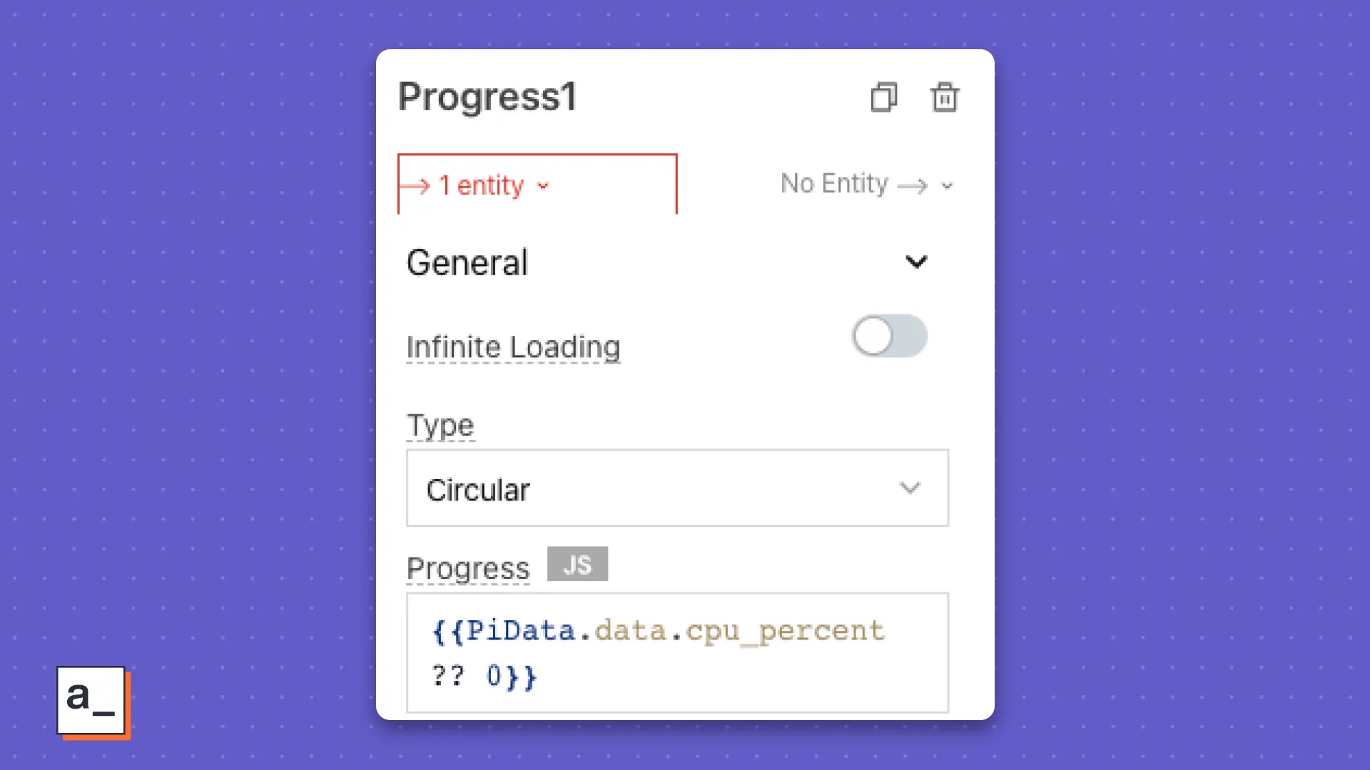
To bind data to the "Progress Bar" widget:
- Click the "Progress Bar" widget to open the "Property" on the right panel.
- Look for the "Progress" attribute.
- Click the "JS" button to activate JavaScript.
- Paste
{{PiData.data.cpu_percent ?? 0}}in the "Progress" field. This code references your API's data stream, namedPiData. Appsmith caches response data in the.dataoperator ofPiData. The keycpu_percentcontains the data used by Appsmith to display CPU utilization percentage. - Add a “Text” widget as a label below the “Progress Bar” widget.
 Bind data in configuration screen
在 CPU 部分有三个 “统计框Stat Box” 小部件。将数据绑定到每个小部件的步骤与绑定 “进度条Progress Bar” 小部件的步骤完全相同,只是你需要从 .data 运算符中绑定不同的数据属性。按照相同的步骤进行操作,但有以下例外:
- 使用
{{${PiData.data.cpu_freq[0]} ?? 0 }}来显示时钟速度。 - 使用
{{${PiData.data.cpu_count} ?? 0 }}来显示 CPU 计数。 - 使用
{{${(PiData.data.sensor_temperatures).toPrecision(3)} ?? 0 }}来显示 CPU 温度数据。
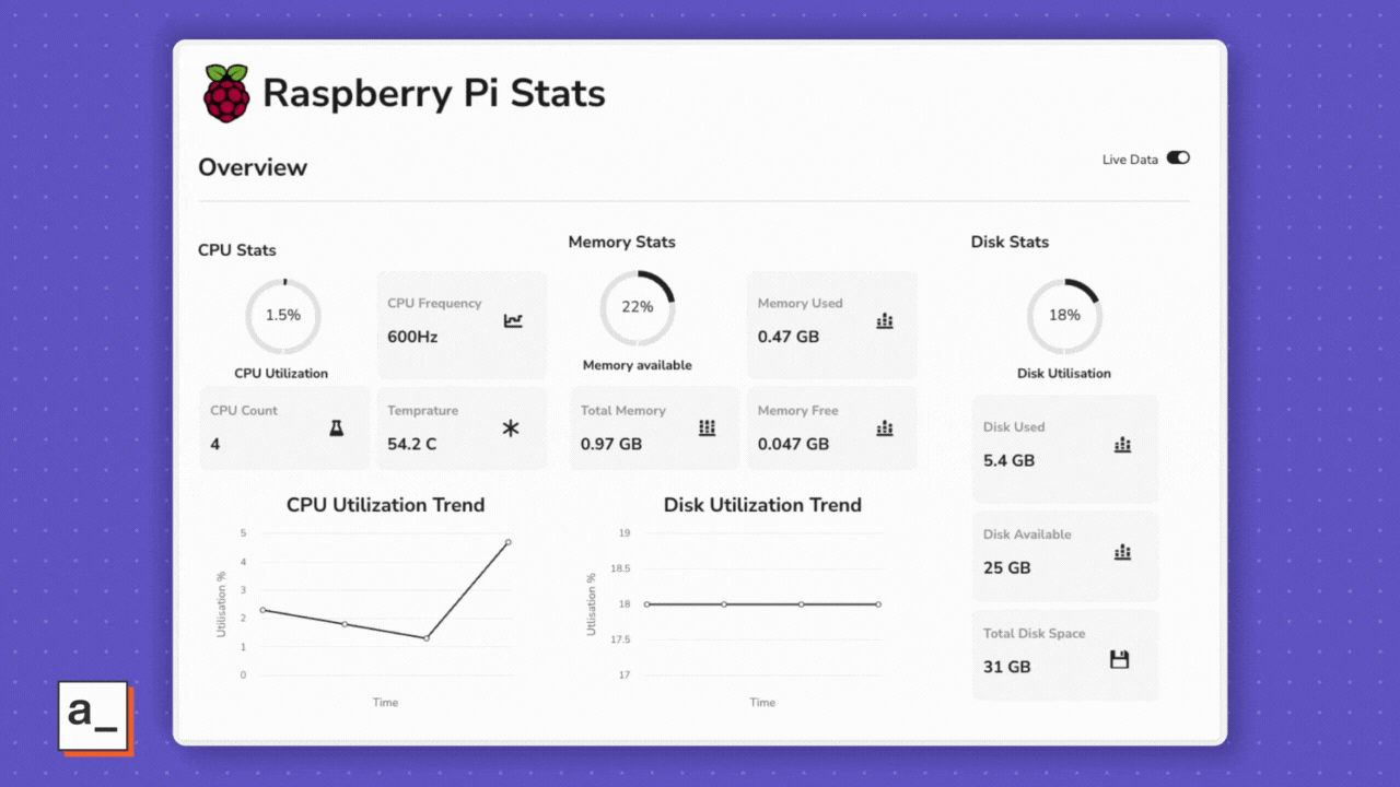
如果一切顺利,你将得到一个漂亮的仪表盘,如下所示:
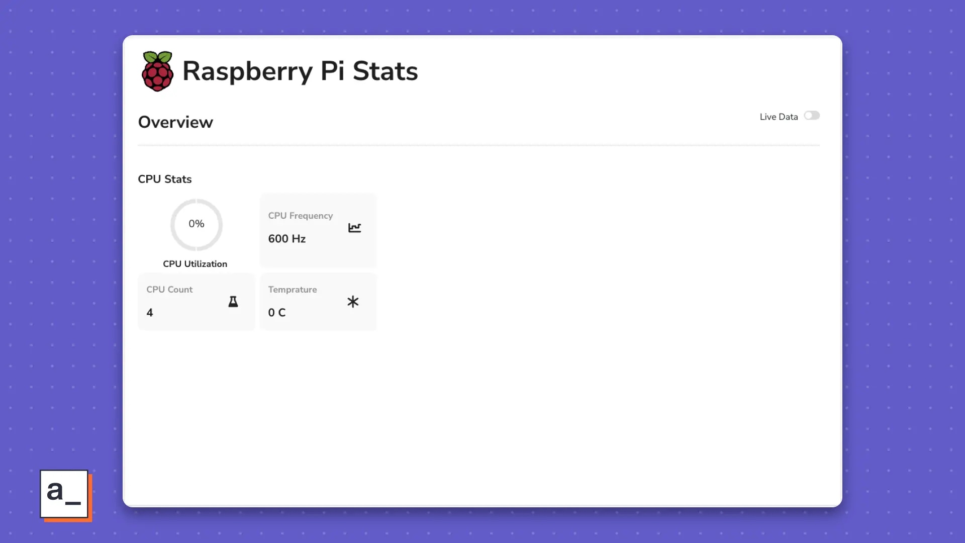 树莓派的仪表盘
CPU 利用率趋势图
你可以使用 “图表Chart” 小部件将 CPU 利用率显示为趋势线,并使其随时间自动更新。
首先,单击小部件,在右侧找到 “图表类型Chart Type” 属性,并将其更改为 “折线图LINE CHART”。为了显示趋势线,需要将 cpu_percent 存储在数据点数组中。你的 API 目前将其作为单个时间数据点返回,因此可以使用 Appsmith 的 storeValue 函数(Appsmith 内置的 setItem 方法的一个原生实现)来获取一个数组。
在 “查询或 JSQUERIES/JS” 旁边单击 “+” 按钮,并将其命名为 “utils”。
将以下 JavaScript 代码粘贴到 “代码Code” 字段中:
export default {getLiveData: () => {//When switch is on:if (Switch1.isSwitchedOn) {setInterval(() => {let utilData = appsmith.store.cpu_util_data;PiData.run()storeValue("cpu_util_data", [...utilData, {x: PiData.data.cpu_percent,y: PiData.data.cpu_percent}]); }, 1500, 'timerId')} else {clearInterval('timerId');}},initialOnPageLoad: () => {storeValue("cpu_util_data", []);}}为了初始化 Store,你在 initialOnPageLoad 对象中创建了一个 JavaScript 函数,并将 storeValue 函数放在其中。
你使用 storeValue("cpu_util_data", []); 将 cpu_util_data 中的值存储到 storeValue 函数中。此函数在页面加载时运行。
So far, the code will store a data point from cpu_util_data into Store every time the page is refreshed. To store an array, you use the x and y subscript variables, both of which store values from the cpu_percent data attribute.
You also want to automatically store this data by setting a fixed time interval between storing values. When executing the setInterval function:
- Get the value stored in
cpu_util_data. - Call API
PiData. - Update
cpu_util_datato thexandyvariables using the latestcpu_percentdata returned. - Store the value of
cpu_util_datain the keyutilData. - Repeat steps 1 to 4 only if set to execute the function automatically. You set it up to execute automatically using the Switch widget, which explains why there is a
getLiveDataparent function.
In the "Settings" tab, find all parent functions in the object and set initialOnPageLoad to "RUN ON PAGE LOAD when the page loads" option. "Yes".
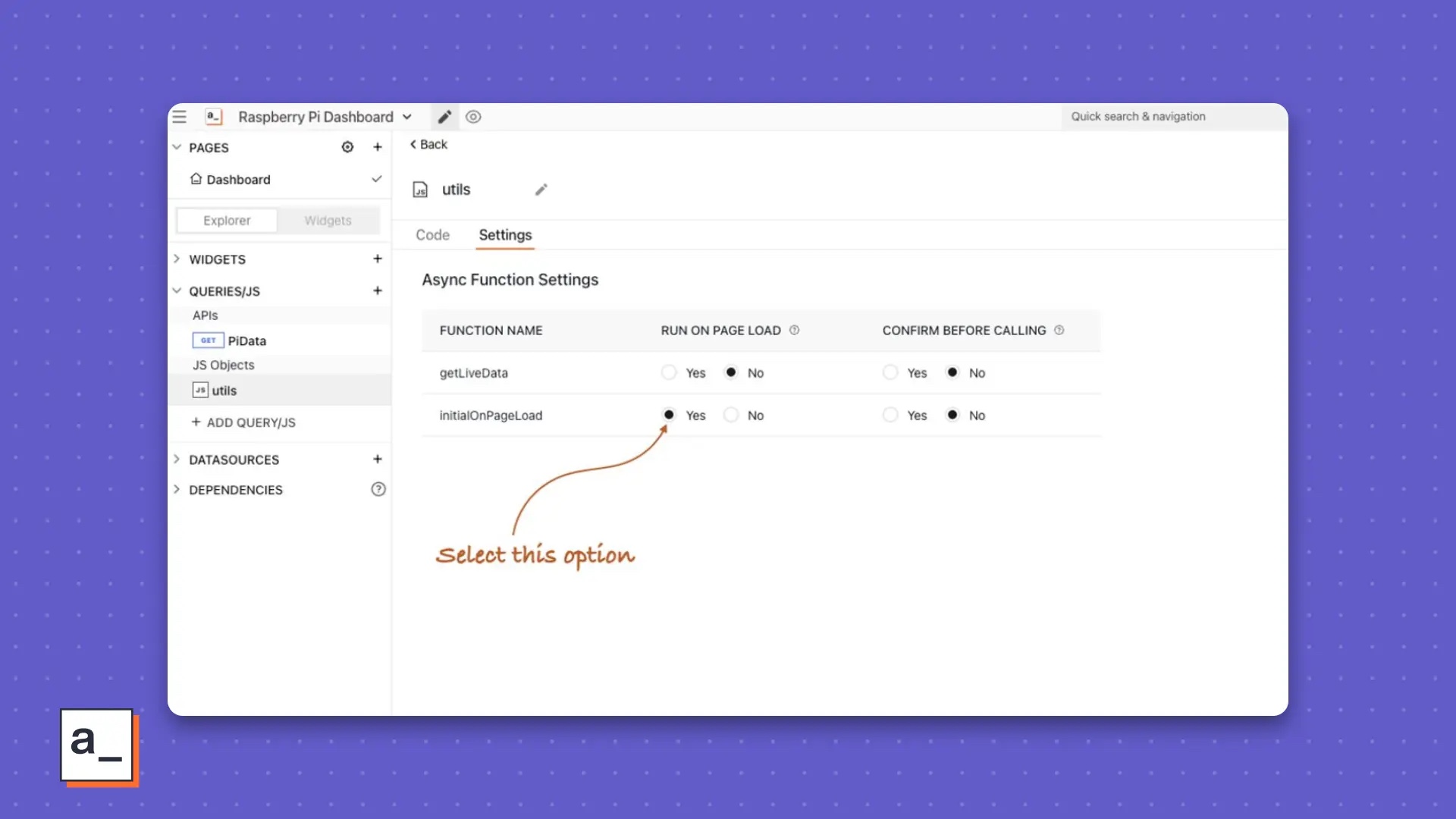 Set the function to be executed when the page loads
Now refresh the page to confirm.
Return to canvas. Click the Chart widget and find the Chart Data property. Paste the binding {{ appsmith.store.disk_util_data }} into it. This way, if you run the object utils yourself multiple times, you can get the chart data. To run this automatically:
- Find and click the "Live Data Switch" widget in the dashboard header.
- Find
onChangeevent. - Bind it to
{{ utils.getLiveData() }}. The JavaScript object isutilsandgetLiveDatais a function that is activated when you toggle the switch and gets live data from your Raspberry Pi. But there are other real-time data, so the same switch works for them too. Read on to learn more.
Bind data to the widgets in the Memory and Disk sections in a similar way to what you did in the CPU Statistics section.
For the memory part, the binding is as follows:
- The binding in the progress bar is:
{{( PiData.data.cpu_mem_avail/1000000000).toPrecision( 2) \* 100 ?? 0 }}. - The bindings of the three statistical box widgets are:
{{ \${(PiData.data.cpu_mem_used/1000000000).toPrecision(2)} ?? 0 }} GB,{{ \${(PiData.data.cpu_mem_free/1000000000).toPrecision(2)} ?? 0}} GBand{{ \${(PiData.data.cpu_mem_total/1000000000 ).toPrecision(2)} ?? 0 }} GB.
For the disk part, the binding of the progress bar and statistics box widgets respectively becomes:
- The binding of the progress bar is:
{{ PiData. data.disk_usage_percent ?? 0 }}. - The bindings of the three statistical box widgets are:
{{ \${(PiData.data.disk_usage_used/1000000000).toPrecision(2)} ?? 0 }} GB,{{ \${(PiData.data.disk_usage_free/1000000000).toPrecision(2)} ?? 0 }} GBand{{ \${(PiData.data.disk_usage_total/1000000000 ).toPrecision(2)} ?? 0 }} GB.
The chart here needs to update the utils object you created for CPU statistics, using the storeValue key name disk_util_data, embedded Set below getLiveData, its logic is similar to cpu_util_data. For the disk utilization chart, the logic of the disk_util_data we store is the same as that of the CPU utilization trend chart.
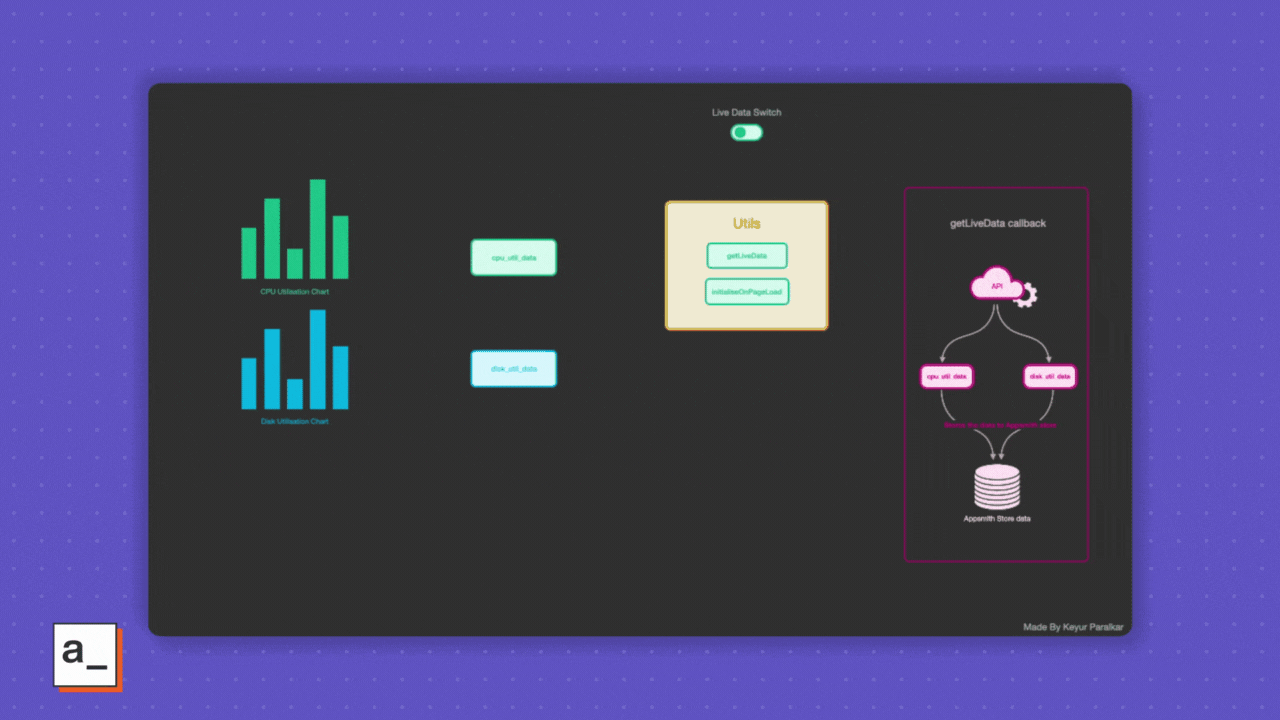
export default {getLiveData: () => {//When switch is on:if (Switch1.isSwitchedOn) {setInterval(() => { const cpuUtilData = appsmith.store.cpu_util_data; const diskUtilData = appsmith.store.disk_util_data; PiData.run(); storeValue("cpu_util_data", [...cpuUtilData, { x: PiData.data.cpu_percent,y: PiData.data.cpu_percent }]); storeValue("disk_util_data", [...diskUtilData, { x: PiData.data.disk_usage_percent,y: PiData.data.disk_usage_percent }]);}, 1500, 'timerId')} else {clearInterval('timerId');}},initialOnPageLoad: () => {storeValue("cpu_util_data", []);storeValue("disk_util_data", []);}}通过使用 utils JavaScript 对象在打开和关闭真实数据开关时触发的数据流可视化如下所示:
 切换
切换
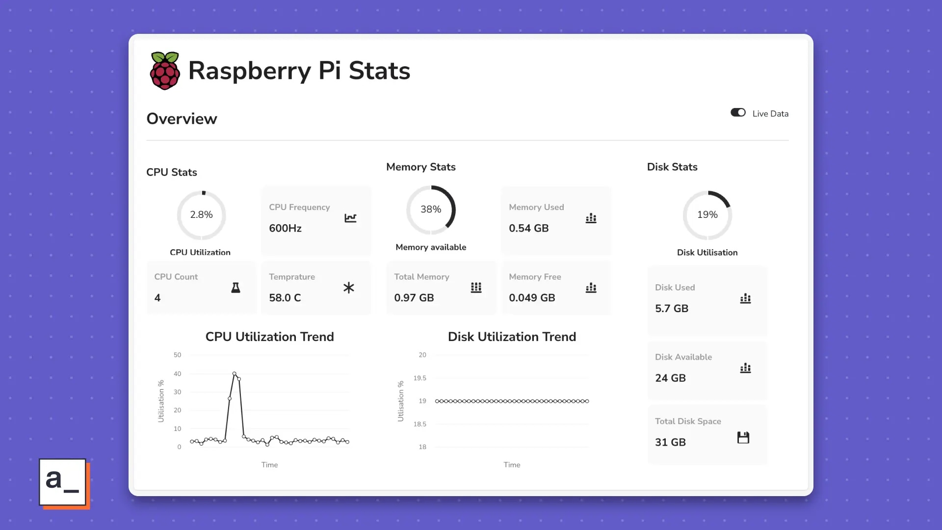
在打开实时数据开关时,图表会变成这样:
 显示实时数据
整体上,它既漂亮,又简约,而且非常有用。
祝你使用愉快!
当你对 psutils、JavaScript 和 Appsmith 更加熟悉时,我相信你会发现可以轻松无限地调整你的仪表板,实现非常酷的功能,例如:
- 查看先前一周、一个月、一个季度、一年或根据你的树莓派数据允许的任何自定义范围的趋势
- 为任何统计数据的阈值违规构建报警机制
- 监控连接到你的树莓派的其他设备
- 将
psutils扩展到另一台安装有 Python 的计算机上 - 使用其他库监控你家庭或办公室的网络
- 监控你的花园
- 跟踪你自己的生活习惯
在下一个令人兴奋的项目中,祝你玩得愉快!
The above is the detailed content of Build a Raspberry Pi monitoring dashboard in less than 30 minutes. For more information, please follow other related articles on the PHP Chinese website!

Hot AI Tools

Undresser.AI Undress
AI-powered app for creating realistic nude photos

AI Clothes Remover
Online AI tool for removing clothes from photos.

Undress AI Tool
Undress images for free

Clothoff.io
AI clothes remover

AI Hentai Generator
Generate AI Hentai for free.

Hot Article
Hot Tools

Notepad++7.3.1
Easy-to-use and free code editor

SublimeText3 Chinese version
Chinese version, very easy to use

Zend Studio 13.0.1
Powerful PHP integrated development environment

Dreamweaver CS6
Visual web development tools

SublimeText3 Mac version
God-level code editing software (SublimeText3)
Hot Topics
 1377
1377
 52
52

 Steps to draw dashboard using ECharts and Python interface
Dec 18, 2023 am 08:40 AM
Steps to draw dashboard using ECharts and Python interface
Dec 18, 2023 am 08:40 AM
The steps to draw a dashboard using ECharts and Python interface require specific code examples. Summary: ECharts is an excellent data visualization tool that can easily perform data processing and graphics drawing through the Python interface. This article will introduce the specific steps to draw a dashboard using ECharts and Python interface, and provide sample code. Keywords: ECharts, Python interface, dashboard, data visualization Introduction Dashboard is a commonly used form of data visualization, which uses
 Five unique uses for the Raspberry Pi
Jul 09, 2023 pm 02:10 PM
Five unique uses for the Raspberry Pi
Jul 09, 2023 pm 02:10 PM
Recently, I heard someone on a conference call say that the open source community is a combination of curiosity and a culture of problem-solving. Curiosity is the basis of our problem solving. When solving problems of all sizes, we use a wide range of open source tools, including Linux running on the incredibly convenient Raspberry Pi. We all have different life experiences, so I asked our community of authors for the weirdest uses for a Raspberry Pi they've come across. I have a feeling these amazing builds will inspire others. Experimenting with a Raspberry Pi For me, the Raspberry Pi is a great tool for adding extra development resources to my home network. If I want to create a new website or try a new software tool, I don't have to let my desktop Lin
 Build a Raspberry Pi monitoring dashboard in less than 30 minutes
Jul 16, 2023 pm 08:50 PM
Build a Raspberry Pi monitoring dashboard in less than 30 minutes
Jul 16, 2023 pm 08:50 PM
If you want to know how your Raspberry Pi is performing, then you probably need a Raspberry Pi dashboard. In this article, I'll demonstrate how to quickly build an on-demand monitoring dashboard to view your Raspberry Pi's CPU performance, memory, and disk usage in real time, and add more views and actions at any time as needed. If you already use Appsmith, you can also import the sample application directly and get started. Appsmith Appsmith is an open source low-code application building tool that helps developers easily and quickly build internal applications such as dashboards and admin panels. It is a great option for dashboards and reduces the time and complexity required by traditional coding methods. In this example dashboard, I display the following statistics
 Control your Raspberry Pi with Lua
Jun 10, 2023 am 09:07 AM
Control your Raspberry Pi with Lua
Jun 10, 2023 am 09:07 AM
Lua is a language that is sometimes misunderstood. It is different from other languages such as Python, but it is a general extension language that is widely used in game engines, frameworks, etc. Overall, I find Lua to be a valuable tool for developers, allowing them to enhance and extend their projects in some powerful ways. You can follow Seth Kenlon's article "Is Lua worth learning?" 》Introducing downloading and running commonly used Lua, the article also includes simple Lua code examples. However, to get the most out of Lua, it's best to use it with a framework that adopts the language. In this tutorial, I demonstrate how to use a framework called MakoServer, which is designed to enable Lua programmers to easily
 ECharts dashboard: how to display data indicators
Dec 17, 2023 pm 09:56 PM
ECharts dashboard: how to display data indicators
Dec 17, 2023 pm 09:56 PM
ECharts Dashboard: How to display data indicators, specific code examples are required Introduction: In the modern information age, we are exposed to all kinds of data everywhere. Understanding and analyzing data is critical to decision-making and business development. As a data visualization tool, the dashboard can visually display various data indicators and help us better grasp the data. ECharts is a powerful data visualization library, and its dashboard component can easily realize the visual display of data. This article will introduce how to use ECharts dashboard display
 GitLab's dashboard and statistical functions and data analysis
Oct 27, 2023 pm 03:15 PM
GitLab's dashboard and statistical functions and data analysis
Oct 27, 2023 pm 03:15 PM
GitLab's dashboard, statistical functions and data analysis As a version control system and source code hosting platform, GitLab not only provides powerful code management functions, but also provides rich dashboards, statistical functions and data analysis tools to help the team better Understand project progress and make data-driven decisions. This article will introduce GitLab's dashboard and statistical functions and provide specific code examples. 1. Dashboard function GitLab’s dashboard function provides a centralized view that summarizes various information to help
 Implementation of funnel and dashboard functions for Vue statistical charts
Aug 26, 2023 pm 04:28 PM
Implementation of funnel and dashboard functions for Vue statistical charts
Aug 26, 2023 pm 04:28 PM
Introduction to the implementation of funnel and dashboard functions of Vue statistical charts: Vue.js is a progressive JavaScript framework for creating reusable components. It provides a concise and flexible way to build interactive user interfaces. In terms of data visualization, Vue.js also provides a wealth of plug-ins and components, allowing developers to easily implement various statistical chart functions. This article will introduce how to use Vue.js and some commonly used component libraries to implement the chart functions of funnels and dashboards, and provide corresponding code examples.
 How to create dashboard charts using Highcharts
Dec 17, 2023 pm 04:41 PM
How to create dashboard charts using Highcharts
Dec 17, 2023 pm 04:41 PM
How to use Highcharts to create a dashboard chart requires specific code examples. Preface: Dashboard chart is a common data visualization tool that displays data in the form of a dashboard to make the data more intuitive and easy to understand. Highcharts is a powerful JavaScript charting library that supports multiple chart types, including dashboard charts. This article will introduce how to use Highcharts to create dashboard charts and provide specific code examples. Step 1: Introduce Highcharts
