
Preface
Bubble components are very common in actual work, whether in web pages or apps, such as:
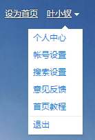
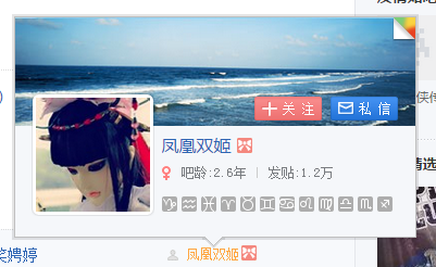
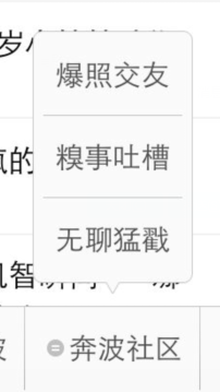
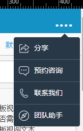

The so-called bubble component here refers to the list bubble component. Here we will discuss its dom implementation, css implementation, and js implementation. Finally, we will explain some details. I hope it will be useful to everyone
Xiaochai is new to CSS recently. Here is a special topic to help improve her own CSS. The article has many problems and optimization points. Please give me your guidance
Component classificationAs far as the bubble component is concerned, it still belongs to the "pop-up layer" type component, which means that it will have these characteristics:
① Layout is out of document flow
② You can have a mask, and you can configure whether the click mask is turned off
③ Optional features include clicking the browser back to close the component and the animation display and hide animation features
The more different ones are:
① Not centered
② has an arrow mark and can be set up or down
③ Because there is an arrow, and this arrow is relative to an element, in a general sense our task is relative to a button, so it is said to have a triggerEL
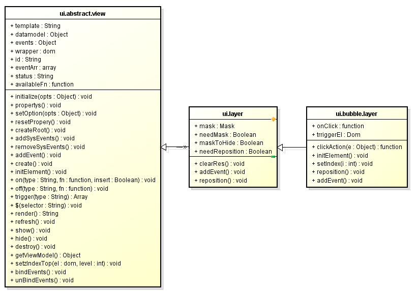
So based on the discussion here, our component is called BubbleLayer, which should inherit from a general Layer
However, as far as Layer is concerned, it will at least have the following general characteristics:
① Create——create
② Show——show
③ Hide——hide
④ Destroy——destroy
The above features are not unique to the Layer component, but are unique to all components, so there should be an abstract component of AbstractView on top of the Layer
The inheritance relationship is now revealed. Putting aside the redundant interfaces, it is simply as follows:
From the perspective of DOM implementation, a simple ul can actually complete the task
Of course there must be something relevant here The css
The effect formed so far is purple drops:

这个时候在为其加一个伪类,做点样式上的调整,便基本实现了,这里用到了伪类的知识点:
这里设置了一个绝对定位的矩形框,为其两个边框设置了值,然后变形偏斜45度形成小三角,然后大家都知道了
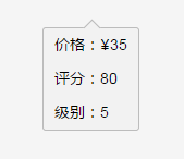
http://sandbox.runjs.cn/show/9ywitfn8
Defects and ExtensionsAs a basic implementation, there is no problem with the above, but its actual application scenarios will have the following shortcomings:
① The basic ul level requires a wrapping layer. The wrapping layer has an up or down class, and then determines whether the arrow is up or down
② We cannot use pseudo-classes here. The reason is that our small triangle label is not necessarily in the middle. It has certain sliding characteristics. In other words, this small triangle needs to be controlled by js to its left and right positions. He needs is a tag
Based on the above, our structure seems to be like this:
① On the root element, we can set the current style of up or down
② The i tag selects whether to go up or down based on the up or down of the root element, and the tag can be operated by js
At this point, it seems that the entire component is relatively complete, but the real situation is not like this. What can I say, the above structure is too limited
This component needs a container, and the container label should be located above ul. At this time, the DOM structure loaded inside the container can be not ul but some other structure
Secondly, on mobile phones, our visible items will not exceed 5 on 4S phones, often 4, so we should set scrollable attributes like overflow on its container
Component return·Final structureFrom the above, based on the fact that it is inherited from Layer, we can form such a structure:
This It can also be the basic structure of our entire pop-up layer class. We can make many extensions on this, but we won’t go into too much detail here and will only discuss the bubble component
As for the bubble component, its structure is:
JS level implementation
This is still the inheritance mechanism used in blade. If there are students who don’t understand and are interested, please go to: [Blade’s UI Design] Understand front-end MVC and layering ideas
About templatesBecause the topic of our section is related to refactoring, our focus here is CSS. We first generate our template:
here Several key customization points are given:
① wrapperClass is used to add a class customized by the business team to change the class of the root element. The advantage of this is that it is convenient for the business team to customize the style of the bubble component
② The customizable className of the project list Ul is given. The general purpose is just to facilitate the business team to make style changes
③ By default, the name field of the incoming item is returned, but the user can pass in an itemFn callback to customize the return
The above template can basically meet the conditions. If not, the entire template can be passed in as a parameter
About js implementationDue to the implementation of inheritance, most of our work has already been done, we only need to write code in a few key places
this.datamodel = {
data: [],
wrapperClass: 'cui-bubble-layer',
upClass: 'cui-pop--triangle-up',
downClass: 'cui-pop--triangle-down',
curClass: 'active',
itemStyleClass: '',
needBorder: true,
index: -1,
dir: 'up' //箭头方向默认值
};
this.events = {
'click .cui-pop-list>li': 'clickAction'
};
this.onClick = function (data, index, el, e) {
console.log(arguments);
// this.setIndex(index);
};
this.width = null;
//三角图标偏移量
this.triangleLeft = null;
this.triangleRight = null;
this.triggerEl = null;
},
initialize: function ($super, opts) {
$super(opts);
},
createRoot: function (html) {
this.$el = $(html).hide().attr('id', this.id);
},
clickAction: function (e) {
var el = $(e.currentTarget);
var i = el.attr('data-index');
var data = this.datamodel.data[i];
this.onClick.call(this, data, i, el, e);
},
initElement: function () {
this.el = this.$el;
this.triangleEl = this.$('.cui-pop-triangle');
this.windowWidth = $(window).width();
},
setIndex: function (i) {
var curClass = this.datamodel.curClass;
i = parseInt(i);
if (i < 0 || i > this.datamodel.data.length || i == this.datamodel.index) return;
this.datamodel.index = i;
//这里不以datamodel改变引起整个dom变化了,不划算
this.$('.cui-pop-list li').removeClass(curClass);
this.$('li[data-index="' i '"]').addClass(curClass);
},
//位置定位
reposition: function () {
if (!this.triggerEl) return;
var offset = this.triggerEl.offset();
var step = 6, w = offset.width - step;
var top = 0, left = 0, right;
if (this.datamodel.dir == 'up') {
top = (offset.top offset.height 8) 'px';
} else {
top = (offset.top - this.el.offset().height - 8) 'px';
}
left = (offset.left 2) 'px';
if (offset.left (parseInt(this.width) || w) > this.windowWidth) {
this.el.css({
width: this.width || w,
top: top,
right: '2px'
});
} else {
this.el.css({
width: this.width || w,
top: top,
left: left
});
}
if (this.triangleLeft) {
this.triangleEl.css({ 'left': this.triangleLeft, 'right': 'auto' });
}
if (this.triangleRight) {
this.triangleEl.css({ 'right': this.triangleRight, 'left': 'auto' });
}
},
addEvent: function ($super) {
$super();
this.on('onCreate', function () {
this.$el.removeClass('cui-layer');
this.$el.css({ position: 'absolute' });
});
this.on('onShow', function () {
this.setzIndexTop(this.el);
});
}
});
});
Slightly modify it to form another look:
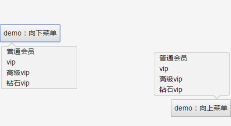
It’s just that we still have to consider the occurrence of this scenario. When there are too many projects and they are too long, we still need to deal with them:
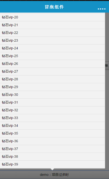
There are many ways to deal with this. The first is to directly pass in maxHeight. If the height exceeds, a scroll bar will appear. The second is to dynamically calculate it inside the component and check the relationship between the component and the visible area
Let’s use the visible area calculation here, so we made some modifications to the original components and added an interface:
This simple interface can actually be divided into several paragraphs of implementation
The first interface is to detect the visible area, which can be overridden by the user
The second interface is the processing logic when the first interface returns true if the visible area is exceeded
Considering that the excess is not necessarily the height, the height here is changed to Size
Of course, there will be resource destruction work here, so a new hide interface will be added
handleSizeOverflow: function () {
if (!this.isSizeOverflow()) return;
this.listWrapper.css({
height: (parseInt(this.windowHeight * 0.8) 'px'),
overflow: 'hidden',
position: 'relative'
});
this.listEl.css({ position: 'absolute', width: '100%' });
//The position needs to be reset before calling
this.reposition();
this.scroll = new UIScroll({
wrapper: this.listWrapper,
scroller: this.listEl
});
},
checkSizeOverflow: function () {
this.handleSizeOverflow();
},
addEvent: function ($super) {
$super();
this.on('onCreate', function () {
this.$el.removeClass('cui-layer' );
this.$el.css({ position: 'absolute' });
});
this.on('onShow', function () {
//Check whether the visible area is exceeded;
this.checkSizeOverflow();
this.setzIndexTop(this.el);
});
this.on('onHide' , function () {
if (this.scroll) this.scroll.destroy();
});
}
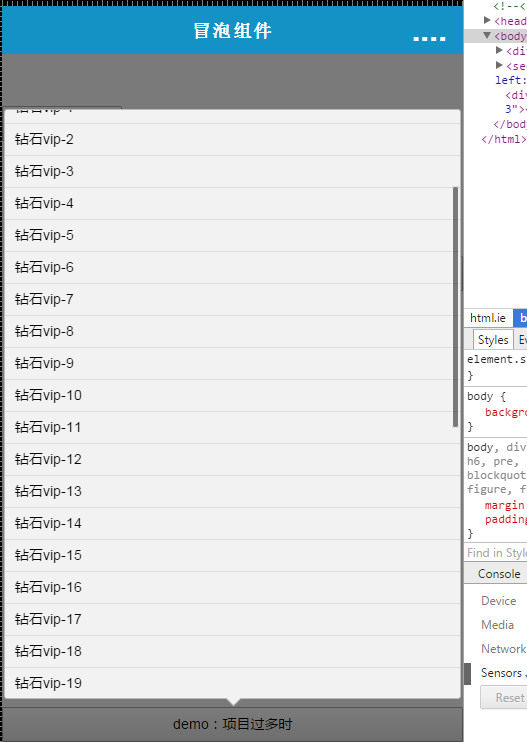
At this point, our function is basically over. Finally, we implement a more customized function to turn our bubble component into black:
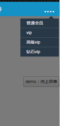
Today’s study ends here, because Xiaochai CSS3 is considered a beginner. If there are any errors in the article, please report
Since the animation of this component, I plan to use the Layer base class. Instead, I will introduce the animation technology of CSS3, which will not be introduced here
 css3 tutorial
 What are the production methods of html5 animation production?
 What are the css3 gradient properties?
 The difference between HTML and HTML5
 What are the components of a linux system?
 504 Gateway Time out causes and solutions
 Flutter framework advantages and disadvantages
 The difference between gateway and router


