
 Backend Development
Python Tutorial
Python-matplotlib | Draw dual y-axis graphics (legend settings)
Backend Development
Python Tutorial
Python-matplotlib | Draw dual y-axis graphics (legend settings)
Python-matplotlib | Draw dual y-axis graphics (legend settings)

df = pd.read_csv('jobdata.csv')
colors = ["#51C1C8", "#536D84","#E96279"]
plt.figure(figsize=(16, 8))
ax1 = plt.subplot(111)
ax1.set_ylim(0,1200)
lin0 = ax1.plot(x_data, y_data1, marker='o', color=colors[0], label='岗位数量')
for x, y in enumerate(y_data1):
plt.text(x - 0.2, y+5, y)
ax1.set_ylabel('岗位数量',fontsize=12)
plt.legend()
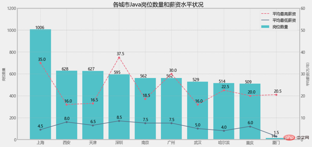
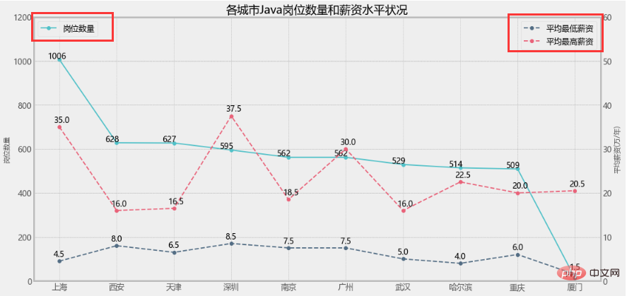
plt.title("各城市Java岗位数量")
plt.show()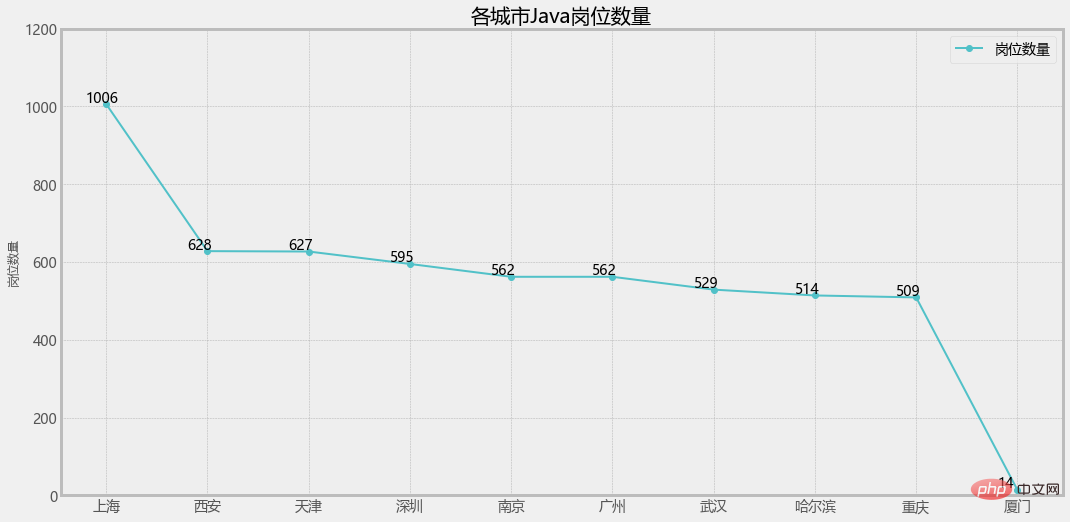
# 增加y轴
ax2 = ax1.twinx()

ax2.set_ylim(0,60)
lin1 = ax2.plot(x_data, y_data2, linestyle='--', marker='o', c=colors[1], label='平均最低薪资')
for x, y in enumerate(y_data2):
    plt.text(x - 0.1, y+1, y)
lin2 = ax2.plot(x_data, y_data3, linestyle='--', marker='o', c=colors[2], label='平均最高薪资')
for x, y in enumerate(y_data3):
    plt.text(x - 0.1, y+1, y)
ax2.set_ylabel('平均薪资(万/年)',fontsize=12)
plt.legend()
plt.title("各城市Java岗位数量和薪资水平状况")
plt.show()3. 单独设置图例
ax1.legend(loc='best')
ax2.legend(loc='best')
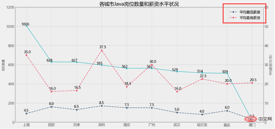
ax1.legend(loc=2)
ax2.legend(loc=1)
这样看就比较直观了,但是我就想把三个图例放一起不可以吗?
当然可以!
3. 设置组合图例
lines = lin0+lin1+lin2
labs = [label.get_label() for label in lines]
plt.legend(lines,labs)
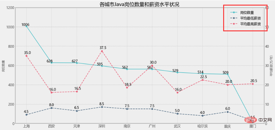
大功告成!
但是!如果是柱状图+折线图的情况,效果还一样吗?
但是!如果是柱状图+折线图的情况,效果还一样吗?
但是!如果是柱状图+折线图的情况,效果还一样吗?
1. 修改岗位数量为柱状图
plt.figure(figsize=(16, 8))
a1 = plt.subplot(111)
a1.set_ylim(0,1200)
bar = a1.bar(x_data, y_data1, color=colors[0], label='岗位数量')
for x, y in enumerate(y_data1):
    plt.text(x - 0.2, y+5, y)
a1.set_ylabel('岗位数量',fontsize=12)

...

lines = bar+lin1+lin2
labs = [label.get_label() for label in lines]
plt.legend(lines,labs)直接报错了!

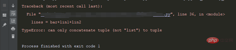
The prompt type is inconsistent. It is obviously a problem with the type of bar and line. Let’s check the source code:
matplotlib.axes.Axes.plot:
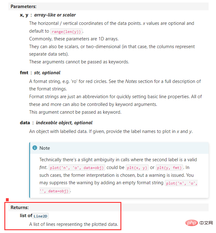
matplotlib.axes.Axes.bar:
2. 设置Line2D和patches的组合图例
legend_handles = [
    Line2D([], [], linewidth=1, ls='--', lw=2, c=colors[2], label='平均最高薪资'),
    Line2D([], [], linewidth=1, lw=2, c=colors[1], label='平均最低薪资'),
    patches.Rectangle((0, 0), 1, 1, facecolor=colors[0],label='岗位数量')
]
plt.legend(handles=legend_handles, loc='best', fontsize=14)
The above is the detailed content of Python-matplotlib | Draw dual y-axis graphics (legend settings). For more information, please follow other related articles on the PHP Chinese website!

Hot AI Tools

Undresser.AI Undress
AI-powered app for creating realistic nude photos

AI Clothes Remover
Online AI tool for removing clothes from photos.

Undress AI Tool
Undress images for free

Clothoff.io
AI clothes remover

AI Hentai Generator
Generate AI Hentai for free.

Hot Article
Hot Tools

Notepad++7.3.1
Easy-to-use and free code editor

SublimeText3 Chinese version
Chinese version, very easy to use

Zend Studio 13.0.1
Powerful PHP integrated development environment

Dreamweaver CS6
Visual web development tools

SublimeText3 Mac version
God-level code editing software (SublimeText3)
Hot Topics
 1382
1382
 52
52

 PHP and Python: Code Examples and Comparison
Apr 15, 2025 am 12:07 AM
PHP and Python: Code Examples and Comparison
Apr 15, 2025 am 12:07 AM
PHP and Python have their own advantages and disadvantages, and the choice depends on project needs and personal preferences. 1.PHP is suitable for rapid development and maintenance of large-scale web applications. 2. Python dominates the field of data science and machine learning.
 How is the GPU support for PyTorch on CentOS
Apr 14, 2025 pm 06:48 PM
How is the GPU support for PyTorch on CentOS
Apr 14, 2025 pm 06:48 PM
Enable PyTorch GPU acceleration on CentOS system requires the installation of CUDA, cuDNN and GPU versions of PyTorch. The following steps will guide you through the process: CUDA and cuDNN installation determine CUDA version compatibility: Use the nvidia-smi command to view the CUDA version supported by your NVIDIA graphics card. For example, your MX450 graphics card may support CUDA11.1 or higher. Download and install CUDAToolkit: Visit the official website of NVIDIACUDAToolkit and download and install the corresponding version according to the highest CUDA version supported by your graphics card. Install cuDNN library:
 Detailed explanation of docker principle
Apr 14, 2025 pm 11:57 PM
Detailed explanation of docker principle
Apr 14, 2025 pm 11:57 PM
Docker uses Linux kernel features to provide an efficient and isolated application running environment. Its working principle is as follows: 1. The mirror is used as a read-only template, which contains everything you need to run the application; 2. The Union File System (UnionFS) stacks multiple file systems, only storing the differences, saving space and speeding up; 3. The daemon manages the mirrors and containers, and the client uses them for interaction; 4. Namespaces and cgroups implement container isolation and resource limitations; 5. Multiple network modes support container interconnection. Only by understanding these core concepts can you better utilize Docker.
 Python vs. JavaScript: Community, Libraries, and Resources
Apr 15, 2025 am 12:16 AM
Python vs. JavaScript: Community, Libraries, and Resources
Apr 15, 2025 am 12:16 AM
Python and JavaScript have their own advantages and disadvantages in terms of community, libraries and resources. 1) The Python community is friendly and suitable for beginners, but the front-end development resources are not as rich as JavaScript. 2) Python is powerful in data science and machine learning libraries, while JavaScript is better in front-end development libraries and frameworks. 3) Both have rich learning resources, but Python is suitable for starting with official documents, while JavaScript is better with MDNWebDocs. The choice should be based on project needs and personal interests.
 MiniOpen Centos compatibility
Apr 14, 2025 pm 05:45 PM
MiniOpen Centos compatibility
Apr 14, 2025 pm 05:45 PM
MinIO Object Storage: High-performance deployment under CentOS system MinIO is a high-performance, distributed object storage system developed based on the Go language, compatible with AmazonS3. It supports a variety of client languages, including Java, Python, JavaScript, and Go. This article will briefly introduce the installation and compatibility of MinIO on CentOS systems. CentOS version compatibility MinIO has been verified on multiple CentOS versions, including but not limited to: CentOS7.9: Provides a complete installation guide covering cluster configuration, environment preparation, configuration file settings, disk partitioning, and MinI
 How to operate distributed training of PyTorch on CentOS
Apr 14, 2025 pm 06:36 PM
How to operate distributed training of PyTorch on CentOS
Apr 14, 2025 pm 06:36 PM
PyTorch distributed training on CentOS system requires the following steps: PyTorch installation: The premise is that Python and pip are installed in CentOS system. Depending on your CUDA version, get the appropriate installation command from the PyTorch official website. For CPU-only training, you can use the following command: pipinstalltorchtorchvisiontorchaudio If you need GPU support, make sure that the corresponding version of CUDA and cuDNN are installed and use the corresponding PyTorch version for installation. Distributed environment configuration: Distributed training usually requires multiple machines or single-machine multiple GPUs. Place
 How to choose the PyTorch version on CentOS
Apr 14, 2025 pm 06:51 PM
How to choose the PyTorch version on CentOS
Apr 14, 2025 pm 06:51 PM
When installing PyTorch on CentOS system, you need to carefully select the appropriate version and consider the following key factors: 1. System environment compatibility: Operating system: It is recommended to use CentOS7 or higher. CUDA and cuDNN:PyTorch version and CUDA version are closely related. For example, PyTorch1.9.0 requires CUDA11.1, while PyTorch2.0.1 requires CUDA11.3. The cuDNN version must also match the CUDA version. Before selecting the PyTorch version, be sure to confirm that compatible CUDA and cuDNN versions have been installed. Python version: PyTorch official branch
 How to install nginx in centos
Apr 14, 2025 pm 08:06 PM
How to install nginx in centos
Apr 14, 2025 pm 08:06 PM
CentOS Installing Nginx requires following the following steps: Installing dependencies such as development tools, pcre-devel, and openssl-devel. Download the Nginx source code package, unzip it and compile and install it, and specify the installation path as /usr/local/nginx. Create Nginx users and user groups and set permissions. Modify the configuration file nginx.conf, and configure the listening port and domain name/IP address. Start the Nginx service. Common errors need to be paid attention to, such as dependency issues, port conflicts, and configuration file errors. Performance optimization needs to be adjusted according to the specific situation, such as turning on cache and adjusting the number of worker processes.
