
 Backend Development
Python Tutorial
Unexpectedly, Python can also create web visualization pages!
Backend Development
Python Tutorial
Unexpectedly, Python can also create web visualization pages!
Unexpectedly, Python can also create web visualization pages!

#When it comes to Web pages, perhaps the first thing that comes to mind is HTML, CSS or JavaScript.
This time Xiao F will introduce to you how to use Python to create a data visualization web page, using Streamlit library.
Easily convert an Excel data file into a Web page for everyone to view online.
whenever You make changes to the Excel file and save it, and the web page can be updated in real time, which is really good.
Streamlit’s documentation and tutorial addresses are as follows.
https://docs.streamlit.io/en/stable/
https://streamlit.io/gallery
Relevant API usage can be viewed in the documentation, which has detailed explanations.
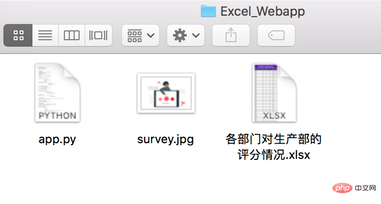
The project has three files in total, program, picture, and Excel table data.
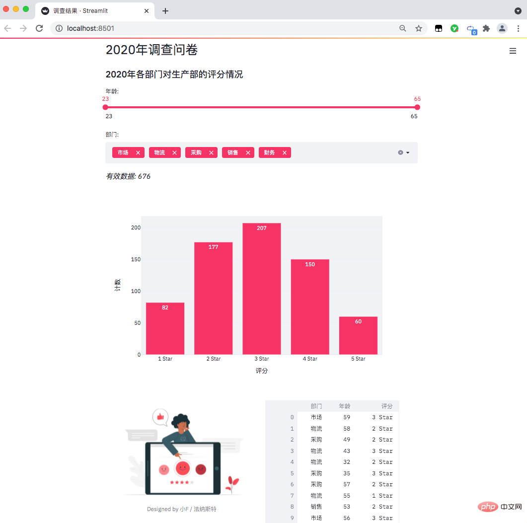
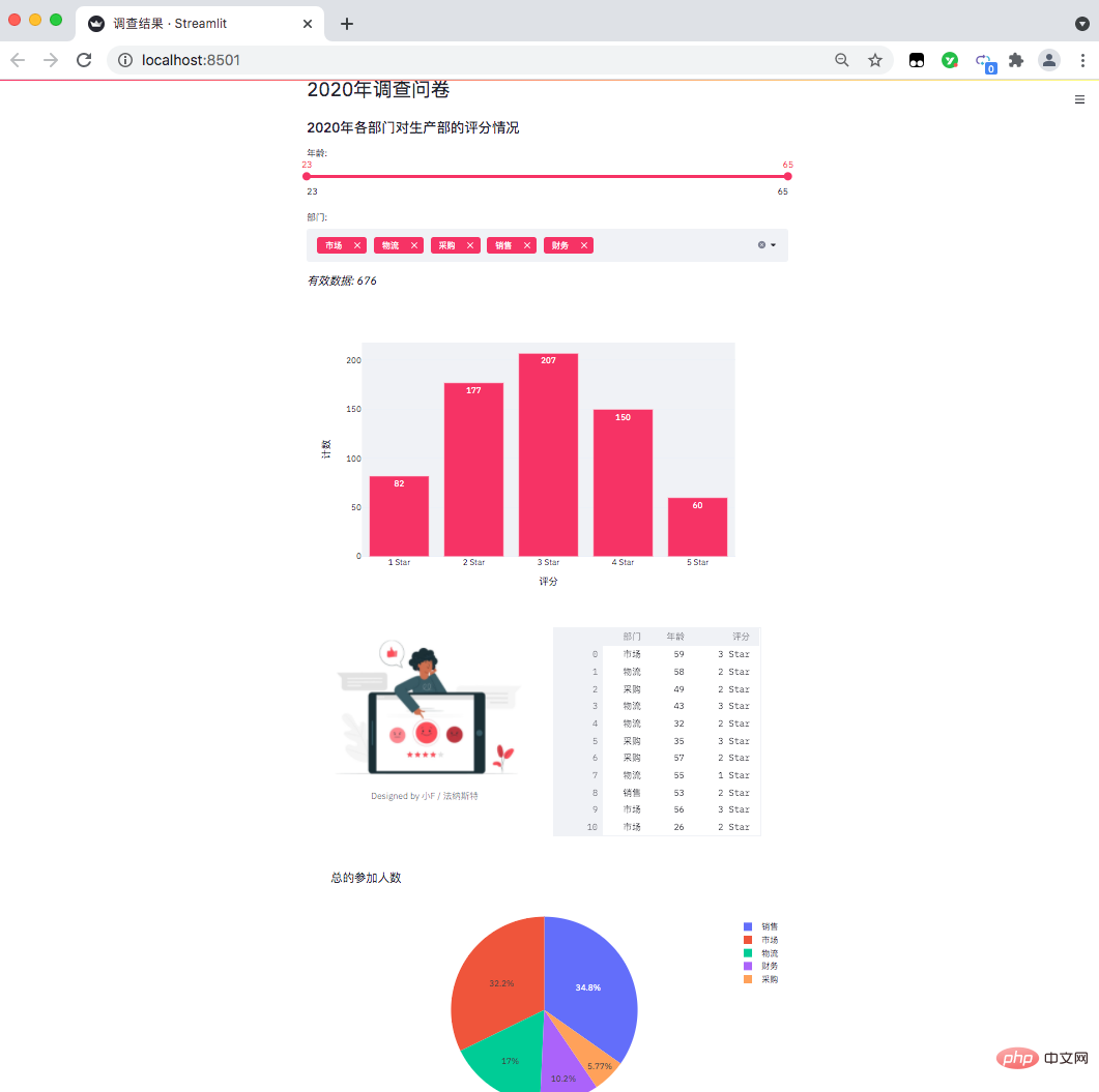
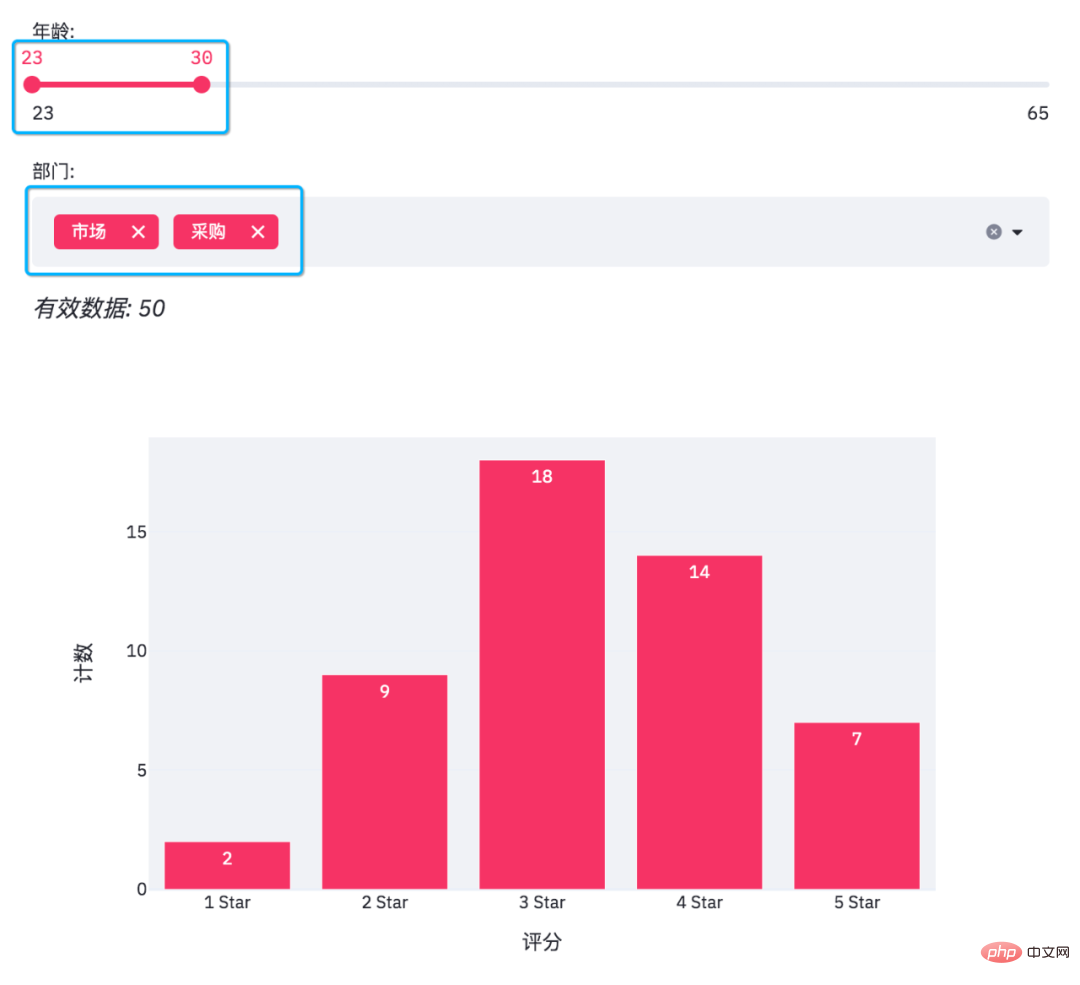
##The data situation is as follows, a company’s year-end questionnaire survey (fictitious data), the scores of relevant departments on the work collaboration of the production department.
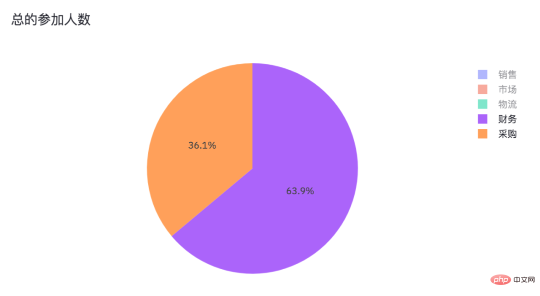
Because our data files are in xlsx format, the latest version of xlrd only supports xls files. So you need to specify the xlrd version as 1.2.0 so that pandas can successfully read the data. Command line terminal launches the web page. #If it does not pop up automatically, You can directly access the address in the picture above. The result is as follows, a data visualization webpage comes out. It can be accessed and viewed locally. If you want to put it online, you can deploy it through the server. You need to study it by yourself~ 导入相关的Python包,pandas处理数据,streamlit用来生成网页,plotly.express则是生成图表,PIL读取图片。 设置了网页名称,以及网页里的标题和子标题。 读取Excel表格数据,并且得出年龄分布以及部门情况,一共是有5个部门。 添加滑动条和多重选择的数据选项。 结果如下。 年龄是从23至65,部门则是市场、物流、采购、销售、财务这几个。 由于滑动条和多重选择是可变的,需要根据过滤条件得出最终数据。 得到数据便可以绘制柱状图了。 使用plotly绘制柱状图。 当我们在网页调整选项时,有效数据和柱状图也会随之变化。 此外streamlit还可以给网页添加图片和交互式表格。 得到结果如下。 可以看到表格有一个滑动条,可以使用鼠标滚轮滚动查看。 最后便是绘制一个饼图啦! 结果如下。 各部门参加问卷调查的人数,也是一个可以交互的图表。 Cancel sales, marketing, and logistics, and we can see that finance and procurement The proportion of people who participated in the questionnaire survey. # 安装streamlit
pip install streamlit -i https://mirror.baidu.com/pypi/simple/
# 安装Plotly Express
pip install plotly_express==0.4.0 -i https://mirror.baidu.com/pypi/simple/
# 安装xlrd
pip install xlrd==1.2.0 -i https://mirror.baidu.com/pypi/simple/
# 命令行终端打开文件所在路径
cd Excel_Webapp

# 运行网页
streamlit run app.py
## Let’s take a look at the specific code. import pandas as pd
import streamlit as st
import plotly.express as px
from PIL import Image
# 设置网页名称
st.set_page_config(page_title='调查结果')
# 设置网页标题
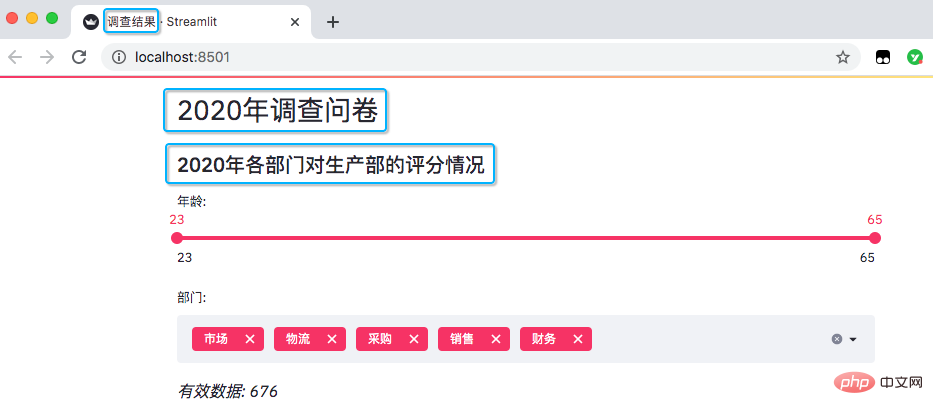
st.header('2020年调查问卷')
# 设置网页子标题
st.subheader('2020年各部门对生产部的评分情况')
# 读取数据
excel_file = '各部门对生产部的评分情况.xlsx'
sheet_name = 'DATA'

df = pd.read_excel(excel_file,
                   sheet_name=sheet_name,
                   usecols='B:D',
                   header=3)

# 此处为各部门参加问卷调查人数
df_participants = pd.read_excel(excel_file,
                                sheet_name=sheet_name,
                                usecols='F:G',
                                header=3)
df_participants.dropna(inplace=True)

# streamlit的多重选择(选项数据)
department = df['部门'].unique().tolist()
# streamlit的滑动条(年龄数据)
ages = df['年龄'].unique().tolist()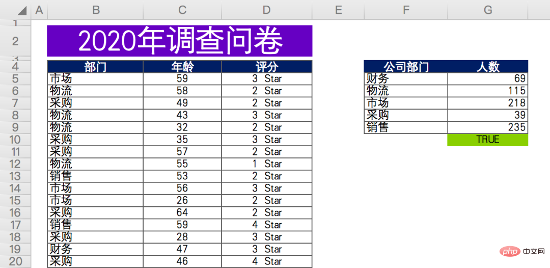
# 滑动条, 最大值、最小值、区间值
age_selection = st.slider('年龄:',
                          min_value=min(ages),
                          max_value=max(ages),
                          value=(min(ages), max(ages)))

# 多重选择, 默认全选
department_selection = st.multiselect('部门:',
                                      department,
                                      default=department)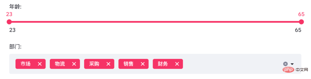
# 根据选择过滤数据
mask = (df['年龄'].between(*age_selection)) & (df['部门'].isin(department_selection))
number_of_result = df[mask].shape[0]

# 根据筛选条件, 得到有效数据
st.markdown(f'*有效数据: {number_of_result}*')

# 根据选择分组数据
df_grouped = df[mask].groupby(by=['评分']).count()[['年龄']]
df_grouped = df_grouped.rename(columns={'年龄': '计数'})
df_grouped = df_grouped.reset_index()# 绘制柱状图, 配置相关参数
bar_chart = px.bar(df_grouped,
x='评分',
y='计数',
text='计数',
color_discrete_sequence=['#F63366']*len(df_grouped),
template='plotly_white')
st.plotly_chart(bar_chart)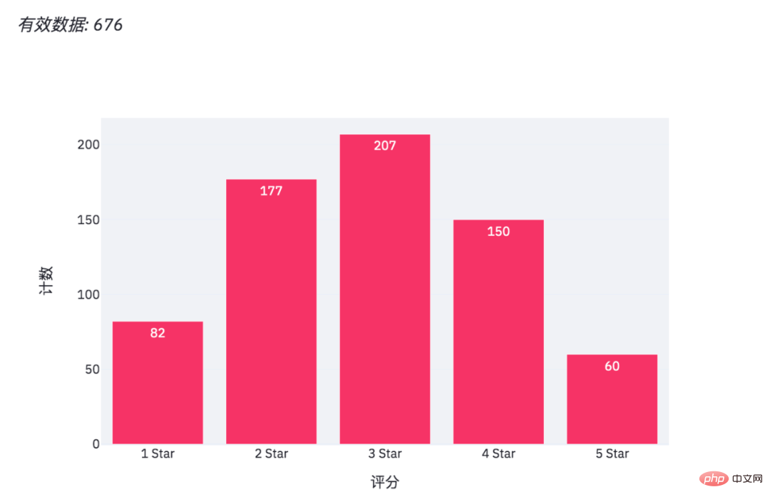
# 添加图片和交互式表格
col1, col2 = st.beta_columns(2)
image = Image.open('survey.jpg')
col1.image(image,
           caption='Designed by 小F / 法纳斯特',
           use_column_width=True)
col2.dataframe(df[mask], width=300)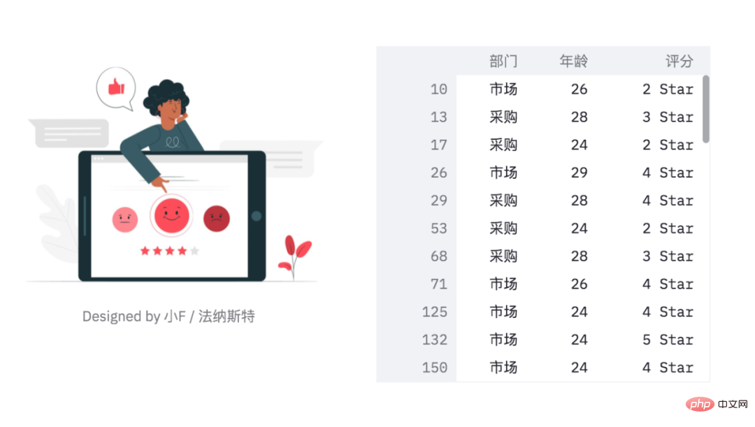
# 绘制饼图
pie_chart = px.pie(df_participants,
                   title='总的参加人数',
                   values='人数',
                   names='公司部门')
st.plotly_chart(pie_chart)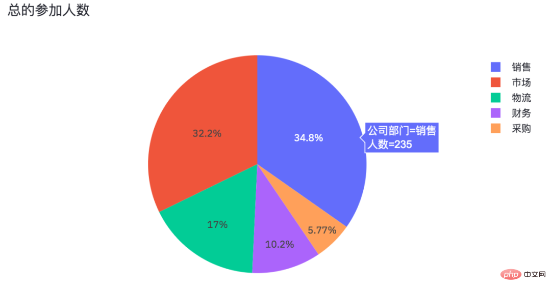
The above is the detailed content of Unexpectedly, Python can also create web visualization pages!. For more information, please follow other related articles on the PHP Chinese website!

Hot AI Tools

Undresser.AI Undress
AI-powered app for creating realistic nude photos

AI Clothes Remover
Online AI tool for removing clothes from photos.

Undress AI Tool
Undress images for free

Clothoff.io
AI clothes remover

AI Hentai Generator
Generate AI Hentai for free.

Hot Article
Hot Tools

Notepad++7.3.1
Easy-to-use and free code editor

SublimeText3 Chinese version
Chinese version, very easy to use

Zend Studio 13.0.1
Powerful PHP integrated development environment

Dreamweaver CS6
Visual web development tools

SublimeText3 Mac version
God-level code editing software (SublimeText3)
Hot Topics
 1378
1378
 52
52

 The 2-Hour Python Plan: A Realistic Approach
Apr 11, 2025 am 12:04 AM
The 2-Hour Python Plan: A Realistic Approach
Apr 11, 2025 am 12:04 AM
You can learn basic programming concepts and skills of Python within 2 hours. 1. Learn variables and data types, 2. Master control flow (conditional statements and loops), 3. Understand the definition and use of functions, 4. Quickly get started with Python programming through simple examples and code snippets.
 Python: Exploring Its Primary Applications
Apr 10, 2025 am 09:41 AM
Python: Exploring Its Primary Applications
Apr 10, 2025 am 09:41 AM
Python is widely used in the fields of web development, data science, machine learning, automation and scripting. 1) In web development, Django and Flask frameworks simplify the development process. 2) In the fields of data science and machine learning, NumPy, Pandas, Scikit-learn and TensorFlow libraries provide strong support. 3) In terms of automation and scripting, Python is suitable for tasks such as automated testing and system management.
 Navicat's method to view MongoDB database password
Apr 08, 2025 pm 09:39 PM
Navicat's method to view MongoDB database password
Apr 08, 2025 pm 09:39 PM
It is impossible to view MongoDB password directly through Navicat because it is stored as hash values. How to retrieve lost passwords: 1. Reset passwords; 2. Check configuration files (may contain hash values); 3. Check codes (may hardcode passwords).
 How to use AWS Glue crawler with Amazon Athena
Apr 09, 2025 pm 03:09 PM
How to use AWS Glue crawler with Amazon Athena
Apr 09, 2025 pm 03:09 PM
As a data professional, you need to process large amounts of data from various sources. This can pose challenges to data management and analysis. Fortunately, two AWS services can help: AWS Glue and Amazon Athena.
 How to start the server with redis
Apr 10, 2025 pm 08:12 PM
How to start the server with redis
Apr 10, 2025 pm 08:12 PM
The steps to start a Redis server include: Install Redis according to the operating system. Start the Redis service via redis-server (Linux/macOS) or redis-server.exe (Windows). Use the redis-cli ping (Linux/macOS) or redis-cli.exe ping (Windows) command to check the service status. Use a Redis client, such as redis-cli, Python, or Node.js, to access the server.
 How to read redis queue
Apr 10, 2025 pm 10:12 PM
How to read redis queue
Apr 10, 2025 pm 10:12 PM
To read a queue from Redis, you need to get the queue name, read the elements using the LPOP command, and process the empty queue. The specific steps are as follows: Get the queue name: name it with the prefix of "queue:" such as "queue:my-queue". Use the LPOP command: Eject the element from the head of the queue and return its value, such as LPOP queue:my-queue. Processing empty queues: If the queue is empty, LPOP returns nil, and you can check whether the queue exists before reading the element.
 How to view server version of Redis
Apr 10, 2025 pm 01:27 PM
How to view server version of Redis
Apr 10, 2025 pm 01:27 PM
Question: How to view the Redis server version? Use the command line tool redis-cli --version to view the version of the connected server. Use the INFO server command to view the server's internal version and need to parse and return information. In a cluster environment, check the version consistency of each node and can be automatically checked using scripts. Use scripts to automate viewing versions, such as connecting with Python scripts and printing version information.
 How secure is Navicat's password?
Apr 08, 2025 pm 09:24 PM
How secure is Navicat's password?
Apr 08, 2025 pm 09:24 PM
Navicat's password security relies on the combination of symmetric encryption, password strength and security measures. Specific measures include: using SSL connections (provided that the database server supports and correctly configures the certificate), regularly updating Navicat, using more secure methods (such as SSH tunnels), restricting access rights, and most importantly, never record passwords.
