A grid arranges content in a row and column layout. The same goes for CSS grids.
Set grid items as flexible containers−
display: flex
To center vertically and horizontally, use −
align-items: center;
justify-content: center;
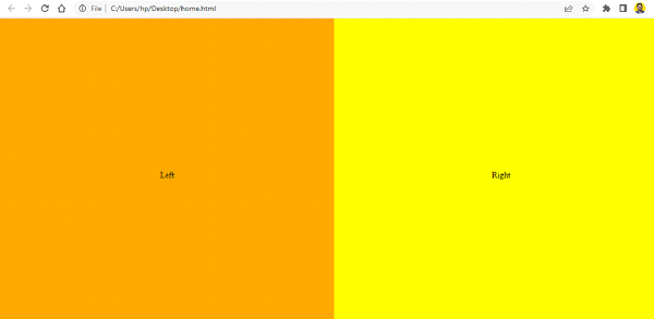
Let’s look at a complete example −
<!DOCTYPE html>
<html>
<head>
   <title>Grid and Flex Example</title>
   <style>
      html,body {
         margin: 0;
         padding: 0;
      }

      .box {
         display: grid;
         grid-template-columns: 1fr 1fr;
         grid-template-rows: 100vh;
      }

      .first,
      .second {
         display: flex;
         align-items: center;
         justify-content: center;
      }

      .first {
         background-color: orange;
      }

      .second {
         background-color: yellow;
      }
   </style>
</head>
<body>
   <div class="box">
      <div class="first">Left</div>
      <div class="second">Right</div>
   </div>
</body>
</html>

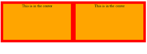
We can also center without using Flex. We set the grid container to display: grid. When the display attribute is set to grid, the HTML element becomes a grid container -
grid-container {
   display: grid;
   grid-template-columns: 1fr 1fr;
   grid-auto-rows: 150px;
   grid-gap: 20px;
}
Grid items use relative positioning settings -
grid-item {
   position: relative;
   text-align: center;
}
However,
<!DOCTYPE html>
<html>
<head>
   <title>Grid</title>
   <style>
      grid-container {
         display: grid;
         grid-template-columns: 1fr 1fr;
         grid-auto-rows: 150px;
         grid-gap: 20px;
      }

      grid-item {
         position: relative;
         text-align: center;
      }

      grid-container {
         background-color: red;
         padding: 10px;
      }

      grid-item {
         background-color: orange;
      }
   </style>
</head>
<body>
   <grid-container>
      <grid-item>This is in the center</grid-item>
      <grid-item>This is in the center</grid-item>
   </grid-container>
</body>
</html>

The above is the detailed content of How to center in CSS Grid?. For more information, please follow other related articles on the PHP Chinese website!
 Which mobile phone models does Hongmeng OS 3.0 support?
 A memory that can exchange information directly with the CPU is a
 Dual graphics card notebook
 The role of index.html
 webstorm adjust font size
 webservice calling method
 Introduction to carriage return and line feed characters in java
 Learn C# from scratch
 How to apply for registration of email address


