

Explaining how modal windows work in React Native

Modal components help to display content views above UI content.
The basic modal components are as follows-
<Modal animationType="slide" transparent={true} visible={modalVisible} onRequestClose={() => { Alert.alert("Modal has been closed."); }}> Your Content Here</Modal>To use the modal component, you need to import it first, as shown below-
import { Modal } from "react-native";The basic properties of the modal window are as follows-
| Sr.No | Props and instructions |
|---|---|
| 1 | < strong>animationType This property handles the displayed animation Modal window. It is an enumeration with three values − Slide, Fade and None. |
| 2 | onDismiss This property accepts a function that will be called When the modal window is closed. |
| 3 | onOrientationChange Callback function called when the device starts When a modal window changes orientation show. |
| 4 | onShow The function passed as the prop value is called When showing a modal window. |
| 5 | presentationStyle This property handles the display of the modal box window. Available values are full screen, pageSheet, formSheet and overFullScreen. |
| 6 | Transparent This prop will determine whether to provide a transparent view or fill The entire view of the modal window. |
| 7 | visibile< p>This property will determine whether your modal window is Visible or invisible. |
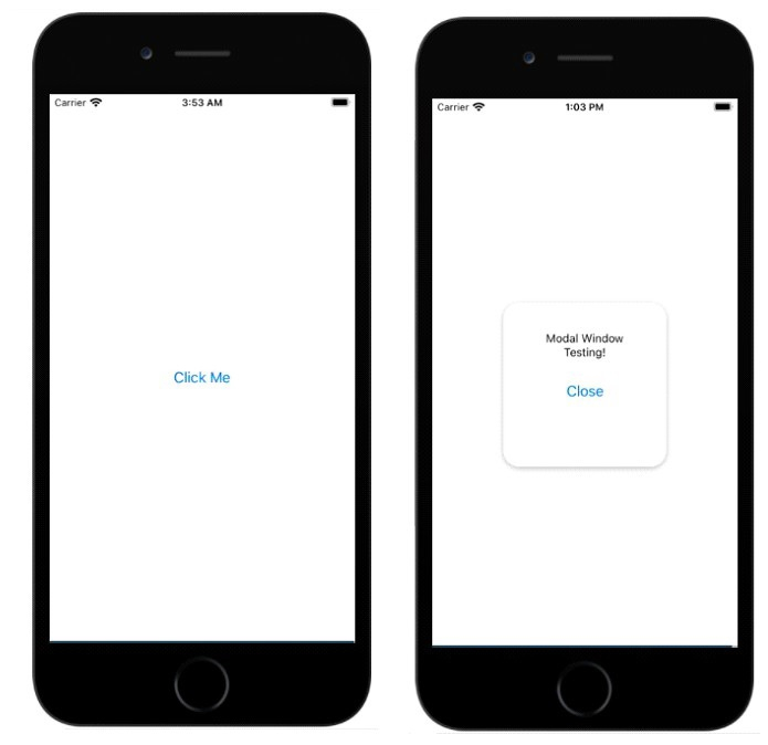
Example 1: Show modal window display
To use a modal component, you need to import it first as shown below -
import { Modal } from "react-native";To display a modal window, you can decide the animation to be displayed on it. Options are Slide, Fade, and None. In the following example, we want to display a simple modal window with text and buttons as shown below -
<Modal
animationType="slide"
transparent={true}
visible={isVisible}
>
<View style={styles.centeredView}>
<View style={styles.myModal}>
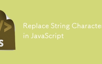
<Text style={styles.modalText}>Modal Window Testing!</Text>
<Button style={styles.modalButton} title="Close" onPress={() => {setModalVisiblility(false); }}/>
</View>
</View>
</Modal>isVisible variable is assigned to the visible property. Defaults to false, i.e. modal windows will not be shown by default. The isVisible property is initialized as follows -
const [isVisible, setModalVisiblility] = useState(false);
setModalVisiblility will update the isVisible variable from false to true and vice versa.
To show a modal window,
<View style={styles.centeredView}>
   <Modal
      animationType="slide"
      transparent={true}
      visible={isVisible}
   >
   <View style={styles.centeredView}>
      <View style={styles.myModal}>
         <Text style={styles.modalText}>Modal Window Testing!</Text>
            <Button style={styles.modalButton} title="Close" onPress={() =>{setModalVisiblility(false); }}/>
            </View>
         </View>
      </Modal>
      <Button title="Click Me" onPress={() => {
         setModalVisiblility(true);
      }}
   />
</View>This is the working code to show/hide the modal window.
import React, { useState } from "react";
import { Button, Alert, Modal, StyleSheet, Text, View } from "react-native";
const App = () => {
   const [isVisible, setModalVisiblility] = useState(false);
   return (
      <View style={styles.centeredView}>
         <Modal
            animationType="slide"
            transparent={true}
            visible={isVisible}
         >
         <View style={styles.centeredView}>
            <View style={styles.myModal}>
               <Text style={styles.modalText}>Modal Window Testing!</Text>
                  <Button style={styles.modalButton} title="Close" onPress={() =>{setModalVisiblility(false); }}/>
                  </View>
               </View>
            </Modal>
            <Button title="Click Me" onPress={() => {
               setModalVisiblility(true);
            }}
         />
      </View>
   );
};
const styles = StyleSheet.create({
   centeredView: {
      flex: 1,
      justifyContent: "center",
      alignItems: "center",
      marginTop: 22
   },
   myModal: {
      width:200,
      height:200,
      margin: 20,
      backgroundColor: "white",
      borderRadius: 20,
      padding: 35,
      alignItems: "center",
      shadowColor: "#000",
      shadowOffset: {
         width: 0,
         height: 2
      },
      shadowOpacity: 0.30,
      shadowRadius: 4,
      elevation: 5
   },
   modalText: {
      marginBottom: 20,
      textAlign: "center"
   },
   modalButton: {
      marginBottom: 50,
   }
});
export default App;Output
The above is the detailed content of Explaining how modal windows work in React Native. For more information, please follow other related articles on the PHP Chinese website!

Hot AI Tools

Undresser.AI Undress
AI-powered app for creating realistic nude photos

AI Clothes Remover
Online AI tool for removing clothes from photos.

Undress AI Tool
Undress images for free

Clothoff.io
AI clothes remover

AI Hentai Generator
Generate AI Hentai for free.

Hot Article
Hot Tools

Notepad++7.3.1
Easy-to-use and free code editor

SublimeText3 Chinese version
Chinese version, very easy to use

Zend Studio 13.0.1
Powerful PHP integrated development environment

Dreamweaver CS6
Visual web development tools

SublimeText3 Mac version
God-level code editing software (SublimeText3)
Hot Topics


 Replace String Characters in JavaScript
Mar 11, 2025 am 12:07 AM
Replace String Characters in JavaScript
Mar 11, 2025 am 12:07 AM
Detailed explanation of JavaScript string replacement method and FAQ This article will explore two ways to replace string characters in JavaScript: internal JavaScript code and internal HTML for web pages. Replace string inside JavaScript code The most direct way is to use the replace() method: str = str.replace("find","replace"); This method replaces only the first match. To replace all matches, use a regular expression and add the global flag g: str = str.replace(/fi
 Custom Google Search API Setup Tutorial
Mar 04, 2025 am 01:06 AM
Custom Google Search API Setup Tutorial
Mar 04, 2025 am 01:06 AM
This tutorial shows you how to integrate a custom Google Search API into your blog or website, offering a more refined search experience than standard WordPress theme search functions. It's surprisingly easy! You'll be able to restrict searches to y
 Build Your Own AJAX Web Applications
Mar 09, 2025 am 12:11 AM
Build Your Own AJAX Web Applications
Mar 09, 2025 am 12:11 AM
So here you are, ready to learn all about this thing called AJAX. But, what exactly is it? The term AJAX refers to a loose grouping of technologies that are used to create dynamic, interactive web content. The term AJAX, originally coined by Jesse J
 Example Colors JSON File
Mar 03, 2025 am 12:35 AM
Example Colors JSON File
Mar 03, 2025 am 12:35 AM
This article series was rewritten in mid 2017 with up-to-date information and fresh examples. In this JSON example, we will look at how we can store simple values in a file using JSON format. Using the key-value pair notation, we can store any kind
 10 jQuery Syntax Highlighters
Mar 02, 2025 am 12:32 AM
10 jQuery Syntax Highlighters
Mar 02, 2025 am 12:32 AM
Enhance Your Code Presentation: 10 Syntax Highlighters for Developers Sharing code snippets on your website or blog is a common practice for developers. Choosing the right syntax highlighter can significantly improve readability and visual appeal. T
 8 Stunning jQuery Page Layout Plugins
Mar 06, 2025 am 12:48 AM
8 Stunning jQuery Page Layout Plugins
Mar 06, 2025 am 12:48 AM
Leverage jQuery for Effortless Web Page Layouts: 8 Essential Plugins jQuery simplifies web page layout significantly. This article highlights eight powerful jQuery plugins that streamline the process, particularly useful for manual website creation
 10 JavaScript & jQuery MVC Tutorials
Mar 02, 2025 am 01:16 AM
10 JavaScript & jQuery MVC Tutorials
Mar 02, 2025 am 01:16 AM
This article presents a curated selection of over 10 tutorials on JavaScript and jQuery Model-View-Controller (MVC) frameworks, perfect for boosting your web development skills in the new year. These tutorials cover a range of topics, from foundatio
 What is 'this' in JavaScript?
Mar 04, 2025 am 01:15 AM
What is 'this' in JavaScript?
Mar 04, 2025 am 01:15 AM
Core points This in JavaScript usually refers to an object that "owns" the method, but it depends on how the function is called. When there is no current object, this refers to the global object. In a web browser, it is represented by window. When calling a function, this maintains the global object; but when calling an object constructor or any of its methods, this refers to an instance of the object. You can change the context of this using methods such as call(), apply(), and bind(). These methods call the function using the given this value and parameters. JavaScript is an excellent programming language. A few years ago, this sentence was
