How to implement TabLayout with icons in Android?
TabLayout with icons has become a popular UI component in Android development. It simplifies navigation within the application by providing horizontally laid out tabs. Each tab represents a different category or feature and can be visually enhanced by adding icons. The combination of icons and labels makes it easier for users to understand the purpose of each tab.
By selecting the tab, the corresponding content will be displayed. This is usually done in ViewPager. To implement a TabLayout with icons, you need to create the necessary layout and manage the fragments or activities for each tab's content. It also involves customizing the appearance to suit the design of the application. This navigation solution not only enhances the user experience but also improves the usability of the application by providing a user-friendly and visually appealing interface.
Tab layout
TabLayout is a UI component in the Android framework that provides users with a user-friendly way to work with horizontally laid out tabs. This versatile feature is often used to effectively organize and enable seamless navigation between multiple screens or sections in an application. Each label represents a different category or feature, and users can easily switch by simply tapping the corresponding label.
TabLayout is a component commonly used with ViewPager. ViewPager is responsible for managing content related to each tab. This combination allows seamless navigation between different fragments or activities based on the selected tab. Additionally, TabLayout offers various customization options such as adding icons, setting text labels, and applying styles. These features make it adaptable and versatile to meet a variety of application designs and requirements.
method
In Android, there are different ways to implement TabLayout, we will look at some common ways to implement it:
Method1: Using a custom view of a tab item
Method 2: Use the default TabLayout setting with icons
Method 1: Use a custom view as a tab item
One way to combine a TabLayout with icons in Android is to use a custom view for each tab item. This method requires designing a unique XML layout file for the tab item, which includes an ImageView for the icon and a TextView for the title. In your Activity or Fragment, you can set up a TabLayout next to a ViewPager and then create a custom tab view for each individual tab.
Custom views for each tab allow easy retrieval. In this view, you can find the ImageView and TextView components, customize the icon and title as needed. By using a custom view, users have greater control over the appearance and layout of tab items in a TabLayout, allowing them to seamlessly display icons that correspond to titles.
algorithm
An XML layout file for the main activity or fragment should be created, which includes the TabLayout and ViewPager.
In addition, a separate XML layout file should be created for the custom tab item, which contains an ImageView and a TextView to display the icon and title respectively.
To get references to TabLayout and ViewPager in an activity or fragment, their respective IDs should be used
ViewPager needs to use the appropriate adapter to handle the content of the tab
In order to connect TabLayout with ViewPager, you can use the setupWithViewPager() method
Use a loop to iterate through each tab in the TabLayout. For each tab, retrieve its Tab object and customize its view using the setCustomView() method.
In this custom view, find the ImageView and TextView using their respective IDs.
Set relevant icon and title information for each tab by calling methods such as setImageResource() and setText() on ImageView and TextView.
Repeat the steps iteratively for all tabs to configure their custom views as needed with the desired icons and titles. Customization options are available to adjust the appearance and behavior of the TabLayout to specific requirements.
Additionally, other functionality can be integrated, such as responding to tab selection events or updating content in the ViewPager based on tab changes.
Example
// activity_main.xml
<?xml version="1.0" encoding="utf-8"?>
<RelativeLayout xmlns:android="http://schemas.android.com/apk/res/
android"
   xmlns:app="http://schemas.android.com/apk/res-auto"
   xmlns:tools="http://schemas.android.com/tools"
   android:layout_width="match_parent"
   android:layout_height="match_parent"
   tools:context=".MainActivity">

   <com.google.android.material.tabs.TabLayout
      android:id="@+id/tab_layout"
      android:layout_width="match_parent"
      android:layout_height="wrap_content"
      android:layout_alignParentBottom="true"
      app:tabGravity="fill"
      app:tabMode="fixed"
      app:tabIndicatorHeight="0dp" />

   <androidx.viewpager2.widget.ViewPager2
      android:id="@+id/view_pager"
      android:layout_width="match_parent"
      android:layout_height="match_parent"
      android:layout_above="@id/tab_layout" />

</RelativeLayout>

//MainActivity.java
import androidx.appcompat.app.AppCompatActivity;
import androidx.viewpager2.widget.ViewPager2;

import android.os.Bundle;

import com.google.android.material.tabs.TabLayout;
import com.google.android.material.tabs.TabLayoutMediator;

public class MainActivity extends AppCompatActivity {

   private static final String[] tabTitles = {"Tab 1", "Tab 2", "Tab 3"};
   private static final int[] tabIcons = {R.drawable.ic_tab1, R.drawable.ic_tab2, R.drawable.ic_tab3};

   @Override
   protected void onCreate(Bundle savedInstanceState) {
      super.onCreate(savedInstanceState);
      setContentView(R.layout.activity_main);

      TabLayout tabLayout = findViewById(R.id.tab_layout);
      ViewPager2 viewPager = findViewById(R.id.view_pager);
      viewPager.setAdapter(new ViewPagerAdapter(this));

      new TabLayoutMediator(tabLayout, viewPager, (tab, position) -> {
         tab.setIcon(tabIcons[position]);
         tab.setText(tabTitles[position]);
      }).attach();
   }
}

// ViewPagerAdapter.java
import android.content.Context;
import android.view.LayoutInflater;
import android.view.View;
import android.view.ViewGroup;
import android.widget.TextView;

import androidx.annotation.NonNull;
import androidx.recyclerview.widget.RecyclerView;

public class ViewPagerAdapter extends RecyclerView.Adapter<ViewPagerAdapter.ViewHolder> {

   private final Context context;

   public ViewPagerAdapter(Context context) {
      this.context = context;
   }

   @NonNull
   @Override
   public ViewHolder onCreateViewHolder(@NonNull ViewGroup parent, int viewType) {
      View view = LayoutInflater.from(context).inflate(R.layout.item_view_pager, parent, false);
      return new ViewHolder(view);
   }

   @Override
   public void onBindViewHolder(@NonNull ViewHolder holder, int position) {
      holder.textView.setText("Page " + (position + 1));
   }

   @Override
   public int getItemCount() {
      return 3; // Change this value based on the number of tabs
   }

   public static class ViewHolder extends RecyclerView.ViewHolder {
      TextView textView;

      public ViewHolder(View itemView) {
         super(itemView);
         textView = itemView.findViewById(R.id.textView);
      }
   }
}
ic_tab1.png, ic_tab2.png, ic_tab3.png in res/drawable

// item_view_pager.xml
<?xml version="1.0" encoding="utf-8"?>
<LinearLayout xmlns:android="http://schemas.android.com/apk/res/
android"
   android:layout_width="match_parent"
   android:layout_height="match_parent"
   android:gravity="center"
   android:orientation="vertical">

   <TextView
      android:id="@+id/textView"
      android:layout_width="wrap_content"
      android:layout_height="wrap_content"
      android:textAppearance="?android:textAppearanceLarge" />

</LinearLayout>
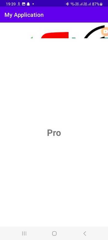
Output

Method 2: Use the default TabLayout setting with icons
Another way to implement a TabLayout with icons in Android is to take advantage of the default TabLayout settings, which support including icons. This approach eliminates the need to create custom views because it allows icons to be assigned directly to each tab.
After configuring TabLayout with ViewPager, you can easily browse each tab and specify the required icon resource using the setIcon() method.
By leveraging this method, you can take advantage of TabLayout's built-in functionality to manage tab selection and styling while simplifying implementation. This simple approach simplifies the association of icons with tabs in a TabLayout, helping to achieve the visual representation you want without additional modifications.
算法
需要为主 Activity 或片段创建 XML 布局文件。这包括合并 TabLayout 和 ViewPager 组件。
首先,在您的活动或片段中获取对TabLayout和ViewPager的引用。
接下来,使用适当的适配器设置ViewPager来处理选项卡的内容。使用setupWithViewPager()方法将TabLayout与ViewPager连接起来
然后,迭代 TabLayout 中的每个选项卡并使用 getTabAt() 方法检索它们各自的 Tab 对象。
如果 Tab 对象不为 null,则可以通过使用 setIcon() 设置图标来自定义其外观。
此外,根据您对TabLayout的期望外观和行为进行任何必要的调整
最后,处理可能需要的任何附加功能,例如响应选项卡选择电子事件或根据选项卡更改更新 ViewPager 中的内容。
程序
// activity_main.xml
<?xml version="1.0" encoding="utf-8"?>
<RelativeLayout xmlns:android="http://schemas.android.com/apk/res/android"
   xmlns:app="http://schemas.android.com/apk/res-auto"
   xmlns:tools="http://schemas.android.com/tools"
   android:layout_width="match_parent"
   android:layout_height="match_parent"
   tools:context=".MainActivity">

   <com.google.android.material.tabs.TabLayout
      android:id="@+id/tab_layout"
      android:layout_width="match_parent"
      android:layout_height="wrap_content"
      android:layout_alignParentBottom="true"
      app:tabGravity="fill"
      app:tabMode="fixed"
      app:tabIndicatorHeight="0dp" />

   <androidx.viewpager2.widget.ViewPager2
      android:id="@+id/view_pager"
      android:layout_width="match_parent"
      android:layout_height="match_parent"
      android:layout_above="@id/tab_layout" />

</RelativeLayout>

// MainActivity.java
import androidx.appcompat.app.AppCompatActivity;
import androidx.viewpager2.widget.ViewPager2;

import android.os.Bundle;

import com.google.android.material.tabs.TabLayout;
import com.google.android.material.tabs.TabLayoutMediator;

public class MainActivity extends AppCompatActivity {

   private static final int[] tabIcons = {
         R.drawable.ic_tab1,
         R.drawable.ic_tab2,
         R.drawable.ic_tab3
   };

   @Override
   protected void onCreate(Bundle savedInstanceState) {
      super.onCreate(savedInstanceState);
      setContentView(R.layout.activity_main);

      TabLayout tabLayout = findViewById(R.id.tab_layout);
      ViewPager2 viewPager = findViewById(R.id.view_pager);
      viewPager.setAdapter(new ViewPagerAdapter(this));

      TabLayoutMediator mediator = new TabLayoutMediator(tabLayout, viewPager,
            (tab, position) -> tab.setIcon(tabIcons[position])
      );
      mediator.attach();
   }
}

// ViewPagerAdapter.java
import android.content.Context;
import android.view.LayoutInflater;
import android.view.View;
import android.view.ViewGroup;
import android.widget.TextView;

import androidx.annotation.NonNull;
import androidx.recyclerview.widget.RecyclerView;

public class ViewPagerAdapter extends RecyclerView.Adapter<
ViewPagerAdapter.ViewHolder> {

   private final Context context;

   public ViewPagerAdapter(Context context) {
      this.context = context;
   }

   @NonNull
   @Override
   public ViewHolder onCreateViewHolder(@NonNull ViewGroup parent, int viewType) {
      View view = LayoutInflater.from(context).inflate(R.layout.item_view_pager, parent, false);
      return new ViewHolder(view);
   }

   @Override
   public void onBindViewHolder(@NonNull ViewHolder holder, int position) {
      holder.textView.setText("Page " + (position + 1));
   }

   @Override
   public int getItemCount() {
      return 3; // Change this value based on the number of tabs
   }

   public static class ViewHolder extends RecyclerView.ViewHolder {
      TextView textView;

      public ViewHolder(View itemView) {
         super(itemView);
         textView = itemView.findViewById(R.id.textView);
      }
   }
}

ic_tab1.png, ic_tab2.png, ic_tab3.png in res/drawable

// item_view_pager.xml
<?xml version="1.0" encoding="utf-8"?>
<LinearLayout xmlns:android="http://schemas.android.com/apk/res/android"
   android:layout_width="match_parent"
   android:layout_height="match_parent"
   android:gravity="center"
   android:orientation="vertical">

   <TextView
      android:id="@+id/textView"
      android:layout_width="wrap_content"
      android:layout_height="wrap_content"
      android:textAppearance="?android:textAppearanceLarge" />

</LinearLayout>
输出
结论
总之,TabLayout 与图标的合并可以通过两种主要方法来实现:利用选项卡项的自定义视图或使用默认的 TabLayout 设置。自定义视图方法通过为每个选项卡项创建不同的 XML 布局文件来提供更大的灵活性和个性化。相反,默认设置通过直接将图标分配给各个选项卡来简化流程。
The above is the detailed content of How to implement TabLayout with icons in Android?. For more information, please follow other related articles on the PHP Chinese website!

Hot AI Tools

Undresser.AI Undress
AI-powered app for creating realistic nude photos

AI Clothes Remover
Online AI tool for removing clothes from photos.

Undress AI Tool
Undress images for free

Clothoff.io
AI clothes remover

Video Face Swap
Swap faces in any video effortlessly with our completely free AI face swap tool!

Hot Article

Hot Tools

Notepad++7.3.1
Easy-to-use and free code editor

SublimeText3 Chinese version
Chinese version, very easy to use

Zend Studio 13.0.1
Powerful PHP integrated development environment

Dreamweaver CS6
Visual web development tools

SublimeText3 Mac version
God-level code editing software (SublimeText3)

Hot Topics
 1387
1387
 52
52
 New report delivers damning assessment of rumoured Samsung Galaxy S25, Galaxy S25 Plus and Galaxy S25 Ultra camera upgrades
Sep 12, 2024 pm 12:23 PM
In recent days, Ice Universe has been steadily revealing details about the Galaxy S25 Ultra, which is widely believed to be Samsung's next flagship smartphone. Among other things, the leaker claimed that Samsung only plans to bring one camera upgrade
 Samsung Galaxy S25 Ultra leaks in first render images with rumoured design changes revealed
Sep 11, 2024 am 06:37 AM
OnLeaks has now partnered with Android Headlines to provide a first look at the Galaxy S25 Ultra, a few days after a failed attempt to generate upwards of $4,000 from his X (formerly Twitter) followers. For context, the render images embedded below h
 IFA 2024 | TCL\'s NXTPAPER 14 won\'t match the Galaxy Tab S10 Ultra in performance, but it nearly matches it in size
Sep 07, 2024 am 06:35 AM
Alongside announcing two new smartphones, TCL has also announced a new Android tablet called the NXTPAPER 14, and its massive screen size is one of its selling points. The NXTPAPER 14 features version 3.0 of TCL's signature brand of matte LCD panels
 Vivo Y300 Pro packs 6,500 mAh battery in a slim 7.69 mm body
Sep 07, 2024 am 06:39 AM
The Vivo Y300 Pro just got fully revealed, and it's one of the slimmest mid-range Android phones with a large battery. To be exact, the smartphone is only 7.69 mm thick but features a 6,500 mAh battery. This is the same capacity as the recently launc
 Samsung Galaxy S24 FE billed to launch for less than expected in four colours and two memory options
Sep 12, 2024 pm 09:21 PM
Samsung has not offered any hints yet about when it will update its Fan Edition (FE) smartphone series. As it stands, the Galaxy S23 FE remains the company's most recent edition, having been presented at the start of October 2023. However, plenty of
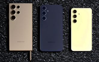 New report delivers damning assessment of rumoured Samsung Galaxy S25, Galaxy S25 Plus and Galaxy S25 Ultra camera upgrades
Sep 12, 2024 pm 12:22 PM
In recent days, Ice Universe has been steadily revealing details about the Galaxy S25 Ultra, which is widely believed to be Samsung's next flagship smartphone. Among other things, the leaker claimed that Samsung only plans to bring one camera upgrade
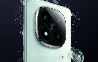 Xiaomi Redmi Note 14 Pro Plus arrives as first Qualcomm Snapdragon 7s Gen 3 smartphone with Light Hunter 800 camera
Sep 27, 2024 am 06:23 AM
The Redmi Note 14 Pro Plus is now official as a direct successor to last year'sRedmi Note 13 Pro Plus(curr. $375 on Amazon). As expected, the Redmi Note 14 Pro Plus heads up the Redmi Note 14 series alongside theRedmi Note 14and Redmi Note 14 Pro. Li
 iQOO Z9 Turbo Plus: Reservations begin for the potentially beefed-up series flagship
Sep 10, 2024 am 06:45 AM
OnePlus'sister brand iQOO has a 2023-4 product cycle that might be nearlyover; nevertheless, the brand has declared that it is not done with itsZ9series just yet. Its final, and possibly highest-end,Turbo+variant has just beenannouncedas predicted. T


