

How to solve overflow issue in CSS Flex layout?

To solve the overflow issue in CSS Flex layout, we will solve the following two examples -
- Fix overflow - set height of outer div to always be equal to specific inner div
- Avoid overflow when nesting elastic containers
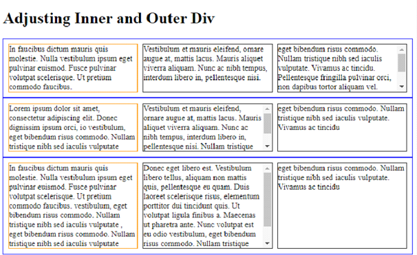
Set the height of the outer div to always be equal to the specific inner div and fix the overflow issue
Example
We are using Flex to fix an overflow issue between inner and outer divs. Let’s see an example −
<!DOCTYPE html>
<html>
<head>
   <style>
   .outer {
      display: flex;
      border: 1px solid blue;
      padding: 5px;
      box-sizing: border-box;
   }
   .outer>div {
      flex: 1;
      margin: 5px;
      border: 1px solid;
      box-sizing: border-box;
   }
   div.inner {
      border-color:orange;
   }
   .inner-in {
      position: relative;
      overflow: auto;
   }
   .inner-in>div {
      position: absolute;
      top: 0;
      right: 0;
      left: 0;
      bottom: 0;
   }
   </style>
</head>
<body>
   <h1>Adjusting Inner and Outer Div</h1>
   <div class="outer">
      <div class="inner">In faucibus dictum mauris quis molestie. Nulla vestibulum ipsum eget pulvinar euismod. Fusce pulvinar volutpat scelerisque. Ut pretium commodo faucibus. </div>
      <div class="inner-in">
         <div>Vestibulum et mauris eleifend, ornare augue at, mattis lacus. Mauris aliquet viverra aliquam. Nunc ac nibh tempus, interdum libero in, pellentesque nisi.</div>
      </div>
      <div class="inner-in">
         <div>eget bibendum risus commodo. Nullam tristique nibh sed iaculis vulputate.
         Vivamus ac tincidu. Pellentesque fringilla pulvinar orci, non dapibus tortor aliquam
         vel. Aenean eget quam vel nisi malesuada auctor nec quis nunc. Morbi eu tempor nunc</div>
      </div>
   </div>
   <div class="outer">
      <div class="inner">Lorem ipsum dolor sit amet, consectetur adipiscing elit. Donec
      dignissim ipsum orci, io vestibulum, eget bibendum risus commodo. Nullam tristique nibh
      sed iaculis vulputate</div>
      <div class="inner-in">
         <div>Vestibulum et mauris eleifend, ornare augue at, mattis lacus. Mauris aliquet
         viverra aliquam. Nunc ac nibh tempus, interdum libero in, pellentesque nisi. Nullam
         tristique nibh sed iaculis vulputate. Vivamus ac tincidu</div>
      </div>
      <div class="inner-in">
         <div>eget bibendum risus commodo. Nullam tristique nibh sed iaculis vulputate. Vivamus ac tincidu</div>
      </div>
   </div>
   <div class="outer">
      <div class="inner">In faucibus dictum mauris quis molestie. Nulla vestibulum ipsum eget
      pulvinar euismod. Fusce pulvinar volutpat scelerisque. Ut pretium commodo faucibus.
      vestibulum, eget bibendum risus commodo. Nullam tristique nibh sed iaculis vulputate ,
      eget bibendum risus commodo. Nullam tristique nibh sed iaculis vulputate</div>
      <div class="inner-in">
         <div>Donec eget libero est. Vestibulum libero tellus, aliquam non mattis quis,
         pellentesque eu quam. Duis laoreet scelerisque risus, elementum porttitor dui
         tincidunt quis. Ut volutpat ligula finibus a. Maecenas ut pharetra ante. Nunc
         volutpat est eu odio vestibulum, eget bibendum risus commodo. Nullam tristique nibh
         sed iaculis vulputate. Vivamus ac tincidu</div>
      </div>
      <div class="inner-in">
         <div>eget bibendum risus commodo. Nullam tristique nibh sed iaculis vulputate. Vivamus ac tincidu</div>
      </div>
   </div>
</body>
</html>
Output
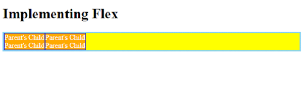
Avoid overflow problems when nesting elastic containers
There are two divs in our parent div ParentBox -
<div class='parentBox'>
   <div class='childBox'>
      <div class='babyChildBox'>Parent's Child</div>
      <div class='babyChildBox'>Parent's Child</div>
   </div>
   <! - - -
   !-->
</div>
The style of the parent container. We use CSS Flex shorthand properties -
.parentBox {
   display: flex;
   flex: 1 0 100%;
   background-color:yellow;
   border: 3px solid skyblue;
}
For the child element, that is, childBox, we again use the abbreviation attribute to set the elastic length of the elastic item -
.childBox {
   flex: 1 1 50%
   background-color: green;
   color: white;
   border: 1px solid blue;
}
The nested children in the .childBox above are set using Flex. This and above have nested Flex containers -
.babyChildBox {
   flex: 1 1 50%;
   background-color: orange;
}
Example
Now let's see a complete example of nesting flex containers correctly and trying to avoid overflow issues -
<!DOCTYPE html>
<html>
<head>
   <style>
   .parentBox {
      display: flex;
      flex: 1 0 100%;
      background-color:yellow;
      border: 3px solid skyblue;
   }
   .childBox {
      flex: 1 1 50%
      background-color: green;
      color: white;
      border: 1px solid blue;
   }
   .babyChildBox {
      flex: 1 1 50%;
      background-color: orange;
   }
   </style>
</head>
<body>
   <h1>Implementing Flex</h1>
   <div class='parentBox'>
      <div class='childBox'>
         <div class='babyChildBox'>Parent's Child</div>
         <div class='babyChildBox'>Parent's Child</div>
      </div>
      <div class='childBox'>
         <div class='babyChildBox'>Parent's Child</div>
         <div class='babyChildBox'>Parent's Child</div>
      </div>
   </div>
</body>
</html>
Output
The above is the detailed content of How to solve overflow issue in CSS Flex layout?. For more information, please follow other related articles on the PHP Chinese website!

Hot AI Tools

Undresser.AI Undress
AI-powered app for creating realistic nude photos

AI Clothes Remover
Online AI tool for removing clothes from photos.

Undress AI Tool
Undress images for free

Clothoff.io
AI clothes remover

Video Face Swap
Swap faces in any video effortlessly with our completely free AI face swap tool!

Hot Article
Hot Tools

Notepad++7.3.1
Easy-to-use and free code editor

SublimeText3 Chinese version
Chinese version, very easy to use

Zend Studio 13.0.1
Powerful PHP integrated development environment

Dreamweaver CS6
Visual web development tools

SublimeText3 Mac version
God-level code editing software (SublimeText3)
Hot Topics
 1386
1386
 52
52

 Building an Ethereum app using Redwood.js and Fauna
Mar 28, 2025 am 09:18 AM
Building an Ethereum app using Redwood.js and Fauna
Mar 28, 2025 am 09:18 AM
With the recent climb of Bitcoin’s price over 20k $USD, and to it recently breaking 30k, I thought it’s worth taking a deep dive back into creating Ethereum
 Vue 3
Apr 02, 2025 pm 06:32 PM
Vue 3
Apr 02, 2025 pm 06:32 PM
It's out! Congrats to the Vue team for getting it done, I know it was a massive effort and a long time coming. All new docs, as well.
 Can you get valid CSS property values from the browser?
Apr 02, 2025 pm 06:17 PM
Can you get valid CSS property values from the browser?
Apr 02, 2025 pm 06:17 PM
I had someone write in with this very legit question. Lea just blogged about how you can get valid CSS properties themselves from the browser. That's like this.
 A bit on ci/cd
Apr 02, 2025 pm 06:21 PM
A bit on ci/cd
Apr 02, 2025 pm 06:21 PM
I'd say "website" fits better than "mobile app" but I like this framing from Max Lynch:
 Stacked Cards with Sticky Positioning and a Dash of Sass
Apr 03, 2025 am 10:30 AM
Stacked Cards with Sticky Positioning and a Dash of Sass
Apr 03, 2025 am 10:30 AM
The other day, I spotted this particularly lovely bit from Corey Ginnivan’s website where a collection of cards stack on top of one another as you scroll.
 Using Markdown and Localization in the WordPress Block Editor
Apr 02, 2025 am 04:27 AM
Using Markdown and Localization in the WordPress Block Editor
Apr 02, 2025 am 04:27 AM
If we need to show documentation to the user directly in the WordPress editor, what is the best way to do it?
 Comparing Browsers for Responsive Design
Apr 02, 2025 pm 06:25 PM
Comparing Browsers for Responsive Design
Apr 02, 2025 pm 06:25 PM
There are a number of these desktop apps where the goal is showing your site at different dimensions all at the same time. So you can, for example, be writing
 Let's use (X, X, X, X) for talking about specificity
Mar 24, 2025 am 10:37 AM
Let's use (X, X, X, X) for talking about specificity
Mar 24, 2025 am 10:37 AM
I was just chatting with Eric Meyer the other day and I remembered an Eric Meyer story from my formative years. I wrote a blog post about CSS specificity, and
