

Enhancing the mobile web experience for startups

This tutorial is part of the "Build Your Startup with PHP" series on Envato Tuts. In this series, I'll guide you through launching a startup from concept to reality, using my meeting planner app as a real-life example. Every step of the way, I'll release the Meeting Planner code as an open source example that you can learn from. I also address startup-related business issues that arise.
Mobile Apps and Responsive Web
Strategically, it makes sense to build mobile apps for Meeting Planner on iOS and Android, but from a financial perspective, I haven't raised the resources for it yet. Mathew Ingram recently wrote in Fortune that with so many products targeting mobile users, "statistically speaking at least, no one is going to download your app." So, while I could certainly enhance the Meeting Planner experience with an app, but with my current resources, the possibility of adopting it didn't make immediate sense.
However, it is important that Meeting Planner provides a great web experience on mobile devices.
In today's show, I'll review and discuss the changes we made to do this - essentially making our web application more like a responsive website that can be easily used on mobile devices and tablets. View the results (on your phone or tablet)!
One of the coding challenges for today’s episode is that I’m not a designer or CSS coder. Sometimes I feel like I shouldn't even be coding myself; at Microsoft I'm a team project manager, which means we have graphic designers, a fully staffed usability lab, CSS doesn't exist, etc.
Before starting this work, I was intimidated by learning media queries, breakpoints, and specialized CSS - it's not a subject I'm good at, and it's very time-consuming and detail-oriented. However, within 48 hours everything was done quickly and perfectly. If you browse to the bottom of the story, you'll see that all the changes ended up requiring very few lines of CSS. Suddenly, when I started browsing Meeting Planner on my phone, I was really excited about how well the new responsive web experience worked.
Frankly, this makes me think that a dedicated mobile app is not necessary at the moment. Currently, we can engage audiences through mobile web experiences, especially during the critical alpha and beta phases that are coming.
Meanwhile, if you haven't tried the Meeting Planner yet, go ahead and schedule your first meeting from your phone or tablet. I do participate in the comment thread below, so please tell me about your experiences! You can also reach me on Twitter @reifman. I'm always interested in new feature requests and suggested tutorial topics.
As a reminder, all the code of Meeting Planner is written using PHP's Yii2 framework. If you want to learn more about Yii2, check out our parallel series "Programming with Yii2."
Current movement status
First, I browsed the current status of the Meeting Planner service using my iOS phone and took a screenshot of the initial application. It's not terrible, but it's not great either. Let's review what I found.
Homepage
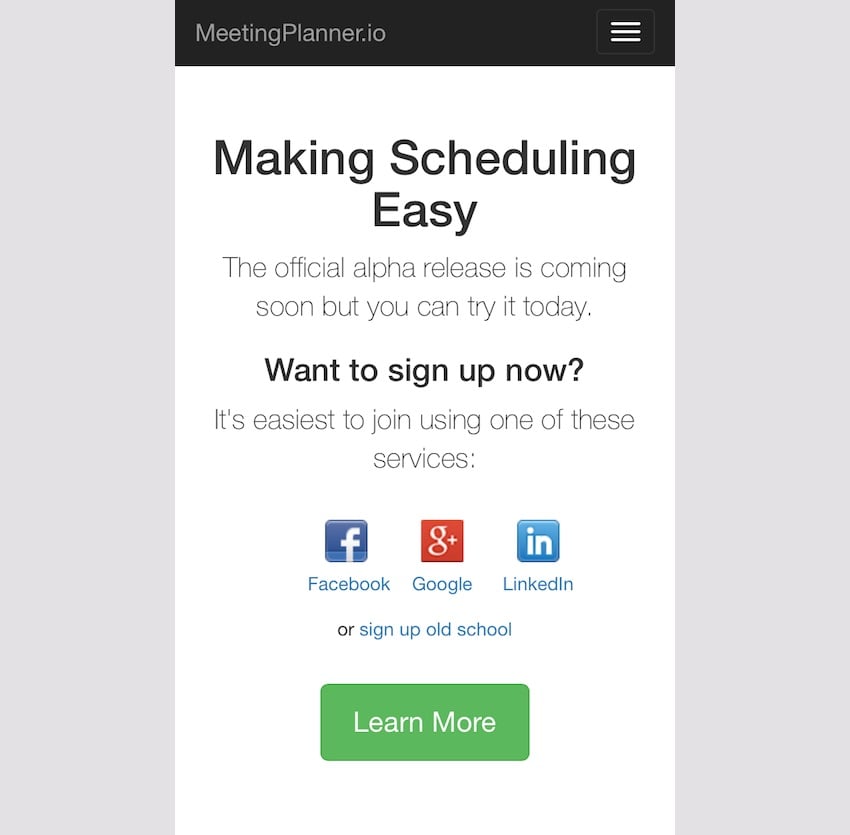
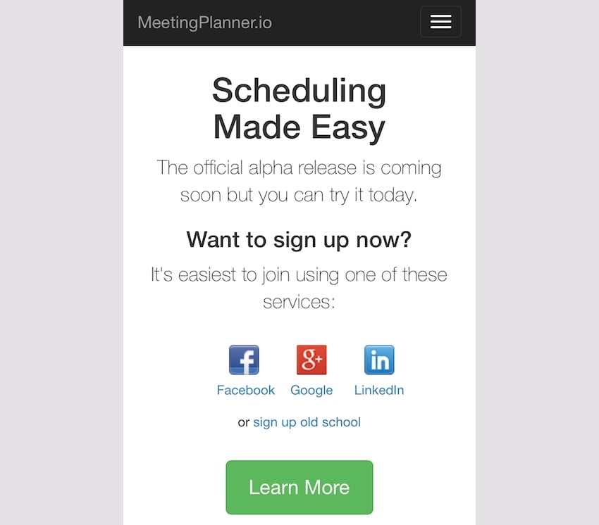
The homepage looks good, although aesthetically I wish the title text "Making Scheduling Easy" were slightly different, i.e. on three lines of approximately equal length. However, Bootstrap manages the dropdown menu well and the rest of the page works fine:
registration page
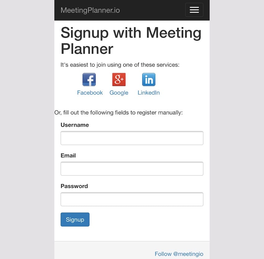
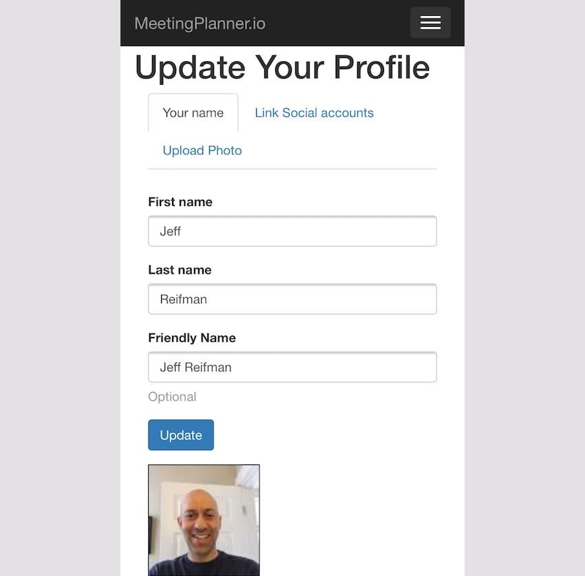
Again, apart from the nice layout of the header and the consistency of the left margin, the registration page is basically functional:
Planning Meeting
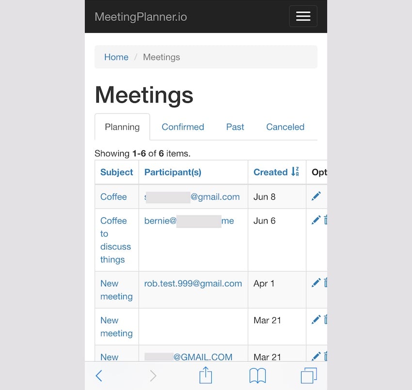
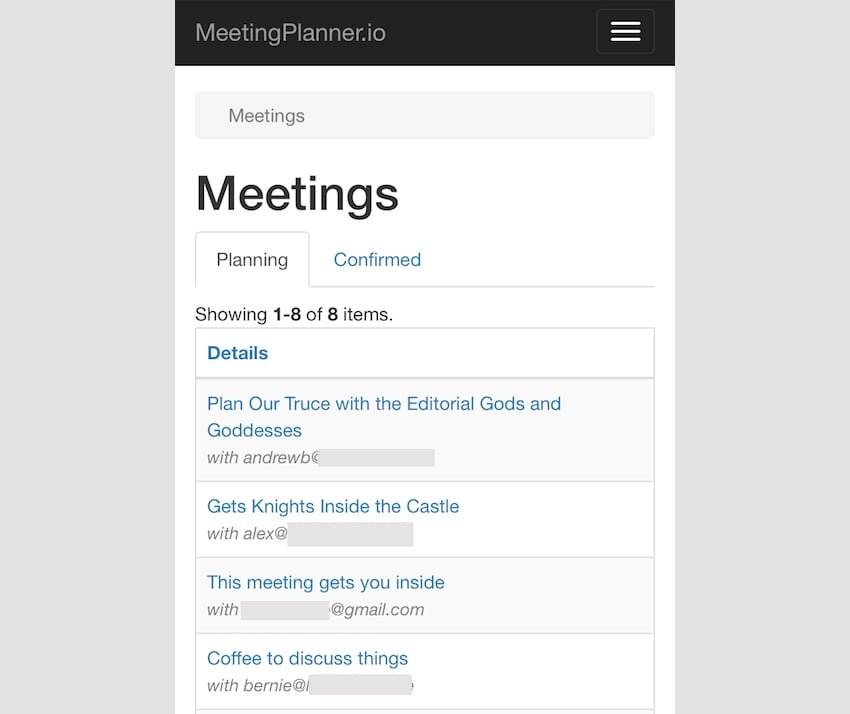
Once the person starts planning a meeting, the current index page needs improvement. Too many columns. The subject is squashed. Maybe it doesn't matter what information I choose to display here in the first place. Of course, the command options are also not in view. The page needs to be adjusted more heavily for mobile devices.
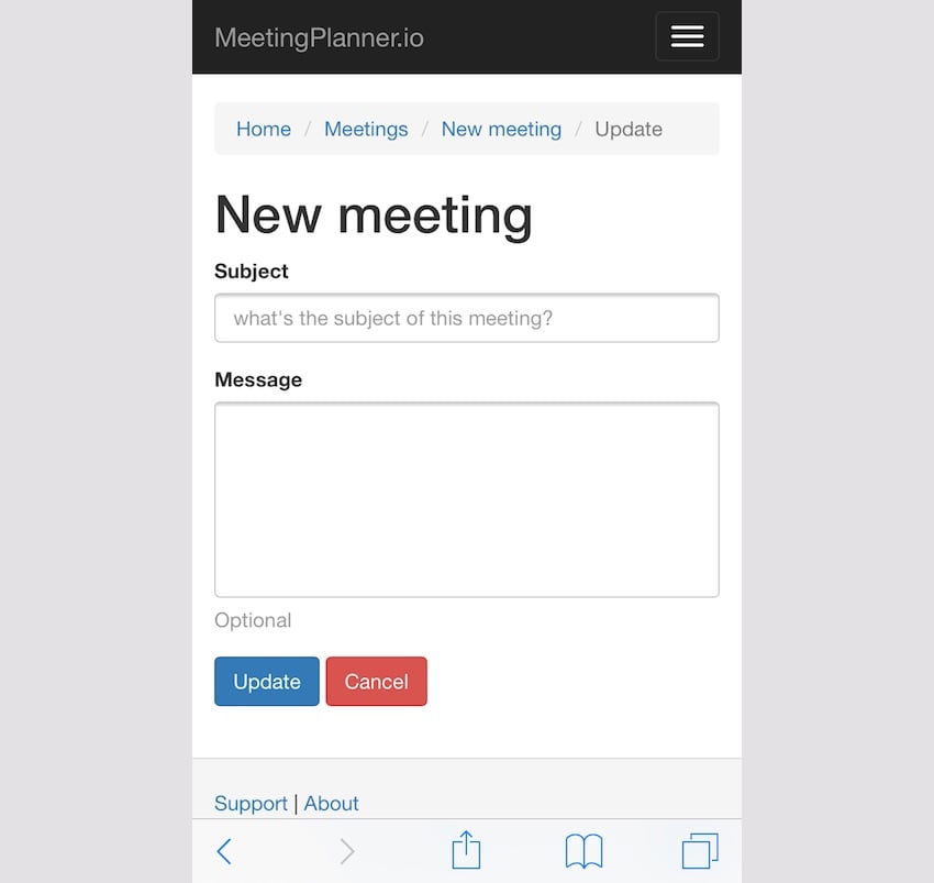
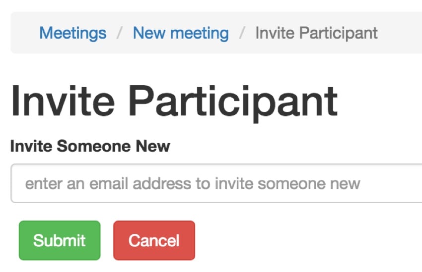
Other pages are working fine, such as new meeting requests for a topic. However, mobile users may not want to provide a text area field to enter a longer message introducing the meeting:
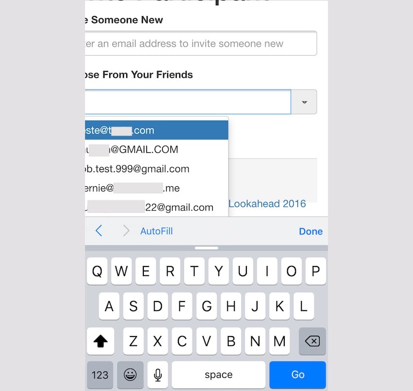
With the bootstrap extension we are using, adding actors would also become a bit dysfunctional:
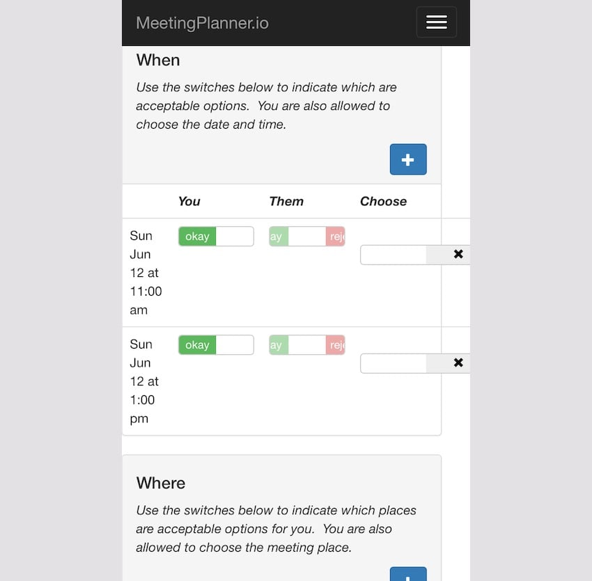
The planning view for places and times starts to crash. Likewise, desktop design offers too many details and too many options for mobile devices:
Other areas
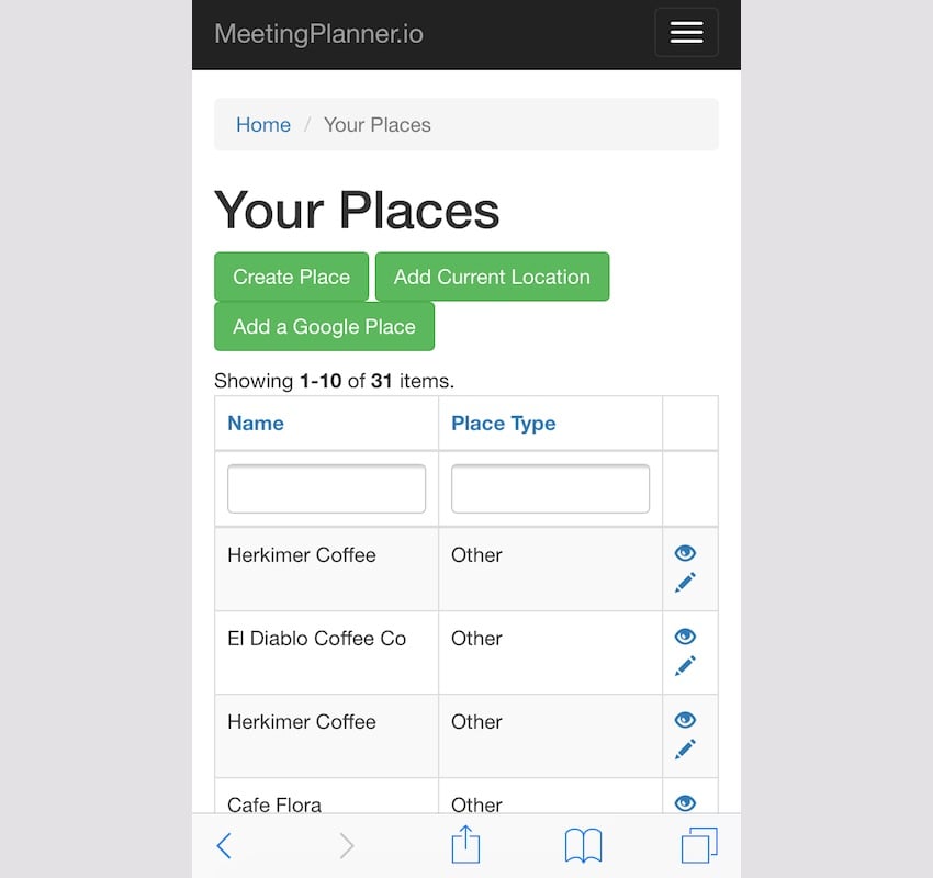
The Places page works fine, but the layout of the buttons needs to be improved. Maybe mobile users don't need this feature.
Similarly, desktop tabs and photo layouts also have issues on mobile devices. Still need to reconsider:
Development Solution
Of course, the website has a lot of room for improvement. Some areas need to be reconsidered for mobile devices, some need to be minimized, and others need aesthetic tweaks. Let's get to work.
Different methods
When I started this task, I had almost zero experience with media queries and breakpoints. I had been procrastinating for the past few days, worried that I would fall into an unfamiliar quagmire. I started by practicing media queries to tease my editor:
@media only life
   and (max-energy-level: 60%)
   and (-caffeine-ratio: 2) {
      .editorBossperson {
         available-to:false;
         visible-to:false;
   }
}
Joking helps break the mental ice in my head. The editing gods at Envato can always see me.
I started thinking about many areas:
- Simplified functions, especially the meeting planning process
- Determine key information to display on mobile devices
- Hide certain features on mobile devices, such as elements, columns, and menu options
- Using media queries and breakpoints
- Focus on the most important areas of the Alpha release
A useful concept I keep coming across around the web is “mobile-first design.” Unfortunately, I'm old school and don't do that. But it helps to rethink every page with the following theme: mobile first.
For example, a meeting index with four table columns had to be removed and would be disorienting on a portrait phone.
I've been asking myself how to design all my pages for use on mobile phones.
Media Inquiry Warmup
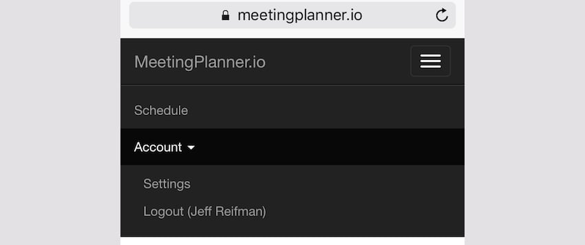
Drop-down menu
It took me some effort to get over my hesitation to delve into CSS. To warm up, I started working on minimizing the dropdown menu and simplifying the scope of the mobile functionality.
For now, I decided to create a basic media query for smaller devices and use it throughout the website. This is frontend/site.css:
/* ----------- mobile displays ----------- */

@media only screen
  and (min-device-width: 320px)
  and (max-device-width: 667px)
  and (-webkit-min-device-pixel-ratio: 2) {
    /* hides drop down menu items and footer items */
    .itemHide,li.menuHide {
      display:none;
      visible:false;
    }
Turns out, making the change is relatively simple. For any menu item I want to hide on mobile devices, I just add a CSS property like menuhide.
This is the menuHide attribute added to /frontend/views/layouts/main.php:
$menuItems[] = [
      'label' => 'Account',
      'items' => [
        [
          'label' => Yii::t('frontend','Places'),
           'url' => ['/place/yours'],
           'options'=>['class'=>'menuHide'],
         ],
         [
            'label' => Yii::t('frontend','Friends'),
            'url' => ['/friend'],
            'options'=>['class'=>'menuHide'],
        ],
           [
             'label' => Yii::t('frontend','Profile'),
             'url' => ['/user-profile'],
             'options'=>['class'=>'menuHide'],
         ],
         [
            'label' => Yii::t('frontend','Contact information'),
            'url' => ['/user-contact'],
            'options'=>['class'=>'menuHide'],
        ],
        [
           'label' => Yii::t('frontend','Settings'),
           'url' => ['/user-setting'],
           //'options'=>['class'=>'menuHide'],
       ],
       [
          'label' => Yii::t('frontend','Reminders'),
          'url' => ['/reminder'],
          'options'=>['class'=>'menuHide'],
      ],
           [
              'label' => Yii::t('frontend','Logout').' (' . \common\components\MiscHelpers::getDisplayName(Yii::$app->user->id) . ')',
              'url' => ['/site/logout'],
              'linkOptions' => ['data-method' => 'post']
          ],
      ],
  ];
  echo Nav::widget([
      'options' => ['class' => 'navbar-nav navbar-right'],
      'items' => $menuItems,
  ]);
Suddenly, drop-down menus become less complicated:
Gradually, I realized that simplifying and reducing features in mobile web would create the best experience. People can always return to the desktop to access other features, at least for now. This is also an opportunity to gather feedback from people during the alpha and beta stages.
Bread crumbs
Yii's default layout includes a breadcrumb widget, which is loaded through Composer and is difficult to customize. I tried adding CSS to hide the first element and the first "/" separator:
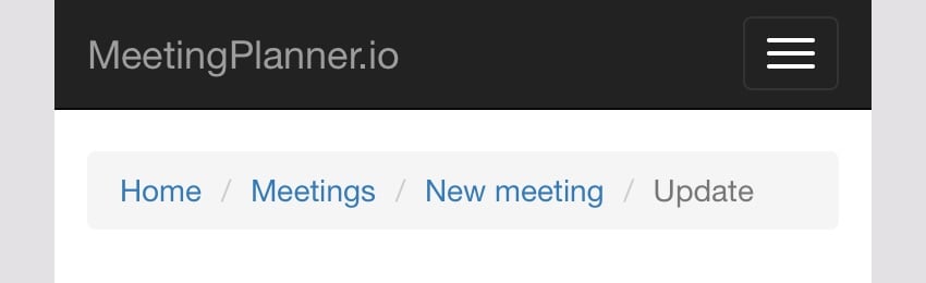
This took some time, but got me digging deeper into CSS, like nth child stuff, and built my confidence:
/* removes home and / from breadcrumb */
    ul.breadcrumb li:first-child, li.tabHide {
      display:none;
      visible:false;
    }
     ul.breadcrumb li:nth-child(2)::before {
       content:'';
    }
I didn't know CSS could modify content.
The results are as follows:
Enhance fingertip button spacing
Next, I added CSS to provide extra padding for the button on mobile devices, reducing the chance of errors when pressing with my fingertip. For example, here are the submit and cancel buttons on desktop:
This is the CSS I used and started adding to the various buttons and clickable icons around the site:
    /* fingertip spacing for buttons */
    a.icon-pad {
      padding: 0 5px 0 2px;
    }
    .button-pad {
      padding-left:7px;
    }
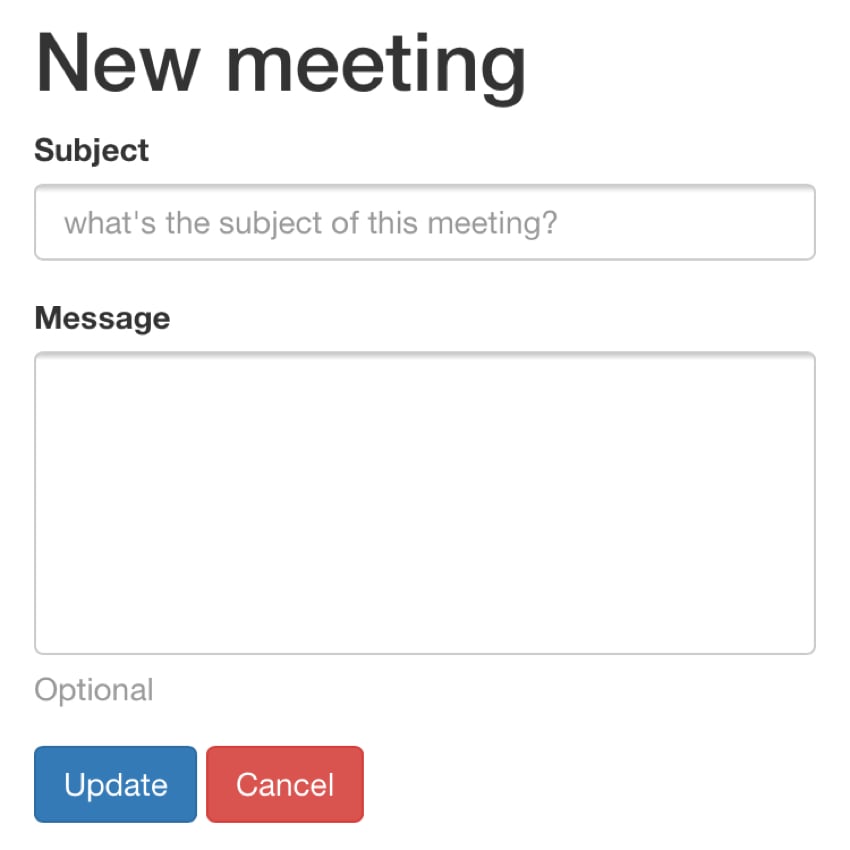
Here's how the form will look on mobile - note the new padding between Submit and Cancel:
Responsive text wrapping
It actually takes more time to make the homepage title "Scheduling Made Easy". Eventually I added the <br /> tag to the text and made it hidden by default when not on mobile devices. But I also have to add a space in the span tag using the itemHide class.
<h1>
    <?php echo Yii::t('frontend','Scheduling'); ?>
    <br class="rwd-break" />
    <span class="itemHide"> </span>
    <?php echo Yii::t('frontend','Made Easy') ?>
</h1>
这是 .rwd-break 的 CSS。默认情况下它是隐藏的,并且仅出现在响应式显示中,从而按照我想要的方式破坏标题文本。
.rwd-break {
  display:none;
}
/* ----------- mobile displays ----------- */
@media only screen
  and (min-device-width: 320px)
  and (max-device-width: 667px)
  and (-webkit-min-device-pixel-ratio: 2) {
  ...
    .rwd-break {
      display:block;
    }
}
如果没有 span 标记空间,文本将在没有正确居中的情况下中断。
简化会议列表页面
随着我越来越认为“移动优先”,我意识到基于手机的用户并不需要我页面上的所有功能。他们不需要所有选项卡,不需要有关会议的数据表,也不需要所有图标按钮选项。事实上,对于会议页面,他们只需要能够打开会议(他们可以从会议视图页面本身取消会议)。
我将主题和参与者列合并为一个垂直列,结果看起来好多了。
在 /frontend/views/meeting/index.php 中,我将 .tabHide 添加到两个四个选项卡中的:
<!-- Nav tabs -->
<ul class="nav nav-tabs" role="tablist">
  <li class="active"><a href="#planning" role="tab" data-toggle="tab">Planning</a></li>
  <li ><a href="#upcoming" role="tab" data-toggle="tab">Confirmed</a></li>
  <li class="tabHide"><a href="#past" role="tab" data-toggle="tab" >Past</a></li>
  <li class="tabHide"><a href="#canceled" role="tab" data-toggle="tab">Canceled</a></li>
</ul>
并且,在 /frontend/views/meeting/_grid.php 中,我重组了该列以合并主题和参与者:
if ($mode =='upcoming' || $mode =='past') {
  echo GridView::widget([
      'dataProvider' => $dataProvider,
      //'filterModel' => $searchModel,
      'columns' => [
      [
        'label'=>'Details',
          'attribute' => 'meeting_type',
          'format' => 'raw',
          'value' => function ($model) {
              // to do - remove legacy code when subject didn't exist
                if ($model->subject=='') {
                  return '<div><a href="'.Url::to(['meeting/view', 'id' => $model->id]).'">'.$model->getMeetingHeader().'</a><br /><span class="index-participant">'.$model->getMeetingParticipants($model->id).'</span></div>';
                } else {
                  return '<div><a href="'.Url::to(['meeting/view', 'id' => $model->id]).'">'.$model->subject.'</a><br /><span class="index-participant">'.$model->getMeetingParticipants($model->id).'</span></div>';
                }
              },
      ],
隐藏 ActionColumn 需要进行一些研究,但看起来像这样:
['class' => 'yii\grid\ActionColumn','header'=>'Options','template'=>'{view}  {decline}  {cancel}',
    'headerOptions' => ['class' => 'itemHide'],
    'contentOptions' => ['class' => 'itemHide'],
    'buttons'=>[
        'view' => function ($url, $model) {
          return Html::a('<span class="glyphicon glyphicon-eye-open"></span>', $url,
          [
                  'title' => Yii::t('frontend', 'view'),
                  'class' => 'icon-pad',
          ]);
        },
        'decline' => function ($url, $model) {
          return ($model->status==$model::STATUS_SENT ) ? Html::a('<span class="glyphicon glyphicon-thumbs-down"></span>', $url, [
                  'title' => Yii::t('frontend', 'decline'),
                  'class' => 'icon-pad',
          ]) : '';
        },
        'cancel' => function ($url, $model) {
          return ($model->status==$model::STATUS_SENT || $model->status==$model::STATUS_CONFIRMED ) ? Html::a('<span class="glyphicon glyphicon-remove-circle"></span>', $url, [
                  'title' => Yii::t('frontend', 'cancel'),
                  'data-confirm' => Yii::t('frontend', 'Are you sure you want to cancel this meeting?'),
                  'class' => 'icon-pad',
          ]) : '';
        },
      ]
    ],
最终,这些更改在改进移动设备的过程中简化了桌面界面。
最大的挑战:会议安排
到目前为止,对我来说最具挑战性的任务是针对移动设备调整上面的会议安排页面。手机上的情况一团糟,我很害怕。另外,我一直担心将来如何为多个参与者采用这个界面 - 响应性要求可能只会让这变得更加困难。
我对 Yii 的 Kartik Bootstrap Switch Widget 扩展的使用在修改布局方面有其自身的局限性。将这些元素放置在表格列中效果很好,但使表格列响应式对于媒体查询来说并不那么简单。
当然,正如我在上面的会议列表页面中所示,隐藏列很容易,但修改位置就不那么容易了。
我首先从显示时间和地点选项的水平表格设计转向垂直的纵向风格。而且,显然,表和列有自己的能力,可以在没有媒体查询的情况下使用 HTML5 和 CSS 进行包装。
您可以在此处查看改进后的空白会议计划页面:
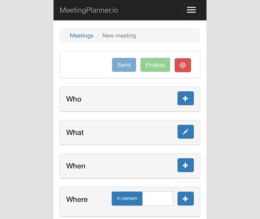
每个部分视图都需要额外的 css 列才能使预定义的 Bootstrap 网格布局正常工作,例如左 col-xs4 和右 col-xs-8。这是一个例子:
<div class="panel panel-default">
  <!-- Default panel contents -->
  <div class="panel-heading">
    <div class="row">
      <div class="col-lg-4 col-md-4 col-xs-4"><h4 id="What">What</h4></div>
      <div class="col-lg-8 col-md-8 col-xs-8"><div style="float:right;">
      <?php
        if ($isOwner) {
            echo Html::a('', ['update', 'id' => $model->id], ['class' => 'btn btn-primary glyphicon glyphicon-pencil','title'=>'Edit']);
          }
        ?>
      </div>
    </div>
    </div>
  </div>
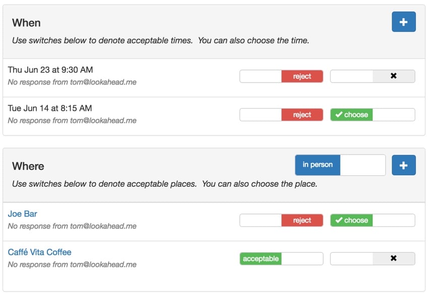
使地点和时间安排表格具有响应性是最困难的。我进行了实验并最终成功地使用了随着内容窗口(或设备)缩小而自然换行的表列。
我还消除了在其自己的列中显示参与者状态并禁用开关的情况 - 您无法更改它们,那么为什么将它们显示为开关呢?相反,我创建了参与者在地点和时间的状态的文本摘要。以下是 getWhenStatus() 的代码:
public static function getWhenStatus($meeting,$viewer_id) {
      // get an array of textual status of meeting times for $viewer_id
      // Acceptable / Rejected / No response:
      $whenStatus['text'] = [];
      $whenStatus['style'] = [];
      foreach ($meeting->meetingTimes as $mt) {
        // build status for each time
        $acceptableChoice=[];
        $rejectedChoice=[];
        $unknownChoice=[];
        // to do - add meeting_id to MeetingTimeChoice for sortable queries
        foreach ($mt->meetingTimeChoices as $mtc) {
          if ($mtc->user_id == $viewer_id) continue;
          switch ($mtc->status) {
            case MeetingTimeChoice::STATUS_UNKNOWN:
              $unknownChoice[]=$mtc->user_id;
            break;
            case MeetingTimeChoice::STATUS_YES:
              $acceptableChoice[]=$mtc->user_id;
            break;
            case MeetingTimeChoice::STATUS_NO:
              $rejectedChoice[]=$mtc->user_id;
            break;
          }
        }
        $temp ='';
        // to do - update for multiple participants
        // to do - integrate current setting for this user in style setting
        if (count($acceptableChoice)>0) {
          $temp.='Acceptable to '.MiscHelpers::getDisplayName($acceptableChoice[0]);
          $whenStatus['style'][$mt->id]='success';
        } else if (count($rejectedChoice)>0) {
          $temp.='Rejected by '.MiscHelpers::getDisplayName($rejectedChoice[0]);
          $whenStatus['style'][$mt->id]='danger';
        } else if (count($unknownChoice)>0) {
          $temp.='No response from '.MiscHelpers::getDisplayName($unknownChoice[0]);
          $whenStatus['style'][$mt->id]='warning';
        }
        $whenStatus['text'][$mt->id]=$temp;
      }
      return $whenStatus;
    }
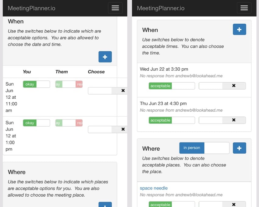
这是它在桌面上的样子 - 注意文本行和开关的横向布局:
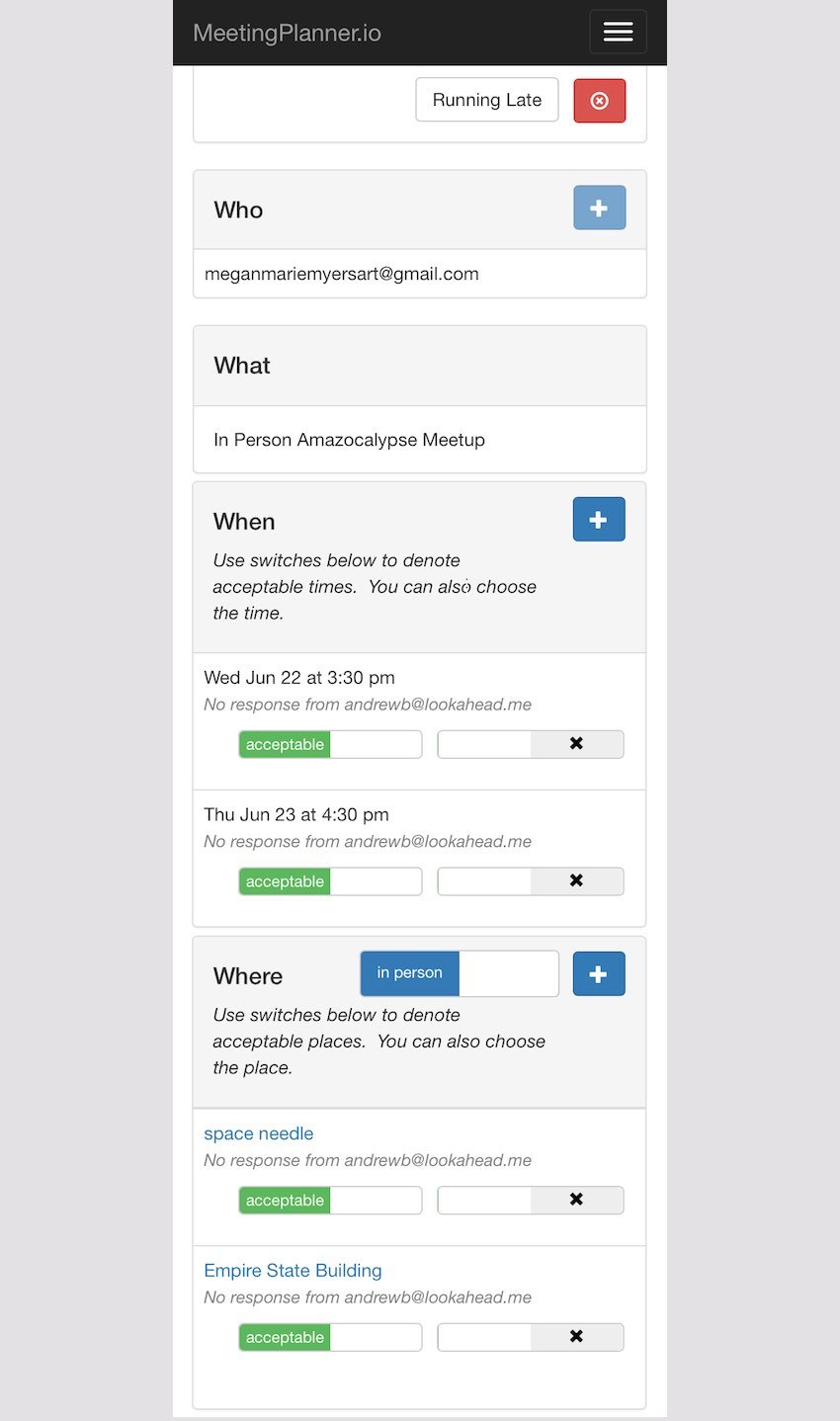
这是移动版本,更加纵向且堆叠,无需媒体查询:
作为示例,以下是我在“时间”面板上对表格列进行编码的 CSS:
table.table-list {
  width:100%;
}
table.table-list td.table-list-first {
    float: left;
    display: inline;
    width: auto;
  }
table.table-list td.table-switches {
    width: auto;
    float: right;
    display: inline;
    padding-top: 10px;
  }
.switch-pad {
    padding-left:7px;
  }
.smallStatus {
  font-size:90%;
  color: grey;
  font-style: italic;
}
这是来自 /frontend/views/meeting-time/_list.php 的部分表单的代码:
<?php
use yii\helpers\Html;
use frontend\models\Meeting;
use \kartik\switchinput\SwitchInput;
?>
<tr > <!-- panel row -->
  <td >
    <table class="table-list"> <!-- list of times -->
      <tr>
        <td class="table-list-first"> <!-- time & status -->
          <?= Meeting::friendlyDateFromTimestamp($model->start,$timezone) ?>
          <?php
            if ($whenStatus['text'][$model->id]<>'') {
            ?>
            <br /><span class="smallStatus">
            <?php
            echo $whenStatus['text'][$model->id];
            ?>
          </span><br />
            <?php
            }
          ?>
      </td>
      <td class="table-switches"> <!-- col of switches to float right -->
        <table >
          <tr>
              <td >
                <?php
                   if ($isOwner) {
                     showTimeOwnerStatus($model,$isOwner);
                   } else {
                     showTimeParticipantStatus($model,$isOwner);
                   }
                ?>
              </td>
              <td class="switch-pad">
                  <?php
                  if ($timeCount>1) {
                    if ($model->status == $model::STATUS_SELECTED) {
                        $value = $model->id;
                    }    else {
                      $value = 0;
                    }
                    if ($isOwner || $participant_choose_date_time) {
                      // value has to match for switch to be on
                      echo SwitchInput::widget([
                          'type' => SwitchInput::RADIO,
                          'name' => 'time-chooser',
                          'items' => [
                              [ 'value' => $model->id],
                          ],
                          'value' => $value,
                          'pluginOptions' => [  'size' => 'mini','handleWidth'=>60,'onText' => '<i class="glyphicon glyphicon-ok"></i> choose','onColor' => 'success','offText'=>'<i class="glyphicon glyphicon-remove"></i>'], // $whenStatus['style'][$model->id],
                          'labelOptions' => ['style' => 'font-size: 12px'],
                      ]);
                    }
                  }
                  ?>
              </td>
            </tr>
          </table>
        </td> <!-- end col with table of switches -->
      </tr>
  </table> <!-- end table list of times -->
  </td>
  </tr> <!-- end panel row -->
这些会议视图变化的最大好处是,它们将简化未来有许多参与者的会议的用户体验设计挑战。无论参加会议的人数有多少,观点都会与上述基本相同。从本质上讲,这解决了我扩展到多人会议的最大障碍——用户体验设计。
下一步是什么?
我希望您喜欢跟随我研究响应式网页设计的细节。当网站的代码和视觉变化结合在一起时,我感到非常满意,并且对 CSS 的需要之少印象深刻。综合起来,您可以在这里看到:
.rwd-break {
  display:none;
}
table.table-list {
  width:100%;
}
table.table-list td.table-list-first {
    float: left;
    display: inline;
    width: auto;
  }

table.table-list td.table-switches {
    width: auto;
    float: right;
    display: inline;
    padding-top: 10px;
  }
.switch-pad {
    padding-left:7px;
  }
.smallStatus {
  font-size:90%;
  color: grey;
  font-style: italic;
}
.setting-label label, #preferences label {
  font-weight:normal;
}

/* ----------- mobile displays ----------- */

@media only screen
  and (min-device-width: 320px)
  and (max-device-width: 667px)
  and (-webkit-min-device-pixel-ratio: 2) {
    /* hides drop down menu items and footer items */
    .itemHide,li.menuHide {
      display:none;
      visible:false;
    }
    /* removes home and / from breadcrumb */
    ul.breadcrumb li:first-child, li.tabHide {
      display:none;
      visible:false;
    }
     ul.breadcrumb li:nth-child(2)::before {
       content:'';
    }
    /* fingertip spacing for buttons */
    a.icon-pad {
      padding: 0 5px 0 2px;
    }
    .button-pad {
      padding-left:7px;
    }
    .rwd-break {
      display:block;
    }
}
我未来的设计工作将从“这在移动设备上看起来应该是什么样子?”
如前所述,我目前正在积极准备 Meeting Planner 的 alpha 版本。我主要关注使 alpha 版本顺利发布的关键改进和功能。
我现在正在跟踪 Asana 中的所有内容,我将在另一个教程中对此进行介绍;这非常有帮助。还有一些有趣的新功能仍在开发中。
I also started paying more attention to the upcoming investment collection efforts through Meeting Planner. I just started trying WeFunder with the implementation of the SEC's new crowdfunding rules. Please consider following our profile. I will also cover this in detail in a future tutorial.
Again, while you wait for more episodes, schedule your first meeting (on your phone!). Also, I'd be grateful if you shared your experiences in the comments below, and I'm always interested in your suggestions. You can also contact me directly on Twitter @reifman. You can also post them on the meeting planner support website.
Watch upcoming tutorials in the "Build Your Startup with PHP" series.
Related Links
- Meeting Planning
- Meeting Planner’s “We Fund” Page
- Programming with Yii2: Getting Started
- Yii2 Developer Exchange Meeting
The above is the detailed content of Enhancing the mobile web experience for startups. For more information, please follow other related articles on the PHP Chinese website!

Hot AI Tools

Undresser.AI Undress
AI-powered app for creating realistic nude photos

AI Clothes Remover
Online AI tool for removing clothes from photos.

Undress AI Tool
Undress images for free

Clothoff.io
AI clothes remover

AI Hentai Generator
Generate AI Hentai for free.

Hot Article
Hot Tools

Notepad++7.3.1
Easy-to-use and free code editor

SublimeText3 Chinese version
Chinese version, very easy to use

Zend Studio 13.0.1
Powerful PHP integrated development environment

Dreamweaver CS6
Visual web development tools

SublimeText3 Mac version
God-level code editing software (SublimeText3)
Hot Topics


 What is the purpose of the <datalist> element?
Mar 21, 2025 pm 12:33 PM
What is the purpose of the <datalist> element?
Mar 21, 2025 pm 12:33 PM
The article discusses the HTML <datalist> element, which enhances forms by providing autocomplete suggestions, improving user experience and reducing errors.Character count: 159
 How do I use HTML5 form validation attributes to validate user input?
Mar 17, 2025 pm 12:27 PM
How do I use HTML5 form validation attributes to validate user input?
Mar 17, 2025 pm 12:27 PM
The article discusses using HTML5 form validation attributes like required, pattern, min, max, and length limits to validate user input directly in the browser.
 What is the purpose of the <iframe> tag? What are the security considerations when using it?
Mar 20, 2025 pm 06:05 PM
What is the purpose of the <iframe> tag? What are the security considerations when using it?
Mar 20, 2025 pm 06:05 PM
The article discusses the <iframe> tag's purpose in embedding external content into webpages, its common uses, security risks, and alternatives like object tags and APIs.
 What is the purpose of the <progress> element?
Mar 21, 2025 pm 12:34 PM
What is the purpose of the <progress> element?
Mar 21, 2025 pm 12:34 PM
The article discusses the HTML <progress> element, its purpose, styling, and differences from the <meter> element. The main focus is on using <progress> for task completion and <meter> for stati
 What is the purpose of the <meter> element?
Mar 21, 2025 pm 12:35 PM
What is the purpose of the <meter> element?
Mar 21, 2025 pm 12:35 PM
The article discusses the HTML <meter> element, used for displaying scalar or fractional values within a range, and its common applications in web development. It differentiates <meter> from <progress> and ex
 What are the best practices for cross-browser compatibility in HTML5?
Mar 17, 2025 pm 12:20 PM
What are the best practices for cross-browser compatibility in HTML5?
Mar 17, 2025 pm 12:20 PM
Article discusses best practices for ensuring HTML5 cross-browser compatibility, focusing on feature detection, progressive enhancement, and testing methods.
 What is the viewport meta tag? Why is it important for responsive design?
Mar 20, 2025 pm 05:56 PM
What is the viewport meta tag? Why is it important for responsive design?
Mar 20, 2025 pm 05:56 PM
The article discusses the viewport meta tag, essential for responsive web design on mobile devices. It explains how proper use ensures optimal content scaling and user interaction, while misuse can lead to design and accessibility issues.
 How do I use the HTML5 <time> element to represent dates and times semantically?
Mar 12, 2025 pm 04:05 PM
How do I use the HTML5 <time> element to represent dates and times semantically?
Mar 12, 2025 pm 04:05 PM
This article explains the HTML5 <time> element for semantic date/time representation. It emphasizes the importance of the datetime attribute for machine readability (ISO 8601 format) alongside human-readable text, boosting accessibilit
