

Custom styling for WordPress Gutenberg blocks: Part 1

It’s an exciting time to be a WordPress developer, with the official release of version 5.0 just around the corner. This will mark the debut of a new editor codenamed Gutenberg. If you deal with WordPress on a regular basis, either as a developer or as a user, then you probably understand why this is big news.
Not everyone is looking forward to the new version, though, as it does bring a very different editing experience to WordPress. There is some uncertainty about how this will impact the broader WordPress ecosystem. However, the new editor has the potential to revolutionize the way you create content for your WordPress site. While it may encounter initial resistance in engaging users, I think it can ultimately create a more tangible connection with your content in a way that the classic TinyMCE editor cannot. You can try out the new editor ahead of the planned WordPress 5.0 release by installing the Gutenberg plugin from the WordPress plugin repository. If you haven’t had the chance to try it out yet, I highly recommend you do so to get a preview of your future editing experience in WordPress!
Creating content in the new editor is entirely based on blocks. Each piece of content you add to the editor is a block. This includes all your favorite elements such as sliders, paragraphs, buttons, lists, images, testimonials, and more. After adding a block to the editor, you can configure settings that control its appearance and behavior. These can be edited on the block itself or via the Inspector panel (located on the right side of the editor screen). Block settings are sometimes repeated in two locations, but this varies from block to block.
However, almost all blocks provide an option in the Inspector panel to manually add one or more CSS class names to allow further customization of the block. This can be useful if you wish to override the styling of a core block or a third-party block.
 While this works fine, it would be beneficial to extend this behavior and allow for adding block customization options through a set of predefined style selections. That's exactly what block style changes bring us, and we'll focus specifically on them in this tutorial.
prerequisites
We’ll also look at how to add block style variations to your own blocks and how to extend existing blocks, so in order to proceed you’ll ideally need to be familiar with the basics of WordPress plugin development and how to create blocks.
Don't panic, though - if you need a crash course, check out my four-part tutorial on creating custom blocks. It covers pretty much everything you need to know about this tutorial - except for the block style changes, which is the focus of this particular tutorial!
Additionally, if you want to follow along with the code and try it out for yourself, you will need a local development server for running WordPress (e.g. WAMP, MAMP, etc.) and a code editor.
background
The Block Style Variants API was introduced to Project Gutenberg in plugin v3.2 and allows you to apply alternative block styles directly through the editor interface.
To get the same results before the block style changes, you must manually enter the custom CSS class in the
Additional CSS Classestext field in the Block Inspector panel, located in the Advanced part. If you are interested in the original proposal for the block style changes, then you can read the full details in the pull request in the official Gutenberg repository.
Any style variants defined for the block can be accessed directly in the block toolbar. Select the block and click the icon in the upper left corner of the toolbar to display the
Block Stylespane.
 Remember earlier when I said that certain block settings
inspection groups can be accessed directly within the block? Well, that's exactly what happens with block style changes! Make sure the block is selected and viewed in the Inspector panel.
 This is for convenience and you can choose the style variant from whichever suits you best. For example, on larger screens, you can choose to change block styles through the Inspector panel, as it allows you to swap between styles with a click of the mouse. However, on smaller devices you may want to hide the inspector panel and just change styles via the block toolbar.
Core Block Support
Some core blocks currently support block style variations, including:
Button
- Pull Quote
- Quote
- Separator
- Table
- I'm sure support for other core blocks will be added in the future as this feature becomes more widely adopted. It's very flexible and I'm sure many users will look forward to choosing from predefined styling options for most blocks. Once you use block style variations, it's easy to see why this happens.
Of course, you can also add block style variations to your own blocks. Next we will discuss the specific implementation details.
Implementing block style changes
There are two ways to implement custom block style changes. If you have access to the block definition, you can specify a block style variant directly within the registerBlockType() function via the style attribute.
For example, this is what the button core block style attribute definition looks like.
styles: [
	{ name: 'default', label: _x( 'Rounded', 'block style' ), isDefault: true },
	{ name: 'outline', label: __( 'Outline' ) },
	{ name: 'squared', label: _x( 'Squared', 'block style' ) },
],
Here, three new block style variants are registered. Note that the Rounded Corners style is also set as the default style.
However, if you don't have access to the block source code, there is another approach you can take. In Gutenberg 3.4, two new functions were added to register and unregister block style variants from outside the block definition.
To register a custom block style variant, use the registerBlockStyle() function as follows:
wp.blocks.registerBlockStyle( 'core/button', {
    name: 'custom-button-style',
    label: 'My Button Style'
} );
This adds a new block style variant called custom-button-style to the core button block. Now when inserting a button block into the editor you will see the new block style variations available.

Once selected, the block style variant is added is-style-custom-add the Button-style CSS class to the ## in the Block Inspector panel #Other CSS ClassesText fields.


registerBlockStyle() function in your own code. Don’t worry, we’ll cover the full example in the next article and you’ll be able to download the final plugin code so you can test it yourself.
When you first insert a block that supports block style variants, it's worth noting that until you specifically click on the block style variant, no CSS classes are actually added to the block tag, even if one of them appears Selected by default.
Try it yourself.
Insert the new button block into the editor and turn on the block style variation options. You should see the
Rounded Corners option selected by default. If you open the Advanced section in the block inspector, the CSS class has not been added to the text field. Therefore, CSS classes are not inserted into block tags. View the HTML output from the button block in the editor to confirm for yourself.
Now go back to the Block Style Variant settings for the Button block and click on the Default option (Selected option) or any other Block Style option. You will immediately see that the CSS class has been added to theOther CSS Classes text field and block wrapper tags. After selecting a block style variant, any custom CSS rules defined for the custom class will also be applied immediately.
This behavior is a bit confusing when first encountered, because intuitively you would expect CSS classes to be added automatically for the default selected block style variant.in conclusion
We've learned what block style variants are and why they are a useful addition to the block editing experience. I also demonstrate a basic implementation of a block style variant.
In the next article, we will detail how to register your own block styles and connect CSS via plugins as well as child themes.
We will also look at how to unregister block styles and how to set which style variant is selected by default when a block is first inserted into the editor.
The above is the detailed content of Custom styling for WordPress Gutenberg blocks: Part 1. For more information, please follow other related articles on the PHP Chinese website!

Hot AI Tools

Undresser.AI Undress
AI-powered app for creating realistic nude photos

AI Clothes Remover
Online AI tool for removing clothes from photos.

Undress AI Tool
Undress images for free

Clothoff.io
AI clothes remover

AI Hentai Generator
Generate AI Hentai for free.

Hot Article
Hot Tools

Notepad++7.3.1
Easy-to-use and free code editor

SublimeText3 Chinese version
Chinese version, very easy to use

Zend Studio 13.0.1
Powerful PHP integrated development environment

Dreamweaver CS6
Visual web development tools

SublimeText3 Mac version
God-level code editing software (SublimeText3)
Hot Topics


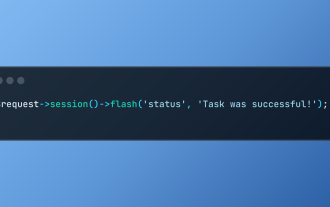 Working with Flash Session Data in Laravel
Mar 12, 2025 pm 05:08 PM
Working with Flash Session Data in Laravel
Mar 12, 2025 pm 05:08 PM
Laravel simplifies handling temporary session data using its intuitive flash methods. This is perfect for displaying brief messages, alerts, or notifications within your application. Data persists only for the subsequent request by default: $request-
 cURL in PHP: How to Use the PHP cURL Extension in REST APIs
Mar 14, 2025 am 11:42 AM
cURL in PHP: How to Use the PHP cURL Extension in REST APIs
Mar 14, 2025 am 11:42 AM
The PHP Client URL (cURL) extension is a powerful tool for developers, enabling seamless interaction with remote servers and REST APIs. By leveraging libcurl, a well-respected multi-protocol file transfer library, PHP cURL facilitates efficient execution of various network protocols, including HTTP, HTTPS, and FTP. This extension offers granular control over HTTP requests, supports multiple concurrent operations, and provides built-in security features.
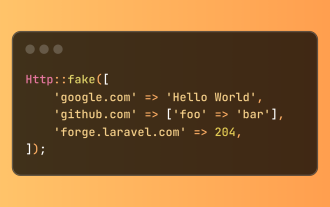 Simplified HTTP Response Mocking in Laravel Tests
Mar 12, 2025 pm 05:09 PM
Simplified HTTP Response Mocking in Laravel Tests
Mar 12, 2025 pm 05:09 PM
Laravel provides concise HTTP response simulation syntax, simplifying HTTP interaction testing. This approach significantly reduces code redundancy while making your test simulation more intuitive. The basic implementation provides a variety of response type shortcuts: use Illuminate\Support\Facades\Http; Http::fake([ 'google.com' => 'Hello World', 'github.com' => ['foo' => 'bar'], 'forge.laravel.com' =>
 12 Best PHP Chat Scripts on CodeCanyon
Mar 13, 2025 pm 12:08 PM
12 Best PHP Chat Scripts on CodeCanyon
Mar 13, 2025 pm 12:08 PM
Do you want to provide real-time, instant solutions to your customers' most pressing problems? Live chat lets you have real-time conversations with customers and resolve their problems instantly. It allows you to provide faster service to your custom
 Explain the concept of late static binding in PHP.
Mar 21, 2025 pm 01:33 PM
Explain the concept of late static binding in PHP.
Mar 21, 2025 pm 01:33 PM
Article discusses late static binding (LSB) in PHP, introduced in PHP 5.3, allowing runtime resolution of static method calls for more flexible inheritance.Main issue: LSB vs. traditional polymorphism; LSB's practical applications and potential perfo
 PHP Logging: Best Practices for PHP Log Analysis
Mar 10, 2025 pm 02:32 PM
PHP Logging: Best Practices for PHP Log Analysis
Mar 10, 2025 pm 02:32 PM
PHP logging is essential for monitoring and debugging web applications, as well as capturing critical events, errors, and runtime behavior. It provides valuable insights into system performance, helps identify issues, and supports faster troubleshoot
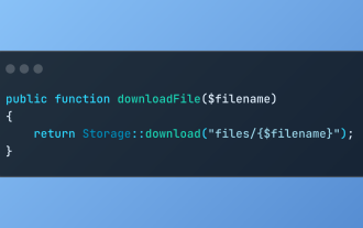 Discover File Downloads in Laravel with Storage::download
Mar 06, 2025 am 02:22 AM
Discover File Downloads in Laravel with Storage::download
Mar 06, 2025 am 02:22 AM
The Storage::download method of the Laravel framework provides a concise API for safely handling file downloads while managing abstractions of file storage. Here is an example of using Storage::download() in the example controller:
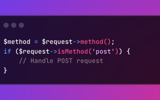 HTTP Method Verification in Laravel
Mar 05, 2025 pm 04:14 PM
HTTP Method Verification in Laravel
Mar 05, 2025 pm 04:14 PM
Laravel simplifies HTTP verb handling in incoming requests, streamlining diverse operation management within your applications. The method() and isMethod() methods efficiently identify and validate request types. This feature is crucial for building
