

How to make a basic scatter plot using Python-Plotly?

Sometimes the task is to analyze a data set and visualize the data using charts or plots. Plotly is a great open source graphics library that can be used with Python for quickly and easily making a variety of plots and charts. In this article, you use two different examples to plot scatter plots using a Python library called Plotly with Python code. In the first example, the Python installed in the computer system is used to run a Python program written to make a scatter plot. Another example, using Google Colab, shows how you can still use Python and Plotly and make scatter plots without Python installed on your computer. In both examples, Kaggle's open source datasets were used for data analysis and visualization.
IRIS.csv file used
sepal_length,sepal_width,petal_length,petal_width,species
5.1,3.5,1.4,0.2,Iris-setosa
4.9,3,1.4,0.2,Iris-setosa
4.7,3.2,1.3,0.2,Iris-setosa
4.6,3.1,1.5,0.2,Iris-setosa
5,3.6,1.4,0.2,Iris-setosa
5.4,3.9,1.7,0.4,Iris-setosa
4.6,3.4,1.4,0.3,Iris-setosa
5,3.4,1.5,0.2,Iris-setosa
4.4,2.9,1.4,0.2,Iris-setosa
…….., ….., ……, ……., ……..
This CSV file contains five columns named sepal_length, sepal_width, petal_length, petal_width, and species. Among them, we will use sepal_width and petal_width as the scatter plot in example 1 and sepal_length and petal_length as the scatter plot in example 2.
Example 1: Making a Scatter Plot using Python and Plotly
Design steps and coding
Step 1 - First import pandas and draw. Plotly, an open source graphics library for Python, will be used to create scatter plots.
Step 2 - Now read the IRIS.csv file as the dataset given here will be used to make the scatter plot.
Step 3 - Make a data frame dff and display the columns and contents of the data frame.
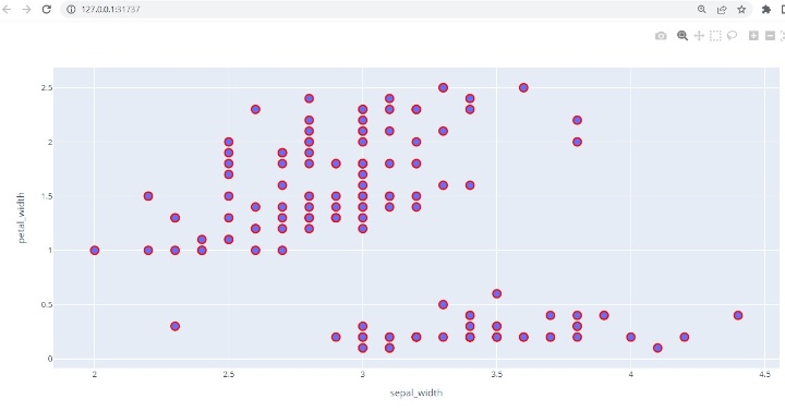
Step 4 - Use the scatter() function to draw a scatter plot, specifying sepal_width for the x-axis and petal_width for the y-axis.
Step 5 - Set the style of the marker, such as size and color.
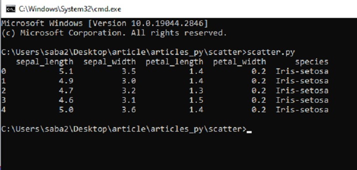
Step 6 - Write a function to display a scatter plot. Run the program using cmd window. The graph will open in a new tab in your browser.
Example 2: Making a scatter plot using Python and Plotly on Google Colab
Design steps and coding
Step 1 - Sign in with your Google Account. Go to Google Colab. Open a new Colab Notebook and write Python code in it.
Step 2 - Upload the IRIS.csv file downloaded and saved from Kaggle using the link given in Example 1 as the dataset given here will be used to make scatter points picture.
Step 3 - Now import pandas and plot. Plotly, an open source graphics library for Python, will be used to create scatter plots.
Step 4 - Make a data frame dff and display the columns and contents of the data frame.
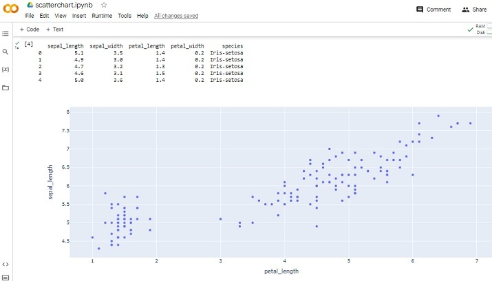
Step 5 - Use the scatter() function to draw a scatter plot, specifying petal_length for the x-axis and sepal_length for the y-axis.
Step 6 - Write a function to display a scatter plot. Run the program by clicking the play button on a given code cell. Check the results as it will appear in the Colab notebook.
Example 1: Making a Scatter Plot using Python and Plotly
Save the data files/csv files required for data analysis
To make the scatter plot, we will use the data available on Kaggle. Log in to Kaggle and download the CSV file from this link -
Create a file named Scatter.py. Write the following code in this file
#include the required libraries
import pandas as pd

#This library is needed to make the scatter plot
import plotly.express as pxx

#read the CSV file and make a dataframe
dff = pd.read_csv("IRIS.csv")

#print the columns and data

print(dff.head())

#make the scatter plot
figg = pxx.scatter(dff, x="sepal_width", y="petal_width")

#set the properties of the scatter plot
figg.update_traces(marker=dict(size=12, line=dict(width=2, color="red")), selector=dict(mode='markers'))

#display the chart
figg.show()
Run Python files in the command line window
View results - Example 1
Example 1: Making a scatter plot using Python on Google Colab
Upload data, CSV file
#Uploading the csv
from google.colab import dfiles
data_to_load = dfiles.upload()
Include libraries and read CSV files
import pandas as pdd
import plotly.express as pxx

dff = pdd.read_csv("IRIS.csv")
Print the results and display the scatter plot
print(dff.head())
figg = pxx.scatter(dff, x="petal_length", y="sepal_length")
figg.show()
View Results
In this Python and Plotly article, two different examples are given on how to make a scatter plot using a Python library called Plotly. First, the method of downloading and saving data sets from Kaggle for analysis is given. Then write a Python program to plot a scatter plot using functions in Plotly. In the second example, write a Python program using Google Colab and make a scatter plot using the same library and the same dataset.
The above is the detailed content of How to make a basic scatter plot using Python-Plotly?. For more information, please follow other related articles on the PHP Chinese website!

Hot AI Tools

Undresser.AI Undress
AI-powered app for creating realistic nude photos

AI Clothes Remover
Online AI tool for removing clothes from photos.

Undress AI Tool
Undress images for free

Clothoff.io
AI clothes remover

AI Hentai Generator
Generate AI Hentai for free.

Hot Article
Hot Tools

Notepad++7.3.1
Easy-to-use and free code editor

SublimeText3 Chinese version
Chinese version, very easy to use

Zend Studio 13.0.1
Powerful PHP integrated development environment

Dreamweaver CS6
Visual web development tools

SublimeText3 Mac version
God-level code editing software (SublimeText3)
Hot Topics


 How to beautify the XML format
Apr 02, 2025 pm 09:57 PM
How to beautify the XML format
Apr 02, 2025 pm 09:57 PM
XML beautification is essentially improving its readability, including reasonable indentation, line breaks and tag organization. The principle is to traverse the XML tree, add indentation according to the level, and handle empty tags and tags containing text. Python's xml.etree.ElementTree library provides a convenient pretty_xml() function that can implement the above beautification process.
 How to open xml format
Apr 02, 2025 pm 09:00 PM
How to open xml format
Apr 02, 2025 pm 09:00 PM
Use most text editors to open XML files; if you need a more intuitive tree display, you can use an XML editor, such as Oxygen XML Editor or XMLSpy; if you process XML data in a program, you need to use a programming language (such as Python) and XML libraries (such as xml.etree.ElementTree) to parse.
 Does XML modification require programming?
Apr 02, 2025 pm 06:51 PM
Does XML modification require programming?
Apr 02, 2025 pm 06:51 PM
Modifying XML content requires programming, because it requires accurate finding of the target nodes to add, delete, modify and check. The programming language has corresponding libraries to process XML and provides APIs to perform safe, efficient and controllable operations like operating databases.
 Is there any mobile app that can convert XML into PDF?
Apr 02, 2025 pm 08:54 PM
Is there any mobile app that can convert XML into PDF?
Apr 02, 2025 pm 08:54 PM
An application that converts XML directly to PDF cannot be found because they are two fundamentally different formats. XML is used to store data, while PDF is used to display documents. To complete the transformation, you can use programming languages and libraries such as Python and ReportLab to parse XML data and generate PDF documents.
 Is there a free XML to PDF tool for mobile phones?
Apr 02, 2025 pm 09:12 PM
Is there a free XML to PDF tool for mobile phones?
Apr 02, 2025 pm 09:12 PM
There is no simple and direct free XML to PDF tool on mobile. The required data visualization process involves complex data understanding and rendering, and most of the so-called "free" tools on the market have poor experience. It is recommended to use computer-side tools or use cloud services, or develop apps yourself to obtain more reliable conversion effects.
 Is the conversion speed fast when converting XML to PDF on mobile phone?
Apr 02, 2025 pm 10:09 PM
Is the conversion speed fast when converting XML to PDF on mobile phone?
Apr 02, 2025 pm 10:09 PM
The speed of mobile XML to PDF depends on the following factors: the complexity of XML structure. Mobile hardware configuration conversion method (library, algorithm) code quality optimization methods (select efficient libraries, optimize algorithms, cache data, and utilize multi-threading). Overall, there is no absolute answer and it needs to be optimized according to the specific situation.
 How to convert XML files to PDF on your phone?
Apr 02, 2025 pm 10:12 PM
How to convert XML files to PDF on your phone?
Apr 02, 2025 pm 10:12 PM
It is impossible to complete XML to PDF conversion directly on your phone with a single application. It is necessary to use cloud services, which can be achieved through two steps: 1. Convert XML to PDF in the cloud, 2. Access or download the converted PDF file on the mobile phone.
 How to convert XML to PDF on your phone?
Apr 02, 2025 pm 10:18 PM
How to convert XML to PDF on your phone?
Apr 02, 2025 pm 10:18 PM
It is not easy to convert XML to PDF directly on your phone, but it can be achieved with the help of cloud services. It is recommended to use a lightweight mobile app to upload XML files and receive generated PDFs, and convert them with cloud APIs. Cloud APIs use serverless computing services, and choosing the right platform is crucial. Complexity, error handling, security, and optimization strategies need to be considered when handling XML parsing and PDF generation. The entire process requires the front-end app and the back-end API to work together, and it requires some understanding of a variety of technologies.
