

How to make Stripplot with Jitter in Altair Python?

This tutorial will explain how to make a Stripplot using Jitter in Altair Python. Use bar charts with dithering in Altair Python to quickly and easily visualize data sets containing continuous and categorical variables. In a strip chart, one of the variables is a categorical variable and the other is a continuous variable. A strip chart is a type of scatter chart. By viewing the data points as individual points along the categorical axis, we can see the distribution of the continuous variable for each category. Dithering the data points across the plot makes it easier to examine how the data is distributed.
Using the mark_circle() function to build a chart and the jitter() function to add a jitter effect, we can create a bar chart with a jitter effect in Altair Python. First, the x and y variables of the chart must be specified using the encoding parameter. Then use the mark_circle() function to create the chart and the jitter() function to add the jitter effect. You can also modify the chart by modifying the axis labels, color scheme, and adding a title. By following these simple methods, we can create a readable and instructive bar chart with jitter effect in Altair Python.
grammar
Altair is a Python library that can be used to create strip charts with dithering. The following is a syntax example for creating a strip chart with dithering using Altair -
import altair as alt

# create a stripplot with jitter using Altair
alt.Chart(df).mark_circle(size = 14).encode(
   x = alt.X('jitter:Q', title = None, axis = alt.Axis(ticks = True, grid = False, labels = False), scale = alt.Scale()),
   y = alt.Y('Y:Q', scale = alt.Scale()),
   color = alt.Color('C:N', legend = None),
).transform_calculate(
   Jitter = 'sqrt(-2*log(rand()))*cos(2*PI*rand())',
)
The given code creates a bar chart with jitter effect using Altair. The transform_calculate() method calculates the square root of the negative twice the natural logarithm of a random number generated by the rand() method in Python's random module, multiplied by twice pi times another random number generated using the same rand() method. The cosine value of , generates a Gaussian jitter on the x-axis. This adds the jitter value to the 'jitter' column of the DataFrame. This jitter value is then mapped onto the x-axis using the 'jitter:Q' encoding in the alt.X() method.
Example
The following code uses the Altair visualization library in Python to generate a bar chart with a jitter effect. The code first uses pandas.DataFrame() to create a custom dataset containing 100 randomly generated x values, y values, and categories. The x and y values represent the coordinates of the points in the plot, while the category column determines the color of each point.
Then use the alt.Chart() function to create a chart object, and call the mark_circle() function to specify that the plot should be circular. The encode() method is used to specify how data is mapped to the visual properties of the plot, such as x and y positions and point colors. In this case, x encoding adds jitter to the x-axis using a calculated field called jitter, while y encoding specifies the y value. Color coding uses the category column to color the points, and the legend=None parameter removes the legend. Finally, the transform_calculate() function is used to calculate the jitter field using a formula based on a random number generator that adds a small amount of random noise to the x-values and spreads the points horizontally.
import altair as alt
import pandas as pd
import numpy as np
# create a custom dataset
custom_data = pd.DataFrame({
'x_values': np.random.randn(100),
'y_values': np.random.randn(100),
'category': np.random.choice(['A', 'B', 'C'], 100)
})
# create a stripplot with jitter using Altair
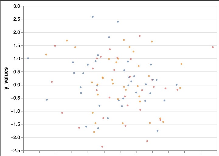
alt.Chart(custom_data).mark_circle(size = 14).encode(
x=alt.X('jitter:Q', title = None,
axis = alt.Axis(ticks = True, grid = False, labels = False), scale = alt.Scale()),
y=alt.Y('y_values:Q', scale=alt.Scale()),
color=alt.Color('category:N', legend = None),
).transform_calculate(
jitter='sqrt(-2*log(random()))*cos(2*PI*random())',
)
Output
Example
This example shows how to create a strip chart with jitter in Altair using the Iris dataset. The code first imports the necessary libraries from the vega_datasets library, including the Altair and Iris datasets. It then creates an Altair chart using the mark_circle method, creating a circle for each data point and encoding the x, y and color variables using the Altair X, Y and Color classes respectively.
This example shows how to create a strip chart with jitter in Altair using the Iris dataset. The code first imports the necessary libraries from the vega_datasets library, including the Altair and Iris datasets. It then creates an Altair chart using the mark_circle method, creating a circle for each data point and encoding the x, y and color variables using the Altair X, Y and Color classes respectively.
import altair as alt
from vega_datasets import data
# load the Iris dataset
iris = data.iris()
# create a stripplot with jitter using Altair
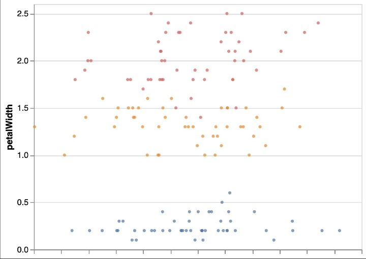
alt.Chart(iris).mark_circle(size = 14).encode(
x = alt.X('jitter:Q', title = None, axis = alt.Axis(ticks = True, grid = False, labels = False), scale = alt.Scale()),
y = alt.Y('petalWidth:Q', scale = alt.Scale()),
color = alt.Color('species:N', legend = None),
).transform_calculate(
jitter = 'sqrt(-2*log(random()))*cos(2*PI*random())',
)
Output
Conclusion
In summary, using dithering to create bar charts is very useful for showing the distribution and variability of data points. Python's Altair package makes doing this easy and efficient. Users can follow the instructions provided in this article, including importing the required libraries, loading data, and encoding x, y, and color variables, to create an educational and beautiful chart. By using the transform_calculate method to include jitter, the chart is further improved as it is now easier to identify specific data points and patterns in the data.
Overall, Altair is a powerful Python data visualization tool, and using dither to create a strip chart is just one example of its capabilities. You can create a variety of powerful and educational visualizations by experimenting with various data sets and visual encodings. Thanks to Altair's simple syntax and powerful functionality, the data visualization possibilities are endless.
The above is the detailed content of How to make Stripplot with Jitter in Altair Python?. For more information, please follow other related articles on the PHP Chinese website!

Hot AI Tools

Undresser.AI Undress
AI-powered app for creating realistic nude photos

AI Clothes Remover
Online AI tool for removing clothes from photos.

Undress AI Tool
Undress images for free

Clothoff.io
AI clothes remover

AI Hentai Generator
Generate AI Hentai for free.

Hot Article
Hot Tools

Notepad++7.3.1
Easy-to-use and free code editor

SublimeText3 Chinese version
Chinese version, very easy to use

Zend Studio 13.0.1
Powerful PHP integrated development environment

Dreamweaver CS6
Visual web development tools

SublimeText3 Mac version
God-level code editing software (SublimeText3)
Hot Topics


 How to Use Python to Find the Zipf Distribution of a Text File
Mar 05, 2025 am 09:58 AM
How to Use Python to Find the Zipf Distribution of a Text File
Mar 05, 2025 am 09:58 AM
This tutorial demonstrates how to use Python to process the statistical concept of Zipf's law and demonstrates the efficiency of Python's reading and sorting large text files when processing the law. You may be wondering what the term Zipf distribution means. To understand this term, we first need to define Zipf's law. Don't worry, I'll try to simplify the instructions. Zipf's Law Zipf's law simply means: in a large natural language corpus, the most frequently occurring words appear about twice as frequently as the second frequent words, three times as the third frequent words, four times as the fourth frequent words, and so on. Let's look at an example. If you look at the Brown corpus in American English, you will notice that the most frequent word is "th
 How Do I Use Beautiful Soup to Parse HTML?
Mar 10, 2025 pm 06:54 PM
How Do I Use Beautiful Soup to Parse HTML?
Mar 10, 2025 pm 06:54 PM
This article explains how to use Beautiful Soup, a Python library, to parse HTML. It details common methods like find(), find_all(), select(), and get_text() for data extraction, handling of diverse HTML structures and errors, and alternatives (Sel
 Image Filtering in Python
Mar 03, 2025 am 09:44 AM
Image Filtering in Python
Mar 03, 2025 am 09:44 AM
Dealing with noisy images is a common problem, especially with mobile phone or low-resolution camera photos. This tutorial explores image filtering techniques in Python using OpenCV to tackle this issue. Image Filtering: A Powerful Tool Image filter
 How to Perform Deep Learning with TensorFlow or PyTorch?
Mar 10, 2025 pm 06:52 PM
How to Perform Deep Learning with TensorFlow or PyTorch?
Mar 10, 2025 pm 06:52 PM
This article compares TensorFlow and PyTorch for deep learning. It details the steps involved: data preparation, model building, training, evaluation, and deployment. Key differences between the frameworks, particularly regarding computational grap
 Introduction to Parallel and Concurrent Programming in Python
Mar 03, 2025 am 10:32 AM
Introduction to Parallel and Concurrent Programming in Python
Mar 03, 2025 am 10:32 AM
Python, a favorite for data science and processing, offers a rich ecosystem for high-performance computing. However, parallel programming in Python presents unique challenges. This tutorial explores these challenges, focusing on the Global Interprete
 How to Implement Your Own Data Structure in Python
Mar 03, 2025 am 09:28 AM
How to Implement Your Own Data Structure in Python
Mar 03, 2025 am 09:28 AM
This tutorial demonstrates creating a custom pipeline data structure in Python 3, leveraging classes and operator overloading for enhanced functionality. The pipeline's flexibility lies in its ability to apply a series of functions to a data set, ge
 Serialization and Deserialization of Python Objects: Part 1
Mar 08, 2025 am 09:39 AM
Serialization and Deserialization of Python Objects: Part 1
Mar 08, 2025 am 09:39 AM
Serialization and deserialization of Python objects are key aspects of any non-trivial program. If you save something to a Python file, you do object serialization and deserialization if you read the configuration file, or if you respond to an HTTP request. In a sense, serialization and deserialization are the most boring things in the world. Who cares about all these formats and protocols? You want to persist or stream some Python objects and retrieve them in full at a later time. This is a great way to see the world on a conceptual level. However, on a practical level, the serialization scheme, format or protocol you choose may determine the speed, security, freedom of maintenance status, and other aspects of the program
 Mathematical Modules in Python: Statistics
Mar 09, 2025 am 11:40 AM
Mathematical Modules in Python: Statistics
Mar 09, 2025 am 11:40 AM
Python's statistics module provides powerful data statistical analysis capabilities to help us quickly understand the overall characteristics of data, such as biostatistics and business analysis. Instead of looking at data points one by one, just look at statistics such as mean or variance to discover trends and features in the original data that may be ignored, and compare large datasets more easily and effectively. This tutorial will explain how to calculate the mean and measure the degree of dispersion of the dataset. Unless otherwise stated, all functions in this module support the calculation of the mean() function instead of simply summing the average. Floating point numbers can also be used. import random import statistics from fracti
