

One of the most common user interface elements used to present data is a table. It turns out that there are many aspects that need to be controlled when using tables, such as:
In this two-part series, you'll learn the ins and outs of working with tabular data in React using the React Bootstrap Table component. You'll be able to create complex, professional-looking forms with ease, with the ability to customize every aspect.
First, you should familiarize yourself with React itself. If you need a primer on React, Envato Tuts has a great series to help you get started with React. In this tutorial, we will focus on using React Bootstrap Table2.
First, create a React application using the create-react-app command. You can learn how to set up create-react-app in the React Beginners Crash Course.
create-react-app react-table-app
Now navigate to the project folder and install React Bootstrap Table 2 and Bootstrap.
cd react-table-app
npm install react-bootstrap-table-next --save
npm install --save bootstrap@4.0.0
We will start with a basic form. We start by importing the BootstrapTable component and CSS as shown below.
import logo from './logo.svg';
import './App.css';
import React, { Component } from 'react';
import '../node_modules/bootstrap/dist/css/bootstrap.min.css';
import BootstrapTable from 'react-bootstrap-table-next';
First, we initialize the data and column variables, and then assign the data to the BootstrapTable component. The data contains the names of some characters from the comedy show Arrested Development.
const data = [
  {id: 1, name: 'Gob', value: '2'},
  {id: 2, name: 'Buster', value: '5'},
  {id: 3, name: 'George Michael', value: '4'}
];
const columns = [{
  dataField: 'id',
  text: 'Product ID'
}, {
  dataField: 'name',
  text: 'Product Name'
}, {
  dataField: 'value',
  text: 'Product value'
}];
Bootstrap components take the following properties.
keyFielddataListrender() The method renders a table with three columns: "ID", "Name", and "Value".
class App extends Component {
  render() {
    return (
      <div className="App">
        <p className="Table-header">Basic Table</p>

        <BootstrapTable keyField='id' data={ person } columns={ columns } />
      </div>
    );
  }
}
To view the table, issue the command npm start --reload. The configuration created by create-react-app watches your code and recompiles when you change anything, so you only have to run it once. Then, every change is reflected automatically.
Compiled successfully!

You can now view my-table-app in the browser.

  Local:            https://localhost:3002
  On Your Network:  http://192.168.43.206:3002

Note that the development build is not optimized.
To create a production build, use npm run build.
The results are as follows:
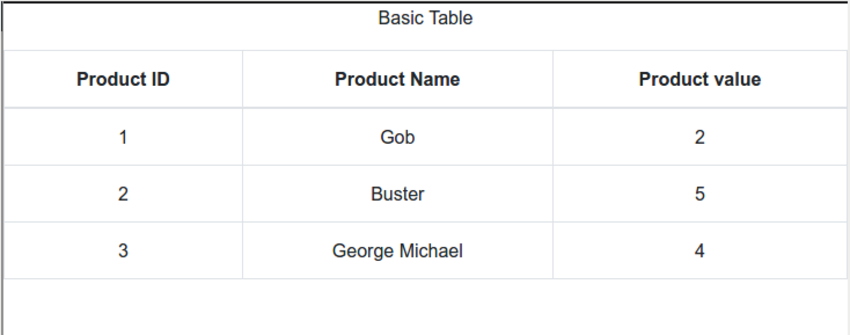
Please note that each column has the same width.
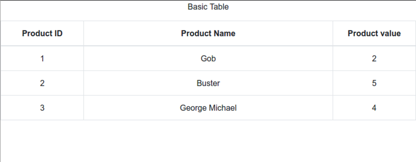
You can control many aspects of columns. In particular, column widths can be specified in absolute units, percentages, or not. The column width of unspecified columns is the remainder after equal division. For example, for our base table, we specify the columns as follows:
You can also manage text and column alignment and header and column styles. Here are examples of how to specify different column widths, text alignment, and custom styles:
const columns = [{
  dataField: 'id',
  text: 'Product ID',
  headerStyle: (colum, colIndex) => {
          return { width: '20%', textAlign: 'center' };
        }
}, {
  dataField: 'name',
  text: 'Product Name',
  sort: true,
  headerStyle: (colum, colIndex) => {
          return { width: '60%', textAlign: 'center' };
        }
}, {
  dataField: 'value',
  text: 'Product value',
  headerStyle: (colum, colIndex) => {
          return { width: '20%', textAlign: 'center' };
        }

}];
The table now looks like this:
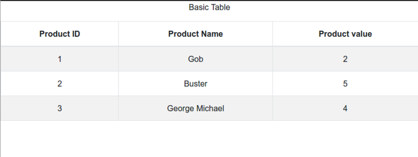
You've seen how to style individual columns and headers, but styling can go much further. React Bootstrap Table 2 offers many customization options. First, you just add the striped and hover properties to the BootstrapTable component to get an alternate background color for each row.
Let's apply the striped and hover properties to our table.
class App extends Component {
  render() {
    return (
      <div className="App">
        <p className="Table-header">Basic Table</p>

        <BootstrapTable
        striped
        hover
        keyField='id'
        keyField='id'
        data={ person }
        columns={ columns }
        />
      </div>
    );
  }
}
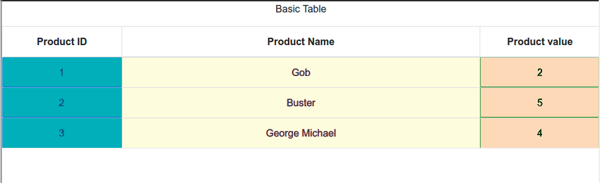
See how to style different columns with different colors.
const columns = [{
  dataField: 'id',
  text: 'Product ID',
  style: { backgroundColor: #00afb9 }
}, {
  dataField: 'name',
  text: 'Product Name',
  style: { backgroundColor: #fdfcdc }
}, {
  dataField: 'value',
  text: 'Product value',
  style: { backgroundColor: #fed9b7 }
}];
React Bootstrap Table 2 allows sorting of columns. This is done by providing the sort: true attribute in the columns definition.
const columns = [{
  dataField: 'id',
  text: 'Product ID',
  style: { backgroundColor: #00afb9 }
}, {
  dataField: 'name',
  text: 'Product Name',
  style: { backgroundColor: #fdfcdc },
  sort: true
}, {
  dataField: 'value',
  text: 'Product value',
      style: { backgroundColor: #fed9b7 }
}];
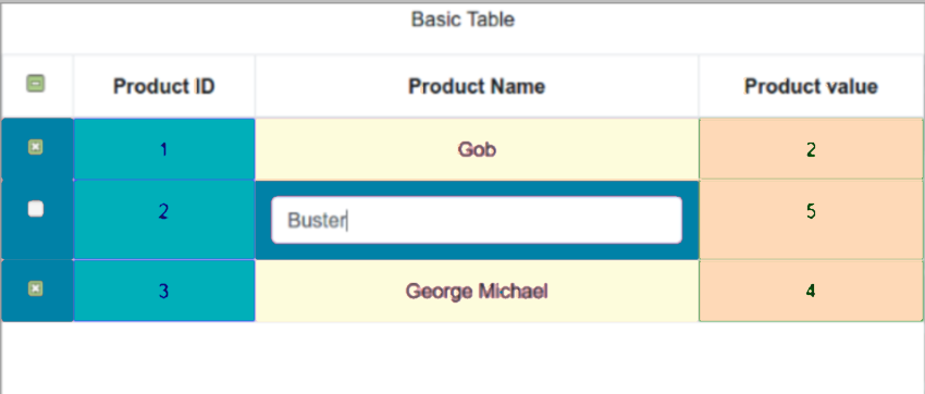
After you put the data into the table, you may need to select certain rows to perform certain operations on them. React Bootstrap Table 2 provides various selection options. All options are organized in an object that you pass to the component as the selectRow property. Here are some selection options:
The following components demonstrate many of these options:
Let’s explore some other open source React table libraries.
react-virtualized is great for efficiently displaying large amounts of data when rendering large lists and tabular data.
react-virtualized uses a technology called virtual rendering to efficiently display large amounts of data. Virtual rendering only renders what is visible. For example, if you have a large list with a thousand items, react-virtualized will only display a small portion of the data (data that fits the screen) at any given moment until the user scrolls to display more data. Other features include:
react-table is a lightweight open source library that allows fast and scalable data grids for React. It also supports hooks. Some of its best features include:
React Data Grid is another open source library that uses Bootstrap and is great for editing tables. It also has an amazing user interface. Features include:
In this tutorial, we created a simple React app using create-react-app, added react-bootstrap-table2, filled the table with data, processed the columns, styled the table and selected rows.
In the next part, we will continue this journey with extending rows, adding rows, deleting rows, as well as paging, cell editing and advanced customization. stay tuned.
The above is the detailed content of Using tables in React: Part 1. For more information, please follow other related articles on the PHP Chinese website!


![[Web front-end] Node.js quick start](https://img.php.cn/upload/course/000/000/067/662b5d34ba7c0227.png)


