How to use alert dialog in ReactNative?
The alert component helps to display a dialog box, that is, a pop-up window with a title, message, and buttons to the user to understand the user's confirmation based on the displayed message.
The basic component alert is as follows-
Alert.alert('yourtile', 'yourmessage', [yourbuttons], ‘options’)
To use the alert component you need to import it as follows-
import { Alert } from 'react-native';To get the popup you just call Alert.alert () function. Alert() has four parameters, namely title, message, button and option. The title is a mandatory parameter, the rest of the parameters are optional.
Here is a simple example on how to use Alert.alert() -
Alert.alert(
   "Hi",
   "Do you want to continue?",
   [
      {
         text: "Later",
         onPress: () => console.log("User pressed Later")
      },
      {
         text: "Cancel",
         onPress: () => console.log("Cancel Pressed"),
         style: "cancel"
      },
      { text: "OK",
         onPress: () => console.log("OK Pressed")
      }
   ],
   { cancelable: false }
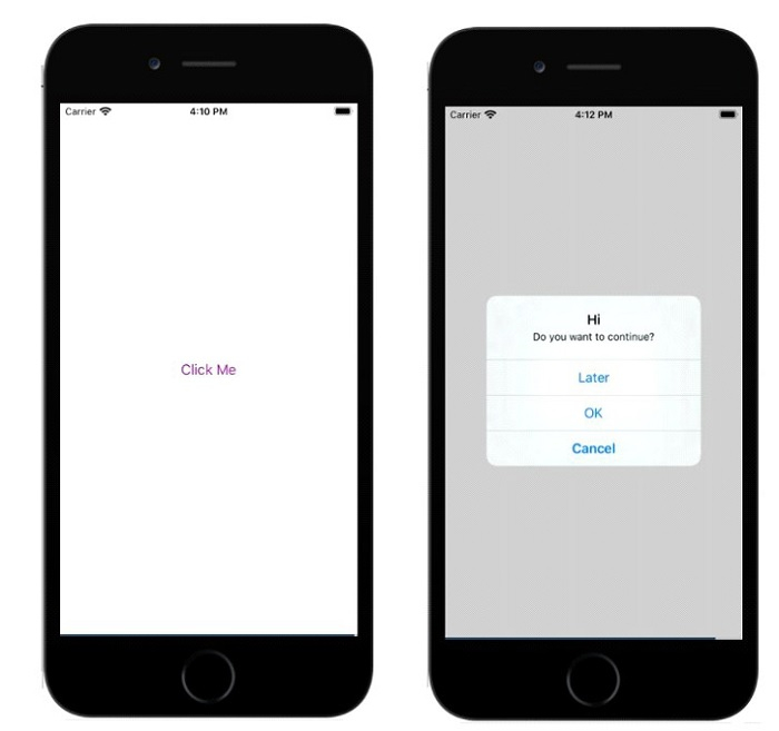
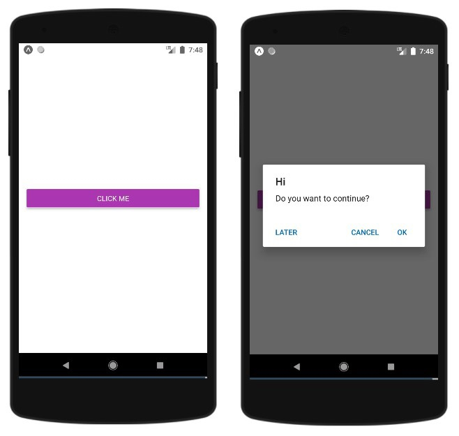
);Here the title is "Hi" and the message is "Do you want to continue" and I want to add a message in the dialog box The buttons shown are Later, Cancel, and OK. For each button onPress event added, the event displays a console message. Finally, there is the options parameter, which can be used to control the behavior of the pop-up window. On Android, by default, a popup will close if clicked outside its boundaries. To disable it you can use { cancelable: false } as the options parameter. When you click outside the popup area, it won't close since Cancelable is set to false.
In iOS, you can specify any number of buttons, but in Android, you can use three buttons. Three buttons in Android have the concept of Neutral, Negative and Positive buttons -
If you specify a button, it will be something like "Positive" 'eg "OK".
If there are two buttons, the first one is "negative" and the second one is "positive". For example "Cancel" and "OK". < /p>
If there are three buttons, they are "Neutral", "Negative" and "Positive". For example "Later", "Cancel" and "OK"
< /li>
This is a working example showing how the alert component works -
Example 1: Display of alert box
import React from 'react';
import { Button, View, Alert } from 'react-native';
const App = () => {
const testAlert = () =>
Alert.alert(
"Hi",
"Do you want to continue?",
[
{
text: "Later",
onPress: () => console.log("User pressed Later")
},
{
text: "Cancel",
onPress: () => console.log("Cancel Pressed"),
style: "cancel"
},
{ text: "OK",
onPress: () => console.log("OK Pressed")
}
],
{ cancelable: false }
);
return (
<View style={{flex :1, justifyContent: 'center', margin: 15 }}>
<Button
title="Click Me"
color="#9C27B0"
onPress={testAlert}
/>
</View>
);
}
export default App;Output

Alert.alert(
   "Hi",
   "Do you want to continue?",
   [
      {
         text: "Later",
         onPress: () => console.log("User pressed Later")
      },
      {
         text: "Cancel",
         onPress: () => console.log("Cancel Pressed"),
         style: "cancel"
      },
      { text: "OK",
         onPress: () => console.log("OK Pressed")
      }
   ],
   { cancelable: true }
);import React from 'react';
import { Button, View, Alert } from 'react-native';
const App = () => {
const testAlert = () =>
Alert.alert(
"Hi",
"Do you want to continue?",
[
{
text: "Later",
onPress: () => console.log("User pressed Later")
},
{
text: "Cancel",
onPress: () => console.log("Cancel Pressed"),
style: "cancel"
},
{ text: "OK",
onPress: () => console.log("OK Pressed")
}
],
{ cancelable: true }
);
return (
<View style={{flex :1, justifyContent: 'center', margin: 15 }}>
<Button
title="Click Me"
color="#9C27B0"
onPress={testAlert}
/>
</View>
);
}
export default App;
The above is the detailed content of How to use alert dialog in ReactNative?. For more information, please follow other related articles on the PHP Chinese website!

Hot AI Tools

Undresser.AI Undress
AI-powered app for creating realistic nude photos

AI Clothes Remover
Online AI tool for removing clothes from photos.

Undress AI Tool
Undress images for free

Clothoff.io
AI clothes remover

AI Hentai Generator
Generate AI Hentai for free.

Hot Article

Hot Tools

Notepad++7.3.1
Easy-to-use and free code editor

SublimeText3 Chinese version
Chinese version, very easy to use

Zend Studio 13.0.1
Powerful PHP integrated development environment

Dreamweaver CS6
Visual web development tools

SublimeText3 Mac version
God-level code editing software (SublimeText3)

Hot Topics
 Replace String Characters in JavaScript
Mar 11, 2025 am 12:07 AM
Detailed explanation of JavaScript string replacement method and FAQ This article will explore two ways to replace string characters in JavaScript: internal JavaScript code and internal HTML for web pages. Replace string inside JavaScript code The most direct way is to use the replace() method: str = str.replace("find","replace"); This method replaces only the first match. To replace all matches, use a regular expression and add the global flag g: str = str.replace(/fi
 jQuery Check if Date is Valid
Mar 01, 2025 am 08:51 AM
Simple JavaScript functions are used to check if a date is valid. function isValidDate(s) { var bits = s.split('/'); var d = new Date(bits[2] '/' bits[1] '/' bits[0]); return !!(d && (d.getMonth() 1) == bits[1] && d.getDate() == Number(bits[0])); } //test var
 jQuery get element padding/margin
Mar 01, 2025 am 08:53 AM
This article discusses how to use jQuery to obtain and set the inner margin and margin values of DOM elements, especially the specific locations of the outer margin and inner margins of the element. While it is possible to set the inner and outer margins of an element using CSS, getting accurate values can be tricky. // set up $("div.header").css("margin","10px"); $("div.header").css("padding","10px"); You might think this code is
 10 jQuery Accordions Tabs
Mar 01, 2025 am 01:34 AM
This article explores ten exceptional jQuery tabs and accordions. The key difference between tabs and accordions lies in how their content panels are displayed and hidden. Let's delve into these ten examples. Related articles: 10 jQuery Tab Plugins
 10 Worth Checking Out jQuery Plugins
Mar 01, 2025 am 01:29 AM
Discover ten exceptional jQuery plugins to elevate your website's dynamism and visual appeal! This curated collection offers diverse functionalities, from image animation to interactive galleries. Let's explore these powerful tools: Related Posts: 1
 HTTP Debugging with Node and http-console
Mar 01, 2025 am 01:37 AM
http-console is a Node module that gives you a command-line interface for executing HTTP commands. It’s great for debugging and seeing exactly what is going on with your HTTP requests, regardless of whether they’re made against a web server, web serv
 Custom Google Search API Setup Tutorial
Mar 04, 2025 am 01:06 AM
This tutorial shows you how to integrate a custom Google Search API into your blog or website, offering a more refined search experience than standard WordPress theme search functions. It's surprisingly easy! You'll be able to restrict searches to y
 jquery add scrollbar to div
Mar 01, 2025 am 01:30 AM
The following jQuery code snippet can be used to add scrollbars when the div content exceeds the container element area. (No demonstration, please copy it directly to Firebug) //D = document //W = window //$ = jQuery var contentArea = $(this), wintop = contentArea.scrollTop(), docheight = $(D).height(), winheight = $(W).height(), divheight = $('#c


