

Learn CSS3 flex layout, how to create a flexible web page layout?

Learn CSS3 flex layout, how to create a flexible web page layout?
In web design, layout plays a vital role. With a good layout, your webpage can look neater, more beautiful, and adapt to different screen sizes and devices. CSS3's flex layout provides a flexible and powerful way to create web page layout. This article will introduce what flex layout is and how to use it to create flexible web page layouts.
1. What is flex layout
Flex layout is a new layout method provided in CSS3, also known as flexible layout. It is based on the concepts of main axis and cross axis, and achieves flexible layout effects by setting a series of properties for the container and its internal elements. Through flex layout, we can easily achieve effects such as adaptive elements, center alignment, and even space distribution.
2. Flex container and flex item
In flex layout, there are two important concepts, namely flex container and flex item. A flex container is a parent element that contains a group of flex items. The attributes and values of this parent element determine how the child elements are laid out. Flex items are child elements directly contained by the flex container.
3. Properties of flex container
- display: flex
This is the first step to use flex layout. Just set the display property of the container to flex. Enable flex layout. It will arrange the elements inside the container on a row, and by default the elements will be sorted in the order they appear in the HTML. - flex-direction
This property determines how elements are arranged in the container. It has the following optional values: - row: Horizontal direction, arranged from left to right (default value)
- row-reverse: Horizontal direction, arranged from right to left
- column: Vertical direction, arranged from top to bottom
- column-reverse: Vertical direction, arranged from bottom to top
- justify-content
This attribute determines the position of the element on the main axis alignment on. It has the following optional values: - flex-start: Aligned close to the start position of the main axis (default value)
- flex-end: Aligned close to the end position of the main axis
- center : Centered alignment
- space-between: Evenly divide the space on the main axis, with the first and last elements close to both sides of the container
- space-around: Evenly divide the space on the main axis, between each element and the first and last elements Equal distance from the container
- align-items
This attribute determines the alignment of the element on the cross axis. It has the following optional values: - flex-start: Alignment close to the starting position of the cross axis
- flex-end: Alignment close to the end position of the cross axis
- center: Centered alignment
- baseline: Align according to the baseline of the element
- stretch: Stretch the element to fill the cross-axis space
4. Properties of flex items
- flex-grow
This property determines the scaling ratio of the flexible item in the remaining space. If the parent container has extra space, the value of the flex-grow property of each flex item will determine the proportion they are allocated. The default value is 0, which means no scaling. - flex-shrink
This property determines the shrinkage ratio of flexible items when there is insufficient space. If the parent container does not have enough space to accommodate all items, the value of the flex-shrink property of each flex item will determine the proportion by which they shrink. The default value is 1, which means equal proportional shrinkage. - flex-basis
This property determines the initial size of the flexible item in the main axis direction. It can be set to a specific value (such as pixels) or a percentage. The default value is auto, which automatically allocates the size based on the project content. - align-self
This property determines the alignment of a single item on the cross axis. It can override the container's align-items property. Its optional values are the same as align-items.
5. Flexible web page layout example
The following is an example of web page layout created using flex layout:
<!DOCTYPE html>
<html>
<head>
    <style>
        .container {
            display: flex;
            flex-direction: column;
            align-items: center;
        }

        .header {
            width: 100%;
            height: 100px;
            background-color: #ccc;
        }

        .main {
            flex: 1;
            width: 100%;
            background-color: #eaeaea;
        }

        .sidebar {
            width: 200px;
            background-color: #ccc;
        }

        .content {
            flex-grow: 1;
            padding: 20px;
        }

        .footer {
            width: 100%;
            height: 50px;
            background-color: #ccc;
        }
    </style>
</head>
<body>
    <div class="container">
        <div class="header">Header</div>
        <div class="main">
            <div class="sidebar">Sidebar</div>
            <div class="content">Content</div>
        </div>
        <div class="footer">Footer</div>
    </div>
</body>
</html>Using the above code, a flexible web page layout can be achieved, in which The head and bottom have a fixed height, and the middle part is divided into sidebar and content area. The middle part can be flexibly expanded according to the height of the content. By setting the flex attribute of each element and the alignment of the container, you can implement a web page layout that adapts to different screen sizes.
6. Summary
CSS3’s flex layout provides a flexible and powerful way to create web page layout. By flexibly using various properties of flex containers and flex items, you can easily achieve effects such as element adaptation, center alignment, and even space distribution. By learning and mastering flex layout, we can create more flexible, beautiful and adaptable web page layouts to different screen sizes and devices.
The above is the detailed content of Learn CSS3 flex layout, how to create a flexible web page layout?. For more information, please follow other related articles on the PHP Chinese website!

Hot AI Tools

Undresser.AI Undress
AI-powered app for creating realistic nude photos

AI Clothes Remover
Online AI tool for removing clothes from photos.

Undress AI Tool
Undress images for free

Clothoff.io
AI clothes remover

AI Hentai Generator
Generate AI Hentai for free.

Hot Article
Hot Tools

Notepad++7.3.1
Easy-to-use and free code editor

SublimeText3 Chinese version
Chinese version, very easy to use

Zend Studio 13.0.1
Powerful PHP integrated development environment

Dreamweaver CS6
Visual web development tools

SublimeText3 Mac version
God-level code editing software (SublimeText3)
Hot Topics


 What does placeholder mean in vue
May 07, 2024 am 09:57 AM
What does placeholder mean in vue
May 07, 2024 am 09:57 AM
In Vue.js, the placeholder attribute specifies the placeholder text of the input element, which is displayed when the user has not entered content, provides input tips or examples, and improves form accessibility. Its usage is to set the placeholder attribute on the input element and customize the appearance using CSS. Best practices include being relevant to the input, being short and clear, avoiding default text, and considering accessibility.
 What does span mean in js
May 06, 2024 am 11:42 AM
What does span mean in js
May 06, 2024 am 11:42 AM
The span tag can add styles, attributes, or behaviors to text. It is used to: add styles, such as color and font size. Set attributes such as id, class, etc. Associated behaviors such as clicks, hovers, etc. Mark text for further processing or citation.
 What does rem mean in js
May 06, 2024 am 11:30 AM
What does rem mean in js
May 06, 2024 am 11:30 AM
REM in CSS is a relative unit relative to the font size of the root element (html). It has the following characteristics: relative to the root element font size, not affected by the parent element. When the root element's font size changes, elements using REM will adjust accordingly. Can be used with any CSS property. Advantages of using REM include: Responsiveness: Keep text readable on different devices and screen sizes. Consistency: Make sure font sizes are consistent throughout your website. Scalability: Easily change the global font size by adjusting the root element font size.
 How to introduce images into vue
May 02, 2024 pm 10:48 PM
How to introduce images into vue
May 02, 2024 pm 10:48 PM
There are five ways to introduce images in Vue: through URL, require function, static file, v-bind directive and CSS background image. Dynamic images can be handled in Vue's computed properties or listeners, and bundled tools can be used to optimize image loading. Make sure the path is correct otherwise a loading error will appear.
 What is node in js
May 07, 2024 pm 09:06 PM
What is node in js
May 07, 2024 pm 09:06 PM
Nodes are entities in the JavaScript DOM that represent HTML elements. They represent a specific element in the page and can be used to access and manipulate that element. Common node types include element nodes, text nodes, comment nodes, and document nodes. Through DOM methods such as getElementById(), you can access nodes and operate on them, including modifying properties, adding/removing child nodes, inserting/replacing nodes, and cloning nodes. Node traversal helps navigate within the DOM structure. Nodes are useful for dynamically creating page content, event handling, animation, and data binding.
 What language is the browser plug-in written in?
May 08, 2024 pm 09:36 PM
What language is the browser plug-in written in?
May 08, 2024 pm 09:36 PM
Browser plug-ins are usually written in the following languages: Front-end languages: JavaScript, HTML, CSS Back-end languages: C++, Rust, WebAssembly Other languages: Python, Java
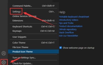 How to set unknown attributes in vscode vscode method to set unknown attributes
May 09, 2024 pm 02:43 PM
How to set unknown attributes in vscode vscode method to set unknown attributes
May 09, 2024 pm 02:43 PM
1. First, open the settings icon in the lower left corner and click the settings option. 2. Then, find the CSS column in the jumped window. 3. Finally, change the drop-down option in the unknownproperties menu to the error button.
 What do ref and id in vue do?
May 02, 2024 pm 08:42 PM
What do ref and id in vue do?
May 02, 2024 pm 08:42 PM
In Vue.js, ref is used in JavaScript to reference a DOM element (accessible to subcomponents and the DOM element itself), while id is used to set the HTML id attribute (can be used for CSS styling, HTML markup, and JavaScript lookup).
