 Web Front-end
 CSS Tutorial
 How to use CSS Viewport units to adjust font size based on screen size
How to use CSS Viewport units to adjust font size based on screen size

How to use CSS Viewport units to adjust the font size according to the screen size
CSS Viewport units are a unit relative to the viewport size, which can help us adjust the font size according to the screen size Dimensions dynamically adjust font size. In the era of mobile devices, this technology can help us solve the problem of too large or too small fonts caused by diverse screen sizes. This article explains how to use CSS Viewport units to adjust font size based on screen size, and provides some specific code examples.
- Use VW units
Viewport width unit (Viewport Width unit, referred to as VW) is a unit relative to the width of the viewport. The basic usage is as follows:
h1{
  font-size: 4vw;
}In the above code, the font size of the h1 tag will be adjusted as the viewport width changes, maintaining a proportional relationship with the viewport width.
- Use VH unit
Viewport height unit (Viewport Height unit, referred to as VH) is a unit relative to the height of the viewport. The basic usage is as follows:
p{
  font-size: 3vh;
}In the above code, the font size of the p tag will be adjusted as the viewport height changes, maintaining a proportional relationship with the viewport height.
- Use Vmin and Vmax units
Viewport minimum width unit (Viewport Minimum unit, referred to as Vmin) is relative to the smaller value of the viewport width and height A unit of Viewport maximum width unit (Viewport Maximum unit, referred to as Vmax) is relative to the larger value of the viewport width and height. The basic usage is as follows:
h2{
  font-size: 2vmin;
}
h3{
  font-size: 2vmax;
}In the above code, the font size of the h2 tag will be adjusted with the change of the smaller value of the viewport width and height, and the font size of the h3 tag will be adjusted with the viewport width. and height changes to larger values.
- Combined with media queries
In order to get better results on screens of different sizes, we can combine media queries to achieve more precise font size adjustment. For example, if you want to use different font sizes under different screen widths, you can use the following code:
h4{
  font-size: 20px;
}

@media screen and (max-width: 600px){
  h4{
    font-size: 15px;
  }
}In the above code, the font size of the h4 tag will be adjusted to 15px when the screen width is less than 600px. Otherwise keep it at 20px.
By using CSS Viewport units and media queries, it is easy to adjust the font size according to the screen size. Not only can web pages be displayed more beautifully and comfortably on screens of different sizes, but it can also improve user experience.
With the above code example, we can easily adapt the font size to suit different devices and screen sizes. This responsive design approach ensures that our web pages are optimally readable and viewable on a variety of devices. Hope this article is helpful to you!
The above is the detailed content of How to use CSS Viewport units to adjust font size based on screen size. For more information, please follow other related articles on the PHP Chinese website!

Hot AI Tools

Undresser.AI Undress
AI-powered app for creating realistic nude photos

AI Clothes Remover
Online AI tool for removing clothes from photos.

Undress AI Tool
Undress images for free

Clothoff.io
AI clothes remover

AI Hentai Generator
Generate AI Hentai for free.

Hot Article

Hot Tools

Notepad++7.3.1
Easy-to-use and free code editor

SublimeText3 Chinese version
Chinese version, very easy to use

Zend Studio 13.0.1
Powerful PHP integrated development environment

Dreamweaver CS6
Visual web development tools

SublimeText3 Mac version
God-level code editing software (SublimeText3)

Hot Topics
 How to adjust Win10 folder font size?
Jun 30, 2023 pm 08:02 PM
How to set the font size of folders in Windows 10 computer? The method to set the font size of the win10 folder is to first click on the lower left corner to start, and then select to open settings. Many friends don’t know how to operate it. The editor has compiled the steps to set the folder font size below. If you are interested, follow the editor and read on! How to set folder font size Step 1. First click on the lower left corner to start, and then select Open Settings. 2. Then click "System". 3. Click "Screen" on the left. 4. Find "Change the size of text, applications, etc." on the right. 5. Finally, click the drop-down menu and select 100%. The above is the entire content of [How to set the folder font size on win10 computer - Steps to set the folder font size]
 How to adjust font size in OnePlus_Tutorial on setting font size in OnePlus
Mar 23, 2024 am 08:31 AM
1. Open the [Settings] of your phone and click the [Display] option. 2. After entering the display settings page, click the [Font Size] option. 3. Enter the font size setting page and drag the slider left or right to adjust the font size.
 How to set font size in eclipse
Jan 23, 2024 pm 03:09 PM
Setting steps: 1. Open Eclipse and enter the menu bar Window -> Preferences; 2. Select General -> Appearance -> Colors And Fonts; 3. Expand Basic -> Text Font and click the Edit button on the right; 4. Select the font , font, size and other attributes, select the appropriate font size according to personal needs, such as 12, 14 or 16, etc.; 5. Click the Apply button to apply the changes.
 How to set font size on Apple mobile phone
Mar 08, 2024 pm 03:40 PM
The method of setting the font size of Apple mobile phones is relatively simple. Many users do not know how to set it specifically. There are two ways to set it, which are to adjust the font size through mobile phone settings and accessibility functions. How to set the font size on Apple phones? Answer: Set the size through phone settings and accessibility functions 1. The user clicks on the phone settings to enter the display and brightness menu. 2. You can see the text size option in Display and Brightness, click and slide. 3. Slide the slider to set the size of the text. Sliding on the right will make it larger, and sliding on the left will make it smaller. 4. Users can also set the font size through the auxiliary function in Apple mobile phones. 5. In Settings Display and Brightness, continue to slide down to find and click the Accessibility button. 6. Select display
 Answer: You need to know how to adjust the font size of WPS documents!
Mar 20, 2024 pm 09:06 PM
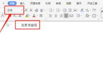
Hello! Hello fellow students, I am here to share a course with you again! WPS, which we commonly use in office now, has powerful functions and is an indispensable software for office work. There are also many students who are new to WPS, so it must be very difficult to enlarge text in WPS documents! Today, we will introduce in detail how to adjust the font size in WPS documents. In order to make it easier for everyone to understand, I have compiled a step-by-step description of [Modifying font size in WPS documents], I hope it can help you! Find the "WPS Text" icon on the desktop and open it; enter the text you want, such as "HelloWorld". Please note that the default font size of WPS text is size 5. 2. Select the font you want to increase and click Large
 Win10 font is too small and starts to blur when enlarged to 125%
Feb 13, 2024 pm 08:24 PM
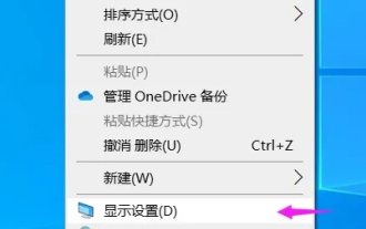
Today's laptops have extremely high resolutions, but the screens are generally between 13-16 inches. When the font scaling is set to 100%, the text on the screen is difficult to read. If it is set to 125%, some software fonts are blurred or the right-click properties panel is still blurry. . Win10 font is too small and zooms in to 125% to start blurring. Solution: 1. The solution is to select 124% scaling ratio. The font will appear to be the same size as 125%, but it will not be blurred. Right-click on an empty space on the desktop and select 2, Medium. The commonly used options are 100% or 125%. The disadvantages are obvious. The 100% characters are too small and clear, while the 125% characters are large enough but blurry. At this time, you need to click 3. On this advanced settings page, enter the custom scaling ratio 4. It will take effect after restarting the computer. After restarting, the renderings are displayed, and the properties panel and
 How to set the font size of win10 education version
Feb 16, 2024 pm 01:33 PM
Many friends will find that their fonts are too small to see clearly when using Win10 Education Edition. We can find the font function in Personalization, and then we can adjust it according to the font size. How to set the font size of win10 education version: 1. Enter the Windows settings interface and select options. 2. After entering the personalization page, click the function module. 3. In the font interface, select the font you want to use. 4. Finally, adjust the font size according to your needs.
 How to adjust the text size in text messages
Aug 29, 2023 am 11:38 AM
How to adjust the font size in text messages: 1. On the iOS device, open the "Settings" application, then select the "Display & Brightness" option, find the "Text Size" slider, and slide the slider to adjust the size of the text on the entire device. The text size, including the text in the text message; 2. On the Android device, open the "Settings" application and select the "Display" option, find the "Font Size" option, and select different font sizes to preview and adjust the text in the text message. font size.


