
 Web Front-end
CSS Tutorial
15 of the best CSS trends will make your web project successful in a second!
Web Front-end
CSS Tutorial
15 of the best CSS trends will make your web project successful in a second!
15 of the best CSS trends will make your web project successful in a second!

In this article, learn about the top 15 CSS trends to watch in 2023. These trends will help you create visually stunning responsive designs by unleashing the power of CSS.
How does CSS help your website?
CSS stands for Cascading Style Sheets. It is a language for creating style sheets that describe the layout and formatting of documents written in a markup language. It works with HTML to modify the appearance of online pages and user interfaces. Any XML document type, including plain XML, SVG, and XUL, can be used with it.
With CSS, you can change old HTML-written documents or create new styles using CSS code. Here are some of the benefits CSS brings to your website.
- The fonts, colors, backgrounds and other tags in the previous website were all repeated. CSS was developed to solve this problem.
- Helps you create consistent designs across multiple web pages and provides reusability of styles across different elements and sites.
- CSS provides more specific properties than plain HTML to define the look and feel of a website.
- Provide visual cues to improve website accessibility.
- Improve website SEO by presenting digital content clearly and concisely.
CSS Trends 2023
Now that you know the essentials of CSS and its benefits, let’s start with a list of the best CSS trends in 2023.
Note: Browser compatibility data here is taken from CanIUse.
1.CSS Grid
CSS Grid is a powerful layout module that allows you to create complex, responsive grid layouts. It is fully supported by modern browsers and is becoming increasingly popular among web developers. This amazing CSS trend makes it easy to work with rows or columns.
Subgrid is a convenience feature that has been added to grid layouts. You can create a subgrid using the subgrid feature, which will mimic the layout of its parent grid. When a subgrid is nested within another grid display, it selects its dimensions and gaps. The layout of the parent grid will be applied to the child grid, although the child grid can still cover certain parts if necessary.
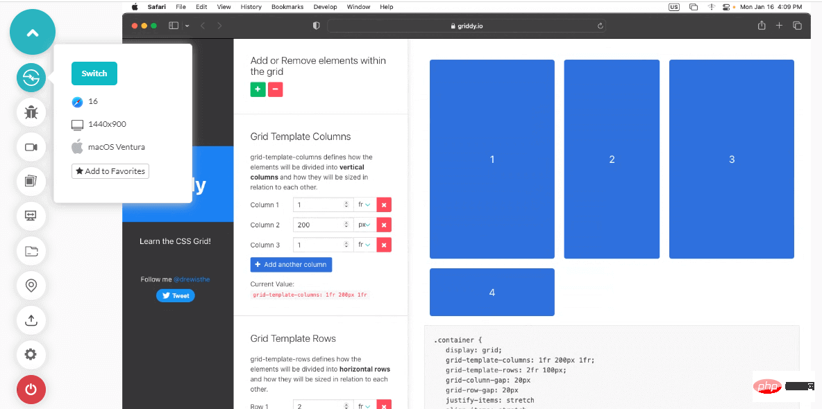
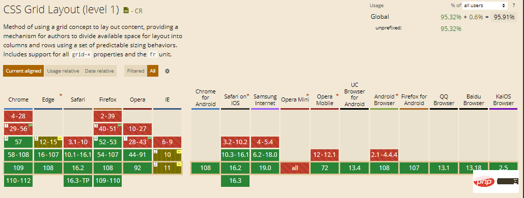
Browser support: 95.91%
2. CSS writing mode
According to language Differently, the CSS writing mode property adjusts the alignment of text so that it can be read from top to bottom or left to right. For example, let's say we want to add some text that reads left to right and top to bottom.
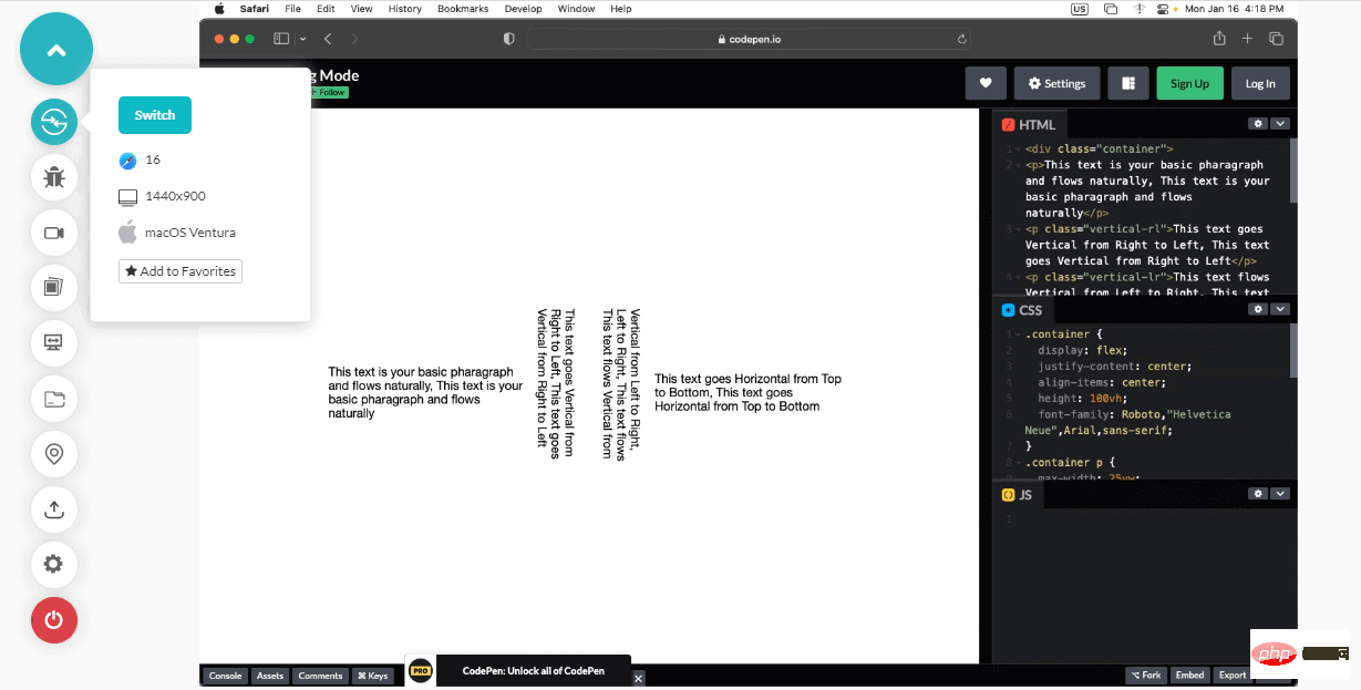
This is helpful for languages where text is often placed vertically (such as Chinese, Japanese, or Korean). For aesthetic reasons, you may want to use this feature in English with the help of CSS trends.
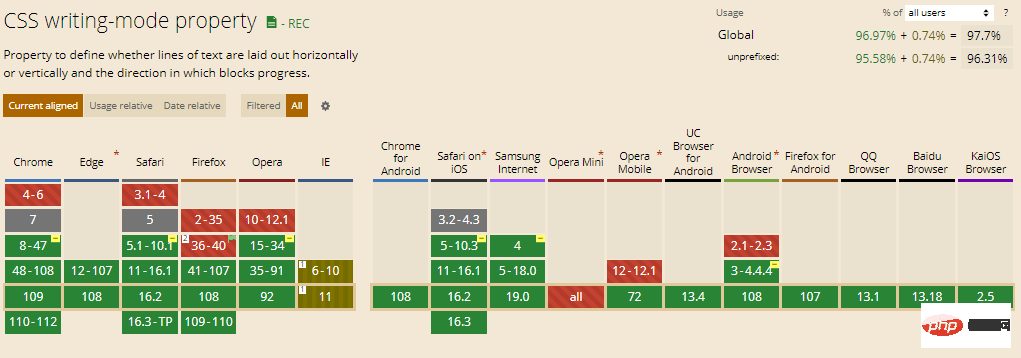
Browser support: 97.7%
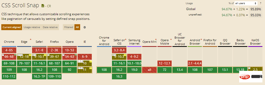
3. Scroll Capture Behavior
To control the CSS scroll capture behavior of web browsers, CSS provides a set of valuable properties. Some of these features have been expanded, but newer browser versions will only now have access to others. The best thing about the CSS trend is that only a third of CSS users know about it.
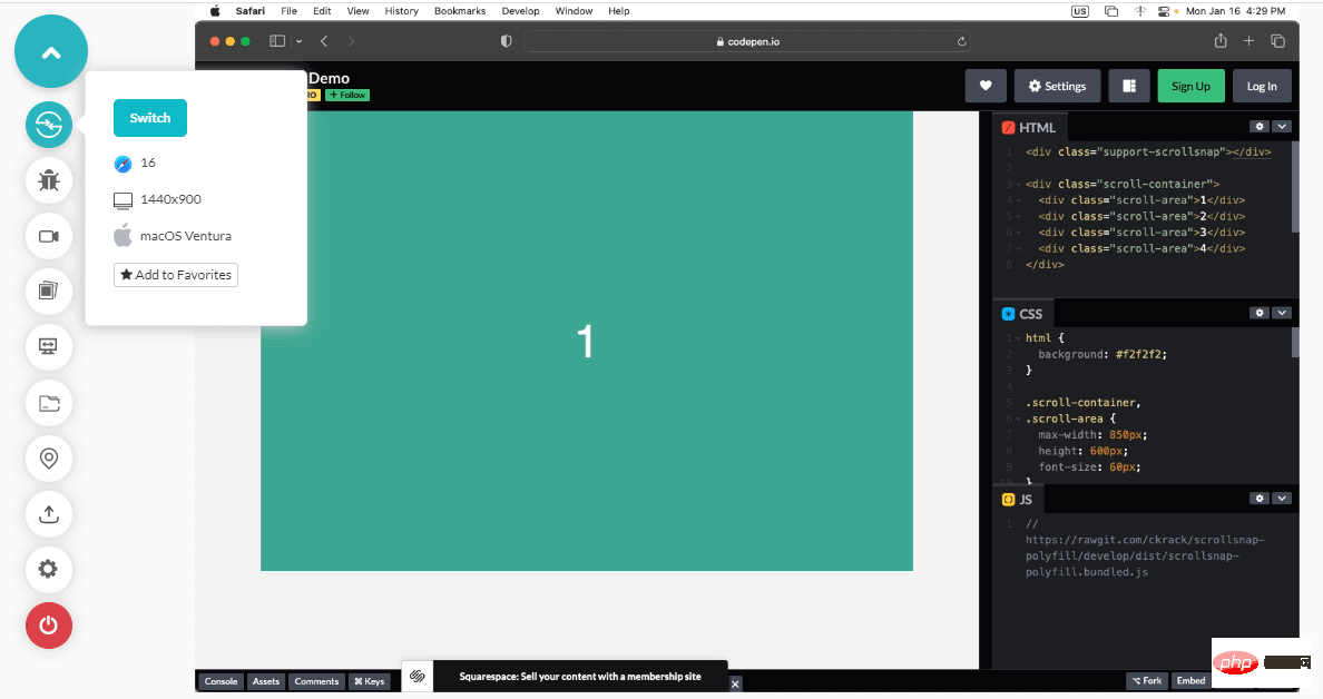
You can modify the scroll position on a container in a variety of ways using the scroll-snap-type attribute. Developers gain greater accuracy, while end users enjoy a smoother, more controllable user experience.
Browser Support: 95.89%
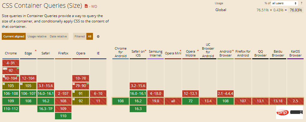
#4. Container Queries
Container queries are not fully built into CSS yet, although they will be. They will have a significant impact on how we think about responsive design. The basic concept is that in addition to the viewport and media, you can also specify breakpoints based on the size of the parent container.
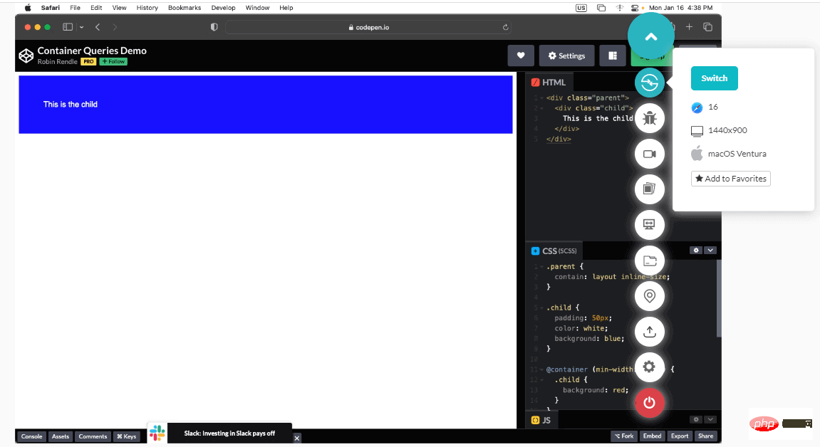
It will include adjusting the layout based on the dimensions of various containers that appear in nested layers of the user interface. CSS container queries are not a CSS trend, but a major initiative that could trigger a wave of UI enhancements.
Browser support: 76.94%
5. New color palette
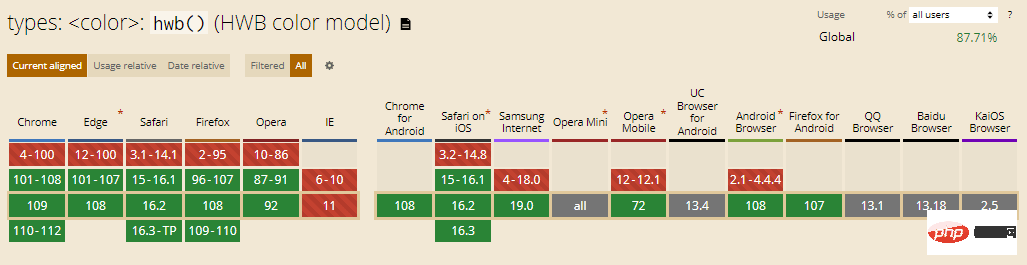
CSS practitioners have begun to use RGB to beautify web pages. Recently, CSS introduced three new color palettes: HWB, LAB, and LCH.
HWB: It is an abbreviation for Hue, Whiteness and Blackness. Here's a function that's easy for people to read: you choose a color, then add white and black. It is supported in recent releases of Chrome, Firefox and Safari.
Browser support: 87.71%
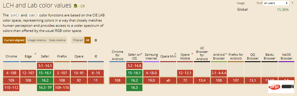
LAB: It is created based on CIA LAB color theory and is considered the most theoretically complex new color space . The LAB color descriptor includes all colors that humans can perceive, which is a bold statement. Currently only Safari is compatible with this CSS trend, just like LCH.
LCH: It stands for Lightness, Chroma and Hue and is known for broadening the palette of available colors. Safari only supports LCH.
Browser support: 15.38%
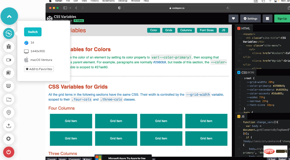
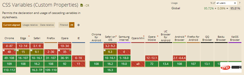
6.CSS variables
CSS variables, also known as CSS custom properties, since 2015 It has been a popular CSS trend in the market for many years and is currently attracting the attention of more and more CSS users. CSS variables allow you to store and use values elsewhere in your HTML code. It helps eliminate redundancy in the code, improves flexibility, and improves code readability.
Browser support: 95.81%
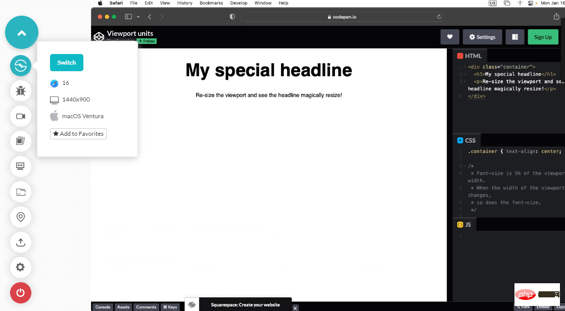
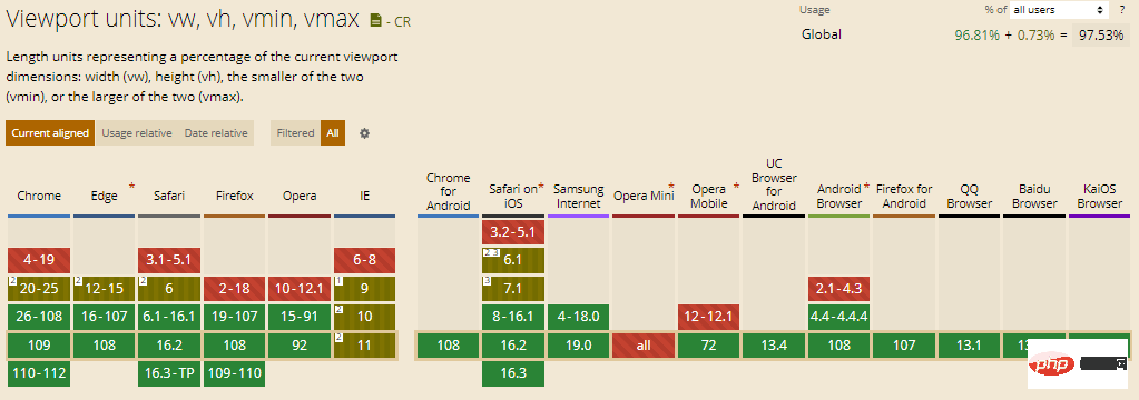
7. Viewport Units
Setting up viewport units is a hassle for everyone trying to write a website for Safari on iOS. Mobile browsers display containers set to unit vh size smaller than they should be.
You need to use a script that automatically resizes the container to resolve this error. In addition to the inconvenience of loading new scripts, some workarounds harm Chrome users.
Thankfully, CSS now supports the new relative length and viewport specifications. Some of them are "vw", "svw", "lvw" and "dvw". These measurements are 1% of the width of small, large, and dynamic viewport sizes, as well as UA's default viewport size.
Browser support rate: 97.53%
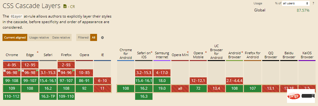
8. Cascading layer
If level If the next element in the chain has a higher level of specificity, CSS overrides the style changes to the first element. This problem always exists in large projects due to the huge code base. This is where CSS cascading layers come in handy.
The cascade layer provides developers with greater flexibility in themes, frameworks, and designs to get the most out of the cascade system. Compared to the original cascade, which is heuristic-centric, the cascade layer provides direct manipulation and management of the underlying cascade logic.
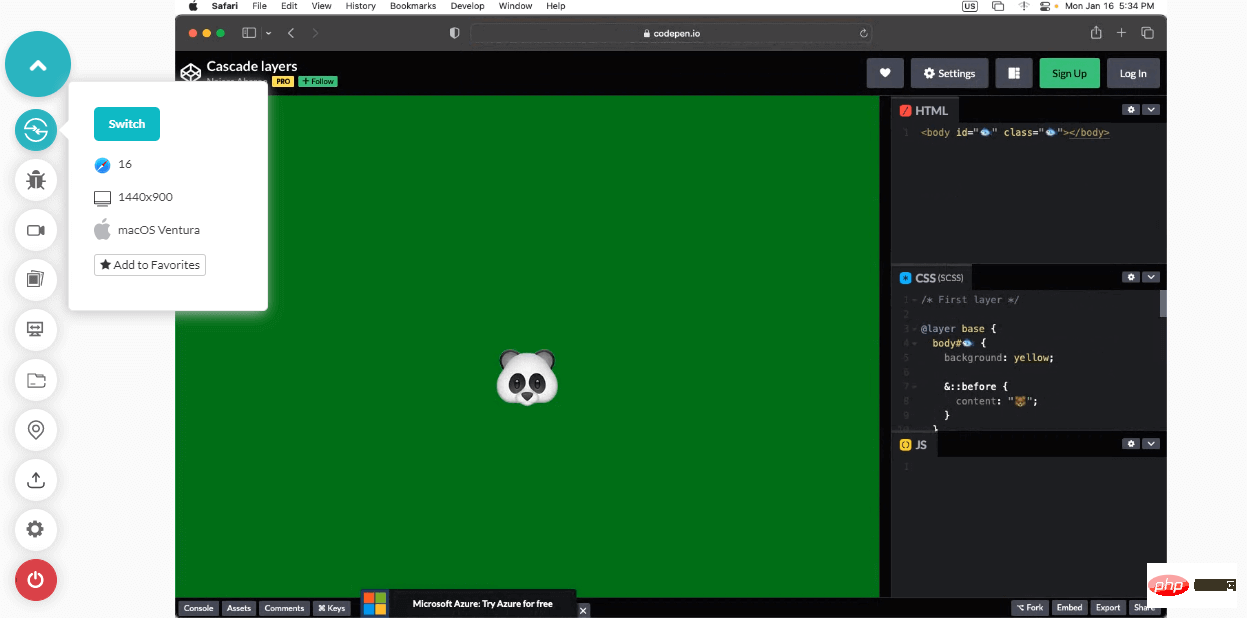
This CSS trend will ensure that components don’t always follow a base style by adding a second layer to the cascade to define style variations. Instead, components are generated based on rules written on the layers and the established layer hierarchy.
Browser support: 87.57%
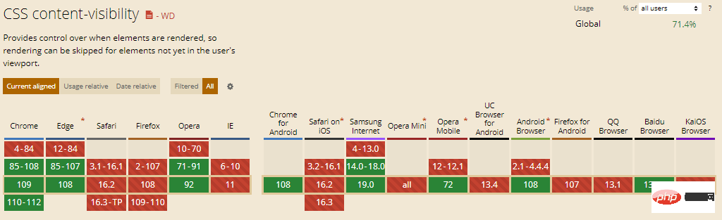
9. Content Visibility
The content visibility property in CSS helps speed up the rendering of content on a web page so that users can view it while the rest of the page loads Interact with content. With this property, developers can instruct the browser which part of the page has independent content. In return, it helps the browser optimize web content through lazy calculations.
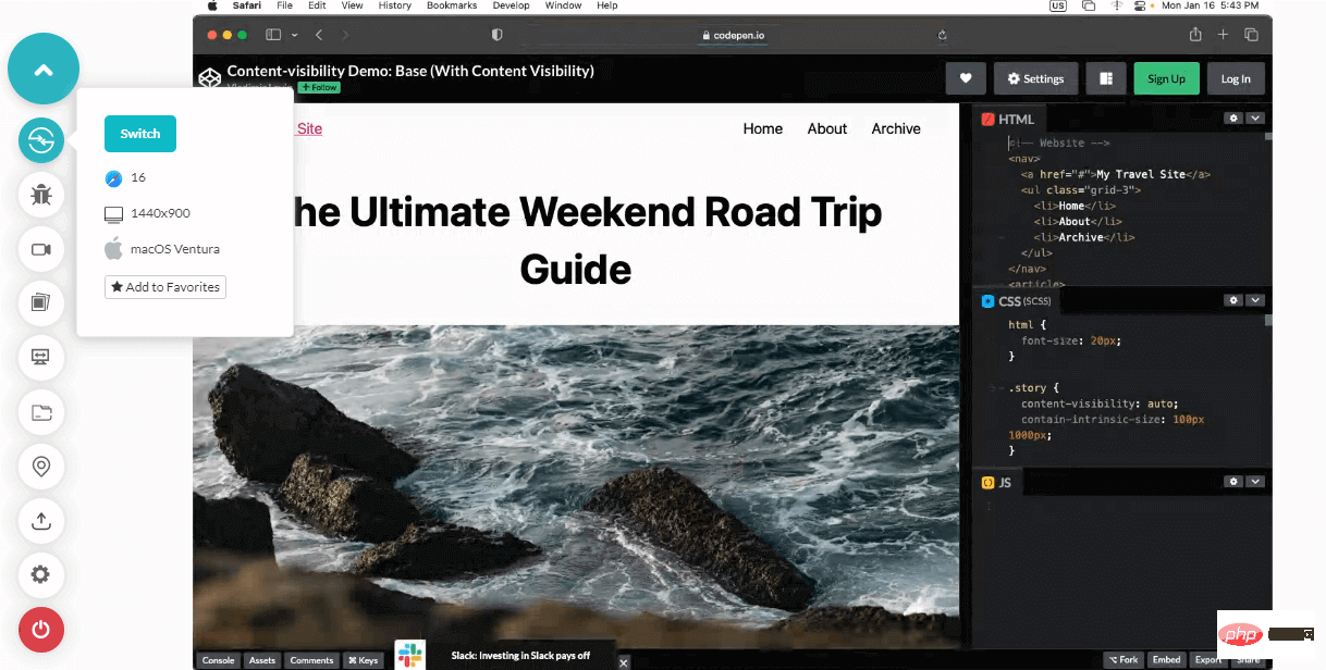
Content visibility depends on the primitives of the CSS Containment Spec. So far, only Chromium 85 supports the content visibility attribute; however, all major browsers support CSS Containment Spec.
Browser Support: 71.40%
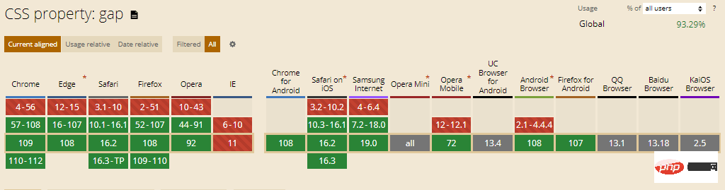
10. Gap
The Gap attribute is an emerging CSS trend that helps define The gaps between rows and columns are formally called grid gaps. It can be used as a replacement for the following properties.
- Line Spacing
- Column Gap
We utilize the Gap property with a single value to indicate equal space between rows and columns. If there is a difference in the distance between rows and columns, we will use the gap function with two values, first defining the distance between the rows and then the distance between the columns. You can take advantage of the row-gap and column-gap properties to make your code more transparent and understandable.
Before the gap attribute, designers need to use the margin attribute with certain restrictions, such as adding indentation between the element and the edge of the container. In contrast, the gap attribute allows you to specify the indentation between items without using such tricks and gimmicks, relying only on the basic constructs of the language.
Browser support rate: 93.29%
11. Object-view-box
Another CSS trend on our list is the object-view-box property. It causes a web page to display only a designated area of an image or video. Its results are roughly equivalent to the viewBox SVG property. The object-view-box attribute comes in handy when you are displaying only part of an image or video for different elements or at different resolutions. Additionally, it can be used to pan and zoom pictures and movies.
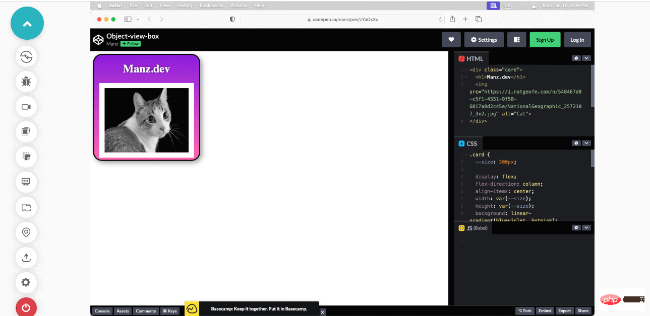
Before the object-view-box attribute appeared, cropping of images or videos had to be done by placing the content inside the wrapping element and resizing it using "overflow: hide;" to solve. Attributes. This can be done by adding top, bottom, left and right values in the code.
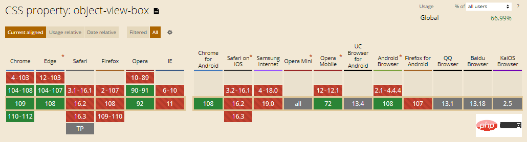
Browser support: 66.99%
12. Illustration
The Inset property helps set the distance between an element and its parent element . It replaces four properties: top, right, left and bottom and allows you to view the insertion of an element from all four sides in a single command. The CSS Inset property requires the addition of all four commands for positioning.
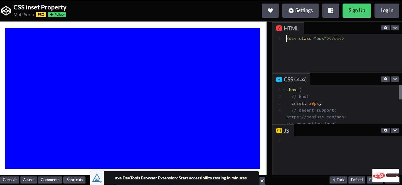
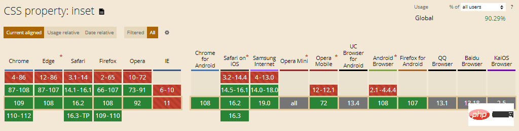
Browser support: 90.29%
13. Variable font
Variable fonts allow multiple variations of a font to be integrated into a single file, rather than using separate font files for each width, weight, or style. It is an evolution of the OpenType font specification.
Although variable fonts can be used like regular fonts, they offer more functionality. The font-weight property accepts values between 100 and 900 for standard fonts, while for variable fonts it accepts any integer between 1 and 999.
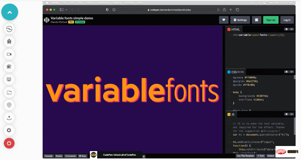
While the font-style property for regular fonts accepts both normal and italic values, for variable fonts you can specify a range from -90 degrees to 90 degrees for the variable font. slope. Variable fonts feature font stretching ranging from 50% (for narrow fonts) to 200% (for wide fonts), with the standard scale being 100%. Another property is the font-optical-sizing property, which changes the appearance of the font based on its size.
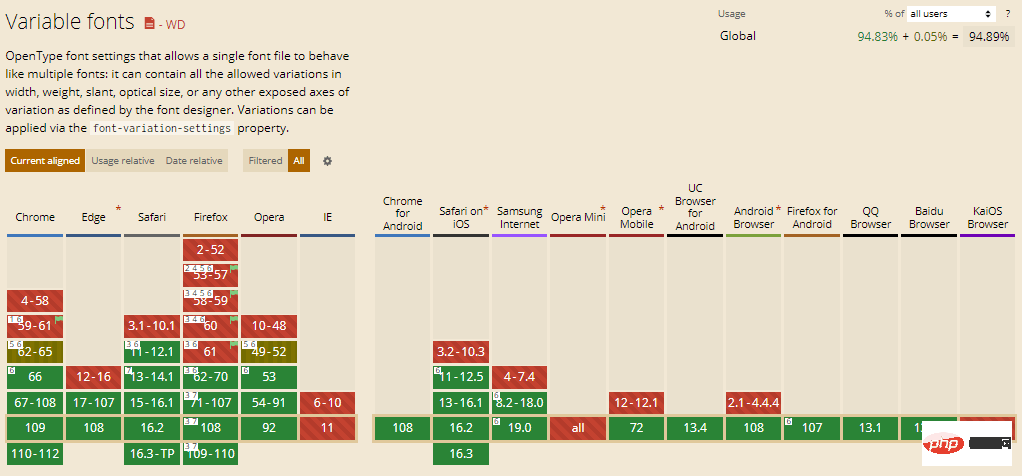
Browser support: 94.89%
14. Text overflow
In CSS, the text-overflow attribute is used to indicate specific text has overflowed and is now hidden. When adding this attribute, overflow content will be trimmed and custom strings or ellipses will be visible on the display.
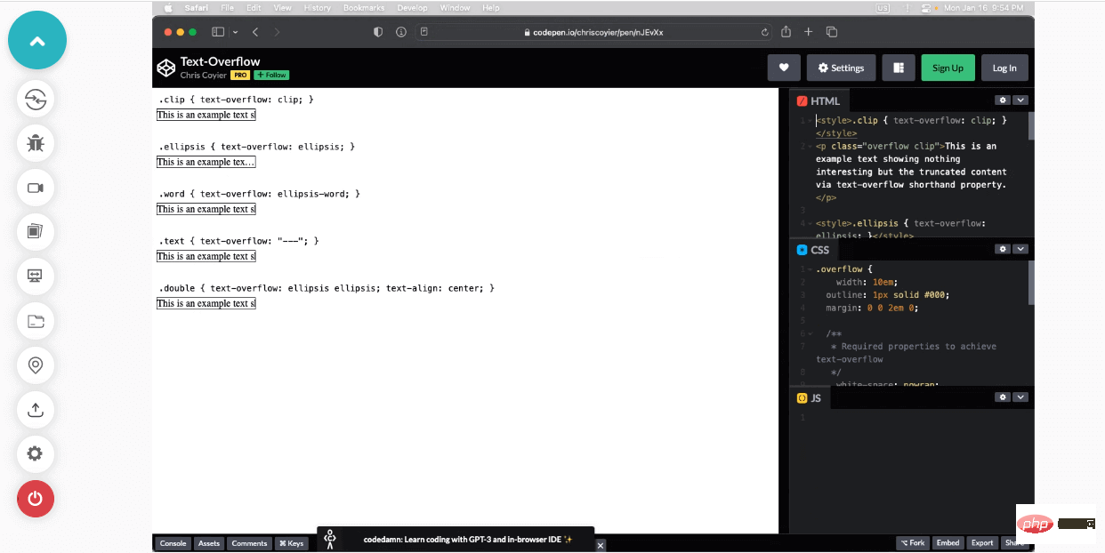
One thing to remember when using the text-overflow property is that the whitespace property must be nowrap, and the overflow property must be set to hidden.
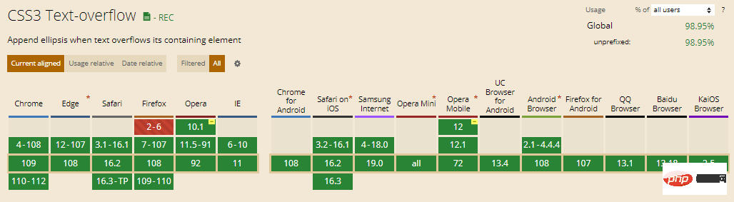
Browser support: 98.95%
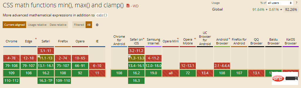
15. Comparison function
Use the comparison function to build a responsive website with less code . It has functions such as "clamp()", "min()" and "max()" which are used to define upper and lower limit values, calculate and compare the input values provided to the function and then apply the calculated property value.
- lamp() function: This function requires three parameters: center value, preferred value and maximum value. clamp() calculates the value of a property based on the center value.
If the calculated value is between the minimum and maximum values, the center value is applied to the element. If the estimated value is below the minimum value or exceeds the maximum value, the minimum or maximum value will be used.
- min() and max() functions: min() determines and applies the smallest value in the range. Similarly, the max() function determines and applies the maximum value in a given range of values.
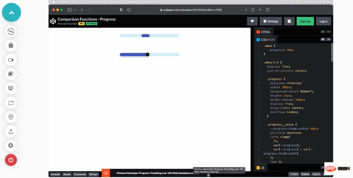
Browser support rate: 92.26%
How to test the browser compatibility of CSS properties?
As CSS libraries introduce new features and properties, it creates new daily challenges for web developers to ensure website browser compatibility. It is essential to check that every CSS property you use for your website works properly and is supported in every browser.
Conclusion
These are just a few of the CSS trends we may see in 2023. While other trends may be emerging, following these should be helpful to newbies. The transition to multi-column layouts is already in full swing, and as we move into 2023 and beyond, the shift to responsive interfaces will rapidly accelerate.
We’ve only highlighted the best of the top CSS trends here, but don’t be surprised if others emerge as we enter the next decade. No matter what happens, one thing is for sure: CSS will never go out of style. Designers may change their views, but they never completely disappear—and that’s a good thing!
The above is the detailed content of 15 of the best CSS trends will make your web project successful in a second!. For more information, please follow other related articles on the PHP Chinese website!

Hot AI Tools

Undresser.AI Undress
AI-powered app for creating realistic nude photos

AI Clothes Remover
Online AI tool for removing clothes from photos.

Undress AI Tool
Undress images for free

Clothoff.io
AI clothes remover

AI Hentai Generator
Generate AI Hentai for free.

Hot Article
Hot Tools

Notepad++7.3.1
Easy-to-use and free code editor

SublimeText3 Chinese version
Chinese version, very easy to use

Zend Studio 13.0.1
Powerful PHP integrated development environment

Dreamweaver CS6
Visual web development tools

SublimeText3 Mac version
God-level code editing software (SublimeText3)
Hot Topics
 1382
1382
 52
52

 How to use bootstrap in vue
Apr 07, 2025 pm 11:33 PM
How to use bootstrap in vue
Apr 07, 2025 pm 11:33 PM
Using Bootstrap in Vue.js is divided into five steps: Install Bootstrap. Import Bootstrap in main.js. Use the Bootstrap component directly in the template. Optional: Custom style. Optional: Use plug-ins.
 The Roles of HTML, CSS, and JavaScript: Core Responsibilities
Apr 08, 2025 pm 07:05 PM
The Roles of HTML, CSS, and JavaScript: Core Responsibilities
Apr 08, 2025 pm 07:05 PM
HTML defines the web structure, CSS is responsible for style and layout, and JavaScript gives dynamic interaction. The three perform their duties in web development and jointly build a colorful website.
 How to write split lines on bootstrap
Apr 07, 2025 pm 03:12 PM
How to write split lines on bootstrap
Apr 07, 2025 pm 03:12 PM
There are two ways to create a Bootstrap split line: using the tag, which creates a horizontal split line. Use the CSS border property to create custom style split lines.
 How to resize bootstrap
Apr 07, 2025 pm 03:18 PM
How to resize bootstrap
Apr 07, 2025 pm 03:18 PM
To adjust the size of elements in Bootstrap, you can use the dimension class, which includes: adjusting width: .col-, .w-, .mw-adjust height: .h-, .min-h-, .max-h-
 How to set up the framework for bootstrap
Apr 07, 2025 pm 03:27 PM
How to set up the framework for bootstrap
Apr 07, 2025 pm 03:27 PM
To set up the Bootstrap framework, you need to follow these steps: 1. Reference the Bootstrap file via CDN; 2. Download and host the file on your own server; 3. Include the Bootstrap file in HTML; 4. Compile Sass/Less as needed; 5. Import a custom file (optional). Once setup is complete, you can use Bootstrap's grid systems, components, and styles to create responsive websites and applications.
 How to insert pictures on bootstrap
Apr 07, 2025 pm 03:30 PM
How to insert pictures on bootstrap
Apr 07, 2025 pm 03:30 PM
There are several ways to insert images in Bootstrap: insert images directly, using the HTML img tag. With the Bootstrap image component, you can provide responsive images and more styles. Set the image size, use the img-fluid class to make the image adaptable. Set the border, using the img-bordered class. Set the rounded corners and use the img-rounded class. Set the shadow, use the shadow class. Resize and position the image, using CSS style. Using the background image, use the background-image CSS property.
 Understanding HTML, CSS, and JavaScript: A Beginner's Guide
Apr 12, 2025 am 12:02 AM
Understanding HTML, CSS, and JavaScript: A Beginner's Guide
Apr 12, 2025 am 12:02 AM
WebdevelopmentreliesonHTML,CSS,andJavaScript:1)HTMLstructurescontent,2)CSSstylesit,and3)JavaScriptaddsinteractivity,formingthebasisofmodernwebexperiences.
 How to use bootstrap button
Apr 07, 2025 pm 03:09 PM
How to use bootstrap button
Apr 07, 2025 pm 03:09 PM
How to use the Bootstrap button? Introduce Bootstrap CSS to create button elements and add Bootstrap button class to add button text
