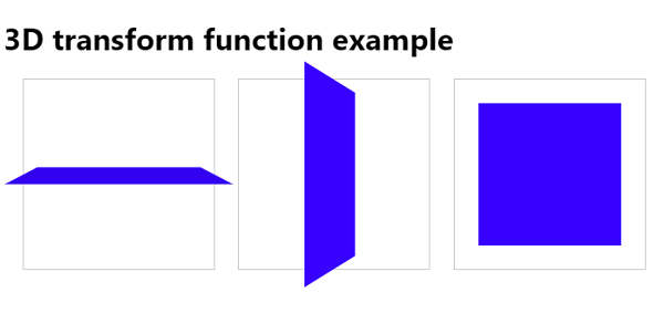
Using CSS3 3D transform functions
Using 3d transform, we can move elements to the x-axis, y-axis and z-axis. The following are some methods of CSS3 3D transform-
The following methods are used to call 3D transform-
| Sr.No. | Value and Description |
|---|---|
| 1 | matrix3d(n,n, n,n,n,n,n,n,n,n,n, n,n,n,n,n) is used to transform elements using the 16 values of the matrix |
| 2 | translate3d(x,y,z) Used to transform elements using the x-axis, y-axis and z-axis |
| translateX(x) | For transforming elements using the x-axis |
| translateY(y) | Used to transform elements using the y-axis |
| translateZ(z) | Used to Transform elements using the y-axis |
<!DOCTYPE html>
<html>
<head>
<style>
body {
   font-family: "Segoe UI", Tahoma, Geneva, Verdana, sans-serif;
}
.container {
   display: inline-block;
   width: 200px;
   height: 200px;
   border: 1px solid #CCC;
   margin-left: 20px;
}
.rotateX {
   width: 100%;
   height: 100%;
   background: rgb(52, 0, 241);
   transform: perspective(600px) rotateX(85deg);
}
.rotateY {
   width: 100%;
   height: 100%;
   background: rgb(55, 0, 255);
   transform: perspective(600px) rotateY(75deg);
}
.translateZ{
   width: 100%;
   height: 100%;
   background: rgb(55, 0, 255);
   transform: perspective(600px) translateZ(-200px);
}
</style>
</head>
<body>
<h1>3D transform function example</h1>
<div class="container">
<div class="rotateX"></div>
</div>
<div class="container">
<div class="rotateY"></div>
</div>
<div class="container">
<div class="translateZ"></div>
</div>
</body>
</html>
The above is the detailed content of Using CSS3 3D transform functions. For more information, please follow other related articles on the PHP Chinese website!

Hot AI Tools

Undresser.AI Undress
AI-powered app for creating realistic nude photos

AI Clothes Remover
Online AI tool for removing clothes from photos.

Undress AI Tool
Undress images for free

Clothoff.io
AI clothes remover

AI Hentai Generator
Generate AI Hentai for free.

Hot Article

Hot Tools

Notepad++7.3.1
Easy-to-use and free code editor

SublimeText3 Chinese version
Chinese version, very easy to use

Zend Studio 13.0.1
Powerful PHP integrated development environment

Dreamweaver CS6
Visual web development tools

SublimeText3 Mac version
God-level code editing software (SublimeText3)

Hot Topics
 1378
1378
 52
52
 Working With GraphQL Caching
Mar 19, 2025 am 09:36 AM
If you’ve recently started working with GraphQL, or reviewed its pros and cons, you’ve no doubt heard things like “GraphQL doesn’t support caching” or
 Show, Don't Tell
Mar 16, 2025 am 11:49 AM
How much time do you spend designing the content presentation for your websites? When you write a new blog post or create a new page, are you thinking about
 Building an Ethereum app using Redwood.js and Fauna
Mar 28, 2025 am 09:18 AM
With the recent climb of Bitcoin’s price over 20k $USD, and to it recently breaking 30k, I thought it’s worth taking a deep dive back into creating Ethereum
 Creating Your Own Bragdoc With Eleventy
Mar 18, 2025 am 11:23 AM
No matter what stage you’re at as a developer, the tasks we complete—whether big or small—make a huge impact in our personal and professional growth.
 Vue 3
Apr 02, 2025 pm 06:32 PM
It's out! Congrats to the Vue team for getting it done, I know it was a massive effort and a long time coming. All new docs, as well.
 A bit on ci/cd
Apr 02, 2025 pm 06:21 PM
I'd say "website" fits better than "mobile app" but I like this framing from Max Lynch:
 Let's use (X, X, X, X) for talking about specificity
Mar 24, 2025 am 10:37 AM
I was just chatting with Eric Meyer the other day and I remembered an Eric Meyer story from my formative years. I wrote a blog post about CSS specificity, and
 Can you get valid CSS property values from the browser?
Apr 02, 2025 pm 06:17 PM
I had someone write in with this very legit question. Lea just blogged about how you can get valid CSS properties themselves from the browser. That's like this.


