

How to draw big data charts with Python


How to use Python to draw big data charts
Introduction:
With the rapid development of big data technology, the analysis and display of large-scale data has become a an important task. In the process of data analysis, data visualization is an indispensable link. As a powerful programming language, Python provides a wealth of libraries and tools that can help us draw impressive big data charts. This article will introduce how to draw big data charts with Python and provide specific code examples.
1. Install necessary libraries
Using Python to draw big data charts requires the installation of some necessary libraries. The following are the main libraries used in this article and their installation methods:
- Matplotlib: a visualization library that provides rich and diverse drawing functions.
Installation method: Enter pip install matplotlib in the terminal to install. - Pandas: Data analysis library, providing fast, flexible and convenient data structure and data analysis tools.
Installation method: Enter pip install pandas in the terminal to install.
2. Import the necessary libraries
Before writing the drawing code, you need to import the required libraries. The following is the import code for the main libraries used in this article:
import pandas as pd
import matplotlib.pyplot as plt
3. Loading data
Before drawing big data charts, you need to load the data. Suppose we have a CSV file containing sales data named "sales.csv". We can use the read_csv function from the Pandas library to load the data. The following is a code example for loading data:
data = pd.read_csv('sales.csv')
4. Draw a chart
- Line chart
The line chart is A common chart type that shows trends and changes. Line charts can be drawn using the plot function of the Matplotlib library. The following is a code example for drawing a line chart:
plt.plot(data['date'], data['sales'])
plt.xlabel('date')
plt.ylabel(' Sales')
plt.title('Daily sales trend chart')
plt.show() - Bar chart
Bar chart is used to compare different categories of data. Histograms can be drawn using the bar function of the Matplotlib library. The following is a code example for drawing a bar chart:
plt.bar(data['month'], data['sales'])
plt.xlabel('month')
plt.ylabel(' Sales')
plt.title('Monthly sales comparison chart')
plt.show() - Scatter chart
Scatter chart is used to display the relationship between two variables relationship between. Scatter plots can be drawn using the scatter function of the Matplotlib library. The following is a code example for drawing a scatter plot:
plt.scatter(data['price'], data['sales'])
plt.xlabel('price')
plt.ylabel(' Sales')
plt.title('Graph of the relationship between price and sales')
plt.show() - Heat map
Heat map is used to display the density of two-dimensional data. Heat maps can be drawn using the imshow function of the Matplotlib library. The following is a code example for drawing a heat map:
plt.imshow(data, cmap='hot', interpolation='nearest')
plt.colorbar()
plt.title('Data density heat map ')
plt.show()
5. Conclusion
This article introduces how to use Python to draw big data charts. By installing and importing the necessary libraries, loading data, and using various functions of the Matplotlib library, we can easily draw various types of big data charts. I hope this article can help readers better present big data and add color to their data analysis work.
The above is an introduction to how to use Python to draw big data charts. I hope it will be helpful to readers. Python is a powerful tool for the analysis and display of large-scale data. The above code example can be used as a reference for readers to get started with drawing big data charts. I hope readers can use Python to draw beautiful big data charts in their daily work, providing more intuitive and powerful support for data analysis work.
The above is the detailed content of How to draw big data charts with Python. For more information, please follow other related articles on the PHP Chinese website!

Hot AI Tools

Undresser.AI Undress
AI-powered app for creating realistic nude photos

AI Clothes Remover
Online AI tool for removing clothes from photos.

Undress AI Tool
Undress images for free

Clothoff.io
AI clothes remover

AI Hentai Generator
Generate AI Hentai for free.

Hot Article
Hot Tools

Notepad++7.3.1
Easy-to-use and free code editor

SublimeText3 Chinese version
Chinese version, very easy to use

Zend Studio 13.0.1
Powerful PHP integrated development environment

Dreamweaver CS6
Visual web development tools

SublimeText3 Mac version
God-level code editing software (SublimeText3)
Hot Topics
 1378
1378
 52
52

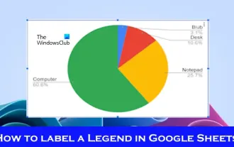 How to add labels to legend in Google Sheet
Feb 19, 2024 am 11:03 AM
How to add labels to legend in Google Sheet
Feb 19, 2024 am 11:03 AM
This article will demonstrate how to add labels to legends in Google Sheet that focus on a single thing, providing a name or identity. A legend explains a system or group of things, giving you relevant contextual information. How to Add Labels to a Legend in GoogleSheet Sometimes, when working with charts, we want to make them easier to understand. This can be achieved by adding appropriate labels and legends. Next, we’ll show you how to add labels to legends in Google Sheets to make your data clearer. Create the chart Edit the text of the legend label Let's get started. 1] Create a chart To label the legend, first, we have to create a chart: First, enter in the columns or rows of GoogleSheets
 PHP's big data structure processing skills
May 08, 2024 am 10:24 AM
PHP's big data structure processing skills
May 08, 2024 am 10:24 AM
Big data structure processing skills: Chunking: Break down the data set and process it in chunks to reduce memory consumption. Generator: Generate data items one by one without loading the entire data set, suitable for unlimited data sets. Streaming: Read files or query results line by line, suitable for large files or remote data. External storage: For very large data sets, store the data in a database or NoSQL.
 Five major development trends in the AEC/O industry in 2024
Apr 19, 2024 pm 02:50 PM
Five major development trends in the AEC/O industry in 2024
Apr 19, 2024 pm 02:50 PM
AEC/O (Architecture, Engineering & Construction/Operation) refers to the comprehensive services that provide architectural design, engineering design, construction and operation in the construction industry. In 2024, the AEC/O industry faces changing challenges amid technological advancements. This year is expected to see the integration of advanced technologies, heralding a paradigm shift in design, construction and operations. In response to these changes, industries are redefining work processes, adjusting priorities, and enhancing collaboration to adapt to the needs of a rapidly changing world. The following five major trends in the AEC/O industry will become key themes in 2024, recommending it move towards a more integrated, responsive and sustainable future: integrated supply chain, smart manufacturing
 Application of algorithms in the construction of 58 portrait platform
May 09, 2024 am 09:01 AM
Application of algorithms in the construction of 58 portrait platform
May 09, 2024 am 09:01 AM
1. Background of the Construction of 58 Portraits Platform First of all, I would like to share with you the background of the construction of the 58 Portrait Platform. 1. The traditional thinking of the traditional profiling platform is no longer enough. Building a user profiling platform relies on data warehouse modeling capabilities to integrate data from multiple business lines to build accurate user portraits; it also requires data mining to understand user behavior, interests and needs, and provide algorithms. side capabilities; finally, it also needs to have data platform capabilities to efficiently store, query and share user profile data and provide profile services. The main difference between a self-built business profiling platform and a middle-office profiling platform is that the self-built profiling platform serves a single business line and can be customized on demand; the mid-office platform serves multiple business lines, has complex modeling, and provides more general capabilities. 2.58 User portraits of the background of Zhongtai portrait construction
 How to insert a chart in word
Mar 20, 2024 pm 03:41 PM
How to insert a chart in word
Mar 20, 2024 pm 03:41 PM
Sometimes in order to display the data more intuitively, we need to use charts to display it. But when it comes to charts, many people think that they can only be operated on Excel. In fact, this is not the case. Word can also directly insert charts. How to do it? Just take a look and you'll find out. 1. First we open a word document. 2. Next we find the "Chart" tool button in the "Insert" menu and click it. 3. Click the "Chart" button and select a suitable chart. Here we can select a chart type at will and click "OK". 4. After selecting the chart, the system will automatically open the excel chart, and inside The data has been entered, we just need to change the data. If you have already prepared the form here,
 Discussion on the reasons and solutions for the lack of big data framework in Go language
Mar 29, 2024 pm 12:24 PM
Discussion on the reasons and solutions for the lack of big data framework in Go language
Mar 29, 2024 pm 12:24 PM
In today's big data era, data processing and analysis have become an important support for the development of various industries. As a programming language with high development efficiency and superior performance, Go language has gradually attracted attention in the field of big data. However, compared with other languages such as Java and Python, Go language has relatively insufficient support for big data frameworks, which has caused trouble for some developers. This article will explore the main reasons for the lack of big data framework in Go language, propose corresponding solutions, and illustrate it with specific code examples. 1. Go language
 How to make good-looking excel charts
Mar 20, 2024 pm 04:06 PM
How to make good-looking excel charts
Mar 20, 2024 pm 04:06 PM
When there is a lot of table data, sometimes the comparison cannot be clearly seen at a glance. If you want to create a contrast or make the icons clearer, how do you make a good-looking excel chart? The editor will share with you an atmospheric bar chart today. Everyone, please pay attention and watch carefully! With all data selected, insert a Percent Stacked Column Chart. Next, copy the data in the "Complete" column, select the entire chart, and paste it into the corresponding location. After selecting the entire series in the chart, go to "Chart Tools" - "Design" - "Change Chart Type" - "Combination". Here, we can change the first and second items to "Percent Stacked Column Chart", change the third item to "Line Chart with Data Markers", and check the "Secondary Axis" after the third item options. This allows
 Getting Started Guide: Using Go Language to Process Big Data
Feb 25, 2024 pm 09:51 PM
Getting Started Guide: Using Go Language to Process Big Data
Feb 25, 2024 pm 09:51 PM
As an open source programming language, Go language has gradually received widespread attention and use in recent years. It is favored by programmers for its simplicity, efficiency, and powerful concurrent processing capabilities. In the field of big data processing, the Go language also has strong potential. It can be used to process massive data, optimize performance, and can be well integrated with various big data processing tools and frameworks. In this article, we will introduce some basic concepts and techniques of big data processing in Go language, and show how to use Go language through specific code examples.
