
 Backend Development
Python Tutorial
Recommendations for the best tools and resources for drawing charts in Python
Backend Development
Python Tutorial
Recommendations for the best tools and resources for drawing charts in Python
Recommendations for the best tools and resources for drawing charts in Python


Recommendations for the best tools and resources for Python charting
Charts are an important tool for data analysis and visualization, which can help us better understand the data and display the analysis results. . Python is a powerful and easy-to-use programming language, and there are many excellent charting tools and resources to choose from. In this article, we will recommend several of the best Python drawing tools and provide specific code examples.
- Matplotlib
Matplotlib is one of the most famous and commonly used drawing tools in Python. It provides a wide range of drawing functions, including line charts, bar charts, pie charts, scatter charts, and more. The beauty of Matplotlib is its flexibility and rich customization options. The following is a simple Matplotlib code example for drawing a line chart:
import matplotlib.pyplot as plt

x = [1, 2, 3, 4, 5]
y = [2, 4, 6, 8, 10]

plt.plot(x, y)
plt.title("折线图示例")
plt.xlabel("x轴")
plt.ylabel("y轴")
plt.show()- Seaborn
Seaborn is an advanced data visualization library based on Matplotlib. It provides a set of simple yet powerful drawing functions that make it easy to create beautiful charts. Seaborn is characterized by its beauty and simplicity. The following is a code example for using Seaborn to draw a boxplot:
import seaborn as sns

tips = sns.load_dataset("tips")
sns.boxplot(x="day", y="total_bill", data=tips)
plt.title("箱线图示例")
plt.show()- Plotly
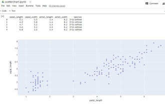
Plotly is an interactive visualization library that provides rich drawing functions and interactivity. With Plotly, we can easily create beautiful interactive charts, including line charts, scatter charts, bar charts, etc. The following is a code example for using Plotly to draw a scatter plot:
import plotly.express as px

df = px.data.iris()
fig = px.scatter(df, x="sepal_width", y="sepal_length", color="species")
fig.update_layout(title="散点图示例")
fig.show()
- Pandas
Pandas is a powerful data analysis library that also provides drawing functions. With Pandas, we can create various charts directly from the data. The following is a code example for drawing a bar chart using Pandas:
import pandas as pd

data = {'年份': [2016, 2017, 2018, 2019, 2020],
        '销售额': [1000, 1500, 2000, 1800, 2500]}
df = pd.DataFrame(data)

df.plot.bar(x='年份', y='销售额', title='条形图示例')
plt.show()In addition to the above recommended tools, there are many other Python drawing tools, such as Bokeh, ggplot, etc., each of which has its own characteristics and applications. scope. It is very important to choose a tool that suits your needs and preferences.
To summarize, this article recommends some of the best Python drawing tools, including Matplotlib, Seaborn, Plotly, and Pandas, and provides specific code examples for each tool. I hope these tools and examples will help you better visualize and chart your data.
The above is the detailed content of Recommendations for the best tools and resources for drawing charts in Python. For more information, please follow other related articles on the PHP Chinese website!

Hot AI Tools

Undresser.AI Undress
AI-powered app for creating realistic nude photos

AI Clothes Remover
Online AI tool for removing clothes from photos.

Undress AI Tool
Undress images for free

Clothoff.io
AI clothes remover

Video Face Swap
Swap faces in any video effortlessly with our completely free AI face swap tool!

Hot Article
Hot Tools

Notepad++7.3.1
Easy-to-use and free code editor

SublimeText3 Chinese version
Chinese version, very easy to use

Zend Studio 13.0.1
Powerful PHP integrated development environment

Dreamweaver CS6
Visual web development tools

SublimeText3 Mac version
God-level code editing software (SublimeText3)
Hot Topics
 1387
1387
 52
52

 How to add text to heat map cell comments using seaborn in Python?
Aug 19, 2023 pm 04:09 PM
How to add text to heat map cell comments using seaborn in Python?
Aug 19, 2023 pm 04:09 PM
Heat maps are useful for identifying patterns and trends in your data, and can be further customized by adding annotations to cells, such as text labels or numerical values, which can provide additional information about the data. In this article, we will discuss how to add text to heat map cell comments using Seaborn in Python. We will explore the different methods and options available in Seaborn to customize text annotations, such as changing the font size, color, and formatting of the text. Heat Maps A heat map (or heat map) is a data visualization method that uses different colors on a two-dimensional plot to represent the intensity of a phenomenon. Colors may vary in hue or saturation to show the reader how phenomena cluster or vary over time and space. The main points of heat map
 Python visualization | Python visualization advanced essentials - plotly
May 03, 2023 pm 02:07 PM
Python visualization | Python visualization advanced essentials - plotly
May 03, 2023 pm 02:07 PM
1. Introduction Plotly is a very famous and powerful open source data visualization framework. It displays information by building interactive charts based on browser display in the form of web, and can create dozens of beautiful charts and maps. 2. Drawing grammar rules 2.1 Offline drawing method There are two ways to draw images in Plotly, online and offline. Because online drawing requires registering an account to obtain an APIkey, which is more troublesome, this article only introduces the offline drawing method. There are two methods for offline drawing: plotly.offline.plot() and plotly.offline.iplot(). The former generates an image file in html format in the current working directory in an offline way and opens it automatically;
 How to install Matplotlib in pycharm
Dec 18, 2023 pm 04:32 PM
How to install Matplotlib in pycharm
Dec 18, 2023 pm 04:32 PM
Installation steps: 1. Open the PyCharm integrated development environment; 2. Go to the "File" menu and select "Settings"; 3. In the "Settings" dialog box, select "Python Interpreter" under "Project: <your_project_name>" ; 4. Click the plus button "+" in the upper right corner and search for "matplotlib" in the pop-up dialog box; 5. Select "matplotlib" to install.
 How to create a three-dimensional line chart using Python and Matplotlib
Apr 22, 2023 pm 01:19 PM
How to create a three-dimensional line chart using Python and Matplotlib
Apr 22, 2023 pm 01:19 PM
1.0 Introduction Three-dimensional image technology is one of the most advanced computer display technologies in the world. Any ordinary computer only needs to install a plug-in to present three-dimensional products in a web browser. It is not only lifelike, but also can dynamically display the product combination process. Especially suitable for remote browsing. The three-dimensional images are visually distinct and colorful, with strong visual impact, allowing viewers to stay in the scene for a long time and leaving a deep impression. The three-dimensional pictures give people a real and lifelike feeling, the characters are ready to be seen, and they have an immersive feeling, which has a high artistic appreciation value. 2.0 Three-dimensional drawing methods and types. First, you need to install the Matplotlib library. You can use pip: pipinstallmatplotlib. It is assumed that matplotl has been installed.
 How to make a basic scatter plot using Python-Plotly?
Aug 31, 2023 pm 01:37 PM
How to make a basic scatter plot using Python-Plotly?
Aug 31, 2023 pm 01:37 PM
Sometimes the task is to analyze a data set and visualize the data using charts or plots. Plotly is a great open source graphics library that can be used with Python for making a variety of plots and charts quickly and easily. In this article, using two different examples, a Python library called Plotly is used with Python code to plot a scatter plot. In the first example, the Python installed in the computer system is used to run a Python program written to make a scatter plot. Another example, using Google Colab, shows how you can still use Python and Plotly and make scatter plots without Python installed on your computer. In these two
 A deep dive into matplotlib's colormap
Jan 09, 2024 pm 03:51 PM
A deep dive into matplotlib's colormap
Jan 09, 2024 pm 03:51 PM
To learn more about the matplotlib color table, you need specific code examples 1. Introduction matplotlib is a powerful Python drawing library. It provides a rich set of drawing functions and tools that can be used to create various types of charts. The colormap (colormap) is an important concept in matplotlib, which determines the color scheme of the chart. In-depth study of the matplotlib color table will help us better master the drawing functions of matplotlib and make drawings more convenient.
 How to add labels to Matplotlib images in Python
May 12, 2023 pm 12:52 PM
How to add labels to Matplotlib images in Python
May 12, 2023 pm 12:52 PM
1. Add text label plt.text() is used to add text at the specified coordinate position on the image during the drawing process. What needs to be used is the plt.text() method. There are three main parameters: plt.text(x,y,s) where x and y represent the x and y axis coordinates of the incoming point. s represents a string. It should be noted that the coordinates here, if xticks and yticks labels are set, do not refer to the labels, but the original values of the x and axes when drawing. Because there are too many parameters, I will not explain them one by one. Learn their usage based on the code. ha='center' means the vertical alignment is centered, fontsize=30 means the font size is 3
 How to install matplotlib
Dec 20, 2023 pm 05:54 PM
How to install matplotlib
Dec 20, 2023 pm 05:54 PM
Installation tutorial: 1. Open the command line window and make sure that Python and pip have been installed; 2. Enter the "pip install matplotlib" command to install matplotlib; 3. After the installation is completed, verify whether matplotlib is successful by importing matplotlib.pyplot as plt code. Installation, if no error is reported, matplotlib has been successfully installed.
