

How to use CSS Positions layout to achieve fluid layout of elements


How to use CSS Positions layout to achieve fluid layout of elements
In web development, achieving fluid layout of elements is an important skill. CSS Positions layout is a commonly used method that can help us achieve adaptability and fluidity of elements. This article will introduce how to use CSS Positions layout to achieve fluid layout of elements, as well as specific code examples.
CSS Positions layout controls the layout and position of elements by setting the element's positioning attribute (position). Several commonly used positioning attributes are:
- static: The default positioning method of the element, which is laid out according to its normal flow in the HTML document. The position of the element cannot be controlled through the top, bottom, left, and right attributes.
- relative: Relative positioning, the element is offset based on its position in the normal flow. The position of the element can be controlled by setting the top, bottom, left, and right attributes.
- Absolute: Absolute positioning, the element is separated from the document flow and positioned relative to its nearest positioned parent element. If there is no positioned parent element, it is positioned relative to the body element. The position of the element can be controlled by setting the top, bottom, left, and right attributes.
- fixed: Fixed positioning, the element is positioned relative to the browser window and will not move with scrolling. The position of the element can be controlled by setting the top, bottom, left, and right attributes.
The following is a simple fluid layout example:
<!DOCTYPE html>
<html>
<head>
  <style>
    .container {
      position: relative;
      height: 500px;
      width: 800px;
      border: 1px solid #000;
    }

    .box {
      position: absolute;
      height: 100px;
      width: 100px;
      background-color: blue;
    }

    .box1 {
      top: 50px;
      left: 50px;
    }

    .box2 {
      top: 150px;
      left: 150px;
    }

    .box3 {
      top: 250px;
      left: 250px;
    }

    .box4 {
      top: 350px;
      left: 350px;
    }
  </style>
</head>
<body>
  <div class="container">
    <div class="box box1"></div>
    <div class="box box2"></div>
    <div class="box box3"></div>
    <div class="box box4"></div>
  </div>
</body>
</html>In the above code, we create a container (.container) and set its height to 500px and width to 800px and add a border to it. Then, we create four child elements (.box) and set their positions respectively (by adjusting the values of the top and left attributes) to achieve the effect of fluid layout.
Through the above code example, we can see that the four sub-elements are laid out according to the positions we set. Since their positioning mode is set to absolute, they are separated from the normal document flow and can be positioned according to our requirements.
By adjusting the size of the container (.container), we can see that the position of the child elements also changes accordingly, thus achieving the effect of fluid layout.
To sum up, CSS Positions layout is a commonly used method to achieve fluid layout of elements. By setting the positioning attribute of an element and adjusting the value of its position attribute, we can achieve various adaptive and fluid layout effects. I hope the methods introduced in this article will be helpful to you in implementing fluid layout of elements in web development.
The above is the detailed content of How to use CSS Positions layout to achieve fluid layout of elements. For more information, please follow other related articles on the PHP Chinese website!

Hot AI Tools

Undresser.AI Undress
AI-powered app for creating realistic nude photos

AI Clothes Remover
Online AI tool for removing clothes from photos.

Undress AI Tool
Undress images for free

Clothoff.io
AI clothes remover

Video Face Swap
Swap faces in any video effortlessly with our completely free AI face swap tool!

Hot Article
Hot Tools

Notepad++7.3.1
Easy-to-use and free code editor

SublimeText3 Chinese version
Chinese version, very easy to use

Zend Studio 13.0.1
Powerful PHP integrated development environment

Dreamweaver CS6
Visual web development tools

SublimeText3 Mac version
God-level code editing software (SublimeText3)
Hot Topics
 1387
1387
 52
52

 Guide to solving misalignment of WordPress web pages
Mar 05, 2024 pm 01:12 PM
Guide to solving misalignment of WordPress web pages
Mar 05, 2024 pm 01:12 PM
Guide to solving misaligned WordPress web pages In WordPress website development, sometimes we encounter web page elements that are misaligned. This may be due to screen sizes on different devices, browser compatibility, or improper CSS style settings. To solve this misalignment, we need to carefully analyze the problem, find possible causes, and debug and repair it step by step. This article will share some common WordPress web page misalignment problems and corresponding solutions, and provide specific code examples to help develop
 How to create a responsive carousel layout using HTML and CSS
Oct 20, 2023 pm 04:24 PM
How to create a responsive carousel layout using HTML and CSS
Oct 20, 2023 pm 04:24 PM
How to create a responsive carousel layout using HTML and CSS Carousels are a common element in modern web design. It can attract the user's attention, display multiple contents or images, and switch automatically. In this article, we will introduce how to create a responsive carousel layout using HTML and CSS. First, we need to create a basic HTML structure and add the required CSS styles. The following is a simple HTML structure: <!DOCTYPEhtml&g
 Flexible application skills of position attribute in H5
Dec 27, 2023 pm 01:05 PM
Flexible application skills of position attribute in H5
Dec 27, 2023 pm 01:05 PM
How to flexibly use the position attribute in H5. In H5 development, the positioning and layout of elements are often involved. At this time, the CSS position property will come into play. The position attribute can control the positioning of elements on the page, including relative positioning, absolute positioning, fixed positioning and sticky positioning. This article will introduce in detail how to flexibly use the position attribute in H5 development.
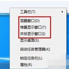 Introducing the window arrangement method in win7
Dec 26, 2023 pm 04:37 PM
Introducing the window arrangement method in win7
Dec 26, 2023 pm 04:37 PM
When we open multiple windows at the same time, win7 has the function of arranging multiple windows in different ways and then displaying them at the same time, which allows us to view the contents of each window more clearly. So how many window arrangements are there in win7? What do they look like? Let’s take a look with the editor. There are several ways to arrange Windows 7 windows: three, namely cascading windows, stacked display windows and side-by-side display windows. When we open multiple windows, we can right-click on an empty space on the taskbar. You can see three window arrangements. 1. Cascading windows: 2. Stacked display windows: 3. Display windows side by side:
 Syntax usage scenarios of contain in CSS
Feb 21, 2024 pm 02:00 PM
Syntax usage scenarios of contain in CSS
Feb 21, 2024 pm 02:00 PM
Syntax usage scenarios of contain in CSS In CSS, contain is a useful attribute that specifies whether the content of an element is independent of its external style and layout. It helps developers better control page layout and optimize performance. This article will introduce the syntax usage scenarios of the contain attribute and provide specific code examples. The syntax of the contain attribute is as follows: contain:layout|paint|size|style|'none'|'stric
 CSS transformation: how to achieve the rotation effect of elements
Nov 21, 2023 pm 06:36 PM
CSS transformation: how to achieve the rotation effect of elements
Nov 21, 2023 pm 06:36 PM
CSS transformation: How to achieve the rotation effect of elements requires specific code examples. In web design, animation effects are one of the important ways to improve user experience and attract user attention, and rotation animation is one of the more classic ones. In CSS, you can use the "transform" attribute to achieve various deformation effects of elements, including rotation. This article will introduce in detail how to use CSS "transform" to achieve the rotation effect of elements, and provide specific code examples. 1. How to use CSS’s “transf
 Windows 11 keeps adding keyboard layouts: 4 tested solutions
Dec 14, 2023 pm 05:49 PM
Windows 11 keeps adding keyboard layouts: 4 tested solutions
Dec 14, 2023 pm 05:49 PM
For some users, Windows 11 keeps adding new keyboard layouts even if they don't accept or confirm the changes. The WindowsReport software team has replicated this issue and knows how to prevent Windows 11 from adding a new keyboard layout to your PC. Why does Windows 11 add its own keyboard layout? This usually happens when using a non-native language and keyboard combination. For example, if you are using a US display language and a French keyboard layout, Windows 11 may also add an English keyboard. What to do if Windows 11 adds a new keyboard layout you don't want. How to prevent Windows 11 from adding a keyboard layout? 1. Delete unnecessary keyboard layouts and click "Open"
 CSS transition effect: how to achieve the sliding effect of elements
Nov 21, 2023 pm 01:16 PM
CSS transition effect: how to achieve the sliding effect of elements
Nov 21, 2023 pm 01:16 PM
CSS transition effect: How to achieve the sliding effect of elements Introduction: In web design, the dynamic effect of elements can improve the user experience, among which the sliding effect is a common and popular transition effect. Through the transition property of CSS, we can easily achieve the sliding animation effect of elements. This article will introduce how to use CSS transition properties to achieve the sliding effect of elements, and provide specific code examples to help readers better understand and apply. 1. Introduction to CSS transition attribute transition CSS transition attribute tra
