
 Web Front-end
CSS Tutorial
Detailed explanation of the implementation of scaling and rotation effects in CSS Flex flexible layout
Web Front-end
CSS Tutorial
Detailed explanation of the implementation of scaling and rotation effects in CSS Flex flexible layout
Detailed explanation of the implementation of scaling and rotation effects in CSS Flex flexible layout


Detailed explanation of the scaling and rotation effects in CSS Flex flexible layout
In front-end development, flexible layout (Flex layout) is a flexible layout method. It can help us achieve various layout effects more easily. Among them, scaling and rotation are one of the common effects. This article will introduce in detail how to implement scaling and rotation effects in CSS Flex layout and provide specific code examples.
First of all, let’s understand the basic concepts and usage of CSS Flex layout. CSS Flex layout is based on the concepts of containers and items. The container refers to the element whose display attribute is set to flex or inline-flex, and the item refers to the direct child element within the container. Containers have some properties to control the arrangement and alignment of items, such as flex-direction, justify-content, align-items, etc.
Zoom effect implementation:
To achieve the scaling effect in CSS Flex layout, we can use the transform attribute to achieve it. The transform attribute is a property in CSS3, which can achieve effects such as scaling, rotation, and displacement of elements.
To achieve the scaling effect, we can use the scale attribute. The scale attribute can scale the element according to the specified ratio. The default ratio is 1. A value greater than 1 indicates enlargement, and a value less than 1 indicates reduction.
The code example is as follows:
<!DOCTYPE html>
<html>
  <head>
    <style>
      .container {
        display: flex;
        justify-content: center;
        align-items: center;
        height: 300px;
      }
      .box {
        width: 100px;
        height: 100px;
        background-color: red;
        transition: transform 0.3s;
      }
      .box:hover {
        transform: scale(1.2);
      }
    </style>
  </head>
  <body>
    <div class="container">
      <div class="box"></div>
    </div>
  </body>
</html>In the above code, we create a container that contains a box. The initial size of the box is 100px*100px, and the background color is set to red. With the :hover pseudo-class selector, when the mouse is hovering over the box, it is scaled to 1.2 times its original size. Through the transition attribute, we add an animation effect to make the scaling process smoother.
Rotation effect implementation:
To achieve rotation effect in CSS Flex layout, we can also use the transform attribute. The rotate attribute of the transform attribute can achieve the rotation effect of the element. The rotate attribute can accept an angle value as a parameter, indicating that the element is rotated according to the specified angle.
The code example is as follows:
<!DOCTYPE html>
<html>
  <head>
    <style>
      .container {
        display: flex;
        justify-content: center;
        align-items: center;
        height: 300px;
      }
      .box {
        width: 100px;
        height: 100px;
        background-color: red;
        transition: transform 0.3s;
      }
      .box:hover {
        transform: rotate(45deg);
      }
    </style>
  </head>
  <body>
    <div class="container">
      <div class="box"></div>
    </div>
  </body>
</html>In the above code, we created a container and a box. Similarly, through the :hover pseudo-class selector, when the mouse hovers over the box, Rotate it 45 degrees. Likewise, we added an animation effect through the transition property.
Through the above code examples, we can see that achieving scaling and rotation effects in CSS Flex layout is not complicated and can be achieved with the help of the transform attribute. At the same time, we can also add transition animation to make the effect smoother and more beautiful.
Summary:
This article details how to implement scaling and rotation effects in CSS Flex layout and provides specific code examples. By using the transform attribute, we can easily achieve these effects. I hope this article can help readers better understand and use the scaling and rotation effects in CSS Flex layout.
The above is the detailed content of Detailed explanation of the implementation of scaling and rotation effects in CSS Flex flexible layout. For more information, please follow other related articles on the PHP Chinese website!

Hot AI Tools

Undresser.AI Undress
AI-powered app for creating realistic nude photos

AI Clothes Remover
Online AI tool for removing clothes from photos.

Undress AI Tool
Undress images for free

Clothoff.io
AI clothes remover

AI Hentai Generator
Generate AI Hentai for free.

Hot Article
Hot Tools

Notepad++7.3.1
Easy-to-use and free code editor

SublimeText3 Chinese version
Chinese version, very easy to use

Zend Studio 13.0.1
Powerful PHP integrated development environment

Dreamweaver CS6
Visual web development tools

SublimeText3 Mac version
God-level code editing software (SublimeText3)
Hot Topics
 1378
1378
 52
52

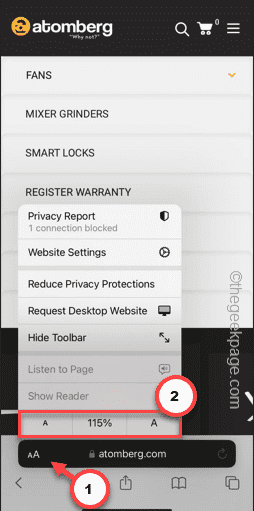 Safari zoom issue on iPhone: Here's the fix
Apr 20, 2024 am 08:08 AM
Safari zoom issue on iPhone: Here's the fix
Apr 20, 2024 am 08:08 AM
If you don't have control over the zoom level in Safari, getting things done can be tricky. So if Safari looks zoomed out, that might be a problem for you. Here are a few ways you can fix this minor zoom issue in Safari. 1. Cursor magnification: Select "Display" > "Cursor magnification" in the Safari menu bar. This will make the cursor more visible on the screen, making it easier to control. 2. Move the mouse: This may sound simple, but sometimes just moving the mouse to another location on the screen may automatically return it to normal size. 3. Use Keyboard Shortcuts Fix 1 – Reset Zoom Level You can control the zoom level directly from the Safari browser. Step 1 – When you are in Safari
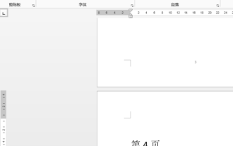 How to zoom pages side by side in word
Mar 19, 2024 pm 07:19 PM
How to zoom pages side by side in word
Mar 19, 2024 pm 07:19 PM
When we use word documents to edit files, sometimes there are many pages. We want to display them side by side and check the overall effect. However, because we don’t know how to operate, we often need to scroll for a long time to view page by page. I don’t know if you have ever encountered a similar situation. In fact, we can easily solve it at this time as long as we learn how to set the word zoom pages side by side. Below, let’s take a look and learn together. First, we create and open a new page in the Word document, and then enter some simple content to make it easier to distinguish. 2. For example, if we want to realize word zoom and side-by-side display, we need to find [View] in the menu bar, and then select [Multiple Pages] in the view tool options, as shown in the figure below: 3. Find [Multiple Pages] and click,
 Word document editing tips: Make two pages of content into one
Mar 25, 2024 pm 06:06 PM
Word document editing tips: Make two pages of content into one
Mar 25, 2024 pm 06:06 PM
In Microsoft Word documents, you often encounter the situation of merging two pages of content into one page, especially when you need to save paper or when you need to print a double-sided document. Several common methods to achieve this goal will be introduced below. Method 1: Adjust the page margins. First open the Word document and find the "Page Layout" option in the menu bar. After clicking, the page layout settings menu will pop up. Here you can adjust the page margins, including the top, bottom, left, and right margins. Generally speaking, making the top and bottom margins smaller will allow the content to fit within one page. you can taste
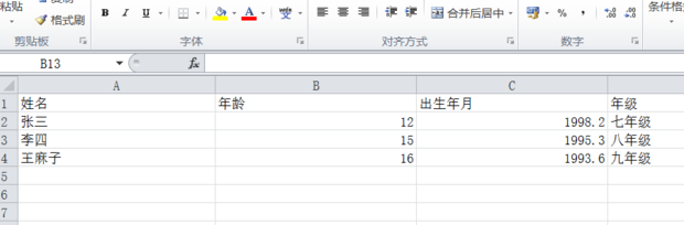 How to enlarge or reduce the entire excel table
Mar 20, 2024 pm 05:16 PM
How to enlarge or reduce the entire excel table
Mar 20, 2024 pm 05:16 PM
The development of computer technology, network technology, and software technology has provided great prospects for office automation. Our current office operation processes can all be carried out electronically, which greatly saves operation time. Excel tables are commonly used software operations. Sometimes based on paper or typesetting problems, we need to enlarge or reduce the entire excel table. Settings, if there are any operation methods that can meet our needs, let’s take a look at the following course. 1. First open the excel software and enter relevant information, as shown in the figure below. 2. Then click the icon in the lower right corner and move it left or right. The plus sign can zoom in and the minus sign can zoom out, as shown in the figure below. 3. The second method can also use ctrl + mouse wheel.
 How to use JavaScript to drag and zoom images while limiting them to the container?
Oct 20, 2023 pm 04:19 PM
How to use JavaScript to drag and zoom images while limiting them to the container?
Oct 20, 2023 pm 04:19 PM
How does JavaScript implement dragging and zooming of images while limiting them to the container? In web development, we often encounter the need to drag and zoom images. This article will introduce how to use JavaScript to implement dragging and zooming of images and limit operations within the container. 1. Drag the picture To drag the picture, we can use mouse events to track the mouse position and move the picture position accordingly. The following is a sample code: //Get the picture element varimage
 How to center a div in html
Apr 05, 2024 am 09:00 AM
How to center a div in html
Apr 05, 2024 am 09:00 AM
There are two ways to center a div in HTML: Use the text-align attribute (text-align: center): For simpler layouts. Use flexible layout (Flexbox): Provide more flexible layout control. The steps include: enabling Flexbox (display: flex) in the parent element. Set the div as a Flex item (flex: 1). Use the align-items and justify-content properties for vertical and horizontal centering.
 How to use JavaScript to achieve the up and down sliding switching effect of images while adding zoom and fade animations?
Oct 20, 2023 pm 05:15 PM
How to use JavaScript to achieve the up and down sliding switching effect of images while adding zoom and fade animations?
Oct 20, 2023 pm 05:15 PM
How can JavaScript achieve the up and down sliding switching effect of images while adding zoom and fade animations? In web design, image switching effects are often used to improve user experience. Among these switching effects, sliding up and down, zooming and fading animations are relatively common and attractive. This article will introduce how to use JavaScript to achieve the combination of these three animation effects. First, we need to use HTML to build a basic web page structure that contains the image elements to be displayed. The following is an example
 How to implement irregular grid layout through CSS Flex layout
Sep 28, 2023 pm 09:49 PM
How to implement irregular grid layout through CSS Flex layout
Sep 28, 2023 pm 09:49 PM
How to implement irregular grid layout through CSSFlex elastic layout. In web design, it is often necessary to use grid layout to achieve page segmentation and layout. Usually grid layout is regular, and each grid is the same size. Sometimes we may need to implement some irregular grid layout. CSSFlex elastic layout is a powerful layout method that can easily implement various grid layouts, including irregular grid layouts. Below we will introduce how to use CSSFlex elastic layout to achieve different
