
 Web Front-end
HTML Tutorial
How to create a responsive image gallery display layout using HTML and CSS
Web Front-end
HTML Tutorial
How to create a responsive image gallery display layout using HTML and CSS
How to create a responsive image gallery display layout using HTML and CSS


How to use HTML and CSS to create a responsive picture gallery display layout
In today's Internet era, picture gallery display is a common layout in web design, which can display various Pictures and graphic works. In order to allow users to have a good browsing experience on different devices, responsive design is becoming more and more important. This article will introduce how to use HTML and CSS to create a responsive image gallery display layout, and provide specific code examples.
Step 1: Create a basic HTML structure
First, we need to create a basic HTML structure. We will use an unordered list (
- ) to contain all image elements, and use list items (
- ) to wrap each image. Within each list item, we will use the
 tag to embed the image.
 <div class="gallery"> <ul> <li><img src="/static/imghw/default1.png" data-src="image1.jpg" class="lazy" alt="Image 1"></li> <li><img src="/static/imghw/default1.png" data-src="image2.jpg" class="lazy" alt="Image 2"></li> <li><img src="/static/imghw/default1.png" data-src="image3.jpg" class="lazy" alt="Image 3"></li> <!-- 添加更多图片 --> </ul> </div>Copy after loginStep 2: Apply CSS Styles
Next, we need to add some CSS styles to the image gallery to create a gallery with a responsive layout. First, we need to define the height and width of the gallery. To achieve a responsive design, we will use percentages to define the width.
.gallery {
  width: 100%;
  max-width: 1200px;
  margin: 0 auto;
}

.gallery ul {
  list-style: none;
  padding: 0;
  margin: 0;
}

.gallery li {
  display: inline-block;
  width: 30%;
  padding: 10px;
  box-sizing: border-box;
}

.gallery img {
  width: 100%;
  height: auto;
}
Copy after loginWith the above CSS style, we define the width of the gallery container to be 100%, but the maximum width is 1200px. Each list item (i.e. image) has a width of 30% and has 10px padding.
Step 3: Implement responsive design
In order to implement responsive design, we can use media queries to adapt to different screen sizes. To make the gallery layout display better on small screen devices, we can do this by changing the width of each list item.
@media screen and (max-width: 768px) {
  .gallery li {
    width: 50%;
  }
}

@media screen and (max-width: 480px) {
  .gallery li {
    width: 100%;
  }
}
Copy after loginThe above CSS code uses media queries to change the width of the list items on small screen devices to 50% and 100% respectively to adapt to different screen sizes.
Through the above steps, we successfully created a responsive image gallery display layout. This layout can adapt to different screen sizes on different devices and provide a good user experience.
Summary
This article introduces how to use HTML and CSS to create a responsive image gallery display layout. By setting up the HTML structure and applying CSS styles, we can achieve a responsive design that adapts to different screen sizes. I hope this article helped you understand responsive design and create image gallery layouts.
 tag to embed the image.
 The above is the detailed content of How to create a responsive image gallery display layout using HTML and CSS. For more information, please follow other related articles on the PHP Chinese website!

Hot AI Tools

Undresser.AI Undress
AI-powered app for creating realistic nude photos

AI Clothes Remover
Online AI tool for removing clothes from photos.

Undress AI Tool
Undress images for free

Clothoff.io
AI clothes remover

AI Hentai Generator
Generate AI Hentai for free.

Hot Article
Hot Tools

Notepad++7.3.1
Easy-to-use and free code editor

SublimeText3 Chinese version
Chinese version, very easy to use

Zend Studio 13.0.1
Powerful PHP integrated development environment

Dreamweaver CS6
Visual web development tools

SublimeText3 Mac version
God-level code editing software (SublimeText3)
Hot Topics
 1378
1378
 52
52

 How to solve the problem of automatically saving pictures when publishing on Xiaohongshu? Where is the automatically saved image when posting?
Mar 22, 2024 am 08:06 AM
How to solve the problem of automatically saving pictures when publishing on Xiaohongshu? Where is the automatically saved image when posting?
Mar 22, 2024 am 08:06 AM
With the continuous development of social media, Xiaohongshu has become a platform for more and more young people to share their lives and discover beautiful things. Many users are troubled by auto-save issues when posting images. So, how to solve this problem? 1. How to solve the problem of automatically saving pictures when publishing on Xiaohongshu? 1. Clear the cache First, we can try to clear the cache data of Xiaohongshu. The steps are as follows: (1) Open Xiaohongshu and click the "My" button in the lower right corner; (2) On the personal center page, find "Settings" and click it; (3) Scroll down and find the "Clear Cache" option. Click OK. After clearing the cache, re-enter Xiaohongshu and try to post pictures to see if the automatic saving problem is solved. 2. Update the Xiaohongshu version to ensure that your Xiaohongshu
 How to post pictures in TikTok comments? Where is the entrance to the pictures in the comment area?
Mar 21, 2024 pm 09:12 PM
How to post pictures in TikTok comments? Where is the entrance to the pictures in the comment area?
Mar 21, 2024 pm 09:12 PM
With the popularity of Douyin short videos, user interactions in the comment area have become more colorful. Some users wish to share images in comments to better express their opinions or emotions. So, how to post pictures in TikTok comments? This article will answer this question in detail and provide you with some related tips and precautions. 1. How to post pictures in Douyin comments? 1. Open Douyin: First, you need to open Douyin APP and log in to your account. 2. Find the comment area: When browsing or posting a short video, find the place where you want to comment and click the "Comment" button. 3. Enter your comment content: Enter your comment content in the comment area. 4. Choose to send a picture: In the interface for entering comment content, you will see a "picture" button or a "+" button, click
 6 Ways to Make Pictures Sharper on iPhone
Mar 04, 2024 pm 06:25 PM
6 Ways to Make Pictures Sharper on iPhone
Mar 04, 2024 pm 06:25 PM
Apple's recent iPhones capture memories with crisp detail, saturation and brightness. But sometimes, you may encounter some issues that may cause the image to look less clear. While autofocus on iPhone cameras has come a long way, allowing you to take photos quickly, the camera can mistakenly focus on the wrong subject in certain situations, making the photo blurry in unwanted areas. If your photos on your iPhone look out of focus or lack sharpness overall, the following post should help you make them sharper. How to Make Pictures Clearer on iPhone [6 Methods] You can try using the native Photos app to clean up your photos. If you want more features and options
 How to make ppt pictures appear one by one
Mar 25, 2024 pm 04:00 PM
How to make ppt pictures appear one by one
Mar 25, 2024 pm 04:00 PM
In PowerPoint, it is a common technique to display pictures one by one, which can be achieved by setting animation effects. This guide details the steps to implement this technique, including basic setup, image insertion, adding animation, and adjusting animation order and timing. Additionally, advanced settings and adjustments are provided, such as using triggers, adjusting animation speed and order, and previewing animation effects. By following these steps and tips, users can easily set up pictures to appear one after another in PowerPoint, thereby enhancing the visual impact of the presentation and grabbing the attention of the audience.
 How to use HTML, CSS and jQuery to implement advanced functions of image merging and display
Oct 27, 2023 pm 04:36 PM
How to use HTML, CSS and jQuery to implement advanced functions of image merging and display
Oct 27, 2023 pm 04:36 PM
Overview of advanced functions of how to use HTML, CSS and jQuery to implement image merge display: In web design, image display is an important link, and image merge display is one of the common techniques to improve page loading speed and enhance user experience. This article will introduce how to use HTML, CSS and jQuery to implement advanced functions of image merging and display, and provide specific code examples. 1. HTML layout: First, we need to create a container in HTML to display the merged images. You can use di
 How to convert pdf documents into jpg images with Foxit PDF Reader - How to convert pdf documents into jpg images with Foxit PDF Reader
Mar 04, 2024 pm 05:49 PM
How to convert pdf documents into jpg images with Foxit PDF Reader - How to convert pdf documents into jpg images with Foxit PDF Reader
Mar 04, 2024 pm 05:49 PM
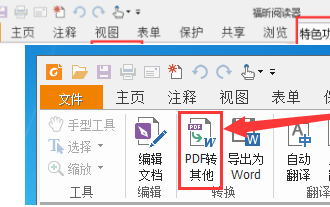
Are you also using Foxit PDF Reader software? So do you know how Foxit PDF Reader converts pdf documents into jpg images? The following article brings you how Foxit PDF Reader converts pdf documents into jpg images. For those who are interested in the method of converting jpg images, please come and take a look below. First start Foxit PDF Reader, then find "Features" on the top toolbar, and then select the "PDF to Others" function. Next, open a web page called "Foxit PDF Online Conversion". Click the "Login" button on the upper right side of the page to log in, and then turn on the "PDF to Image" function. Then click the upload button and add the pdf file you want to convert into an image. After adding it, click "Start Conversion"
 What should I do if the images on the webpage cannot be loaded? 6 solutions
Mar 15, 2024 am 10:30 AM
What should I do if the images on the webpage cannot be loaded? 6 solutions
Mar 15, 2024 am 10:30 AM
Some netizens found that when they opened the browser web page, the pictures on the web page could not be loaded for a long time. What happened? I checked that the network is normal, so where is the problem? The editor below will introduce to you six solutions to the problem that web page images cannot be loaded. Web page images cannot be loaded: 1. Internet speed problem The web page cannot display images. It may be because the computer's Internet speed is relatively slow and there are more softwares opened on the computer. And the images we access are relatively large, which may be due to loading timeout. As a result, the picture cannot be displayed. You can turn off the software that consumes more network speed. You can go to the task manager to check. 2. Too many visitors. If the webpage cannot display pictures, it may be because the webpages we visited were visited at the same time.
 How to use JavaScript to implement the drag and zoom function of images?
Oct 27, 2023 am 09:39 AM
How to use JavaScript to implement the drag and zoom function of images?
Oct 27, 2023 am 09:39 AM
How to use JavaScript to implement the drag and zoom function of images? In modern web development, dragging and zooming images is a common requirement. By using JavaScript, we can easily add dragging and zooming functions to images to provide a better user experience. In this article, we will introduce how to use JavaScript to implement this function, with specific code examples. HTML structure First, we need a basic HTML structure to display pictures and add
