CSS layout property optimization tips: position sticky and flexbox
CSS layout attribute optimization skills: position sticky and flexbox
In web development, layout is a very important aspect. A good layout structure can improve the user experience and make the page more beautiful and easy to navigate. CSS layout properties are the key to achieving this goal. In this article, I will introduce two commonly used CSS layout property optimization techniques: position sticky and flexbox, and provide specific code examples.
1. Position sticky
Position sticky is a relatively new property in CSS. It allows an element to be fixed at a certain position on the page when scrolling until it is scrolled to the specified position and then released. fixed. This effect is similar to position fixed, but sticky can automatically switch between fixed and unfixed states according to the scroll position.
There are usually two prerequisites for using the position sticky attribute: first, you need to set a positioning attribute for the element (such as position:relative or position:absolute); secondly, you need to set top, bottom, left or right. at least one.
Code example:
HTML part:
<div class="container">
   <div class="header">
      <h1>这是一个顶部导航栏</h1>
   </div>
   <div class="content">
      <p>这是页面的主要内容</p>
   </div>
   <div class="sidebar">
      <p>这是一个侧边栏,可以在滚动时固定在页面</p>
   </div>
</div>CSS part:
.container {
   height: 800px; /* 设置容器的高度,用于演示滚动效果 */
   position: relative;
}

.header {
   background-color: #f1f1f1;
   padding: 20px;
}

.sidebar {
   width: 200px;
   position: sticky;
   top: 100px;
}

.content {
   padding: 20px;
}In the above code example, we set up a container div and It contains a top navigation bar, a main content area and a sidebar. Notice that in the CSS style of the sidebar, we set the position attribute to sticky and set the top attribute to 100px. In this way, when the page scrolls down, the sidebar will be fixed at a position 100px from the top, and will not be unfixed until it scrolls to the specified position.
2. Flexbox
Flexbox is a powerful layout model in CSS that can easily layout elements in one or two dimensions. It is ideal for designing responsive web layouts and has easy-to-understand syntax and powerful performance.
Code example:
HTML part:
<div class="container">
   <div class="header">
      <h1>这是一个顶部导航栏</h1>
   </div>
   <div class="content">
      <div class="sidebar">
         <p>这是一个侧边栏</p>
      </div>
      <div class="main">
         <p>这是页面的主要内容</p>
      </div>
   </div>
</div>CSS part:
.container {
   display: flex;
   flex-direction: column;
   height: 800px;
}

.header {
   background-color: #f1f1f1;
   padding: 20px;
}

.content {
   display: flex;
   flex: 1;
}

.sidebar {
   width: 200px;
   background-color: #f9f9f9;
   padding: 20px;
}

.main {
   flex: 1;
   padding: 20px;
}In the above code example, set the display attribute to flex on the container div , and use the flex-direction property to set the arrangement direction of the elements to vertical (column). In this way, the elements within the container will be arranged in order from top to bottom.
In addition, we can also use the flex attribute to adaptively layout the sidebar and main content area. By setting the value of the .flex property, elements can be distributed in proportion to the space they occupy. In the above example, the .flex properties of the sidebar and main content area are set to 1 respectively. This means that they will occupy the remaining space in equal proportions.
To sum up, this article introduces two commonly used CSS layout attribute optimization techniques: position sticky and flexbox, and provides specific code examples. By rationally using these layout techniques, we can be more flexible in page design and layout, improve user experience, and create beautiful and easy-to-navigate web pages.
The above is the detailed content of CSS layout property optimization tips: position sticky and flexbox. For more information, please follow other related articles on the PHP Chinese website!

Hot AI Tools

Undresser.AI Undress
AI-powered app for creating realistic nude photos

AI Clothes Remover
Online AI tool for removing clothes from photos.

Undress AI Tool
Undress images for free

Clothoff.io
AI clothes remover

AI Hentai Generator
Generate AI Hentai for free.

Hot Article

Hot Tools

Notepad++7.3.1
Easy-to-use and free code editor

SublimeText3 Chinese version
Chinese version, very easy to use

Zend Studio 13.0.1
Powerful PHP integrated development environment

Dreamweaver CS6
Visual web development tools

SublimeText3 Mac version
God-level code editing software (SublimeText3)

Hot Topics
 C++ program optimization: time complexity reduction techniques
Jun 01, 2024 am 11:19 AM
Time complexity measures the execution time of an algorithm relative to the size of the input. Tips for reducing the time complexity of C++ programs include: choosing appropriate containers (such as vector, list) to optimize data storage and management. Utilize efficient algorithms such as quick sort to reduce computation time. Eliminate multiple operations to reduce double counting. Use conditional branches to avoid unnecessary calculations. Optimize linear search by using faster algorithms such as binary search.
 How to set unknown attributes in vscode vscode method to set unknown attributes
May 09, 2024 pm 02:43 PM
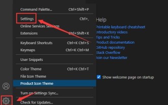
1. First, open the settings icon in the lower left corner and click the settings option. 2. Then, find the CSS column in the jumped window. 3. Finally, change the drop-down option in the unknownproperties menu to the error button.
 Graphical steps for setting the default properties of CSS in Visual Studio 2019
May 09, 2024 pm 02:01 PM
1. Open Visual Studio 2019, find its option settings, and click CSS. 2. Here you can see the technical settings of the following attributes. 3. Now you can set text and fill borders here. 4. At this time, you can also set the floating positioning here. 5. At this moment, you can also set the border and background here to complete the operation. 6. Finally, click the OK button here to set the CSS default properties.
 How to isolate styles in components in vue
May 09, 2024 pm 03:57 PM
Style isolation in Vue components can be achieved in four ways: Use scoped styles to create isolated scopes. Use CSS Modules to generate CSS files with unique class names. Organize class names using BEM conventions to maintain modularity and reusability. In rare cases, it is possible to inject styles directly into the component, but this is not recommended.
 How to wrap alert in javascript
May 08, 2024 pm 10:00 PM
How to wrap the alert box in JavaScript: use \n escape character: const myString = "First line\nSecond line\nThird line"; alert(myString);Use HTML <br> tag: const myString = " First line<br>Second line<br>Third line"; alert(myString); Set the CSS white-space property: const myString = First line, Second line, Third line; alert(myString);
 'Black Myth: Wukong ' Xbox version was delayed due to 'memory leak', PS5 version optimization is in progress
Aug 27, 2024 pm 03:38 PM
Recently, "Black Myth: Wukong" has attracted huge attention around the world. The number of people online at the same time on each platform has reached a new high. This game has achieved great commercial success on multiple platforms. The Xbox version of "Black Myth: Wukong" has been postponed. Although "Black Myth: Wukong" has been released on PC and PS5 platforms, there has been no definite news about its Xbox version. It is understood that the official has confirmed that "Black Myth: Wukong" will be launched on the Xbox platform. However, the specific launch date has not yet been announced. It was recently reported that the Xbox version's delay was due to technical issues. According to a relevant blogger, he learned from communications with developers and "Xbox insiders" during Gamescom that the Xbox version of "Black Myth: Wukong" exists.
 Optimizing C++ server architecture to improve throughput
Jun 01, 2024 pm 01:14 PM
Strategies to optimize C++ server throughput: Thread pool: Create a thread pool in advance to respond to requests quickly. Non-blocking I/O: Perform other tasks while waiting for I/O to improve throughput. HTTP/2: Uses a binary protocol, supports multiplexing and content compression, and improves performance.
 How to register for Bitstamp exchange pro? Is it safe? Is it formal?
Aug 13, 2024 pm 06:36 PM
How to register BitstampPro? Visit the BitstampPro website. Fill in your personal information and email address. Create a password and accept the terms. Verify email address. Is BitstampPro safe? Authentication required. Enforce the use of two-factor authentication. Most assets are stored in cold storage. Use HTTPS to encrypt communication. Conduct regular security audits. Is BitstampPro legitimate? Registered in Luxembourg. Regulated by the Luxembourg Financial Supervisory Committee. Comply with anti-money laundering and know-your-customer regulations.


