How to use HTML and CSS to implement a simple pop-up box layout
How to use HTML and CSS to implement a simple pop-up box layout
Overview:
The pop-up box is a commonly used interactive element in web pages and can be used Display some prompt information, confirmation dialog box, etc. This article will introduce how to use HTML and CSS to implement a simple pop-up box layout, and provide specific code examples.
HTML structure:
First, we need to create an outer container in HTML to wrap the content of the pop-up box. You can create this container using a div element and add a unique id attribute to it, such as "popup-container". In this container, we can place various components of the pop-up box, such as title, content, close button, etc.
The sample code is as follows:
<div id="popup-container">
    <div class="popup-box">
        <h2 id="这里是标题">这里是标题</h2>
        <div class="popup-content">
            这里是内容
        </div>
        <button class="popup-close">关闭</button>
    </div>
</div>CSS style:
Next, we can use CSS to layout and style the pop-up box. First, we need to set the outer container to fixed positioning, and set the width, height, background color, transparency and other styles.
The sample code is as follows:
#popup-container {
    position: fixed;
    top: 0;
    left: 0;
    width: 100%;
    height: 100%;
    background-color: rgba(0, 0, 0, 0.5);
    display: flex;
    justify-content: center;
    align-items: center;
}Then, we can set the content of the pop-up box, such as the title, content and close button style.
The sample code is as follows:
.popup-box {
    background-color: #FFFFFF;
    border-radius: 5px;
    padding: 20px;
    box-shadow: 0 0 10px rgba(0, 0, 0, 0.5);
    max-width: 400px;
    width: 80%;
}

.popup-title {
    font-size: 18px;
    color: #333333;
    margin: 0 0 10px;
}

.popup-content {
    font-size: 14px;
    color: #666666;
    margin-bottom: 20px;
}

.popup-close {
    background-color: #CCCCCC;
    border: none;
    color: #FFFFFF;
    padding: 10px 15px;
    border-radius: 3px;
    cursor: pointer;
}

.popup-close:hover {
    background-color: #999999;
}In addition, we can also add some animation effects to make the pop-up and closing smoother.
The sample code is as follows:
#popup-container {
    opacity: 0;
    pointer-events: none;
    transition: opacity 0.3s ease;
}

#popup-container.active {
    opacity: 1;
    pointer-events: auto;
}

.popup-box {
    transform: translate(-50%, -50%) scale(0.5);
    transition: transform 0.3s ease;
}

.popup-box.active {
    transform: translate(-50%, -50%) scale(1);
}JavaScript interaction:
Finally, we can use JavaScript to realize the interaction of clicking the button to pop up or close the pop-up box.
The sample code is as follows:
var popupContainer = document.getElementById("popup-container");
var popupClose = document.querySelector(".popup-close");

popupClose.addEventListener("click", function() {
    popupContainer.classList.remove("active");
});

function showPopup() {
    popupContainer.classList.add("active");
}

showPopup();Conclusion:
In this article, we introduced how to use HTML and CSS to implement a simple pop-up box layout, and provided specific code examples . Through these examples, you can better understand and master the method of making pop-up boxes, and you can modify and expand them according to your own needs to achieve a more personalized pop-up box effect. Hope this article can be helpful to you!
The above is the detailed content of How to use HTML and CSS to implement a simple pop-up box layout. For more information, please follow other related articles on the PHP Chinese website!

Hot AI Tools

Undresser.AI Undress
AI-powered app for creating realistic nude photos

AI Clothes Remover
Online AI tool for removing clothes from photos.

Undress AI Tool
Undress images for free

Clothoff.io
AI clothes remover

AI Hentai Generator
Generate AI Hentai for free.

Hot Article

Hot Tools

Notepad++7.3.1
Easy-to-use and free code editor

SublimeText3 Chinese version
Chinese version, very easy to use

Zend Studio 13.0.1
Powerful PHP integrated development environment

Dreamweaver CS6
Visual web development tools

SublimeText3 Mac version
God-level code editing software (SublimeText3)

Hot Topics
 Table Border in HTML
Sep 04, 2024 pm 04:49 PM
Guide to Table Border in HTML. Here we discuss multiple ways for defining table-border with examples of the Table Border in HTML.
 Nested Table in HTML
Sep 04, 2024 pm 04:49 PM
This is a guide to Nested Table in HTML. Here we discuss how to create a table within the table along with the respective examples.
 HTML margin-left
Sep 04, 2024 pm 04:48 PM
Guide to HTML margin-left. Here we discuss a brief overview on HTML margin-left and its Examples along with its Code Implementation.
 HTML Table Layout
Sep 04, 2024 pm 04:54 PM
Guide to HTML Table Layout. Here we discuss the Values of HTML Table Layout along with the examples and outputs n detail.
 Moving Text in HTML
Sep 04, 2024 pm 04:45 PM
Guide to Moving Text in HTML. Here we discuss an introduction, how marquee tag work with syntax and examples to implement.
 HTML Ordered List
Sep 04, 2024 pm 04:43 PM
Guide to the HTML Ordered List. Here we also discuss introduction of HTML Ordered list and types along with their example respectively
 How do you parse and process HTML/XML in PHP?
Feb 07, 2025 am 11:57 AM
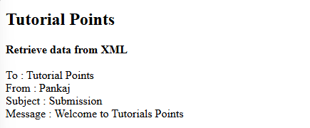
This tutorial demonstrates how to efficiently process XML documents using PHP. XML (eXtensible Markup Language) is a versatile text-based markup language designed for both human readability and machine parsing. It's commonly used for data storage an
 HTML onclick Button
Sep 04, 2024 pm 04:49 PM
Guide to HTML onclick Button. Here we discuss their introduction, working, examples and onclick Event in various events respectively.


