How to use Layui to implement collapsible drawer component function

How to use Layui to implement the collapsible drawer component function
Introduction: Layui is a lightweight front-end UI framework that provides a wealth of components and tools that can Help developers quickly build user-friendly interfaces. Among them, the drawer component is a common interactive effect that can fold and expand content, improving the flexibility and readability of the page. This article will introduce how to use Layui to implement the collapsible drawer component function, and come with specific code examples.
1. Preparation work:
First make sure that Layui related files have been introduced, including Layui’s CSS and JS files. It can be imported through CDN or downloaded locally and imported.
2. HTML structure:
In HTML, we need to define a container containing the drawer component and give it a unique ID. The drawer component consists of two parts: header and content. The header is a button that triggers the folding operation, and the content is the part to be folded. The following is an example HTML structure:
<div id="drawer" class="layui-collapse">
   <div class="layui-colla-item">
      <h2 id="抽屉标题">抽屉标题</h2>
      <div class="layui-colla-content">
         抽屉内容
      </div>
   </div>
</div>3. Initialize the drawer component:
In Javascript, we need to initialize the drawer component. Initialize the drawer component by calling the render method of Layui's collapse component. We can also set some parameters to control the behavior of the component, such as whether to expand by default, the speed of the folding animation, etc. The following is an example initialization code:
layui.use('element', function(){
   var element = layui.element;

   // 初始化抽屉组件
   element.render('collapse');
});4. Set the style of the drawer component:
In order to give the drawer component a certain interactive effect, we can specify some styles for it. For example, you can set the background color, border style, etc. of the drawer component. The following is an example CSS style:
#drawer .layui-colla-item {
   border: 1px solid #ddd;
   margin-bottom: 10px;
}

#drawer .layui-colla-title {
   background-color: #f2f2f2;
   padding: 10px;
   cursor: pointer;
}

#drawer .layui-colla-content {
   padding: 10px;
} 5. Effect display:
Through the above steps, we have completed the basic configuration of the drawer component. Now you can open the browser and see the effect of the drawer component. By clicking on the head of the drawer, you can achieve folding and unfolding effects. The contents of the drawer can be folded or unfolded, creating a collapsible effect.
Summary: This article introduces how to use Layui to implement the collapsible drawer component function, and provides specific code examples. Through Layui's collapse component, we can quickly build a drawer component with folding and unfolding effects. I hope this article will be helpful to everyone in learning Layui and implementing the drawer component function.
The above is the detailed content of How to use Layui to implement collapsible drawer component function. For more information, please follow other related articles on the PHP Chinese website!

Hot AI Tools

Undresser.AI Undress
AI-powered app for creating realistic nude photos

AI Clothes Remover
Online AI tool for removing clothes from photos.

Undress AI Tool
Undress images for free

Clothoff.io
AI clothes remover

Video Face Swap
Swap faces in any video effortlessly with our completely free AI face swap tool!

Hot Article

Hot Tools

Notepad++7.3.1
Easy-to-use and free code editor

SublimeText3 Chinese version
Chinese version, very easy to use

Zend Studio 13.0.1
Powerful PHP integrated development environment

Dreamweaver CS6
Visual web development tools

SublimeText3 Mac version
God-level code editing software (SublimeText3)

Hot Topics
 1389
1389
 52
52
 Google Pixel 9 Pro Fold phone case exposed: 6.4-inch outer screen, 8.02-inch inner screen
Jun 25, 2024 pm 02:35 PM
According to news on June 25, the source ytechb published a blog post yesterday (June 24), sharing a rendering of the Google Pixel 9 Pro Fold mobile phone case, once again showing the design of the back of this folding screen. According to previous news, Google will release the Pixel 9 series of mobile phones in October this year. In addition to the three phones in the Pixel 9 series, Pixel Fold will also be included in the Pixel 9 series and will be officially named Pixel 9 Pro Fold. The phone case exposed this time comes from accessory manufacturer Torro. The company's UK and US online stores have listed the product phone case and disclosed the design and display size of the phone. The page shows a large number of Pixel 9 Pro Fold phone case renderings
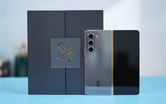 Samsung's 10,000-yuan foldable phone W25 revealed: 5-megapixel under-screen front camera and thinner body
Aug 23, 2024 pm 12:43 PM
According to news on August 23, Samsung is about to launch a new folding mobile phone W25, which is expected to be unveiled at the end of September. It will make corresponding improvements in the under-screen front camera and body thickness. According to reports, Samsung W25, codenamed Q6A, will be equipped with a 5-megapixel under-screen camera, which is an improvement over the 4-megapixel camera of the Galaxy Z Fold series. In addition, the W25’s external-screen front camera and ultra-wide-angle camera are expected to be 10 million and 12 million pixels respectively. In terms of design, the W25 is about 10 mm thick in the folded state, which is about 2 mm thinner than the standard Galaxy Z Fold 6. In terms of screen, the W25 has an external screen of 6.5 inches and an internal screen of 8 inches, while the Galaxy Z Fold6 has an external screen of 6.3 inches and an internal screen of 8 inches.
 How to get form data in layui
Apr 04, 2024 am 03:39 AM
layui provides a variety of methods for obtaining form data, including directly obtaining all field data of the form, obtaining the value of a single form element, using the formAPI.getVal() method to obtain the specified field value, serializing the form data and using it as an AJAX request parameter, and listening Form submission event gets data.
 Samsung Galaxy Z Flip 6 model first revealed: narrower bezels, creases still present
Jun 22, 2024 am 03:28 AM
According to news on June 21, foreign media recently released model photos of Samsung Galaxy Z Flip 6 on the Internet. According to the picture, it can be understood that the borders of Samsung Galaxy Z Flip 6 will be further narrowed, which means that the width of the phone may be reduced in the folded state, and it will also provide a more comfortable grip and portability. Moreover, compared with the previous generation ZFlip5, the model of Galaxy ZFlip6 is more square and the camera module on the back is more prominent. It is expected to use a new camera sensor. However, from the front, the creases of the phone are still relatively obvious, but considering that the leaked model is a model phone, there may be some differences with the real phone, so it is for reference only. In terms of performance configuration, Galaxy
 How layui implements self-adaptation
Apr 26, 2024 am 03:00 AM
Adaptive layout can be achieved by using the responsive layout function of the layui framework. The steps include: referencing the layui framework. Define an adaptive layout container and set the layui-container class. Use responsive breakpoints (xs/sm/md/lg) to hide elements under specific breakpoints. Specify element width using the grid system (layui-col-). Create spacing via offset (layui-offset-). Use responsive utilities (layui-invisible/show/block/inline) to control the visibility of elements and how they appear.
 How to transfer data in layui
Apr 26, 2024 am 03:39 AM
The method of using layui to transmit data is as follows: Use Ajax: Create the request object, set the request parameters (URL, method, data), and process the response. Use built-in methods: Simplify data transfer using built-in methods such as $.post, $.get, $.postJSON, or $.getJSON.
 What is the difference between layui and vue?
Apr 04, 2024 am 03:54 AM
The difference between layui and Vue is mainly reflected in functions and concerns. Layui focuses on rapid development of UI elements and provides prefabricated components to simplify page construction; Vue is a full-stack framework that focuses on data binding, component development and state management, and is more suitable for building complex applications. Layui is easy to learn and suitable for quickly building pages; Vue has a steep learning curve but helps build scalable and easy-to-maintain applications. Depending on the project needs and developer skill level, the appropriate framework can be selected.
 What does layui mean?
Apr 04, 2024 am 04:33 AM
layui is a front-end UI framework that provides a wealth of UI components, tools and functions to help developers quickly build modern, responsive and interactive web applications. Its features include: flexible and lightweight, modular design, rich components, Powerful tools and easy customization. It is widely used in the development of various web applications, including management systems, e-commerce platforms, content management systems, social networks and mobile applications.


