 Web Front-end
 JS Tutorial
 HTML, CSS, and jQuery: A technical guide to implementing a sliding panel effect
HTML, CSS, and jQuery: A technical guide to implementing a sliding panel effect

HTML, CSS and jQuery: Technical Guide to Implementing the Sliding Panel Effect
With the popularity of mobile devices and the development of web applications, sliding panels have become a popular Interactive methods are becoming more and more common in web design. By implementing the sliding panel effect, we can display more content in a limited space and improve the user experience. This article will introduce in detail how to use HTML, CSS and jQuery to achieve the sliding panel effect, and provide specific code examples.
- HTML Structure
First, we need to create a basic HTML structure. We will use a<div> element as the container of the sliding panel, and nest several <code><div> elements as the panel content. Each panel uses the same CSS class for styling, and the corresponding panel number is bound through the <code>data-attribute.The sample code is as follows:
<div class="slider-container">
  <div class="slider-panel" data-panel="1">
    <!-- 面板1的内容 -->
  </div>
  <div class="slider-panel" data-panel="2">
    <!-- 面板2的内容 -->
  </div>
  <div class="slider-panel" data-panel="3">
    <!-- 面板3的内容 -->
  </div>
</div>
Copy after login- CSS style
Next, we need to set the CSS style to define the appearance of the sliding panel. We can useposition: absoluteandoverflow: hiddento position and hide the panel.
The sample code is as follows:
.slider-container {
  position: relative;
  width: 100%;
  height: 100%;
  overflow: hidden;
}

.slider-panel {
  position: absolute;
  top: 0;
  left: 0;
  width: 100%;
  height: 100%;
  transition: transform 0.3s ease;
}

.slider-panel[data-panel='1'] {
  transform: translateX(0%);
}

.slider-panel[data-panel='2'] {
  transform: translateX(100%);
}

.slider-panel[data-panel='3'] {
  transform: translateX(200%);
}
Copy after login- jQuery interaction
Finally, we use jQuery to add interactive effects. When the user slides the screen or clicks the corresponding button, we will switch between panels by changing thetransformproperty of the panel.
The sample code is as follows:
$(document).ready(function() {
  var currentPanel = 1;
  var numPanels = $(".slider-panel").length;

  $(".slider-container").on("swipeleft", function() {
    if (currentPanel < numPanels) {
      currentPanel++;
      $(".slider-panel").css("transform", "translateX(-" + (currentPanel-1) * 100 + "%)");
    }
  });

  $(".slider-container").on("swiperight", function() {
    if (currentPanel > 1) {
      currentPanel--;
      $(".slider-panel").css("transform", "translateX(-" + (currentPanel-1) * 100 + "%)");
    }
  });

  $(".slider-button-next").on("click", function() {
    if (currentPanel < numPanels) {
      currentPanel++;
      $(".slider-panel").css("transform", "translateX(-" + (currentPanel-1) * 100 + "%)");
    }
  });

  $(".slider-button-prev").on("click", function() {
    if (currentPanel > 1) {
      currentPanel--;
      $(".slider-panel").css("transform", "translateX(-" + (currentPanel-1) * 100 + "%)");
    }
  });
});
Copy after loginIn this example, we realize panel switching by listening to the left and right sliding gesture events. We also added two buttons for switching to the next panel and the previous panel.
With the above HTML, CSS and jQuery code, we can achieve a basic sliding panel effect. You can add more styles and interactive effects as needed to achieve a richer sliding panel design. I hope this article will help you achieve the sliding panel effect, and I wish you success in web design!
- CSS style
The above is the detailed content of HTML, CSS, and jQuery: A technical guide to implementing a sliding panel effect. For more information, please follow other related articles on the PHP Chinese website!

Hot AI Tools

Undresser.AI Undress
AI-powered app for creating realistic nude photos

AI Clothes Remover
Online AI tool for removing clothes from photos.

Undress AI Tool
Undress images for free

Clothoff.io
AI clothes remover

AI Hentai Generator
Generate AI Hentai for free.

Hot Article

Hot Tools

Notepad++7.3.1
Easy-to-use and free code editor

SublimeText3 Chinese version
Chinese version, very easy to use

Zend Studio 13.0.1
Powerful PHP integrated development environment

Dreamweaver CS6
Visual web development tools

SublimeText3 Mac version
God-level code editing software (SublimeText3)

Hot Topics
 1378
1378
 52
52
 The Stable Diffusion 3 paper is finally released, and the architectural details are revealed. Will it help to reproduce Sora?
Mar 06, 2024 pm 05:34 PM
StableDiffusion3’s paper is finally here! This model was released two weeks ago and uses the same DiT (DiffusionTransformer) architecture as Sora. It caused quite a stir once it was released. Compared with the previous version, the quality of the images generated by StableDiffusion3 has been significantly improved. It now supports multi-theme prompts, and the text writing effect has also been improved, and garbled characters no longer appear. StabilityAI pointed out that StableDiffusion3 is a series of models with parameter sizes ranging from 800M to 8B. This parameter range means that the model can be run directly on many portable devices, significantly reducing the use of AI
 This article is enough for you to read about autonomous driving and trajectory prediction!
Feb 28, 2024 pm 07:20 PM
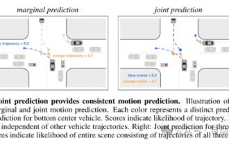
Trajectory prediction plays an important role in autonomous driving. Autonomous driving trajectory prediction refers to predicting the future driving trajectory of the vehicle by analyzing various data during the vehicle's driving process. As the core module of autonomous driving, the quality of trajectory prediction is crucial to downstream planning control. The trajectory prediction task has a rich technology stack and requires familiarity with autonomous driving dynamic/static perception, high-precision maps, lane lines, neural network architecture (CNN&GNN&Transformer) skills, etc. It is very difficult to get started! Many fans hope to get started with trajectory prediction as soon as possible and avoid pitfalls. Today I will take stock of some common problems and introductory learning methods for trajectory prediction! Introductory related knowledge 1. Are the preview papers in order? A: Look at the survey first, p
 DualBEV: significantly surpassing BEVFormer and BEVDet4D, open the book!
Mar 21, 2024 pm 05:21 PM
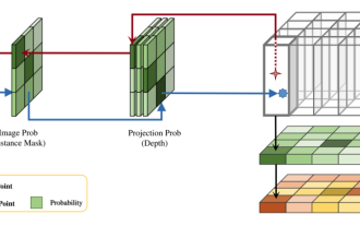
This paper explores the problem of accurately detecting objects from different viewing angles (such as perspective and bird's-eye view) in autonomous driving, especially how to effectively transform features from perspective (PV) to bird's-eye view (BEV) space. Transformation is implemented via the Visual Transformation (VT) module. Existing methods are broadly divided into two strategies: 2D to 3D and 3D to 2D conversion. 2D-to-3D methods improve dense 2D features by predicting depth probabilities, but the inherent uncertainty of depth predictions, especially in distant regions, may introduce inaccuracies. While 3D to 2D methods usually use 3D queries to sample 2D features and learn the attention weights of the correspondence between 3D and 2D features through a Transformer, which increases the computational and deployment time.
 What should I do if my mobile phone screen is hard to slide and dry?
Dec 04, 2023 pm 03:51 PM
Solutions for mobile phone screens that are difficult to slide and dry: 1. Humidify the screen; 2. Clean the screen regularly; 3. Increase the sliding strength of your fingers; 4. Use mobile phone screen protectors; 5. Replace protective covers; 6. Keep hands moist; 7. , handle it cleanly when applying the film; 8. Use lubricant; 9. Use gloves; 10. Adjust the screen brightness; 11. Replace the mobile phone. Detailed introduction: 1. Humidify the screen, place a humidifier next to the screen or spray some water to increase the humidity in the air, thereby reducing the dryness of the screen; 2. Clean the screen regularly, use professional screen cleaner, etc.
 'Minecraft' turns into an AI town, and NPC residents role-play like real people
Jan 02, 2024 pm 06:25 PM
Please note that this square man is frowning, thinking about the identities of the "uninvited guests" in front of him. It turned out that she was in a dangerous situation, and once she realized this, she quickly began a mental search to find a strategy to solve the problem. Ultimately, she decided to flee the scene and then seek help as quickly as possible and take immediate action. At the same time, the person on the opposite side was thinking the same thing as her... There was such a scene in "Minecraft" where all the characters were controlled by artificial intelligence. Each of them has a unique identity setting. For example, the girl mentioned before is a 17-year-old but smart and brave courier. They have the ability to remember and think, and live like humans in this small town set in Minecraft. What drives them is a brand new,
 LCD is finally over: global mobile phone OLED panel shipments surpassed LCD for the first time!
Jun 27, 2024 pm 06:46 PM
According to news on June 27, according to the latest report released by research organization Omdia, in the first quarter of 2024, global smartphone organic light-emitting diode (OLED) panel shipments exceeded liquid crystal display screens (LCD) for the first time in history. The report shows that annual smartphone display shipments will reach 1.45 billion units in 2023, a year-on-year increase of 5%. By the first half of 2024, shipments are expected to reach 715 million units, a year-on-year increase of 9%. Among them, active matrix organic light-emitting diode (AMOLED) screen shipments increased to 182 million units in the first quarter of 2024, a year-on-year increase of 39%. In contrast, thin film transistor liquid crystal display (TFTLCD) shipments dropped to 1.72 billion pieces, down 10% year-on-year. Om
 In the first quarter of 2024, global AMOLED mobile phone panel shipments increased by 44.6% year-on-year, and domestic manufacturers accounted for 53.4%
Apr 22, 2024 pm 09:04 PM
According to CINNO Research statistics, global AMOLED smartphone panel shipments will be approximately 190 million pieces by the first quarter of 2024, a year-on-year increase of 44.6% and a month-on-month decrease of 18.8%. Data show that in terms of regions, South Korea's share narrowed to 46.6%, and domestic manufacturers accounted for 53.4% of shipments. At the same time, the share increased by 15.6 percentage points, a month-on-month increase of 8.5 percentage points, and the share exceeded 50% for the first time. The market share narrowed from 53.3% in the same period last year to 41.0%. The market share fell by 12.3 percentage points year-on-year, and the share dropped to only 40%. The reliance on Apple and Samsung mobile phones is getting deeper and deeper, and orders from other domestic Android brands continue to be transferred out. BOE AM
 Review! Deep model fusion (LLM/basic model/federated learning/fine-tuning, etc.)
Apr 18, 2024 pm 09:43 PM
In September 23, the paper "DeepModelFusion:ASurvey" was published by the National University of Defense Technology, JD.com and Beijing Institute of Technology. Deep model fusion/merging is an emerging technology that combines the parameters or predictions of multiple deep learning models into a single model. It combines the capabilities of different models to compensate for the biases and errors of individual models for better performance. Deep model fusion on large-scale deep learning models (such as LLM and basic models) faces some challenges, including high computational cost, high-dimensional parameter space, interference between different heterogeneous models, etc. This article divides existing deep model fusion methods into four categories: (1) "Pattern connection", which connects solutions in the weight space through a loss-reducing path to obtain a better initial model fusion


