

Tips for implementing border animation effects using CSS properties

Techniques for realizing border animation effects using CSS properties require specific code examples
With the continuous development of Web technology, the requirements for page design are becoming higher and higher. In page design, animation effects are one of the important means to attract users' attention. Among them, border animation effects can add vitality and vitality to the page. This article will introduce some techniques for using CSS properties to help you achieve various border animation effects.
1. Use the transition attribute to achieve transition effects
The transition attribute can define the transition effect of an element between different states, including changes in the border. By setting different states of the border color, width, style and other attributes, various border animation effects can be achieved.
Code example:
.box {
  width: 200px;
  height: 200px;
  border: 1px solid #000;
  transition: border 0.5s;
}

.box:hover {
  border: 3px solid red;
}In the above code, a square box with a width and height of 200px is defined, and a 1px black border is set for the box. By setting the :hover pseudo-class, when the mouse hovers over the box, the border changes to a 3px red border. Set the transition attribute to border 0.5s, which means that the border change process requires a transition animation effect of 0.5 seconds.
2. Use the animation attribute to achieve frame animation effects
The animation attribute can achieve more flexible and complex animation effects. By defining multiple keyframes (@keyframes), the border can be animated according to the specified time and state changes.
Code example:
.box {
  width: 200px;
  height: 200px;
  border: 1px solid #000;
  animation: border-animation 2s infinite;
}

@keyframes border-animation {
  0% {
    border: 1px solid #000;
  }
  50% {
    border: 3px dashed blue;
  }
  100% {
    border: 5px dotted green;
  }
}In the above code, a square box with a width and height of 200px is defined, and a 1px black border is set for the box. By setting the animation property to border-animation 2s infinite, it means that the animation effect of the border lasts for 2 seconds and loops infinitely.
@keyframes border-animation defines three key frames, which represent the status of the border at different points in time. 0% represents the starting state, which is a 1px black border; 50% represents the intermediate state, which is a 3px blue dotted border; 100% represents the end state, which is a 5px green dotted border.
3. Use the box-shadow attribute to achieve shadow animation effects
In addition to changes in borders, shadow effects can also add dynamics to elements. The box-shadow attribute can realize shadow changes. By setting different shadow states and attributes, various shadow animation effects can be achieved.
Code example:
.box {
  width: 200px;
  height: 200px;
  background-color: #fff;
  box-shadow: 0 0 0 5px red;
  transition: box-shadow 0.5s;
}

.box:hover {
  box-shadow: 0 0 0 10px blue;
}In the above code, a square box with a width and height of 200px is defined, and the background color is set to white. By setting the box-shadow property to 0 0 0 5px red, it means that the starting state of the shadow is no shadow, and when the mouse is hovering over the box, the shadow changes to 0 0 0 10px blue.
Set the transition attribute to box-shadow 0.5s, which means that the shadow change process requires a transition animation effect of 0.5 seconds.
To sum up, by using CSS properties, we can achieve a variety of border animation effects. The transition effect of the border can be achieved by setting the transition attribute, the frame animation effect of the border can be achieved by setting the animation attribute, and the shadow animation effect can be achieved by setting the box-shadow attribute. These techniques can help designers better display page content and increase user experience.
The above is the detailed content of Tips for implementing border animation effects using CSS properties. For more information, please follow other related articles on the PHP Chinese website!

Hot AI Tools

Undresser.AI Undress
AI-powered app for creating realistic nude photos

AI Clothes Remover
Online AI tool for removing clothes from photos.

Undress AI Tool
Undress images for free

Clothoff.io
AI clothes remover

AI Hentai Generator
Generate AI Hentai for free.

Hot Article
Hot Tools

Notepad++7.3.1
Easy-to-use and free code editor

SublimeText3 Chinese version
Chinese version, very easy to use

Zend Studio 13.0.1
Powerful PHP integrated development environment

Dreamweaver CS6
Visual web development tools

SublimeText3 Mac version
God-level code editing software (SublimeText3)
Hot Topics
 1384
1384
 52
52

 CSS Animation: How to Achieve the Flash Effect of Elements
Nov 21, 2023 am 10:56 AM
CSS Animation: How to Achieve the Flash Effect of Elements
Nov 21, 2023 am 10:56 AM
CSS animation: How to achieve the flash effect of elements, specific code examples are needed. In web design, animation effects can sometimes bring a good user experience to the page. The glitter effect is a common animation effect that can make elements more eye-catching. The following will introduce how to use CSS to achieve the flash effect of elements. 1. Basic implementation of flash First, we need to use the animation property of CSS to achieve the flash effect. The value of the animation attribute needs to specify the animation name, animation execution time, and animation delay time
![Animation not working in PowerPoint [Fixed]](https://img.php.cn/upload/article/000/887/227/170831232982910.jpg?x-oss-process=image/resize,m_fill,h_207,w_330) Animation not working in PowerPoint [Fixed]
Feb 19, 2024 am 11:12 AM
Animation not working in PowerPoint [Fixed]
Feb 19, 2024 am 11:12 AM
Are you trying to create a presentation but can't add animation? If animations are not working in PowerPoint on your Windows PC, then this article will help you. This is a common problem that many people complain about. For example, animations may stop working during presentations in Microsoft Teams or during screen recordings. In this guide, we will explore various troubleshooting techniques to help you fix animations not working in PowerPoint on Windows. Why aren't my PowerPoint animations working? We have noticed that some possible reasons that may cause the animation in PowerPoint not working issue on Windows are as follows: Due to personal
 How to set up ppt animation to enter first and then exit
Mar 20, 2024 am 09:30 AM
How to set up ppt animation to enter first and then exit
Mar 20, 2024 am 09:30 AM
We often use ppt in our daily work, so are you familiar with every operating function in ppt? For example: How to set animation effects in ppt, how to set switching effects, and what is the effect duration of each animation? Can each slide play automatically, enter and then exit the ppt animation, etc. In this issue, I will first share with you the specific steps of entering and then exiting the ppt animation. It is below. Friends, come and take a look. Look! 1. First, we open ppt on the computer, click outside the text box to select the text box (as shown in the red circle in the figure below). 2. Then, click [Animation] in the menu bar and select the [Erase] effect (as shown in the red circle in the figure). 3. Next, click [
 After a two-year delay, the domestic 3D animated film 'Er Lang Shen: The Deep Sea Dragon' is scheduled to be released on July 13
Jan 26, 2024 am 09:42 AM
After a two-year delay, the domestic 3D animated film 'Er Lang Shen: The Deep Sea Dragon' is scheduled to be released on July 13
Jan 26, 2024 am 09:42 AM
This website reported on January 26 that the domestic 3D animated film "Er Lang Shen: The Deep Sea Dragon" released a set of latest stills and officially announced that it will be released on July 13. It is understood that "Er Lang Shen: The Deep Sea Dragon" is produced by Mihuxing (Beijing) Animation Co., Ltd., Horgos Zhonghe Qiancheng Film Co., Ltd., Zhejiang Hengdian Film Co., Ltd., Zhejiang Gongying Film Co., Ltd., Chengdu The animated film produced by Tianhuo Technology Co., Ltd. and Huawen Image (Beijing) Film Co., Ltd. and directed by Wang Jun was originally scheduled to be released in mainland China on July 22, 2022. Synopsis of the plot of this site: After the Battle of the Conferred Gods, Jiang Ziya took the "Conferred Gods List" to divide the gods, and then the Conferred Gods List was sealed by the Heavenly Court under the deep sea of Kyushu Secret Realm. In fact, in addition to conferring divine positions, there are also many powerful evil spirits sealed in the Conferred Gods List.
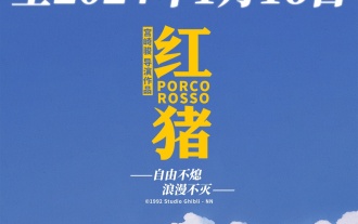 Hayao Miyazaki's animated film 'Porco Rosso' has been extended to January 16 next year, with a Douban score of 8.6
Dec 18, 2023 am 08:07 AM
Hayao Miyazaki's animated film 'Porco Rosso' has been extended to January 16 next year, with a Douban score of 8.6
Dec 18, 2023 am 08:07 AM
According to news from this site, Miyazaki Hayao's animated film "Porco Rosso" has announced that it will extend the release date to January 16, 2024. This site previously reported that "Porco Rosso" has been launched in the National Art Federation Special Line Cinema on November 17, with a cumulative box office of over 2,000 10,000, with a Douban score of 8.6, and 85.8% of 4 and 5 star reviews. "Porco Rosso" was produced by Studio Ghibli and directed by Hayao Miyazaki. Moriyama Moriyama, Tokiko Kato, Otsuka Akio, Okamura Akemi and others participated in the dubbing. It was originally released in Japan in 1992. The film is adapted from Hayao Miyazaki's comic book "The Age of Airships" and tells the story of the Italian Air Force's ace pilot Pollock Rosen who was magically turned into a pig. After that, he became a bounty hunter, fighting against air robbers and protecting those around him. Plot synopsis: Rosen is a soldier in World War I
 The final trailer for Netflix's claymation film 'Chicken Run 2” has been announced and will be released on December 15
Nov 20, 2023 pm 01:21 PM
The final trailer for Netflix's claymation film 'Chicken Run 2” has been announced and will be released on December 15
Nov 20, 2023 pm 01:21 PM
The final trailer for Netflix's claymation film "Chicken Run 2" has been released. The film is expected to be released on December 15. This site noticed that the trailer for "Chicken Run 2" shows Chicken Loki and King Kong. Jay launches an operation to find his daughter Molly. Molly is taken away by a truck at FunLand Farm, and Rocky and Ginger risk their lives to retrieve their daughter. The film is directed by Sam Fehr and stars Sandy Way Newton, Zachary Levi, Bella Ramsey, Imelda Staunton and David Bradley. It is understood that "Chicken Run 2" is the sequel to "Chicken Run" after more than 20 years. The first work was released in China on January 2, 2001. It tells the story of a group of chickens who face the fate of being turned into chicken pies in a chicken factory.
 What does groove mean in css
Apr 28, 2024 pm 04:12 PM
What does groove mean in css
Apr 28, 2024 pm 04:12 PM
In CSS, groove represents a border style that creates a groove-like effect. The specific application is as follows: Use the CSS property border-style: groove; the groove-shaped border has a concave inner edge, a raised outer edge and a shadow effect.
 Create dynamic background effects: flexible use of CSS properties
Nov 18, 2023 pm 03:56 PM
Create dynamic background effects: flexible use of CSS properties
Nov 18, 2023 pm 03:56 PM
Create dynamic background effects: The flexible use of CSS attributes in web design, background effects are a very important part, it can add a vivid atmosphere to the website and improve user experience. As a key language for web page style design, CSS gives full play to flexibility and diversity, and provides a wealth of attributes and techniques to create various dynamic background effects. This article will use specific code examples to introduce the flexible use of some common CSS properties to achieve wonderful dynamic background effects. 1. Gradient background Gradient background can add charm to the web page, making it
