

Create dynamic background effects: flexible use of CSS properties

Creating dynamic background effects: Flexible use of CSS properties
In web design, background effects are a very important part, it can add a vivid atmosphere to the website. Improve user experience. As a key language for web page style design, CSS gives full play to flexibility and diversity, and provides a wealth of attributes and techniques to create various dynamic background effects. This article will use specific code examples to introduce the flexible use of some common CSS properties to achieve wonderful dynamic background effects.
1. Gradient background
Gradient background can add charm to the web page and make the page appear more three-dimensional and vivid. CSS provides two commonly used gradient methods: linear-gradient and radial-gradient. Here is a sample code using a gradient background:
.gradient-bg {
  background: linear-gradient(45deg, #FF6B6B, #556270);
}This code will create a 45 degree linear gradient background from #FF6B6B to #556270. You can also adjust the angle and color to achieve different effects.
2. Background image animation
The animation effect of the background image can greatly enhance the attractiveness of the page. Using CSS's background-image and @keyframes, we can achieve dynamic effects such as smooth movement and gradient of the background image. The following is a simple sample code:
@keyframes bg-move {
  from {
    background-position: 0 0;
  }
  to {
    background-position: 100% 100%;
  }
}

.animated-bg {
  background-image: url('bg-image.jpg');
  animation: bg-move 10s infinite alternate;
}This code will create an animation effect of a background image that moves smoothly. You can adjust the animation's speed, direction, and duration to achieve different effects.
3. Shadow background effect
The shadow effect can make the web page look more three-dimensional and rich. Through the box-shadow attribute, we can achieve various cool shadow background effects. Here is a simple example code:
.shadow-bg {
  box-shadow: 0 0 20px rgba(0, 0, 0, 0.5);
}This code will create a black shadow with a blur effect on the element. You can adjust the offset, blur, and color to achieve different shadow effects.
By flexibly using various properties of CSS, we can create colorful, lively and interesting dynamic background effects, adding infinite charm to web design. I hope the above examples can bring inspiration to your web design, allowing you to better use CSS properties to create various wonderful dynamic background effects.
The above is the detailed content of Create dynamic background effects: flexible use of CSS properties. For more information, please follow other related articles on the PHP Chinese website!

Hot AI Tools

Undresser.AI Undress
AI-powered app for creating realistic nude photos

AI Clothes Remover
Online AI tool for removing clothes from photos.

Undress AI Tool
Undress images for free

Clothoff.io
AI clothes remover

AI Hentai Generator
Generate AI Hentai for free.

Hot Article
Hot Tools

Notepad++7.3.1
Easy-to-use and free code editor

SublimeText3 Chinese version
Chinese version, very easy to use

Zend Studio 13.0.1
Powerful PHP integrated development environment

Dreamweaver CS6
Visual web development tools

SublimeText3 Mac version
God-level code editing software (SublimeText3)
Hot Topics
 1376
1376
 52
52

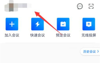 How to set up a dynamic background for Tencent meetings
Mar 01, 2024 pm 12:22 PM
How to set up a dynamic background for Tencent meetings
Mar 01, 2024 pm 12:22 PM
When using Tencent Conference, we can set a dynamic background in it. Some friends are not very familiar with this. Let me introduce you to the method of setting the background. 1. Open the Tencent Meeting APP on your mobile phone and click on your profile picture in the upper left corner of the page to open it. 2. Then click on the "Settings" function on the entered personal information page to enter. 3. There is a "Virtual Background" in the settings page. After seeing it, click on it to select it. 4. Next, swipe the screen on the entered page and find the "+" icon, as shown in the figure below: 5. You will be prompted to open the mobile phone album and click "Only this time". 6. Finally, select the background image you want to use in the entered mobile phone album. After selecting, click the "√" icon in the upper right corner to confirm. These are
 Angular components and their display properties: understanding non-block default values
Mar 15, 2024 pm 04:51 PM
Angular components and their display properties: understanding non-block default values
Mar 15, 2024 pm 04:51 PM
The default display behavior for components in the Angular framework is not for block-level elements. This design choice promotes encapsulation of component styles and encourages developers to consciously define how each component is displayed. By explicitly setting the CSS property display, the display of Angular components can be fully controlled to achieve the desired layout and responsiveness.
 Create dynamic background effects: flexible use of CSS properties
Nov 18, 2023 pm 03:56 PM
Create dynamic background effects: flexible use of CSS properties
Nov 18, 2023 pm 03:56 PM
Create dynamic background effects: The flexible use of CSS attributes in web design, background effects are a very important part, it can add a vivid atmosphere to the website and improve user experience. As a key language for web page style design, CSS gives full play to flexibility and diversity, and provides a wealth of attributes and techniques to create various dynamic background effects. This article will use specific code examples to introduce the flexible use of some common CSS properties to achieve wonderful dynamic background effects. 1. Gradient background Gradient background can add charm to the web page, making it
 What does groove mean in css
Apr 28, 2024 pm 04:12 PM
What does groove mean in css
Apr 28, 2024 pm 04:12 PM
In CSS, groove represents a border style that creates a groove-like effect. The specific application is as follows: Use the CSS property border-style: groove; the groove-shaped border has a concave inner edge, a raised outer edge and a shadow effect.
 How to set html dotted border
Apr 05, 2024 am 09:36 AM
How to set html dotted border
Apr 05, 2024 am 09:36 AM
In HTML, you can set the border to a dotted line through the CSS border-style attribute: determine the element to which you want to set a dotted border, for example, use the p element to represent a paragraph. Use the border-style attribute to set the dotted line style. For example, dotted represents a dotted line, and dashed represents a short dashed line. Set other border properties, such as border-width, border-color, and border-position, to control border width, color, and position.
 How to set the background image in layui
Apr 26, 2024 am 02:45 AM
How to set the background image in layui
Apr 26, 2024 am 02:45 AM
There are two ways to set the background image in layui: using CSS style: body { background-image: url("path/to/image.jpg"); } using layui API: layui.use('element', function() { element.addStyle('.layui-body{background-image: url("path/to/image.jpg");}') });
 How to use CSS3 properties to achieve the wrapping effect of web page text?
Sep 08, 2023 am 10:30 AM
How to use CSS3 properties to achieve the wrapping effect of web page text?
Sep 08, 2023 am 10:30 AM
How to use CSS3 properties to achieve the wrapping effect of web page text? In modern web design, text wrapping effects are a common and interesting presentation method. By using CSS3 properties, we can easily achieve the wrapping effect of web text. This article will introduce some commonly used CSS3 properties and their application in achieving text wrapping effects. 1. Float attribute The float attribute is an attribute used in CSS to set the float of an element. Combined with the clear attribute, the effect of text wrapping around the image can be achieved. Here is an example:&
 How to solve the header misalignment problem of WordPress website?
Mar 01, 2024 am 09:54 AM
How to solve the header misalignment problem of WordPress website?
Mar 01, 2024 am 09:54 AM
How to solve the header misalignment problem of WordPress website? When you encounter head misalignment issues on your WordPress site, it can be confusing and frustrating. This problem may be caused by a variety of reasons, such as CSS style errors, Javascript conflicts, plug-in issues, etc. In this article, we will discuss how to solve the header misalignment issue in WordPress and provide specific code examples. 1. Check CSS Styles First, check your theme CSS style sheet for errors or conflicts.
