

How to use CSS to achieve image rotation effect

How to use CSS to achieve image rotation effects
CSS (Cascading Style Sheets) is a markup language used to set the style and layout of web pages. Through CSS, we can achieve many attractive web page effects, including image rotation effects. In this article, we’ll discuss how to use CSS to rotate images and provide some concrete code examples.
In CSS, we can use the transform attribute to achieve the rotation effect of the image. transformAttributes can apply various transformation functions, including rotation, scaling, translation, etc. The following is a simple HTML structure, containing an image and a button:
<!DOCTYPE html>
<html lang="en">
<head>
  <meta charset="UTF-8">
  <meta name="viewport" content="width=device-width, initial-scale=1.0">
  <title>图片旋转</title>
  <style>
    .image-container {
      position: relative;
      width: 300px;
      height: 300px;
    }
    .rotate-btn {
      position: absolute;
      bottom: 10px;
      left: 50%;
      transform: translateX(-50%);
      padding: 10px 20px;
      background-color: #f00;
      color: #fff;
      border: none;
      cursor: pointer;
    }
    .image {
      width: 100%;
      height: 100%;
      object-fit: cover;
    }
  </style>
</head>
<body>
  <div class="image-container">
    <img class="image lazy"  src="/static/imghw/default1.png"  data-src="example.jpg"  alt="example image">
    <button class="rotate-btn" onclick="rotateImage()">旋转</button>
  </div>

  <script>
    function rotateImage() {
      var img = document.querySelector('.image');
      img.style.transform = "rotate(45deg)";
    }
  </script>
</body>
</html>In the above example, we first define a container with the class name .image-container, using to wrap the image and spin button. The container uses the position: relative attribute to enable subsequent absolutely positioned buttons to be positioned relative to the container. In the container, we placed a picture and a button. The picture uses the .image class name for style setting, and the button uses the .rotate-btn class name for style setting.
It is worth noting that the image uses the object-fit: cover attribute to maintain the proportion of the image in the container and fill the entire container.
In the button click event handling function rotateImage(), we use JavaScript to select the image element and rotate the image through the style.transform attribute . In this example, we set rotate(45deg) to rotate the image 45 degrees clockwise.
In addition to JavaScript, we can also achieve image rotation effects through CSS animation. Here is an example of using CSS animation:
<!DOCTYPE html>
<html lang="en">
<head>
  <meta charset="UTF-8">
  <meta name="viewport" content="width=device-width, initial-scale=1.0">
  <title>图片旋转</title>
  <style>
    @keyframes rotateAnimation {
      0% {
        transform: rotate(0deg);
      }
      100% {
        transform: rotate(360deg);
      }
    }

    .image {
      animation: rotateAnimation 5s infinite linear;
    }
  </style>
</head>
<body>
  <img class="image lazy"  src="/static/imghw/default1.png"  data-src="example.jpg"  alt="example image">
</body>
</html> In the above example, we used @keyframes to define an animation named rotateAnimation. The animation gradually rotates the image 360 degrees from 0% to 100%. Next, we applied this animation to the picture element .image, and set the animation execution time to 5 seconds, the number of loops to unlimited, and the animation speed to linear.
Through the introduction of the above example, we can see that through the transform property and animation properties of CSS, we can easily achieve the rotation effect of the image. Of course, there are many other transformation functions and animation features that allow us to create even more cool effects. I hope the introduction in this article can help you better use CSS to achieve web page effects.
Reference link:
- [MDN Web Document: CSS transform](https://developer.mozilla.org/zh-CN/docs/Web /CSS/transform)
- [MDN Web Documentation: CSS Animation](https://developer.mozilla.org/zh-CN/docs/Web/CSS/animation)
Note:
This article only briefly introduces how to use CSS to achieve image rotation effects, and provides some code examples. Readers can conduct further exploration and practice according to their own needs and actual situations.
The above is the detailed content of How to use CSS to achieve image rotation effect. For more information, please follow other related articles on the PHP Chinese website!

Hot AI Tools

Undresser.AI Undress
AI-powered app for creating realistic nude photos

AI Clothes Remover
Online AI tool for removing clothes from photos.

Undress AI Tool
Undress images for free

Clothoff.io
AI clothes remover

AI Hentai Generator
Generate AI Hentai for free.

Hot Article
Hot Tools

Notepad++7.3.1
Easy-to-use and free code editor

SublimeText3 Chinese version
Chinese version, very easy to use

Zend Studio 13.0.1
Powerful PHP integrated development environment

Dreamweaver CS6
Visual web development tools

SublimeText3 Mac version
God-level code editing software (SublimeText3)
Hot Topics


 What does placeholder mean in vue
May 07, 2024 am 09:57 AM
What does placeholder mean in vue
May 07, 2024 am 09:57 AM
In Vue.js, the placeholder attribute specifies the placeholder text of the input element, which is displayed when the user has not entered content, provides input tips or examples, and improves form accessibility. Its usage is to set the placeholder attribute on the input element and customize the appearance using CSS. Best practices include being relevant to the input, being short and clear, avoiding default text, and considering accessibility.
 What does span mean in js
May 06, 2024 am 11:42 AM
What does span mean in js
May 06, 2024 am 11:42 AM
The span tag can add styles, attributes, or behaviors to text. It is used to: add styles, such as color and font size. Set attributes such as id, class, etc. Associated behaviors such as clicks, hovers, etc. Mark text for further processing or citation.
 What does rem mean in js
May 06, 2024 am 11:30 AM
What does rem mean in js
May 06, 2024 am 11:30 AM
REM in CSS is a relative unit relative to the font size of the root element (html). It has the following characteristics: relative to the root element font size, not affected by the parent element. When the root element's font size changes, elements using REM will adjust accordingly. Can be used with any CSS property. Advantages of using REM include: Responsiveness: Keep text readable on different devices and screen sizes. Consistency: Make sure font sizes are consistent throughout your website. Scalability: Easily change the global font size by adjusting the root element font size.
 How to introduce images into vue
May 02, 2024 pm 10:48 PM
How to introduce images into vue
May 02, 2024 pm 10:48 PM
There are five ways to introduce images in Vue: through URL, require function, static file, v-bind directive and CSS background image. Dynamic images can be handled in Vue's computed properties or listeners, and bundled tools can be used to optimize image loading. Make sure the path is correct otherwise a loading error will appear.
 What is node in js
May 07, 2024 pm 09:06 PM
What is node in js
May 07, 2024 pm 09:06 PM
Nodes are entities in the JavaScript DOM that represent HTML elements. They represent a specific element in the page and can be used to access and manipulate that element. Common node types include element nodes, text nodes, comment nodes, and document nodes. Through DOM methods such as getElementById(), you can access nodes and operate on them, including modifying properties, adding/removing child nodes, inserting/replacing nodes, and cloning nodes. Node traversal helps navigate within the DOM structure. Nodes are useful for dynamically creating page content, event handling, animation, and data binding.
 What language is the browser plug-in written in?
May 08, 2024 pm 09:36 PM
What language is the browser plug-in written in?
May 08, 2024 pm 09:36 PM
Browser plug-ins are usually written in the following languages: Front-end languages: JavaScript, HTML, CSS Back-end languages: C++, Rust, WebAssembly Other languages: Python, Java
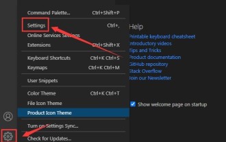 How to set unknown attributes in vscode vscode method to set unknown attributes
May 09, 2024 pm 02:43 PM
How to set unknown attributes in vscode vscode method to set unknown attributes
May 09, 2024 pm 02:43 PM
1. First, open the settings icon in the lower left corner and click the settings option. 2. Then, find the CSS column in the jumped window. 3. Finally, change the drop-down option in the unknownproperties menu to the error button.
 Can less files in vue introduce data?
May 07, 2024 pm 12:06 PM
Can less files in vue introduce data?
May 07, 2024 pm 12:06 PM
Yes, Less files in Vue can introduce data through CSS variables and Less mixins: create a JSON file containing data. Import JSON files using the @import rule. Access JSON data using CSS variables or Less mixins.
