Implement the drop-down menu effect in WeChat applet
To implement the drop-down menu effect in WeChat mini programs, specific code examples are required
With the popularity of mobile Internet, WeChat mini programs have become an important part of Internet development , more and more people are beginning to pay attention to and use WeChat mini programs. The development of WeChat mini programs is simpler and faster than traditional APP development, but it also requires mastering certain development skills.
In the development of WeChat mini programs, drop-down menus are a common UI component, achieving a better user operating experience. This article will introduce in detail how to implement the drop-down menu effect in the WeChat applet and provide specific code examples.
First, we need to define the basic structure of a drop-down menu in the wxml file, as shown below:
<view class="dropdown">
  <view class="dropdown-header" bindtap="toggleDropdown">{{selectedItem}}</view>
  <view class="dropdown-list" hidden="{{!isDropdownOpen}}">
    <view class="dropdown-item" wx:for="{{dropdownItems}}" wx:key="index" bindtap="selectItem">{{item}}</view>
  </view>
</view>In the above code, we wrap the entire drop-down menu through a view container. By setting the click event bindtap="toggleDropdown" you can control the hiding and display of the drop-down menu. In the dropdown-header view, we can display the currently selected menu item. The dropdown-list view is used to display all drop-down menu items.
Next, define the corresponding styles in the wxss file so that the drop-down menu has a good appearance and interactive effect:
.dropdown {
  position: relative;
  width: 200rpx;
}

.dropdown-header {
  padding: 10rpx 0;
  border-bottom: 1rpx solid #f0f0f0;
}

.dropdown-list {
  position: absolute;
  top: 100%;
  left: 0;
  background-color: #fff;
  box-shadow: 0 2rpx 4rpx rgba(0, 0, 0, .2);
  min-width: 100%;
  z-index: 999;
}

.dropdown-item {
  padding: 10rpx;
  border-bottom: 1rpx solid #f0f0f0;
}In the above code, we set the corresponding styles for each part of the drop-down menu The style, position: relative can position the entire drop-down menu relative to the parent element. position: absoluteYou can absolutely position the list part of the drop-down menu.
Finally, in the js file, we need to handle the hiding and showing of the drop-down menu and the selection of options.
Page({
  data: {
    isDropdownOpen: false, // 判断下拉菜单是否打开的标志
    selectedItem: "请选择", // 当前选中的菜单项
    dropdownItems: ["选项1", "选项2", "选项3"] // 下拉菜单的选项列表
  },
  toggleDropdown: function() {
    this.setData({
      isDropdownOpen: !this.data.isDropdownOpen
    });
  },
  selectItem: function(e) {
    this.setData({
      selectedItem: e.target.dataset.item,
      isDropdownOpen: false
    });
  }
})In the above code, we bind data through the data attribute, isDropdownOpen indicates whether the drop-down menu is open, and selectedItem indicates The currently selected menu item. The display and hiding of the drop-down menu can be switched through the toggleDropdown method, and the selectItem method is used to handle the selection operation of the option.
Through the above code examples, we can implement a simple drop-down menu effect in the WeChat applet. Depending on the needs, we can further modify and optimize the code to achieve more diverse drop-down menu effects.
Summary:
This article introduces how to implement the drop-down menu effect in the WeChat applet and provides corresponding code examples. I hope it will be helpful to everyone in the development of small programs. By understanding and mastering relevant development skills, you can achieve richer and more diverse user interaction effects and improve the user experience of mini programs.
The above is the detailed content of Implement the drop-down menu effect in WeChat applet. For more information, please follow other related articles on the PHP Chinese website!

Hot AI Tools

Undresser.AI Undress
AI-powered app for creating realistic nude photos

AI Clothes Remover
Online AI tool for removing clothes from photos.

Undress AI Tool
Undress images for free

Clothoff.io
AI clothes remover

Video Face Swap
Swap faces in any video effortlessly with our completely free AI face swap tool!

Hot Article

Hot Tools

Notepad++7.3.1
Easy-to-use and free code editor

SublimeText3 Chinese version
Chinese version, very easy to use

Zend Studio 13.0.1
Powerful PHP integrated development environment

Dreamweaver CS6
Visual web development tools

SublimeText3 Mac version
God-level code editing software (SublimeText3)

Hot Topics
 1387
1387
 52
52
 How to make drop-down menu in WPS table
Mar 21, 2024 pm 01:31 PM
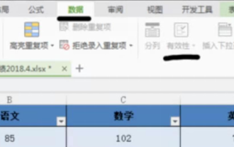
How to make the WPS table drop-down menu: After selecting the cell where you want to set the drop-down menu, click "Data", "Validity" in sequence, and then make the corresponding settings in the pop-up dialog box to pull down our menu. As a powerful office software, WPS has the ability to edit documents, statistical data tables, etc., which provides a lot of convenience for many people who need to deal with text, data, etc. In order to skillfully use WPS software to provide us with a lot of convenience, we need to be able to master various very basic operations of WPS software. In this article, the editor will share with you how to use WPS software. Perform drop-down menu operations in the WPS table that appears. After opening the WPS form, first select the
 Xianyu WeChat mini program officially launched
Feb 10, 2024 pm 10:39 PM
Xianyu's official WeChat mini program has quietly been launched. In the mini program, you can post private messages to communicate with buyers/sellers, view personal information and orders, search for items, etc. If you are curious about what the Xianyu WeChat mini program is called, take a look now. What is the name of the Xianyu WeChat applet? Answer: Xianyu, idle transactions, second-hand sales, valuations and recycling. 1. In the mini program, you can post idle messages, communicate with buyers/sellers via private messages, view personal information and orders, search for specified items, etc.; 2. On the mini program page, there are homepage, nearby, post idle, messages, and mine. 5 functions; 3. If you want to use it, you must activate WeChat payment before you can purchase it;
 How to implement dual WeChat login on Huawei mobile phones?
Mar 24, 2024 am 11:27 AM
How to implement dual WeChat login on Huawei mobile phones? With the rise of social media, WeChat has become one of the indispensable communication tools in people's daily lives. However, many people may encounter a problem: logging into multiple WeChat accounts at the same time on the same mobile phone. For Huawei mobile phone users, it is not difficult to achieve dual WeChat login. This article will introduce how to achieve dual WeChat login on Huawei mobile phones. First of all, the EMUI system that comes with Huawei mobile phones provides a very convenient function - dual application opening. Through the application dual opening function, users can simultaneously
 Use Java to write code to implement love animation
Dec 23, 2023 pm 12:09 PM
Realizing love animation effects through Java code In the field of programming, animation effects are very common and popular. Various animation effects can be achieved through Java code, one of which is the heart animation effect. This article will introduce how to use Java code to achieve this effect and give specific code examples. The key to realizing the heart animation effect is to draw the heart-shaped pattern and achieve the animation effect by changing the position and color of the heart shape. Here is the code for a simple example: importjavax.swing.
 PHP Programming Guide: Methods to Implement Fibonacci Sequence
Mar 20, 2024 pm 04:54 PM
The programming language PHP is a powerful tool for web development, capable of supporting a variety of different programming logics and algorithms. Among them, implementing the Fibonacci sequence is a common and classic programming problem. In this article, we will introduce how to use the PHP programming language to implement the Fibonacci sequence, and attach specific code examples. The Fibonacci sequence is a mathematical sequence defined as follows: the first and second elements of the sequence are 1, and starting from the third element, the value of each element is equal to the sum of the previous two elements. The first few elements of the sequence
 How to implement the WeChat clone function on Huawei mobile phones
Mar 24, 2024 pm 06:03 PM
How to implement the WeChat clone function on Huawei mobile phones With the popularity of social software and people's increasing emphasis on privacy and security, the WeChat clone function has gradually become the focus of people's attention. The WeChat clone function can help users log in to multiple WeChat accounts on the same mobile phone at the same time, making it easier to manage and use. It is not difficult to implement the WeChat clone function on Huawei mobile phones. You only need to follow the following steps. Step 1: Make sure that the mobile phone system version and WeChat version meet the requirements. First, make sure that your Huawei mobile phone system version has been updated to the latest version, as well as the WeChat App.
 How to implement exact division operation in Golang
Feb 20, 2024 pm 10:51 PM
Implementing exact division operations in Golang is a common need, especially in scenarios involving financial calculations or other scenarios that require high-precision calculations. Golang's built-in division operator "/" is calculated for floating point numbers, and sometimes there is a problem of precision loss. In order to solve this problem, we can use third-party libraries or custom functions to implement exact division operations. A common approach is to use the Rat type from the math/big package, which provides a representation of fractions and can be used to implement exact division operations.
 Master how Golang enables game development possibilities
Mar 16, 2024 pm 12:57 PM
In today's software development field, Golang (Go language), as an efficient, concise and highly concurrency programming language, is increasingly favored by developers. Its rich standard library and efficient concurrency features make it a high-profile choice in the field of game development. This article will explore how to use Golang for game development and demonstrate its powerful possibilities through specific code examples. 1. Golang’s advantages in game development. As a statically typed language, Golang is used in building large-scale game systems.


