
 Backend Development
Golang
From beginner to proficient: Use ECharts and golang to create professional-level statistical charts
Backend Development
Golang
From beginner to proficient: Use ECharts and golang to create professional-level statistical charts
From beginner to proficient: Use ECharts and golang to create professional-level statistical charts


From entry to proficiency: Use ECharts and golang to create professional-level statistical charts
Abstract: Statistical charts are an important tool for data visualization, which can make complex data become Intuitive and easy to understand. This article introduces how to use ECharts and golang to create professional-level statistical charts, including the basic settings of charts, import and display of data, and adjustment of chart styles. At the same time, specific code examples are provided to help readers better understand and apply.
1. Introduction
Statistical charts play a vital role in the field of data analysis and visualization. It can help us understand the data more intuitively and discover patterns and trends in the data. ECharts is an open source JavaScript chart library that is highly flexible and customizable and can be used to create various types of statistical charts. Golang is a powerful programming language through which we can manipulate data, process logic, and pass data to the front-end page for display.
2. Environment setup
Before we start making statistical charts, we need to set up the corresponding development environment. First, you need to install and configure the golang development environment. Secondly, you need to import the relevant files of ECharts. You can download the source code of ECharts or directly import the ECharts files on CDN.
3. Basic settings of the chart
In golang, we can use the following code example to create a simple web page and introduce the relevant scripts and style files of ECharts.
package main

import (
    "fmt"
    "net/http"
)

func main() {
    http.HandleFunc("/", func(w http.ResponseWriter, r *http.Request) {
        fmt.Fprintf(w, `
            <html>
                <head>
                    <title>统计图表示例</title>
                    <script src="echarts.min.js"></script>
                </head>
                <body>
                    <div id="chart" style="width: 600px; height: 400px;"></div>
                    <script type="text/javascript">
                        var chart = echarts.init(document.getElementById('chart'));
                        // 在这里填写具体的图表配置和数据
                        chart.setOption({ /* 具体配置 */ });
                    </script>
                </body>
            </html>
        `)
    })

    http.ListenAndServe(":8080", nil)
}In this example, we create a web page with a div element with an id of "chart" to display our statistical charts. We build a simple web server by using golang's http library in the background, and return the web page to the browser for display.
4. Data import and display
In the code of the previous step, we can see chart.setOption({ /* specific configuration*/ });This line of code , which is the configuration and data used to set up the chart. ECharts supports a variety of chart types, such as line charts, bar charts, pie charts, etc. We can choose the corresponding chart type according to our needs and provide data for display.
Take the line chart as an example. Here is a simple code example:
var option = {
    title: {
        text: '折线图示例'
    },
    xAxis: {
        data: ['周一', '周二', '周三', '周四', '周五', '周六', '周日']
    },
    yAxis: {},
    series: [{
        name: '销量',
        type: 'line',
        data: [5, 20, 36, 10, 10, 20, 5]
    }]
};

chart.setOption(option);In this example, we create a line chart and provide the data for the x-axis and the y-axis. data. In this way, the corresponding line chart can be drawn based on these data.
5. Adjustment of chart style
In addition to importing and displaying data, we can also adjust the style of the chart to make it more beautiful and easier to read. ECharts provides a wealth of configuration options that can be used to adjust chart colors, fonts, label display, etc.
The following is a simple code example of style adjustment:
var option = {
    title: {
        text: '折线图示例',
        textStyle: {
            color: '#666',
            fontSize: 16
        }
    },
    xAxis: {
        data: ['周一', '周二', '周三', '周四', '周五', '周六', '周日'],
        axisLine: {   //设置x轴的样式
            lineStyle: {
                color: '#999'
            }
        }
    },
    yAxis: {
        axisLine: {    //设置y轴的样式
            lineStyle: {
                color: '#999'
            }
        }
    },
    series: [{
        name: '销量',
        type: 'line',
        data: [5, 20, 36, 10, 10, 20, 5],
        itemStyle: {    //设置折线的样式
            color: '#f00'
        }
    }]
};

chart.setOption(option);In this example, we configure the relevant style options to make the title color #666 , the font size is 16, the color of the x-axis and y-axis markings is #999, and the color of the polyline is #f00.
6. Summary
This article introduces how to use ECharts and golang to create professional-level statistical charts. Through basic settings, data import and display, and adjustment of chart styles, we can create various types of beautiful statistical charts. At the same time, specific code examples are provided to help readers better understand and apply.
I hope this article will be helpful to readers in using ECharts and golang to create statistical charts. I hope readers can use these tools to create more beautiful and useful statistical charts.
The above is the detailed content of From beginner to proficient: Use ECharts and golang to create professional-level statistical charts. For more information, please follow other related articles on the PHP Chinese website!

Hot AI Tools

Undresser.AI Undress
AI-powered app for creating realistic nude photos

AI Clothes Remover
Online AI tool for removing clothes from photos.

Undress AI Tool
Undress images for free

Clothoff.io
AI clothes remover

Video Face Swap
Swap faces in any video effortlessly with our completely free AI face swap tool!

Hot Article
Hot Tools

Notepad++7.3.1
Easy-to-use and free code editor

SublimeText3 Chinese version
Chinese version, very easy to use

Zend Studio 13.0.1
Powerful PHP integrated development environment

Dreamweaver CS6
Visual web development tools

SublimeText3 Mac version
God-level code editing software (SublimeText3)
Hot Topics
 1393
1393
 52
37
110
52
37
110

 Generate PPT with one click! Kimi: Let the 'PPT migrant workers' become popular first
Aug 01, 2024 pm 03:28 PM
Generate PPT with one click! Kimi: Let the 'PPT migrant workers' become popular first
Aug 01, 2024 pm 03:28 PM
Kimi: In just one sentence, in just ten seconds, a PPT will be ready. PPT is so annoying! To hold a meeting, you need to have a PPT; to write a weekly report, you need to have a PPT; to make an investment, you need to show a PPT; even when you accuse someone of cheating, you have to send a PPT. College is more like studying a PPT major. You watch PPT in class and do PPT after class. Perhaps, when Dennis Austin invented PPT 37 years ago, he did not expect that one day PPT would become so widespread. Talking about our hard experience of making PPT brings tears to our eyes. "It took three months to make a PPT of more than 20 pages, and I revised it dozens of times. I felt like vomiting when I saw the PPT." "At my peak, I did five PPTs a day, and even my breathing was PPT." If you have an impromptu meeting, you should do it
 How to safely read and write files using Golang?
Jun 06, 2024 pm 05:14 PM
How to safely read and write files using Golang?
Jun 06, 2024 pm 05:14 PM
Reading and writing files safely in Go is crucial. Guidelines include: Checking file permissions Closing files using defer Validating file paths Using context timeouts Following these guidelines ensures the security of your data and the robustness of your application.
 All CVPR 2024 awards announced! Nearly 10,000 people attended the conference offline, and a Chinese researcher from Google won the best paper award
Jun 20, 2024 pm 05:43 PM
All CVPR 2024 awards announced! Nearly 10,000 people attended the conference offline, and a Chinese researcher from Google won the best paper award
Jun 20, 2024 pm 05:43 PM
In the early morning of June 20th, Beijing time, CVPR2024, the top international computer vision conference held in Seattle, officially announced the best paper and other awards. This year, a total of 10 papers won awards, including 2 best papers and 2 best student papers. In addition, there were 2 best paper nominations and 4 best student paper nominations. The top conference in the field of computer vision (CV) is CVPR, which attracts a large number of research institutions and universities every year. According to statistics, a total of 11,532 papers were submitted this year, and 2,719 were accepted, with an acceptance rate of 23.6%. According to Georgia Institute of Technology’s statistical analysis of CVPR2024 data, from the perspective of research topics, the largest number of papers is image and video synthesis and generation (Imageandvideosyn
 From bare metal to a large model with 70 billion parameters, here is a tutorial and ready-to-use scripts
Jul 24, 2024 pm 08:13 PM
From bare metal to a large model with 70 billion parameters, here is a tutorial and ready-to-use scripts
Jul 24, 2024 pm 08:13 PM
We know that LLM is trained on large-scale computer clusters using massive data. This site has introduced many methods and technologies used to assist and improve the LLM training process. Today, what we want to share is an article that goes deep into the underlying technology and introduces how to turn a bunch of "bare metals" without even an operating system into a computer cluster for training LLM. This article comes from Imbue, an AI startup that strives to achieve general intelligence by understanding how machines think. Of course, turning a bunch of "bare metal" without an operating system into a computer cluster for training LLM is not an easy process, full of exploration and trial and error, but Imbue finally successfully trained an LLM with 70 billion parameters. and in the process accumulate
 AI in use | AI created a life vlog of a girl living alone, which received tens of thousands of likes in 3 days
Aug 07, 2024 pm 10:53 PM
AI in use | AI created a life vlog of a girl living alone, which received tens of thousands of likes in 3 days
Aug 07, 2024 pm 10:53 PM
Editor of the Machine Power Report: Yang Wen The wave of artificial intelligence represented by large models and AIGC has been quietly changing the way we live and work, but most people still don’t know how to use it. Therefore, we have launched the "AI in Use" column to introduce in detail how to use AI through intuitive, interesting and concise artificial intelligence use cases and stimulate everyone's thinking. We also welcome readers to submit innovative, hands-on use cases. Video link: https://mp.weixin.qq.com/s/2hX_i7li3RqdE4u016yGhQ Recently, the life vlog of a girl living alone became popular on Xiaohongshu. An illustration-style animation, coupled with a few healing words, can be easily picked up in just a few days.
 Counting down the 12 pain points of RAG, NVIDIA senior architect teaches solutions
Jul 11, 2024 pm 01:53 PM
Counting down the 12 pain points of RAG, NVIDIA senior architect teaches solutions
Jul 11, 2024 pm 01:53 PM
Retrieval-augmented generation (RAG) is a technique that uses retrieval to boost language models. Specifically, before a language model generates an answer, it retrieves relevant information from an extensive document database and then uses this information to guide the generation process. This technology can greatly improve the accuracy and relevance of content, effectively alleviate the problem of hallucinations, increase the speed of knowledge update, and enhance the traceability of content generation. RAG is undoubtedly one of the most exciting areas of artificial intelligence research. For more details about RAG, please refer to the column article on this site "What are the new developments in RAG, which specializes in making up for the shortcomings of large models?" This review explains it clearly." But RAG is not perfect, and users often encounter some "pain points" when using it. Recently, NVIDIA’s advanced generative AI solution
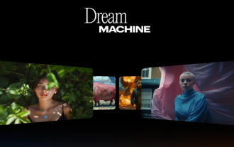 Another Sora-level player is coming to hit the streets! We compared it with Sora and Keling.
Aug 02, 2024 am 10:19 AM
Another Sora-level player is coming to hit the streets! We compared it with Sora and Keling.
Aug 02, 2024 am 10:19 AM
When Sora failed to come out, OpenAI's opponents used their weapons to destroy the streets. If Sora is not open for use, it will really be stolen! Today, San Francisco startup LumaAI played a trump card and launched a new generation of AI video generation model DreamMachine. Free and available to everyone. According to reports, the model can generate high-quality, realistic videos based on simple text descriptions, with effects comparable to Sora. As soon as the news came out, a large number of users crowded into the official website to try it out. Although officials claim that the model can generate 120-frame video in just two minutes, many users have been waiting for hours on the official website due to a surge in visits. BarkleyDai, Luma’s head of product growth, had to comment on Discord
 Kuaishou Keling AI is fully open for internal testing globally, and the model effect has been upgraded again
Jul 24, 2024 pm 08:34 PM
Kuaishou Keling AI is fully open for internal testing globally, and the model effect has been upgraded again
Jul 24, 2024 pm 08:34 PM
On July 24, Kuaishou video generation large model Keling AI announced that the basic model has been upgraded again and is fully open for internal testing. Kuaishou said that in order to allow more users to use Keling AI and better meet the different levels of usage needs of creators, from now on, on the basis of fully open internal testing, it will also officially launch a membership system for different categories of members. Provide corresponding exclusive functional services. At the same time, the basic model of Keling AI has also been upgraded again to further enhance the user experience. The basic model effect has been upgraded to further improve the user experience. Since its release more than a month ago, Keling AI has been upgraded and iterated many times. With the launch of this membership system, the basic model effect of Keling AI has once again undergone transformation. The first is that the picture quality has been significantly improved. The visual quality generated through the upgraded basic model
