How to use line charts to display data trends in ECharts

How to use line charts to display data trends in ECharts
ECharts is an open source visualization library based on JavaScript, which is widely used in various types of data analysis and visual display project. It provides rich chart types and interactive functions, making the presentation of data more intuitive and easy to understand. This article will introduce in detail how to use line charts in ECharts to display data trends and provide specific code examples.
1. Preparation work
Before we start using ECharts to draw a line chart, we need to do some preparation work. First, make sure you have introduced the ECharts library file. You can download the latest version of ECharts from the ECharts official website (https://echarts.apache.org/), and then introduce the relevant script files into the HTML page.
1 |
|
At the same time, in order to display charts on the page, we need to prepare a container to accommodate ECharts charts. You can add a div element to HTML and set its id attribute.
1 |
|
2. Draw a line chart
- Initialize chart instance
1 |
|
- Configure chart options
1 2 3 4 5 6 7 8 9 10 11 12 13 14 15 16 |
|
In the configuration options of the chart, we can set the title of the chart, the style of the horizontal and vertical axes, and the specific data series. In this example, we set up a line chart with the horizontal axis showing the days of the week and the vertical axis showing the corresponding values.
- Render chart
Pass configuration options to the chart instance and call the setOption method to render.
1 |
|
In this way, a simple line chart is drawn. You can view the effect in your browser.
3. Advanced configuration
ECharts provides many advanced configuration options, allowing us to make more detailed customizations according to actual needs. The following are some commonly used advanced configuration examples:
- Set the polyline style
1 2 3 4 5 6 7 8 9 |
|
In this example, we set the polyline style to red and the line width to 2px. The line type is dashed.
- Add data markers
1 2 3 4 5 6 |
|
In this example, we add data markers and set the marker shape to a circle and the size to 6px.
- Add animation effect
1 |
|
By setting animation to true, you can add a progressive loading animation to the chart Effect.
4. Summary
This article introduces how to use line charts to display data trends in ECharts, including preparation, chart drawing, and advanced configuration. With appropriate customization, we can make a more personalized display based on actual needs. ECharts also provides other chart types and rich interactive functions. You can further learn and master by consulting official documentation and examples.
To sum up, ECharts is a powerful and easy-to-use data visualization library, which can help us better display data and obtain deeper insights from it. I hope this article will be helpful to you in using ECharts to draw line charts.
The above is the detailed content of How to use line charts to display data trends in ECharts. For more information, please follow other related articles on the PHP Chinese website!

Hot AI Tools

Undresser.AI Undress
AI-powered app for creating realistic nude photos

AI Clothes Remover
Online AI tool for removing clothes from photos.

Undress AI Tool
Undress images for free

Clothoff.io
AI clothes remover

Video Face Swap
Swap faces in any video effortlessly with our completely free AI face swap tool!

Hot Article

Hot Tools

Notepad++7.3.1
Easy-to-use and free code editor

SublimeText3 Chinese version
Chinese version, very easy to use

Zend Studio 13.0.1
Powerful PHP integrated development environment

Dreamweaver CS6
Visual web development tools

SublimeText3 Mac version
God-level code editing software (SublimeText3)

Hot Topics
 1392
1392
 52
52
 ECharts and Java interface: How to quickly implement statistical charts such as line charts, bar charts, pie charts, etc.
Dec 17, 2023 pm 10:37 PM
ECharts and Java interface: How to quickly implement statistical charts such as line charts, bar charts, and pie charts. Specific code examples are required. With the advent of the Internet era, data analysis has become more and more important. Statistical charts are a very intuitive and powerful display method. Charts can display data more clearly, allowing people to better understand the connotation and patterns of the data. In Java development, we can use ECharts and Java interfaces to quickly display various statistical charts. ECharts is a software developed by Baidu
 How to use php interface and ECharts to generate visual statistical charts
Dec 18, 2023 am 11:39 AM
In today's context where data visualization is becoming more and more important, many developers hope to use various tools to quickly generate various charts and reports so that they can better display data and help decision-makers make quick judgments. In this context, using the Php interface and ECharts library can help many developers quickly generate visual statistical charts. This article will introduce in detail how to use the Php interface and ECharts library to generate visual statistical charts. In the specific implementation, we will use MySQL
 Steps to draw dashboard using ECharts and Python interface
Dec 18, 2023 am 08:40 AM
The steps to draw a dashboard using ECharts and Python interface require specific code examples. Summary: ECharts is an excellent data visualization tool that can easily perform data processing and graphics drawing through the Python interface. This article will introduce the specific steps to draw a dashboard using ECharts and Python interface, and provide sample code. Keywords: ECharts, Python interface, dashboard, data visualization Introduction Dashboard is a commonly used form of data visualization, which uses
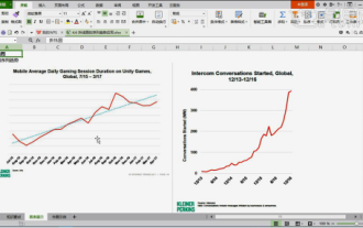 How to make WPS table line chart, do you really know how to do it?
Mar 21, 2024 am 08:36 AM
Using wps tables to process a large amount of data can make our work more efficient. Of course, wps tables can not only process data, but can also formulate line charts and other data based on the data, so that it is more intuitive to view. But for some novices, they don’t know how to make a line chart in a WPS table. Today I will explain to you the detailed steps of making a line chart: 1. First, check [Use Scenarios of Line Charts]. 2. Production method: First select [Data Source-Insert Chart-Line Chart] and click [Chart Elements-Check Trend Line-A dotted line will appear in the chart]. 3. Then in [Insert a column for average in the data source] use [AVERAGE to find the average] drop-down filling method [copy and paste the value first - then fill in the drop-down]
 How to use map heat map to display city heat in ECharts
Dec 18, 2023 pm 04:00 PM
How to use a map heat map to display city heat in ECharts ECharts is a powerful visual chart library that provides various chart types for developers to use, including map heat maps. Map heat maps can be used to show the popularity of cities or regions, helping us quickly understand the popularity or density of different places. This article will introduce how to use the map heat map in ECharts to display city heat, and provide code examples for reference. First, we need a map file containing geographic information, EC
 How to use calendar charts to display time data in ECharts
Dec 18, 2023 am 08:52 AM
How to use calendar charts to display time data in ECharts ECharts (Baidu’s open source JavaScript chart library) is a powerful and easy-to-use data visualization tool. It offers a variety of chart types, including line charts, bar charts, pie charts, and more. The calendar chart is a very distinctive and practical chart type in ECharts, which can be used to display time-related data. This article will introduce how to use calendar charts in ECharts and provide specific code examples. First, you need to use
 Steps to create a mixed line and column chart in PPT
Mar 26, 2024 pm 09:26 PM
1. Insert the data chart into the PPT and select [Clustered Column Chart] as the type. 2. Enter the source data and use only two columns of data. For example, the first column is monthly data and the second column is monthly cumulative data. 3. Change the chart type of the cumulative data series, click "Change Chart Type" under Chart Tools, click [Combine], select the line chart with data markers for the cumulative data, and check the secondary axis. 4. After clicking OK, you get Basic combination graphics. 5. Add data labels for column charts and line charts. And set different colors to show distinction. 6. Further beautify the data chart, delete unnecessary elements, highlight information, and get the final chart.
 ECharts and golang technical guide: practical tips for creating various statistical charts
Dec 17, 2023 pm 09:56 PM
ECharts and golang technical guide: Practical tips for creating various statistical charts, specific code examples are required. Introduction: In the field of modern data visualization, statistical charts are an important tool for data analysis and visualization. ECharts is a powerful data visualization library, while golang is a fast, reliable and efficient programming language. This article will introduce you to how to use ECharts and golang to create various types of statistical charts, and provide code examples to help you master this skill. Preparation


