

How to use Sankey chart to display data in Highcharts


How to use Sankey Diagram to display data in Highcharts
Sankey Diagram is a kind of complex process used to visualize flow, energy, funds, etc. chart type. It can clearly display the relationship and flow between various nodes, and can help us better understand and analyze data. In this article, we will introduce how to use Highcharts to create and customize a Sankey chart, with specific code examples.
First, we need to load the Highcharts library and Sankey module. In the HTML page, you can use the following code to introduce it:
<script src="https://code.highcharts.com/highcharts.js"></script>
<script src="https://code.highcharts.com/modules/sankey.js"></script>
Next, we need to define a container to place the chart. You can create a div element in an HTML page and specify a unique id. For example:
<div id="container"></div>
Then, in JavaScript, we can use the following code to create a Sankey chart:
Highcharts.chart('container', {
  chart: {
    type: 'sankey'
  },
  title: {
    text: '数据流动示例'
  },
  series: [{
    data: [{
      name: '节点1'
    }, {
      name: '节点2'
    }, {
      name: '节点3'
    }],
    links: [{
      source: '节点1',
      target: '节点2',
      value: 10
    }, {
      source: '节点1',
      target: '节点3',
      value: 5
    }, {
      source: '节点2',
      target: '节点3',
      value: 3
    }],
    nodeWidth: 30,
    nodePadding: 10,
    colorByPoint: true,
    tooltip: {
      pointFormat: '<b>{point.name}</b>: {point.value}'
    }
  }]
});In the above code, we first specify the type of chart as sankey . Then, the relationship between data and links is defined in series. Each node is identified by name, and the link is described by source, target, and value. Among them, source represents the starting node, target represents the target node, and value represents the value of the traffic. We can also control the width and spacing of nodes by adjusting nodeWidth and nodePadding, set the color of nodes through colorByPoint, and use tooltip To define the prompt information when the mouse hovers.
Finally, render the chart into the specified container by calling the Highcharts.chart method.
In actual use, the chart can be further customized according to specific needs. For example, you can set the title, axis, color, etc. The following is a more complete sample code:
Highcharts.chart('container', {
  chart: {
    type: 'sankey'
  },
  title: {
    text: '数据流动示例'
  },
  plotArea: {
    colorByPoint: true
  },
  series: [{
    data: [{
      name: '节点1'
    }, {
      name: '节点2'
    }, {
      name: '节点3'
    }],
    links: [{
      source: '节点1',
      target: '节点2',
      value: 10
    }, {
      source: '节点1',
      target: '节点3',
      value: 5
    }, {
      source: '节点2',
      target: '节点3',
      value: 3
    }],
    nodeWidth: 30,
    nodePadding: 10,
    colors: ['#7cb5ec', '#2f7ed8', '#434348'],
    tooltip: {
      pointFormat: '<b>{point.name}</b>: {point.value}'
    }
  }]
});In the above code, we set the color of the node through the plotArea attribute, and specify the node's color through the colors attribute. Custom colors. This way, different nodes will have different colors.
Through the above code examples, we can use Sankey charts to display data in Highcharts. I hope this article is helpful to you and can be used in practical applications.
The above is the detailed content of How to use Sankey chart to display data in Highcharts. For more information, please follow other related articles on the PHP Chinese website!

Hot AI Tools

Undresser.AI Undress
AI-powered app for creating realistic nude photos

AI Clothes Remover
Online AI tool for removing clothes from photos.

Undress AI Tool
Undress images for free

Clothoff.io
AI clothes remover

AI Hentai Generator
Generate AI Hentai for free.

Hot Article
Hot Tools

Notepad++7.3.1
Easy-to-use and free code editor

SublimeText3 Chinese version
Chinese version, very easy to use

Zend Studio 13.0.1
Powerful PHP integrated development environment

Dreamweaver CS6
Visual web development tools

SublimeText3 Mac version
God-level code editing software (SublimeText3)
Hot Topics


 How to use dynamic data in Highcharts to display real-time data
Dec 17, 2023 pm 06:57 PM
How to use dynamic data in Highcharts to display real-time data
Dec 17, 2023 pm 06:57 PM
How to use dynamic data in Highcharts to display real-time data. With the advent of the big data era, the display of real-time data has become more and more important. Highcharts, as a popular charting library, provides rich functions and customizability, allowing us to flexibly display real-time data. This article will introduce how to use dynamic data in Highcharts to display real-time data, and give specific code examples. First, we need to prepare a data source that can provide real-time data. In this article, I
 How to use Sankey chart to display data in Highcharts
Dec 17, 2023 pm 04:41 PM
How to use Sankey chart to display data in Highcharts
Dec 17, 2023 pm 04:41 PM
How to use Sankey diagram to display data in Highcharts Sankey diagram (SankeyDiagram) is a chart type used to visualize complex processes such as flow, energy, and funds. It can clearly display the relationship and flow between various nodes, and can help us better understand and analyze data. In this article, we will introduce how to use Highcharts to create and customize a Sankey chart, with specific code examples. First, we need to load the Highcharts library and Sank
 How to use stacked charts to display data in Highcharts
Dec 18, 2023 pm 05:56 PM
How to use stacked charts to display data in Highcharts
Dec 18, 2023 pm 05:56 PM
How to use stacked charts to display data in Highcharts Stacked charts are a common way of visualizing data, which can display the sum of multiple data series at the same time and display the contribution of each data series in the form of a bar chart. Highcharts is a powerful JavaScript library that provides a rich variety of charts and flexible configuration options to meet various data visualization needs. In this article, we will introduce how to use Highcharts to create a stacked chart and provide
 Python draws stunning Sankey diagrams, have you learned it?
Apr 12, 2023 pm 02:28 PM
Python draws stunning Sankey diagrams, have you learned it?
Apr 12, 2023 pm 02:28 PM
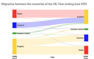
Introduction to Sankey Diagrams Many times we have a situation where we have to visualize how data flows between entities. For example, take how residents move from one country to another. Here's a demonstration of how many residents moved from England to Northern Ireland, Scotland and Wales. It is evident from this Sankey visualization that more residents moved from England to Wales than from Scotland or Northern Ireland. What is a Sankey diagram? Sankey diagrams typically depict the flow of data from one entity (or node) to another. The entity to which the data flows is called a node, and the node where the data flow originates is the source node (for example, England on the left)
 How to create a Gantt chart using Highcharts
Dec 17, 2023 pm 07:23 PM
How to create a Gantt chart using Highcharts
Dec 17, 2023 pm 07:23 PM
How to use Highcharts to create a Gantt chart requires specific code examples. Introduction: The Gantt chart is a chart form commonly used to display project progress and time management. It can visually display the start time, end time and progress of the task. Highcharts is a powerful JavaScript chart library that provides rich chart types and flexible configuration options. This article will introduce how to use Highcharts to create a Gantt chart and give specific code examples. 1. Highchart
 How to create a map heat map using Highcharts
Dec 17, 2023 pm 04:06 PM
How to create a map heat map using Highcharts
Dec 17, 2023 pm 04:06 PM
How to use Highcharts to create a map heat map requires specific code examples. A heat map is a visual data display method that can represent the data distribution in each area through different color shades. In the field of data visualization, Highcharts is a very popular JavaScript library that provides rich chart types and interactive functions. This article will introduce how to use Highcharts to create a map heat map and provide specific code examples. First, we need to prepare some data
 How to create custom charts with Highcharts
Dec 17, 2023 pm 10:39 PM
How to create custom charts with Highcharts
Dec 17, 2023 pm 10:39 PM
How to create custom charts with Highcharts Highcharts is a powerful and easy-to-use JavaScript chart library that helps developers create various types of interactive and customizable charts. In order to create custom charts using Highcharts, we need to master some basic concepts and techniques. This article walks through some important steps and provides specific code examples. Step 1: Introduce the Highcharts library First, we need to
 How to use Vue to implement statistical charts for large-screen data display
Aug 17, 2023 am 09:54 AM
How to use Vue to implement statistical charts for large-screen data display
Aug 17, 2023 am 09:54 AM
How to use Vue to implement statistical charts for large-screen data display. In the modern information society, data statistics and visualization have become important means of decision-making and analysis. In order to display data more intuitively, we often use statistical charts. Under the Vue framework, you can easily achieve large-screen data display needs by using some excellent chart libraries. This article will introduce how to use Vue combined with two mainstream statistical chart libraries, echarts and chart.js, to display data. First, we need to install echarts and c for the Vue project
