How to implement chart linkage in ECharts

How to implement chart linkage in ECharts requires specific code examples
When we need to display multiple related data, it is necessary to display the data in the form of a chart An intuitive and effective way. In practical applications, we often encounter situations where multiple charts of different types need to be displayed in conjunction. As a powerful data visualization library, ECharts provides chart linkage functions, which can help us quickly realize this requirement.
The method of realizing chart linkage in ECharts is through event triggering and data interaction. By monitoring the events of a certain chart, when the event is triggered, the corresponding data can be obtained and corresponding operations can be performed, thereby achieving the linkage effect of the chart. The following will explain how to implement chart linkage in ECharts through specific code examples.
First, we need to prepare two different types of charts, a bar chart and a line chart. For convenience, we use the sample data officially provided by ECharts for demonstration. The following is the HTML code for the bar chart and line chart:
<div id="bar" style="width: 600px;height:400px;"></div>
<div id="line" style="width: 600px;height:400px;"></div>
Then, introduce the ECharts library in JavaScript and write the corresponding code to create the chart and monitor the chart events. The following is the complete JavaScript code:
// 图表数据
var barData = [
    {name: '周一', value: 120},
    {name: '周二', value: 200},
    {name: '周三', value: 150},
    {name: '周四', value: 80},
    {name: '周五', value: 70},
    {name: '周六', value: 110},
    {name: '周日', value: 130}
];

var lineData = [
    {name: '周一', value: 190},
    {name: '周二', value: 230},
    {name: '周三', value: 170},
    {name: '周四', value: 120},
    {name: '周五', value: 90},
    {name: '周六', value: 150},
    {name: '周日', value: 160}
];

// 创建柱状图
var barChart = echarts.init(document.getElementById('bar'));
var barOption = {
    xAxis: {
        type: 'category',
        data: barData.map(item => item.name)
    },
    yAxis: {
        type: 'value'
    },
    series: [{
        type: 'bar',
        data: barData.map(item => item.value)
    }]
};
barChart.setOption(barOption);

// 创建折线图
var lineChart = echarts.init(document.getElementById('line'));
var lineOption = {
    xAxis: {
        type: 'category',
        data: lineData.map(item => item.name)
    },
    yAxis: {
        type: 'value'
    },
    series: [{
        type: 'line',
        data: lineData.map(item => item.value)
    }]
};
lineChart.setOption(lineOption);

// 监听柱状图点击事件
barChart.on('click', function(params) {
    // 获取点击的数据
    var data = barData[params.dataIndex];

    // 根据点击的数据更新折线图数据
    lineOption.series[0].data = [data.value, data.value, data.value, data.value, data.value, data.value, data.value];
    lineChart.setOption(lineOption);
});In the above code, instances of the bar chart and line chart are first created and their initial data is set. Then, set the data to the chart by calling the setOption method. Then, by listening to the click event of the bar chart, obtain the click data in the event callback function, then update the line chart data based on the click data, and set the updated data to the line chart through the setOption method . In this way, the linkage effect of the bar chart and the line chart is achieved.
It should be noted that the above is just a simple example, and actual applications may involve more complex data interaction and chart linkage requirements. But the overall implementation idea and operation method are the same: by listening to the events of the chart, obtain the data and perform corresponding operations.
Through the above sample code, we can see that it is not complicated to implement chart linkage in ECharts. With the rich functions and flexible operations provided by ECharts, we can easily achieve interactive effects between multiple charts, providing more possibilities for data analysis and display.
The above is the detailed content of How to implement chart linkage in ECharts. For more information, please follow other related articles on the PHP Chinese website!

Hot AI Tools

Undresser.AI Undress
AI-powered app for creating realistic nude photos

AI Clothes Remover
Online AI tool for removing clothes from photos.

Undress AI Tool
Undress images for free

Clothoff.io
AI clothes remover

AI Hentai Generator
Generate AI Hentai for free.

Hot Article

Hot Tools

Notepad++7.3.1
Easy-to-use and free code editor

SublimeText3 Chinese version
Chinese version, very easy to use

Zend Studio 13.0.1
Powerful PHP integrated development environment

Dreamweaver CS6
Visual web development tools

SublimeText3 Mac version
God-level code editing software (SublimeText3)

Hot Topics
 1377
1377
 52
52
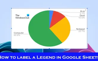 How to add labels to legend in Google Sheet
Feb 19, 2024 am 11:03 AM
This article will demonstrate how to add labels to legends in Google Sheet that focus on a single thing, providing a name or identity. A legend explains a system or group of things, giving you relevant contextual information. How to Add Labels to a Legend in GoogleSheet Sometimes, when working with charts, we want to make them easier to understand. This can be achieved by adding appropriate labels and legends. Next, we’ll show you how to add labels to legends in Google Sheets to make your data clearer. Create the chart Edit the text of the legend label Let's get started. 1] Create a chart To label the legend, first, we have to create a chart: First, enter in the columns or rows of GoogleSheets
 ECharts and Java interface: How to quickly implement statistical charts such as line charts, bar charts, pie charts, etc.
Dec 17, 2023 pm 10:37 PM
ECharts and Java interface: How to quickly implement statistical charts such as line charts, bar charts, and pie charts. Specific code examples are required. With the advent of the Internet era, data analysis has become more and more important. Statistical charts are a very intuitive and powerful display method. Charts can display data more clearly, allowing people to better understand the connotation and patterns of the data. In Java development, we can use ECharts and Java interfaces to quickly display various statistical charts. ECharts is a software developed by Baidu
 Zhengtu IPx classic animation 'Journey to the West' The journey to the west is fearless and fearless
Jun 10, 2024 pm 06:15 PM
Journey through the vastness and set foot on the journey to the west! Today, Zhengtu IP officially announced that it will launch a cross-border cooperation with CCTV animation "Journey to the West" to jointly create a cultural feast that combines tradition and innovation! This cooperation not only marks the in-depth cooperation between the two major domestic classic brands, but also demonstrates the unremitting efforts and persistence of the Zhengtu series on the road of promoting Chinese traditional culture. Since its birth, the Zhengtu series has been loved by players for its profound cultural heritage and diversified gameplay. In terms of cultural inheritance, the Zhengtu series has always maintained respect and love for traditional Chinese culture, and skillfully integrated traditional cultural elements into the game, bringing more fun and inspiration to players. The CCTV animation "Journey to the West" is a classic that has accompanied the growth of generations.
 How to use php interface and ECharts to generate visual statistical charts
Dec 18, 2023 am 11:39 AM
In today's context where data visualization is becoming more and more important, many developers hope to use various tools to quickly generate various charts and reports so that they can better display data and help decision-makers make quick judgments. In this context, using the Php interface and ECharts library can help many developers quickly generate visual statistical charts. This article will introduce in detail how to use the Php interface and ECharts library to generate visual statistical charts. In the specific implementation, we will use MySQL
 Steps to draw dashboard using ECharts and Python interface
Dec 18, 2023 am 08:40 AM
The steps to draw a dashboard using ECharts and Python interface require specific code examples. Summary: ECharts is an excellent data visualization tool that can easily perform data processing and graphics drawing through the Python interface. This article will introduce the specific steps to draw a dashboard using ECharts and Python interface, and provide sample code. Keywords: ECharts, Python interface, dashboard, data visualization Introduction Dashboard is a commonly used form of data visualization, which uses
 How to use map heat map to display city heat in ECharts
Dec 18, 2023 pm 04:00 PM
How to use a map heat map to display city heat in ECharts ECharts is a powerful visual chart library that provides various chart types for developers to use, including map heat maps. Map heat maps can be used to show the popularity of cities or regions, helping us quickly understand the popularity or density of different places. This article will introduce how to use the map heat map in ECharts to display city heat, and provide code examples for reference. First, we need a map file containing geographic information, EC
 How to use calendar charts to display time data in ECharts
Dec 18, 2023 am 08:52 AM
How to use calendar charts to display time data in ECharts ECharts (Baidu’s open source JavaScript chart library) is a powerful and easy-to-use data visualization tool. It offers a variety of chart types, including line charts, bar charts, pie charts, and more. The calendar chart is a very distinctive and practical chart type in ECharts, which can be used to display time-related data. This article will introduce how to use calendar charts in ECharts and provide specific code examples. First, you need to use
 Double chef ecstasy! 'Onmyoji' x 'Hatsune Miku' collaboration starts on March 6
Feb 22, 2024 pm 06:52 PM
NetEase's "Onmyoji" mobile game announced today that the Onmyoji x Hatsune Miku limited collaboration will officially begin on March 6. The collaboration-limited SSR Hatsune Miku (CV: Saki Fujita) and SSR Kagamine Rin (CV: Asami Shimoda) are coming to Heian Kyo! The linkage online special performance event will officially start in the game on March 9~


