
 Web Front-end
JS Tutorial
An introductory guide to creating CSS3 animations with Move.js_JavaScript
Web Front-end
JS Tutorial
An introductory guide to creating CSS3 animations with Move.js_JavaScript
An introductory guide to creating CSS3 animations with Move.js_JavaScript

On websites, CSS3 transitions and animations are currently the preferred method for creating lightweight animations. Unfortunately, many developers find their own syntax complex and confusing. If this sounds like you, maybe Move.js is the perfect solution for you. Move.js is a simple JavaScript library for creating CSS3 animations using simple functions. This tutorial will explore the basics of Move.js and provide an online demo.
Basic knowledge
Move.js provides the simplest JavaScript API for creating CSS3 animations. Let's assume we have a div with class box and we want to move the element 100 pixels from the left when the mouse moves over the div. In this case, our code would look like this:
.box {
 -webkit-transition: margin 1s;
 -moz-transition: margin 1s;
 -o-transition: margin 1s;
 transition: margin 1s;
}
.box:hover {
 margin-left: 100px;
}
Using Move.js we can simply call the set() method to achieve the same result, as follows:
move('.box')
 .set('margin-left', 100)
 .end();
Getting Started
First, visit the Move.js GitHub page and download the latest package. Extract and copy the Move.js file to your working directory. Next, include this file in your html page. The completed page should look like this:
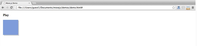
<!DOCTYPE html>
<html>
 <head>
 <title>Move.js Demo</title>
 <link rel="stylesheet" type="text/css" href="styles.css">
 </head>
 <body>
 <a href="#" id="playButton">Play</a>
 <div class="box"></div>
 <script type="text/javascript" src="js/move.js"></script>
 </body>
</html>
We have defined a div element with class box and a link with ID playButton for our demo. Let us create a styles.css file and add the following styles. Note that the following styles are not required for Move.js:
.box {
 margin: 10px;
 width: 100px;
 height: 100px;
 background: #7C9DD4;
 box-shadow: 5px 5px 0px #D1D1D1;
}
#playButton {
 display: block;
 font-size: 20px;
 margin: 20px 10px;
 font-weight: bold;
 color: #222;
 text-decoration: none;
}
Our html page should look like this:
Now, let’s write our first Move.js snippet. We need to attach an onclick event handler to the playButton and move it to the right when clicked. The JavaScript code of the event handler is as follows. This code adds transform:translateX(300px) to the box element:
document.getElementById('playButton').onclick = function(e) {
 move('.box')
 .x(300)
 .end();
};
The complete code after adding the Move.js code is as follows:
HTML
<!DOCTYPE html>
<html>
 <head>
 <title>Move.js Demo</title>
 <link rel="stylesheet" type="text/css" href="styles.css">
 </head>
 <body>
 <a href="#" id="playButton">Play</a>
 <div class="box"></div>
 <script type="text/javascript" src="js/move.js"></script>
 <script type="text/javascript">
  document.getElementById('playButton').onclick = function(e){
  move('.box')
   .x(300)
   .end();
  };
 </script>
 </body>
</html>
CSS
.box {
 margin-left: 10px;
 width: 100px;
 height: 100px;
 background: #7C9DD4;
 box-shadow: 5px 5px 0px #D1D1D1;
}
#playButton {
 display: block;
 font-size: 20px;
 margin: 20px 10px;
 font-weight: bold;
 color: #222;
 text-decoration: none;
}
Move.js method
In the previous demo, we saw the x() method. Now, let us understand the other methods of Move.js.
set(prop, val)
set() method is used to set the css attribute of the element. It takes two parameters: css attribute and attribute value. Example usage:
.set('background-color', '#CCC')
.set('margin-left', 500)
.set('color', '#222')
add(prop, val)
The add() method is used to add its already set attribute value. This method must have a numeric value in order to be used for increments. This method must have two parameters: the attribute value and its increment:
.add('margin-left', 200)
After the previous code snippet is called, 200px will be added to its value.
sub(prop, val)
sub() is the inverse process of add(). It accepts the same two parameters, but its value will be subtracted from the attribute value.
.sub('margin-left', 200)
rotate(deg)
As the name suggests, this method rotates an element by providing a numerical value as a parameter. By attaching to the element's transform property when the method is called. The following code rotates the element 90deg:
.rotate(90)
This code will add the following css to the element:
transform:rotate(90deg)
duration(n)
With this method, you can set the playback time of the animation. For example: The following code moves the element 200px from the left to the right in 2 seconds:
.set('margin-left', 200)
.duration('2s')
Another example, the code below. Move.js will modify the margin attribute of the element, set the background color, and rotate the element 90 degrees within 2 seconds.
.set('margin-left', 200)
.set('background-color', '#CCC')
.rotate(90)
.duration('2s')
translate(x[, y])
Thetranslate() method is used to modify the default position of the element, using the provided coordinates as parameters. If only one parameter is set, it will be used as the x coordinate. If a second parameter is provided, it will be used as the y coordinate:
.translate(200, 400)
x() and y()
The x() method is used to adjust the x coordinate of the element, and the y() method is used to adjust the y coordinate of the element. The parameters of the two methods can be positive or negative, as follows:
.x(300)
.y(-20)
skew(x, y)
skew() is used to adjust an angle relative to the x and y axes. This method can be divided into two methods: skewX(deg) and skewY(deg):
.skew(30, 40)
scale(x, y)
This method is used to enlarge or compress the size of the element. For each value provided, the scale method of transform will be called:
.scale(3, 3)
ease(fn)
If you have used CSS3 transitions, you know that the ease function works on the transition attribute. He specifies the act of transition. Each ease function is in, out, in-out, snap, cubic-bezeir, etc. These functions can be called through the ease() method provided by Move.js. For example:
.ease('in').x(400)
.ease('cubic-bezier(0,1,1,0)').x(400)
end()
该方法用于Move.js代码片段的结束,他标识动画的结束。技术上,该方法触发动画的播放。该方法接受一个可选的callback回掉函数。代码如下:
move('.box')
 .set('background-color', 'red')
 .duration(1000)
 .end(function() {
 alert("Animation Over!");
 });
delay(n)
正如方法所暗示的,该方法提供一个时间的数值作为动画的延时。如下:
move('.box')
 .set('background-color', 'red')
 .delay(1000)
 .end();
then()
该方法是Move.js中一个最重要的函数。他用于分割动画为两个集合,并按顺序执行。如下动画被分为两步,通过then()方法实现分割:
move('.box')
 .set('background-color', 'red')
 .x(500)
 .then()
 .y(400)
 .set('background-color', 'green')
 .end();
## 使用Move.js创建复杂动画 ##
在本教程中,我们已经写了很多基本的 动画来了解各个方法。接下来,我们使用Move.js可以很容易的创建复杂的动画。该demo阐述了Move.js的大部分内容,在demo page
上我们创建了动画的描述,代码如下:
move('.square')
 .to(500, 200)
 .rotate(180)
 .scale(.5)
 .set('background-color', '#FF0551')
 .set('border-color', 'black')
 .duration('3s')
 .skew(50, -10)
 .then()
 .set('opacity', 0)
 .duration('0.3s')
 .scale(0.1)
 .pop()
 .end();
结论
希望本篇教程能带给你关于Move.js是什么的清晰的认识和如何创建CSS3动画。使用Movejs能帮助你在一个地方正确的组织所有的动画代码。在任何时候你想修复一个动画,你就知道他在那里。

Hot AI Tools

Undresser.AI Undress
AI-powered app for creating realistic nude photos

AI Clothes Remover
Online AI tool for removing clothes from photos.

Undress AI Tool
Undress images for free

Clothoff.io
AI clothes remover

Video Face Swap
Swap faces in any video effortlessly with our completely free AI face swap tool!

Hot Article
Hot Tools

Notepad++7.3.1
Easy-to-use and free code editor

SublimeText3 Chinese version
Chinese version, very easy to use

Zend Studio 13.0.1
Powerful PHP integrated development environment

Dreamweaver CS6
Visual web development tools

SublimeText3 Mac version
God-level code editing software (SublimeText3)
Hot Topics
 1386
1386
 52
52

 How to achieve wave effect with pure CSS3? (code example)
Jun 28, 2022 pm 01:39 PM
How to achieve wave effect with pure CSS3? (code example)
Jun 28, 2022 pm 01:39 PM
How to achieve wave effect with pure CSS3? This article will introduce to you how to use SVG and CSS animation to create wave effects. I hope it will be helpful to you!
 Use CSS skillfully to realize various strange-shaped buttons (with code)
Jul 19, 2022 am 11:28 AM
Use CSS skillfully to realize various strange-shaped buttons (with code)
Jul 19, 2022 am 11:28 AM
This article will show you how to use CSS to easily realize various weird-shaped buttons that appear frequently. I hope it will be helpful to you!
 How to hide elements in css without taking up space
Jun 01, 2022 pm 07:15 PM
How to hide elements in css without taking up space
Jun 01, 2022 pm 07:15 PM
Two methods: 1. Using the display attribute, just add the "display:none;" style to the element. 2. Use the position and top attributes to set the absolute positioning of the element to hide the element. Just add the "position:absolute;top:-9999px;" style to the element.
 How to implement lace borders in css3
Sep 16, 2022 pm 07:11 PM
How to implement lace borders in css3
Sep 16, 2022 pm 07:11 PM
In CSS, you can use the border-image attribute to achieve a lace border. The border-image attribute can use images to create borders, that is, add a background image to the border. You only need to specify the background image as a lace style; the syntax "border-image: url (image path) offsets the image border width inward. Whether outset is repeated;".
 How to enlarge the image by clicking the mouse in css3
Apr 25, 2022 pm 04:52 PM
How to enlarge the image by clicking the mouse in css3
Apr 25, 2022 pm 04:52 PM
Implementation method: 1. Use the ":active" selector to select the state of the mouse click on the picture; 2. Use the transform attribute and scale() function to achieve the picture magnification effect, the syntax "img:active {transform: scale(x-axis magnification, y Axis magnification);}".
 It turns out that text carousel and image carousel can also be realized using pure CSS!
Jun 10, 2022 pm 01:00 PM
It turns out that text carousel and image carousel can also be realized using pure CSS!
Jun 10, 2022 pm 01:00 PM
How to create text carousel and image carousel? The first thing everyone thinks of is whether to use js. In fact, text carousel and image carousel can also be realized using pure CSS. Let’s take a look at the implementation method. I hope it will be helpful to everyone!
 How to set animation rotation speed in css3
Apr 28, 2022 pm 04:32 PM
How to set animation rotation speed in css3
Apr 28, 2022 pm 04:32 PM
In CSS3, you can use the "animation-timing-function" attribute to set the animation rotation speed. This attribute is used to specify how the animation will complete a cycle and set the speed curve of the animation. The syntax is "element {animation-timing-function: speed attribute value;}".
 Does css3 animation effect have deformation?
Apr 28, 2022 pm 02:20 PM
Does css3 animation effect have deformation?
Apr 28, 2022 pm 02:20 PM
The animation effect in css3 has deformation; you can use "animation: animation attribute @keyframes ..{..{transform: transformation attribute}}" to achieve deformation animation effect. The animation attribute is used to set the animation style, and the transform attribute is used to set the deformation style. .
