How to create interactive data visualizations with Highcharts

How to use Highcharts to create interactive data visualization
Introduction:
With the advent of the big data era, data visualization has become an important tool for many companies and individuals to process data. Important tool. As a powerful yet easy-to-use data visualization library, Highcharts is widely used in fields such as web development, data analysis, and report presentation. This article will introduce how to use Highcharts to create interactive data visualization and give specific code examples.
1. Preparation
First, you need to introduce the Highcharts library file into the web page. You can download the latest version of Highcharts from the official website (https://www.highcharts.com.cn or https://www.highcharts.com) and place it in your project directory.
Then, add the following code within the
tag of the HTML file to introduce Highcharts and related style files:<script src="路径/highcharts.js"></script> <link rel="stylesheet" href="路径/highcharts.css">
where path is your The specific path to place the Highcharts library file.
2. Create a chart container
Add a
<div id="container" style="width: 600px; height: 400px;"></div>
where container is the unique identifier of the chart container, which you can customize.
3. Draw basic charts
Next, we start using Highcharts to create interactive data visualization charts.
First, create an empty Highcharts chart object and specify the container and basic configuration options. For example:
Highcharts.chart('container', {
    chart: {
        type: 'bar'  //指定图表类型为柱状图
    },
    title: {
        text: '销售数据'  //设置图表标题
    },
    xAxis: {
        categories: ['一月', '二月', '三月', '四月', '五月']  //设置x轴刻度标签
    },
    yAxis: {
        title: {
            text: '销售额'  //设置y轴标题
        }
    },
    series: [{
        name: '销售额',  //设置数据系列名称
        data: [100, 200, 150, 300, 250]  //设置数据系列的数据
    }]
});The above code creates a histogram, with the x-axis representing the month and the y-axis representing the sales, visually displaying the sales in different months.
4. Configuring data series and interactive functions
In addition to basic chart configuration, Highcharts also provides a wealth of configuration options that can be set according to actual needs.
Configuring data series
Highcharts supports multiple data series, and can configure attributes such as styles and labels for each data series. For example:series: [{ name: '销售额', data: [100, 200, 150, 300, 250], color: '#ff9900' //设置数据系列的颜色 }, { name: '利润', data: [80, 150, 120, 200, 180], color: '#66cc00' }]Copy after loginThe above code creates two data series, representing sales and profits respectively, and assigns colors to each data series.
Add interactive functions
Highcharts supports a variety of interactive functions, including mouse hover, click events, smooth animation, etc. The following is an example of adding mouse hover prompts and click events:tooltip: { shared: true //启用鼠标悬停提示共享 }, plotOptions: { series: { cursor: 'pointer', point: { events: { click: function () { alert('你点击了 ' + this.category + ' 月的数据'); //点击事件处理函数 } } } } }Copy after loginThe above code designs mouse hover prompts and click events. When the mouse hovers over a data point, the specific information of the data point will be displayed. Value; when a data point is clicked, a prompt box will pop up to display the clicked month.
5. Further customization
In addition to the above basic settings and interactive functions, Highcharts also provides many other customization options, such as modifying the chart style and setting the coordinate axis range. , add legends, etc. When creating a chart, you can further customize the chart's appearance and behavior based on your needs.Conclusion:
This article briefly introduces how to use Highcharts to create interactive data visualization charts. With a few simple steps, you can quickly get started with Highcharts and create beautiful and practical data visualization charts according to your own needs. I hope this article will help you with data processing and display in actual projects.Reference: https://www.highcharts.com/docs
The above is the detailed content of How to create interactive data visualizations with Highcharts. For more information, please follow other related articles on the PHP Chinese website!

Hot AI Tools

Undresser.AI Undress
AI-powered app for creating realistic nude photos

AI Clothes Remover
Online AI tool for removing clothes from photos.

Undress AI Tool
Undress images for free

Clothoff.io
AI clothes remover

AI Hentai Generator
Generate AI Hentai for free.

Hot Article

Hot Tools

Notepad++7.3.1
Easy-to-use and free code editor

SublimeText3 Chinese version
Chinese version, very easy to use

Zend Studio 13.0.1
Powerful PHP integrated development environment

Dreamweaver CS6
Visual web development tools

SublimeText3 Mac version
God-level code editing software (SublimeText3)

Hot Topics
 How to create pixel art in GIMP
Feb 19, 2024 pm 03:24 PM
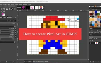
This article will interest you if you are interested in using GIMP for pixel art creation on Windows. GIMP is a well-known graphics editing software that is not only free and open source, but also helps users create beautiful images and designs easily. In addition to being suitable for beginners and professional designers alike, GIMP can also be used to create pixel art, a form of digital art that utilizes pixels as the only building blocks for drawing and creating. How to Create Pixel Art in GIMP Here are the main steps to create pixel pictures using GIMP on a Windows PC: Download and install GIMP, then launch the application. Create a new image. Resize width and height. Select the pencil tool. Set the brush type to pixels. set up
 How to use dynamic data in Highcharts to display real-time data
Dec 17, 2023 pm 06:57 PM
How to use dynamic data in Highcharts to display real-time data. With the advent of the big data era, the display of real-time data has become more and more important. Highcharts, as a popular charting library, provides rich functions and customizability, allowing us to flexibly display real-time data. This article will introduce how to use dynamic data in Highcharts to display real-time data, and give specific code examples. First, we need to prepare a data source that can provide real-time data. In this article, I
 How to use Sankey chart to display data in Highcharts
Dec 17, 2023 pm 04:41 PM
How to use Sankey diagram to display data in Highcharts Sankey diagram (SankeyDiagram) is a chart type used to visualize complex processes such as flow, energy, and funds. It can clearly display the relationship and flow between various nodes, and can help us better understand and analyze data. In this article, we will introduce how to use Highcharts to create and customize a Sankey chart, with specific code examples. First, we need to load the Highcharts library and Sank
 How to create a family with Gree+
Mar 01, 2024 pm 12:40 PM
Many friends expressed that they want to know how to create a family in Gree+ software. Here is the operation method for you. Friends who want to know more, come and take a look with me. First, open the Gree+ software on your mobile phone and log in. Then, in the options bar at the bottom of the page, click the "My" option on the far right to enter the personal account page. 2. After coming to my page, there is a "Create Family" option under "Family". After finding it, click on it to enter. 3. Next jump to the page to create a family, enter the family name to be set in the input box according to the prompts, and click the "Save" button in the upper right corner after entering it. 4. Finally, a "save successfully" prompt will pop up at the bottom of the page, indicating that the family has been successfully created.
 How to use stacked charts to display data in Highcharts
Dec 18, 2023 pm 05:56 PM
How to use stacked charts to display data in Highcharts Stacked charts are a common way of visualizing data, which can display the sum of multiple data series at the same time and display the contribution of each data series in the form of a bar chart. Highcharts is a powerful JavaScript library that provides a rich variety of charts and flexible configuration options to meet various data visualization needs. In this article, we will introduce how to use Highcharts to create a stacked chart and provide
 How to create a folder on Realme Phone?
Mar 23, 2024 pm 02:30 PM
Title: Realme Phone Beginner’s Guide: How to Create Folders on Realme Phone? In today's society, mobile phones have become an indispensable tool in people's lives. As a popular smartphone brand, Realme Phone is loved by users for its simple and practical operating system. In the process of using Realme phones, many people may encounter situations where they need to organize files and applications on their phones, and creating folders is an effective way. This article will introduce how to create folders on Realme phones to help users better manage their phone content. No.
 How to Create a Contact Poster for Your iPhone
Mar 02, 2024 am 11:30 AM
In iOS17, Apple has added a contact poster feature to its commonly used Phone and Contacts apps. This feature allows users to set personalized posters for each contact, making the address book more visual and personal. Contact posters can help users identify and locate specific contacts more quickly, improving user experience. Through this feature, users can add specific pictures or logos to each contact according to their preferences and needs, making the address book interface more vivid. Apple in iOS17 provides iPhone users with a novel way to express themselves, and added a personalizable contact poster. The Contact Poster feature allows you to display unique, personalized content when calling other iPhone users. you
 How to create a Gantt chart using Highcharts
Dec 17, 2023 pm 07:23 PM
How to use Highcharts to create a Gantt chart requires specific code examples. Introduction: The Gantt chart is a chart form commonly used to display project progress and time management. It can visually display the start time, end time and progress of the task. Highcharts is a powerful JavaScript chart library that provides rich chart types and flexible configuration options. This article will introduce how to use Highcharts to create a Gantt chart and give specific code examples. 1. Highchart


