

How to create a thermometer chart using Highcharts


Highcharts is a popular JavaScript charting library that can be used to create a variety of icons, including thermometer charts. This article will introduce how to use Highcharts to create a simple thermometer chart and provide specific code examples.
- Preparation work
First, you need to download the Highcharts library from the Highcharts official website (https://www.highcharts.com/download) and introduce the relevant information into the web page JavaScript and CSS files.
- Create HTML Element
Next, create a div element in the HTML file to hold the thermometer chart:
- Configure the Thermometer Chart
In order to create a thermometer chart, you need to provide Highcharts with some data and configuration options. Here is a simple example:
var options = {
chart: {
renderTo: 'container',
type: 'gauge',
plotBackgroundColor: null,
plotBackgroundImage: null,
plotBorderWidth: 0,
plotShadow: false
},
title: {
text: 'Temperature'
},
pane: {
startAngle: -150,
endAngle: 150,
background: [
{
backgroundColor: {
            linearGradient: { x1: 0, y1: 0, x2: 0, y2: 1 },
            stops: [
                [0, '#FFF'],
                [1, '#333']
            ]
        },
        borderWidth: 0,
        outerRadius: '109%'
    },
    {
        backgroundColor: {
            linearGradient: { x1: 0, y1: 0, x2: 0, y2: 1 },
            stops: [
                [0, '#333'],
                [1, '#FFF']
            ]
        },
        borderWidth: 1,
        outerRadius: '107%'
    },
    {
        // default background
    },
    {
        backgroundColor: '#DDD',
        borderWidth: 0,
        outerRadius: '105%',
        innerRadius: '103%'
    }
]
},
// the value axis
yAxis: {
min: -20,
max: 40,

minorTickInterval: 'auto',
minorTickWidth: 1,
minorTickLength: 10,
minorTickPosition: 'inside',
minorTickColor: '#666',

tickInterval: 10,
tickWidth: 2,
tickPosition: 'inside',
tickLength: 12,
tickColor: '#666',
labels: {
    step: 2,
    rotation: 'auto'
},
title: {
    text: '°C'
},
plotBands: [{
    from: -20,
    to: 0,
    color: '#9CCC65' // green
}, {
    from: 0,
    to: 10,
    color: '#FFEB3B' // yellow
}, {
    from: 10,
    to: 20,
    color: '#FFC107' // orange
}, {
    from: 20,
    to: 30,
    color: '#FF5722' // red
}, {
    from: 30,
    to: 40,
    color: '#F44336' // dark red
}]},
series: [{
name: 'Temperature',
data: [20],
tooltip: {
    valueSuffix: ' °C'
}}]
};
The most important thing is pane, which defines The inner and outer background colors, border width and other styles have been changed. Among them, plotBands defines the color of the temperature interval. The following yAxis defines the scale and other styles of the thermometer, and the initial value of the thermometer is set in the series.
- Rendering the thermometer chart
Finally, call the chart() function and options object of Highcharts to render the thermometer chart:
var chart = new Highcharts. Chart(options);
Full code:
The above is the detailed content of How to create a thermometer chart using Highcharts. For more information, please follow other related articles on the PHP Chinese website!

Hot AI Tools

Undresser.AI Undress
AI-powered app for creating realistic nude photos

AI Clothes Remover
Online AI tool for removing clothes from photos.

Undress AI Tool
Undress images for free

Clothoff.io
AI clothes remover

Video Face Swap
Swap faces in any video effortlessly with our completely free AI face swap tool!

Hot Article
Hot Tools

Notepad++7.3.1
Easy-to-use and free code editor

SublimeText3 Chinese version
Chinese version, very easy to use

Zend Studio 13.0.1
Powerful PHP integrated development environment

Dreamweaver CS6
Visual web development tools

SublimeText3 Mac version
God-level code editing software (SublimeText3)
Hot Topics
 1386
1386
 52
52

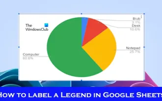 How to add labels to legend in Google Sheet
Feb 19, 2024 am 11:03 AM
How to add labels to legend in Google Sheet
Feb 19, 2024 am 11:03 AM
This article will demonstrate how to add labels to legends in Google Sheet that focus on a single thing, providing a name or identity. A legend explains a system or group of things, giving you relevant contextual information. How to Add Labels to a Legend in GoogleSheet Sometimes, when working with charts, we want to make them easier to understand. This can be achieved by adding appropriate labels and legends. Next, we’ll show you how to add labels to legends in Google Sheets to make your data clearer. Create the chart Edit the text of the legend label Let's get started. 1] Create a chart To label the legend, first, we have to create a chart: First, enter in the columns or rows of GoogleSheets
 How to use PHP arrays to generate and display charts and statistical graphs
Jul 15, 2023 pm 12:24 PM
How to use PHP arrays to generate and display charts and statistical graphs
Jul 15, 2023 pm 12:24 PM
How to use PHP arrays to generate and display charts and statistical graphs. PHP is a widely used server-side scripting language with powerful data processing and graphic generation capabilities. In web development, we often need to display charts and statistical graphs of data. Through PHP arrays, we can easily implement these functions. This article will introduce how to use PHP arrays to generate and display charts and statistical graphs, and provide relevant code examples. Introducing the necessary library files and style sheets Before starting, we need to introduce some necessary library files into the PHP file
 How to use Sankey chart to display data in Highcharts
Dec 17, 2023 pm 04:41 PM
How to use Sankey chart to display data in Highcharts
Dec 17, 2023 pm 04:41 PM
How to use Sankey diagram to display data in Highcharts Sankey diagram (SankeyDiagram) is a chart type used to visualize complex processes such as flow, energy, and funds. It can clearly display the relationship and flow between various nodes, and can help us better understand and analyze data. In this article, we will introduce how to use Highcharts to create and customize a Sankey chart, with specific code examples. First, we need to load the Highcharts library and Sank
 How to use dynamic data in Highcharts to display real-time data
Dec 17, 2023 pm 06:57 PM
How to use dynamic data in Highcharts to display real-time data
Dec 17, 2023 pm 06:57 PM
How to use dynamic data in Highcharts to display real-time data. With the advent of the big data era, the display of real-time data has become more and more important. Highcharts, as a popular charting library, provides rich functions and customizability, allowing us to flexibly display real-time data. This article will introduce how to use dynamic data in Highcharts to display real-time data, and give specific code examples. First, we need to prepare a data source that can provide real-time data. In this article, I
 Implementation of linear and pie chart functions in Vue statistical charts
Aug 19, 2023 pm 06:13 PM
Implementation of linear and pie chart functions in Vue statistical charts
Aug 19, 2023 pm 06:13 PM
The linear and pie chart functions of Vue statistical charts are implemented in the field of data analysis and visualization. Statistical charts are a very commonly used tool. As a popular JavaScript framework, Vue provides convenient methods to implement various functions, including the display and interaction of statistical charts. This article will introduce how to use Vue to implement linear and pie chart functions, and provide corresponding code examples. Linear graph function implementation A linear graph is a type of chart used to display trends and changes in data. In Vue, we can use some excellent
 How to create a Gantt chart using Highcharts
Dec 17, 2023 pm 07:23 PM
How to create a Gantt chart using Highcharts
Dec 17, 2023 pm 07:23 PM
How to use Highcharts to create a Gantt chart requires specific code examples. Introduction: The Gantt chart is a chart form commonly used to display project progress and time management. It can visually display the start time, end time and progress of the task. Highcharts is a powerful JavaScript chart library that provides rich chart types and flexible configuration options. This article will introduce how to use Highcharts to create a Gantt chart and give specific code examples. 1. Highchart
 How to use stacked charts to display data in Highcharts
Dec 18, 2023 pm 05:56 PM
How to use stacked charts to display data in Highcharts
Dec 18, 2023 pm 05:56 PM
How to use stacked charts to display data in Highcharts Stacked charts are a common way of visualizing data, which can display the sum of multiple data series at the same time and display the contribution of each data series in the form of a bar chart. Highcharts is a powerful JavaScript library that provides a rich variety of charts and flexible configuration options to meet various data visualization needs. In this article, we will introduce how to use Highcharts to create a stacked chart and provide
 How to quickly build a statistical chart system under the Vue framework
Aug 21, 2023 pm 05:48 PM
How to quickly build a statistical chart system under the Vue framework
Aug 21, 2023 pm 05:48 PM
How to quickly build a statistical chart system under the Vue framework. In modern web applications, statistical charts are an essential component. As a popular front-end framework, Vue.js provides many convenient tools and components that can help us quickly build a statistical chart system. This article will introduce how to use the Vue framework and some plug-ins to build a simple statistical chart system. First, we need to prepare a Vue.js development environment, including installing Vue scaffolding and some related plug-ins. Execute the following command in the command line
