Comparison and selection of position layout and flex layout

Comparison and selection of position layout and flex layout
In front-end development, page layout is a very important part, which determines the position and arrangement of page elements. Way. In CSS, there are many ways to implement page layout, two of the common ways are position layout and flex layout. This article will introduce the characteristics of these two layout methods from the aspects of comparison and examples, so that readers can choose flexibly in actual development.
1. Position layout
Position layout is one of the most basic and commonly used layout methods in CSS. It implements layout by setting the position attribute of the element. Commonly used position attribute values include: static, relative, absolute and fixed.
-
static (default value): The elements are arranged according to the normal document flow, without special positioning, and cannot be adjusted through the top, bottom, left, and right attributes.
<div style="position: static;">Static Box</div>
Copy after login relative: The element is positioned relative to its normal position and can be adjusted through the top, bottom, left, and right attributes.
<div style="position: relative; top: 50px;">Relative Box</div>
Copy after loginabsolute: The element is positioned relative to the nearest parent element with a positioning attribute (non-static), or relative to the entire page.
<div style="position: absolute; top: 50px; left: 50px;">Absolute Box</div>
Copy after loginfixed: The element is positioned relative to the browser viewport and does not change as the page scrolls.
<div style="position: fixed; top: 50px; left: 50px;">Fixed Box</div>
Copy after login
An important feature of position layout is that the stacking order of elements can be adjusted through the z-index attribute.
2. Flex layout
Flex layout is a new flexible box layout model in CSS3. It achieves flexible page layout by setting the flex properties of containers and items. Compared with position layout, flex layout is more convenient and can easily achieve common effects such as horizontal centering and vertical centering.
- Container properties (set on the parent element)
- display: flex; Defines the container as a flex container.
- flex-direction: row | column; Defines the main axis direction, the default is row horizontal direction.
- flex-wrap: nowrap | wrap; Defines whether to wrap or not. The default is nowrap without wrapping.
- justify-content: flex-start | flex-end | center | space-between | space-around; Defines the alignment of items on the main axis.
- align-items: flex-start | flex-end | center | baseline | stretch; Defines the alignment of items on the cross axis.
- Item properties (set on child elements)
- flex: flex-grow flex-shrink flex-basis; Define the stretch properties of the item.
- order:
; Defines the sorting order of items. - align-self: auto | flex-start | flex-end | center | baseline | stretch; Defines the alignment of the item itself on the cross axis.
The following is a sample code for flex layout:
<div class="flex-container">
  <div class="flex-item">Item 1</div>
  <div class="flex-item">Item 2</div>
  <div class="flex-item">Item 3</div>
</div>
.flex-container {
  display: flex;
  justify-content: center;
  align-items: center;
}

.flex-item {
  flex: 1;
  margin: 10px;
}With the above code, we create a flex container and use the justify-content and align-items attributes to achieve it The centering effect of child elements within the container.
3. Comparison and selection
In actual development, we should flexibly choose position layout and flex layout according to specific needs.
- Position layout is suitable for precise positioning and cascading settings of elements, and is especially suitable for realizing common effects such as floating windows and navigation bars.
- Flex layout is suitable for quickly implementing adaptive layout of the page. It can reduce the amount of code and can easily achieve effects such as vertical centering and horizontal centering.
In some complex layout scenarios, we can also use position layout and flex layout together to give full play to their advantages.
Summary:
This article introduces the characteristics and usage of two common page layout methods, position layout and flex layout, and gives corresponding code examples. In actual development, we should choose appropriate layout methods according to actual needs and use them flexibly to achieve the desired effects.
The above is the detailed content of Comparison and selection of position layout and flex layout. For more information, please follow other related articles on the PHP Chinese website!

Hot AI Tools

Undresser.AI Undress
AI-powered app for creating realistic nude photos

AI Clothes Remover
Online AI tool for removing clothes from photos.

Undress AI Tool
Undress images for free

Clothoff.io
AI clothes remover

AI Hentai Generator
Generate AI Hentai for free.

Hot Article

Hot Tools

Notepad++7.3.1
Easy-to-use and free code editor

SublimeText3 Chinese version
Chinese version, very easy to use

Zend Studio 13.0.1
Powerful PHP integrated development environment

Dreamweaver CS6
Visual web development tools

SublimeText3 Mac version
God-level code editing software (SublimeText3)

Hot Topics
 How to enable nfc function on Xiaomi Mi 14 Pro?
Mar 19, 2024 pm 02:28 PM
Nowadays, the performance and functions of mobile phones are becoming more and more powerful. Almost all mobile phones are equipped with convenient NFC functions to facilitate users for mobile payment and identity authentication. However, some Xiaomi 14Pro users may not know how to enable the NFC function. Next, let me introduce it to you in detail. How to enable nfc function on Xiaomi 14Pro? Step 1: Open the settings menu of your phone. Step 2: Find and click the "Connect and Share" or "Wireless & Networks" option. Step 3: In the Connection & Sharing or Wireless & Networks menu, find and click "NFC & Payments". Step 4: Find and click "NFC Switch". Normally, the default is off. Step 5: On the NFC switch page, click the switch button to switch it to on.
 How to use TikTok on Huawei Pocket2 remotely?
Mar 18, 2024 pm 03:00 PM
Sliding the screen through the air is a feature of Huawei that is highly praised in the Huawei mate60 series. This feature uses the laser sensor on the phone and the 3D depth camera of the front camera to complete a series of functions that do not require The function of touching the screen is, for example, to use TikTok from a distance. But how should Huawei Pocket 2 use TikTok from a distance? How to take screenshots from the air with Huawei Pocket2? 1. Open the settings of Huawei Pocket2 2. Then select [Accessibility]. 3. Click to open [Smart Perception]. 4. Just turn on the [Air Swipe Screen], [Air Screenshot], and [Air Press] switches. 5. When using it, you need to stand 20~40CM away from the screen, open your palm, and wait until the palm icon appears on the screen.
 How to set line spacing in WPS Word to make the document neater
Mar 20, 2024 pm 04:30 PM
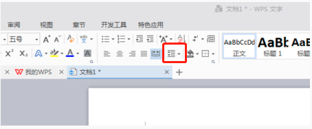
WPS is our commonly used office software. When editing long articles, the fonts are often too small to be seen clearly, so the fonts and the entire document are adjusted. For example: adjusting the line spacing of the document will make the entire document very clear. I suggest that all friends learn this operation step. I will share it with you today. The specific operation steps are as follows, come and take a look! Open the WPS text file you want to adjust, find the paragraph setting toolbar in the [Start] menu, and you will see the small line spacing setting icon (shown as a red circle in the picture). 2. Click the small inverted triangle in the lower right corner of the line spacing setting, and the corresponding line spacing value will appear. You can choose 1 to 3 times the line spacing (as shown by the arrow in the figure). 3. Or right-click the paragraph and it will appear.
 iPhone 16 Pro CAD drawings exposed, adding a second new button
Mar 09, 2024 pm 09:07 PM
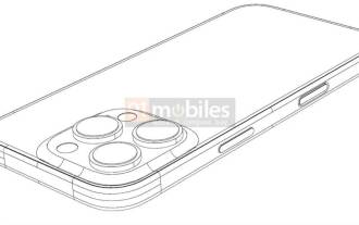
The CAD files of the iPhone 16 Pro have been exposed, and the design is consistent with previous rumors. Last fall, the iPhone 15 Pro added an Action button, and this fall, Apple appears to be planning to make minor adjustments to the size of the hardware. Adding a Capture button According to rumors, the iPhone 16 Pro may add a second new button, which will be the second consecutive year to add a new button after last year. It is rumored that the new Capture button will be set on the lower right side of the iPhone 16 Pro. This design is expected to make camera control more convenient and also allow the Action button to be used for other functions. This button will no longer be just an ordinary shutter button. Regarding the camera, from the current iP
 How to set a custom ringtone for Redmi K70E?
Feb 24, 2024 am 10:00 AM
The Redmi K70E is undoubtedly excellent. As a mobile phone with a price of just over 2,000 yuan, the Redmi K70E can be said to be one of the most cost-effective mobile phones in its class. Many users who pursue cost-effectiveness have purchased this phone to experience various functions on Redmi K70E. So how to set a custom ringtone for Redmi K70E? How to set a custom ringtone for Redmi K70E? To set a custom incoming call ringtone for Redmi K70E, you can follow the steps below: Open the settings application of your phone, find the "Sounds and vibration" or "Sound" option in the settings application, and click "Incoming call ringtone" or "Phone ringtone" " option. In ringtone settings
 The difference and comparative analysis between C language and PHP
Mar 20, 2024 am 08:54 AM
Differences and comparative analysis between C language and PHP C language and PHP are both common programming languages, but they have obvious differences in many aspects. This article will conduct a comparative analysis of C language and PHP and illustrate the differences between them through specific code examples. 1. Syntax and usage: C language: C language is a process-oriented programming language, mainly used for system-level programming and embedded development. The syntax of C language is relatively simple and low-level, can directly operate memory, and is efficient and flexible. C language emphasizes the programmer's completeness of the program
 How to use Xiaomi Mi 14 Ultra AI smart image expansion?
Mar 16, 2024 pm 12:37 PM
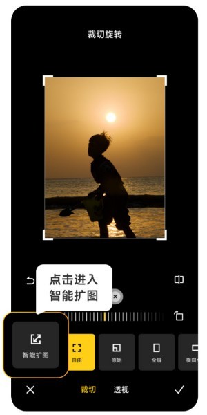
The progress of the times has made many people's incomes higher and higher, and the mobile phones they usually use will be changed frequently. The Xiaomi Mi 14 Ultra recently launched by Xiaomi must be familiar to users. It has very high performance configuration and can provide users with more In order to provide a comfortable and smooth experience, new mobile phones will inevitably encounter many functions that are not used. For example, how to use Xiaomi 14UltraAI smart image expansion? Come and take a look at the usage tutorial below! How to use Xiaomi 14UltraAI smart image expansion? First open Xiaomi 14Ultra, enter the photo album, select the picture you want to enlarge, and enter the photo album editing option. Click Crop Rotate, click Crop, and click Smart Expand in the selection that appears. Finally, choose the way to expand the image according to your own needs.
 How to switch language in microsoft teams
Feb 23, 2024 pm 09:00 PM
There are many languages to choose from in Microsoft Teams, so how to switch languages? Users need to click the menu, then find Settings, select General there, then click Language, select the language and save it. This introduction to switching language methods can tell you the specific content. The following is a detailed introduction. Take a look. Bar! How to switch language in Microsoft Teams Answer: Select the specific process in Settings-General-Language: 1. First, click the three dots next to the avatar to enter the settings. 2. Then click on the general options inside. 3. Then click on the language and scroll down to see more languages. 4. Finally, click Save and Restart.


