 System Tutorial
 Windows Series
 What new adjustments and changes will there be in the Win10 interface in 2023?
What new adjustments and changes will there be in the Win10 interface in 2023?
After we upgraded the win10 operating system, Microsoft has continued to make corresponding optimization and improvements to the win10 operating system. So what new adjustments and changes will be made to the current win10 interface in 2020? According to the latest news obtained by the editor, Microsoft has probably made relevant optimizations in the taskbar, login panel, start menu and other interfaces. Let’s take a look at what the editor said for details~
What new adjustments will be made to the win10 interface in 2020
1. Login panel
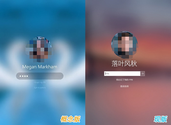
1. Login panel There are not many changes. If you have to look for it, it is probably that the rectangle has become rounded and blended with the background to be more unified
(the concept version adds a frosted glass effect). In fact, this is also a problem with the current version of Win10.
2. After watching it for five years, the square corners are really boring, not to mention that the current Internet celebrities have rounded corners.
3. No matter from which perspective, turning square corners into rounded corners does not mean that it lacks mass support.
4. And from a visual point of view, the concept version is indeed more refined than the current version of Win10. This is probably due to the frosted glass special effect!
5. Rounded corner elements are added to the login panel.
2. Taskbar
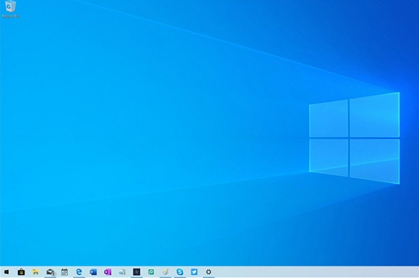
1. To be fair, since v1903 launched the “light theme”, the appearance of Win10 has improved a lot.
2. Perhaps it is for this reason that the concept version did not make a big move on the taskbar.
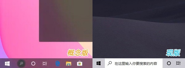
3. However, we still found some differences, that is, the concept version adds a new semi-transparent taskbar.
4. It can automatically change colors according to the theme. At the same time, the search button has also been added with a circular background,
5, indicating that it is different from the previous search function. However, since it will be introduced in detail below, I won’t say more about this change here.
3. Start Menu
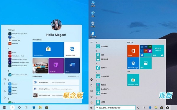
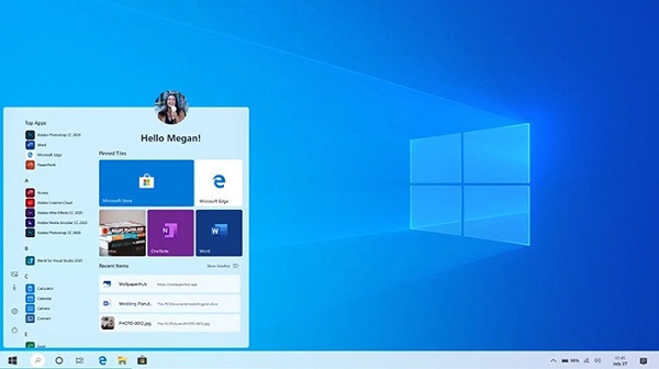
1. The Start Menu has changed a lot. The first is the account avatar. This design is very similar to Win10 X, but the concept version is obvious. Better and more coordinated.
2. The recently used list is placed below the tiles. In addition to being practical, it is also more beautiful than before.
3. The tile has a small change, adding a rounded corner shape, which visually echoes the previous login panel.
4. In addition, a colorful background is added below the tiles, which is also the most criticized aspect of the current version of Win10.
4. File Explorer
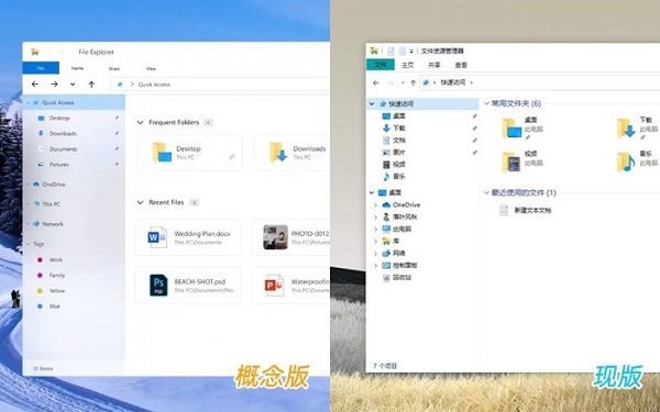
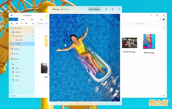
1. The concept version enlarges the spacing between elements and adds "acrylic" special effects, making the overall look more refined. .
2. A large number of UI lines are diluted, giving people a "blank" feeling.
3. The color TAG at the bottom of the left panel should be a highlight of the concept version.
4. Although there is no more detailed introduction, combined with the experience of using other operating systems, it should be concluded that it is a file classification function.
5. Multi-label
1. Multi-label is similar to the RS5 version of SETS, but more practical than SETS, it will not destroy existing Windows form,
2, so it is easier to implement. Bottom-mounted labels seem a little "anti-human".
3. After all, years of browser operation have made us accustomed to cutting labels at the top of the window.
4. The rest of the style is very similar to the browser style, which is more in line with public usage habits.
5. Especially the color matching is quite good, and it is very coordinated with the resource manager.

6. QuickLook
1. QuickLook (one-finger flick) of MacOS has always been highly praised. There was also a plug-in under Windows to simulate it.
2. This function is also mentioned in the concept version this time. It is simple and practical, and visually very similar to MAC.
7. Independent version of Cortana
1. From the initial popularity of Cortana to the current popularity, the experience is probably only shared by Microsoft itself. Know.
2. In fact, Cortana was not born at the wrong time. It was preceded by MAC’s Siri, and later by domestic manufacturers’ “Xiao Ai”,
3, “Xiaoou”, “Xiaodu”… …. Especially after the popularization of the concept some time ago,
4, voice assistants have already been deeply rooted in the hearts of the people. It can be said that the right time and the right place are available. But why is Cortana so unpopular?
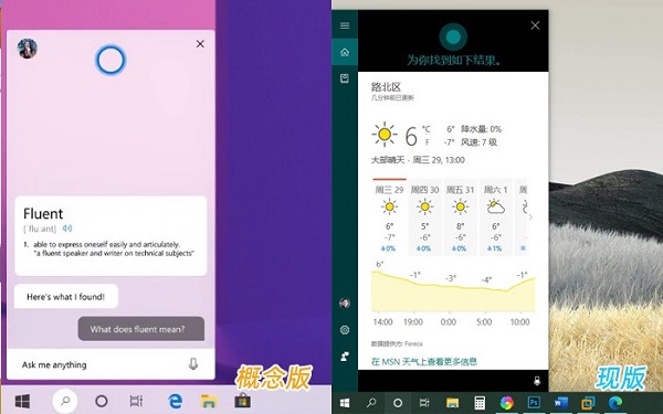
5. The reason is simple, that is, Cortana’s steps are not big enough!
6. Looking at the development of Xiaona in the past few years, at the beginning everyone was trying to be fresh. If you can chat, I will chat with you for a few words,
7. If you know how to talk, I will help you talk a few words. But as time goes by, the passion is diluted by the years,
8. Voice assistants will eventually return to the old way of helping people do things.
9. To take the simplest example, if you ask several assistants the same sentence "What day is today?",
10. Siri, Xiao Ai, Xiao Ou... can basically tell you the actual date
(of course there may be some differences in the tone of answer, after all, the optimization capabilities of manufacturers are also different),
11, and Xiaona, however, would just stupidly open the browser and search for "What's today's date?"
12. Many voice assistants nowadays can complete system-level operations and easily recognize most daily languages.
13. Our Cortana can only answer some mechanical questions and also provides Without too much valuable help, people will naturally lose interest in it.
14. In addition, Cortana's style has always been inconsistent with the entire system, making it difficult to believe that this is a product from the same company,
15 , further reducing the probability of people opening it.
8. Notification Center
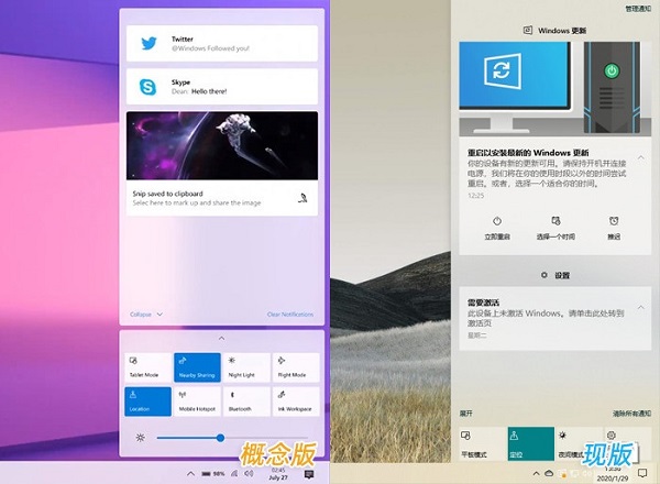
1. The concept version divides the notification center into two parts. The upper part is dedicated to notifications, and the lower part is dedicated to operations.
2. The structure is much clearer than the current version. The brightness slider is a bright spot. Although the current version of Win10 also has a slider,
3. However, you need to fully expand the panel to see it. For laptops with ordinary low resolutions,
4. This means that it will occupy more notification area. The buttons use rounded corners and are reduced in size.
5. More "blank" areas are left to give the interface more breathing.
9. Volume Panel
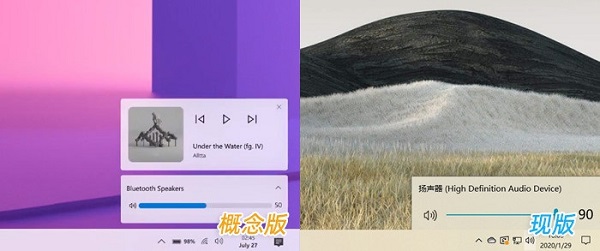
1. The current version of UWP has a mini panel that can quickly adjust the volume, but this function is not suitable for keyboard and mouse users. It has never been very friendly.
2. The operation is cumbersome and the keystroke is long. The preview version moves the mini panel above the volume buttons.
3. On the one hand, you can adjust the volume through the lower slider, and at the same time, you can also use the upper panel to switch playback.
10. Night Mode
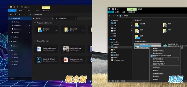
1. One of the biggest changes in the concept version is to expand the coverage of night mode to all areas,
2. In addition to UWP and resource manager, night mode is also added to the start menu, taskbar, notification panel, and Cortana.
3. Especially for the resource manager, compared with the current version of Win10, the concept version has reduced the use of many lines.
4. The icons and text colors have also been specially processed, at least not It’s no longer as dazzling as the current version.
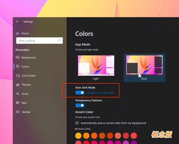
5. In addition, the concept version also adds an automatic switching function, which can automatically switch to night mode according to the time or the sunrise and sunset conditions of the user's location.

11. Search function
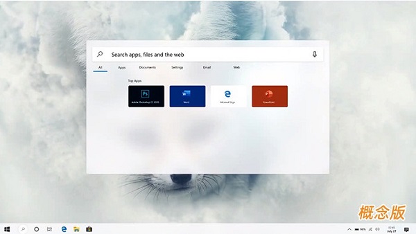
1. Search function of Win10 After several adjustments, it was still unsatisfactory. The concept version proposes a
2, independent search concept, which seems to be similar to MAC's "Focus" function.
3. The entire interface is similar to a small search engine, which can provide local applications or simple network search services.
4. In fact, similar designs have long been popular in many third-party software, such as Listary.
Summary:
1. Overall, this "concept version" of Win10 is quite exciting, although there are still some issues with some details. 2. But it is undeniable that compared with the current version of Win10, the concept version is more complete and the UI is more systematic.
3. In fact, since the first version of Win10 was released in 2014, Microsoft has been continuously transforming Win10.
4. However, the result of such efforts is verbal criticism from users. Looking at Microsoft's old rivals,
 5, MacOS has a complete design language, although one or two problems may arise from time to time.
6. But there are many details that make people want to stop after using it once.
7. Looking back at Win10, except for the "heirloom" of high resource usage,
8. The rest are almost all related to improper handling of details and poor appearance.
9. It’s hard for you to even imagine that a mature operating system that has been around for more than five years would have multiple sets of completely different UI systems at the same time.
The above is the detailed content of What new adjustments and changes will there be in the Win10 interface in 2023?. For more information, please follow other related articles on the PHP Chinese website!

Hot AI Tools

Undresser.AI Undress
AI-powered app for creating realistic nude photos

AI Clothes Remover
Online AI tool for removing clothes from photos.

Undress AI Tool
Undress images for free

Clothoff.io
AI clothes remover

AI Hentai Generator
Generate AI Hentai for free.

Hot Article

Hot Tools

Notepad++7.3.1
Easy-to-use and free code editor

SublimeText3 Chinese version
Chinese version, very easy to use

Zend Studio 13.0.1
Powerful PHP integrated development environment

Dreamweaver CS6
Visual web development tools

SublimeText3 Mac version
God-level code editing software (SublimeText3)

Hot Topics
 1379
1379
 52
52
 win11 activation key permanent 2025
Mar 18, 2025 pm 05:57 PM
Article discusses sources for a permanent Windows 11 key valid until 2025, legal issues, and risks of using unofficial keys. Advises caution and legality.
 win11 activation key permanent 2024
Mar 18, 2025 pm 05:56 PM
Article discusses reliable sources for permanent Windows 11 activation keys in 2024, legal implications of third-party keys, and risks of using unofficial keys.
 Acer PD163Q Dual Portable Monitor Review: I Really Wanted to Love This
Mar 18, 2025 am 03:04 AM
The Acer PD163Q Dual Portable Monitor: A Connectivity Nightmare I had high hopes for the Acer PD163Q. The concept of dual portable displays, conveniently connecting via a single cable, was incredibly appealing. Unfortunately, this alluring idea quic
 ReactOS, the Open-Source Windows, Just Got an Update
Mar 25, 2025 am 03:02 AM
ReactOS 0.4.15 includes new storage drivers, which should help with overall stability and UDB drive compatibility, as well as new drivers for networking. There are also many updates to fonts support, the desktop shell, Windows APIs, themes, and file
 How to Create a Dynamic Table of Contents in Excel
Mar 24, 2025 am 08:01 AM
A table of contents is a total game-changer when working with large files – it keeps everything organized and easy to navigate. Unfortunately, unlike Word, Microsoft Excel doesn’t have a simple “Table of Contents” button that adds t
 Shopping for a New Monitor? 8 Mistakes to Avoid
Mar 18, 2025 am 03:01 AM
Buying a new monitor isn't a frequent occurrence. It's a long-term investment that often moves between computers. However, upgrading is inevitable, and the latest screen technology is tempting. But making the wrong choices can leave you with regret
 How to Use Voice Access in Windows 11
Mar 18, 2025 pm 08:01 PM
Detailed explanation of the voice access function of Windows 11: Free your hands and control your computer with voice! Windows 11 provides numerous auxiliary functions to help users with various needs to use the device easily. One of them is the voice access function, which allows you to control your computer completely through voice. From opening applications and files to entering text with voice, everything is at your fingertips, but first you need to set up and learn key commands. This guide will provide details on how to use voice access in Windows 11. Windows 11 Voice Access Function Settings First, let's take a look at how to enable this feature and configure Windows 11 voice access for the best results. Step 1: Open the Settings menu
 New to Multi-Monitors? Don't Make These Mistakes
Mar 25, 2025 am 03:12 AM
Multi-monitor setups boost your productivity and deliver a more immersive experience. However, it's easy for a novice to stumble while assembling the setup and make mistakes. Here are some of the most common ones and how to avoid them.


